Certification available
Course
Introduction to Python
4 hr
5.4M
Earlier this month, I did a Facebook Live Code Along Session in which I (and everybody who coded along) built several algorithms of increasing complexity that predict whether any given passenger on the Titanic survived or not, given data on them such as the fare they paid, where they embarked and their age.
In this post, you will go over some of the things we covered in this session. If you want to re-watch or follow this post together with the video, you can watch it here:
In particular, you might still remember that we built supervised learning models.
Supervised learning is the branch of Machine Learning (ML) that involves predicting labels, such as 'Survived' or 'Not'. Such models learn from labelled data, which is data that includes whether a passenger survived (called "model training"), and then predict on unlabelled data.
On Kaggle, a platform for predictive modelling and analytics competitions, these are called train and test sets because
Kaggle then tells you the percentage that you got correct: this is known as the accuracy of your model.
As you might already know, a good way to approach supervised learning is the following:
In this code along session, you did or will do all of these steps!
Note that we also have courses that get you up and running with machine learning for the Titanic dataset in Python and R.
A first step is always to import your data to quickly check out the data that you will be working with. In this case, you'll import the pandas package and make use of the read_csv() function to read in the data:
Note that in the code chunks below, other packages and modules of packages such as matplotlib, sklearn and seaborn have already been imported. You'll be making more extensive use of these later for (statistical) data visualization and machine learning purposes!
You also make use of IPython magic command %matplotlib inline so that your plots appear inline in your notebook. You also add sns.set() to your code chunk to change the visualization style to a base Seaborn style:
# Import modules
import pandas as pd
import matplotlib.pyplot as plt
import seaborn as sns
from sklearn import tree
from sklearn.metrics import accuracy_score

# Figures inline and set visualization style
%matplotlib inline
sns.set()
Without further ado, let's import the data and already take the first step in examining your data:
# Import test and train datasets
df_train = pd.read_csv('../data/train.csv')
df_test = pd.read_csv('../data/test.csv')

# View first lines of training data
df_train.head(n=4)
| PassengerId | Survived | Pclass | Name | Sex | Age | SibSp | Parch | Ticket | Fare | Cabin | Embarked | |
|---|---|---|---|---|---|---|---|---|---|---|---|---|
| 0 | 1 | 0 | 3 | Braund, Mr. Owen Harris | male | 22.0 | 1 | 0 | A/5 21171 | 7.2500 | NaN | S |
| 1 | 2 | 1 | 1 | Cumings, Mrs. John Bradley (Florence Briggs Th... | female | 38.0 | 1 | 0 | PC 17599 | 71.2833 | C85 | C |
| 2 | 3 | 1 | 3 | Heikkinen, Miss. Laina | female | 26.0 | 0 | 0 | STON/O2. 3101282 | 7.9250 | NaN | S |
| 3 | 4 | 1 | 1 | Futrelle, Mrs. Jacques Heath (Lily May Peel) | female | 35.0 | 1 | 0 | 113803 | 53.1000 | C123 | S |
If you want to see what all of these features are, check out the Kaggle data documentation here.
Before you continue, it's good to take into account the following when it comes to terminology:
With this in mind, you can continue to check out your data with, for example, the head() function, which you can use to pull up the first five rows of your data set:
# View first lines of test data
df_test.head()
| PassengerId | Pclass | Name | Sex | Age | SibSp | Parch | Ticket | Fare | Cabin | Embarked | |
|---|---|---|---|---|---|---|---|---|---|---|---|
| 0 | 892 | 3 | Kelly, Mr. James | male | 34.5 | 0 | 0 | 330911 | 7.8292 | NaN | Q |
| 1 | 893 | 3 | Wilkes, Mrs. James (Ellen Needs) | female | 47.0 | 1 | 0 | 363272 | 7.0000 | NaN | S |
| 2 | 894 | 2 | Myles, Mr. Thomas Francis | male | 62.0 | 0 | 0 | 240276 | 9.6875 | NaN | Q |
| 3 | 895 | 3 | Wirz, Mr. Albert | male | 27.0 | 0 | 0 | 315154 | 8.6625 | NaN | S |
| 4 | 896 | 3 | Hirvonen, Mrs. Alexander (Helga E Lindqvist) | female | 22.0 | 1 | 1 | 3101298 | 12.2875 | NaN | S |
Note that the df_test DataFrame doesn't have the 'Survived' column because this is what you will try to predict!
.info() method to check out data types, missing values and more (of df_train).df_train.info()
<class 'pandas.core.frame.DataFrame'>
RangeIndex: 891 entries, 0 to 890
Data columns (total 12 columns):
PassengerId    891 non-null int64
Survived       891 non-null int64
Pclass         891 non-null int64
Name           891 non-null object
Sex            891 non-null object
Age            714 non-null float64
SibSp          891 non-null int64
Parch          891 non-null int64
Ticket         891 non-null object
Fare           891 non-null float64
Cabin          204 non-null object
Embarked       889 non-null object
dtypes: float64(2), int64(5), object(5)
memory usage: 83.6+ KB
In this case, you see that there are only 714 non-null values for the 'Age' column in a DataFrame with 891 rows. This means that are are 177 null or missing values.
.describe() method to check out summary statistics of numeric columns (of df_train).df_train.describe()
| PassengerId | Survived | Pclass | Age | SibSp | Parch | Fare | |
|---|---|---|---|---|---|---|---|
| count | 891.000000 | 891.000000 | 891.000000 | 714.000000 | 891.000000 | 891.000000 | 891.000000 |
| mean | 446.000000 | 0.383838 | 2.308642 | 29.699118 | 0.523008 | 0.381594 | 32.204208 |
| std | 257.353842 | 0.486592 | 0.836071 | 14.526497 | 1.102743 | 0.806057 | 49.693429 |
| min | 1.000000 | 0.000000 | 1.000000 | 0.420000 | 0.000000 | 0.000000 | 0.000000 |
| 25% | 223.500000 | 0.000000 | 2.000000 | 20.125000 | 0.000000 | 0.000000 | 7.910400 |
| 50% | 446.000000 | 0.000000 | 3.000000 | 28.000000 | 0.000000 | 0.000000 | 14.454200 |
| 75% | 668.500000 | 1.000000 | 3.000000 | 38.000000 | 1.000000 | 0.000000 | 31.000000 |
| max | 891.000000 | 1.000000 | 3.000000 | 80.000000 | 8.000000 | 6.000000 | 512.329200 |
Now that you have an idea about what your data looks like and have checked out some statistics, it's time to also visualize your data with the help of the seaborn package:
seaborn to build a bar plot of Titanic survival, which is your target variable.sns.countplot(x='Survived', data=df_train);
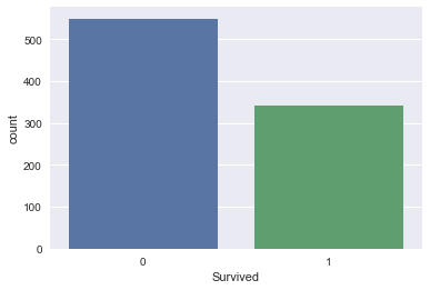
Take-away: in the training set, less people survived than didn't. Let's then build a first model that predicts that nobody survived.
This is a bad model as you know that people survived. But it gives us a baseline: any model that we build later needs to do better than this one.
You can do this by following these steps:
'Survived' for df_test that encodes 'did not survive' for all rows;'PassengerId' and 'Survived' columns of df_test to a .csv and submit to Kaggle.df_test['Survived'] = 0
df_test[['PassengerId', 'Survived']].to_csv('data/predictions/no_survivors.csv', index=False)
What accuracy did this give you? The accuracy on Kaggle is 62.7.
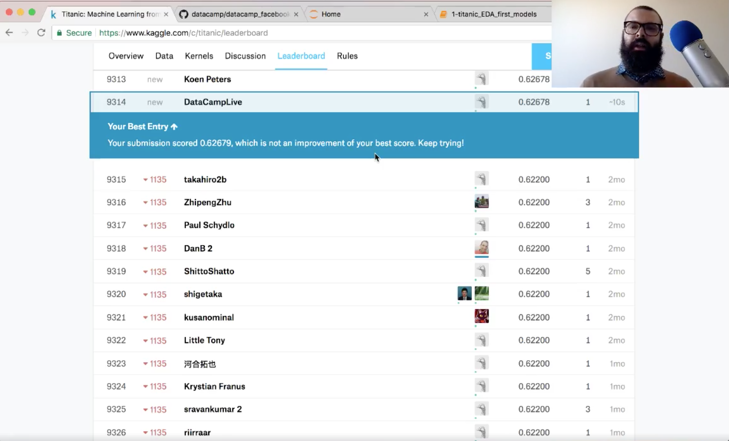
Not too bad!
Essential note! You will also want to use metrics other than accuracy!
Now that you have made a quick-and-dirty model, it's time to reiterate: let's do some more Exploratory Data Analysis and build another model soon!
seaborn to build a bar plot of the Titanic dataset feature 'Sex' (of df_train).sns.countplot(x='Sex', data=df_train);

seaborn to build bar plots of the Titanic dataset feature 'Survived' split (faceted) over the feature 'Sex'.sns.factorplot(x='Survived', col='Sex', kind='count', data=df_train);
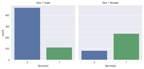
Take-away: Women were more likely to survive than men.
pandas to figure out how many women and how many men survived:df_train.groupby(['Sex']).Survived.sum()
Sex
female    233
male      109
Name: Survived, dtype: int64
pandas to figure out the proportion of women that survived, along with the proportion of men:print(df_train[df_train.Sex == 'female'].Survived.sum()/df_train[df_train.Sex == 'female'].Survived.count())
print(df_train[df_train.Sex == 'male'].Survived.sum()/df_train[df_train.Sex == 'male'].Survived.count())
0.742038216561
0.188908145581
74% of women survived, while 19% of men survived.
Let's now build a second model and predict that all women survived and all men didn't. Once again, this is an unrealistic model, but it will provide a baseline against which to compare future models.
'Survived' for df_test that encodes the above prediction.'PassengerId' and 'Survived' columns of df_test to a .csv and submit to Kaggle.df_test['Survived'] = df_test.Sex == 'female'
df_test['Survived'] = df_test.Survived.apply(lambda x: int(x))
df_test.head()
| PassengerId | Pclass | Name | Sex | Age | SibSp | Parch | Ticket | Fare | Cabin | Embarked | Survived | |
|---|---|---|---|---|---|---|---|---|---|---|---|---|
| 0 | 892 | 3 | Kelly, Mr. James | male | 34.5 | 0 | 0 | 330911 | 7.8292 | NaN | Q | 0 |
| 1 | 893 | 3 | Wilkes, Mrs. James (Ellen Needs) | female | 47.0 | 1 | 0 | 363272 | 7.0000 | NaN | S | 1 |
| 2 | 894 | 2 | Myles, Mr. Thomas Francis | male | 62.0 | 0 | 0 | 240276 | 9.6875 | NaN | Q | 0 |
| 3 | 895 | 3 | Wirz, Mr. Albert | male | 27.0 | 0 | 0 | 315154 | 8.6625 | NaN | S | 0 |
| 4 | 896 | 3 | Hirvonen, Mrs. Alexander (Helga E Lindqvist) | female | 22.0 | 1 | 1 | 3101298 | 12.2875 | NaN | S | 1 |
df_test[['PassengerId', 'Survived']].to_csv('../data/predictions/women_survive.csv', index=False)
Now, what accuracy did this model give you when you submit it to Kaggle?
The accuracy on Kaggle is 76.6%:
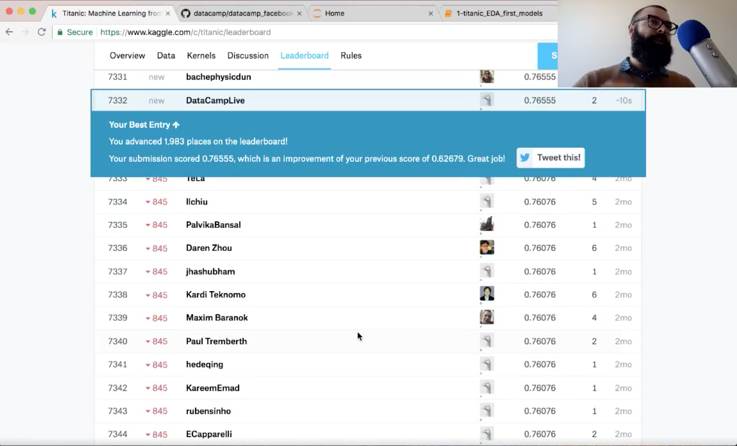
With this submission, you went up about 2,000 places in the leaderboard! Also, you have improved your score, so you've done a great job!
seaborn to build bar plots of the Titanic dataset feature 'Survived' split (faceted) over the feature 'Pclass'.sns.factorplot(x='Survived', col='Pclass', kind='count', data=df_train);

Take-away: Passengers that travelled in first class were more likely to survive. On the other hand, passengers travelling in third class were more unlikely to survive.
seaborn to build bar plots of the Titanic dataset feature 'Survived' split (faceted) over the feature 'Embarked'.sns.factorplot(x='Survived', col='Embarked', kind='count', data=df_train);
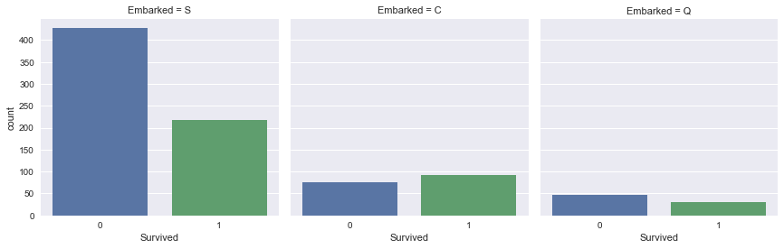
Take-away: Passengers that embarked in Southampton were less likely to survive.
seaborn to plot a histogram of the 'Fare' column of df_train.sns.distplot(df_train.Fare, kde=False);
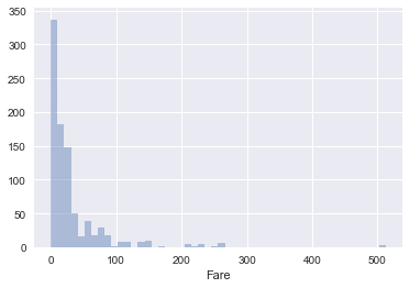
Take-away: Most passengers paid less than 100 for travelling with the Titanic.
pandas plotting method to plot the column 'Fare' for each value of 'Survived' on the same plot.df_train.groupby('Survived').Fare.hist(alpha=0.6);
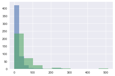
Take-away: It looks as though those that paid more had a higher chance of surviving.
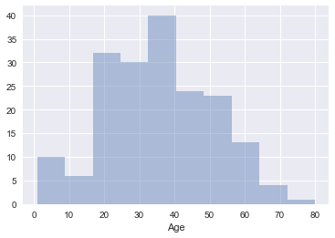
seaborn to plot a histogram of the 'Age' column of df_train. You'll need to drop null values before doing so.df_train_drop = df_train.dropna()
sns.distplot(df_train_drop.Age, kde=False);
'Fare' with 'Survived' on the x-axis.sns.stripplot(x='Survived', y='Fare', data=df_train, alpha=0.3, jitter=True);

sns.swarmplot(x='Survived', y='Fare', data=df_train);

Take-away: Fare definitely seems to be correlated with survival aboard the Titanic.
.describe() to check out summary statistics of 'Fare' as a function of survival.df_train.groupby('Survived').Fare.describe()
| count | mean | std | min | 25% | 50% | 75% | max | |
|---|---|---|---|---|---|---|---|---|
| Survived | ||||||||
| 0 | 549.0 | 22.117887 | 31.388207 | 0.0 | 7.8542 | 10.5 | 26.0 | 263.0000 |
| 1 | 342.0 | 48.395408 | 66.596998 | 0.0 | 12.4750 | 26.0 | 57.0 | 512.3292 |
seaborn to plot a scatter plot of 'Age' against 'Fare', colored by 'Survived'.sns.lmplot(x='Age', y='Fare', hue='Survived', data=df_train, fit_reg=False, scatter_kws={'alpha':0.5});
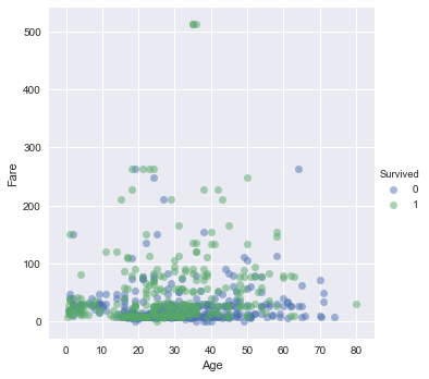
Take-away: It looks like those who survived either paid quite a bit for their ticket or they were young.
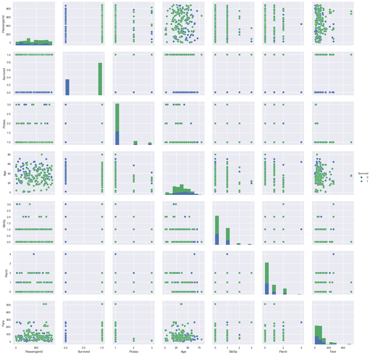
seaborn to create a pairplot of df_train, colored by 'Survived'. A pairplot is a great way to display most of the information that you have already discovered in a single grid of plots.sns.pairplot(df_train_drop, hue='Survived');
In this tutorial, you have successfully:
In the next post, you'll take the time to build some Machine Learning models, based on what you've learnt from your EDA here. We'll do this in the next post on this project (to be launched on December 27).
Python Courses
Course
Course
Course
Mark Graus
10 min
Adel Nehme
15 min
Amina Edmunds
7 min
Satyam Tripathi
9 min
Richmond Alake
13 min
Natassha Selvaraj
9 min