Certification available
Course
Intermediate Data Visualization with ggplot2
4 hr
42.5K
Learn the skills you need at your own pace—from non-coding essentials to data science and machine learning.
Histograms are visualizations that show frequency distributions across continuous (numeric) variables. Histograms allow us to see the count of observations in data within ranges that the continuous variable spans.
We will first need to import the ggplot2 library using the library function. This will bring in all of the different built-in functions available in the ggplot2 library. If you have not already installed ggplot2, you will need to install it by running the install.packages() command. We will do the same for the readr library, which will allow us to read in a csv file, and dplyr, which allows us to work more easily with the data we read in.
install.packages("ggplot2")
install.packages("readr")
install.packages("dplyr")
library(ggplot2)
library(readr)
library(dplyr)
For this tutorial, we will be using this housing dataset which includes details about different house listings, including the size of the house, the number of rooms, the price, and location information.
We can read the data using the read_csv() function. We can read it directly from the URL or download the csv file into a directory and read it from our local storage. The first attribute of read_csv() is the location of the data, and the col_select attribute allows us to choose the columns we are interested in.
home_data <- read_csv(
    "https://raw.githubusercontent.com/rashida048/Datasets/master/home_data.csv",
    col_select = c(price, condition)
)
We can then look at the first few rows of data using the head() function
head(home_data)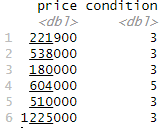
Now we can create the histogram. Regardless of the type of graph we are creating in ggplot2, we always start with the ggplot() function, which creates a canvas to add plot elements to. It takes two parameters.
home_data.aes() function. Here we map the price column to the x-axis.So far, our code is
ggplot(data = home_data, aes(x = price))This won't draw anything useful by itself. To make this a histogram, we add a histogram geometry using geom_histogram().
ggplot(data = home_data, aes(x = price)) +
  geom_histogram()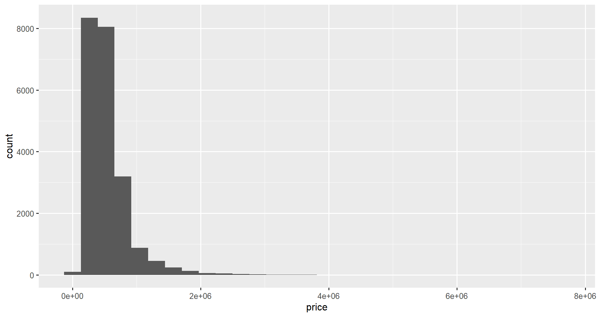
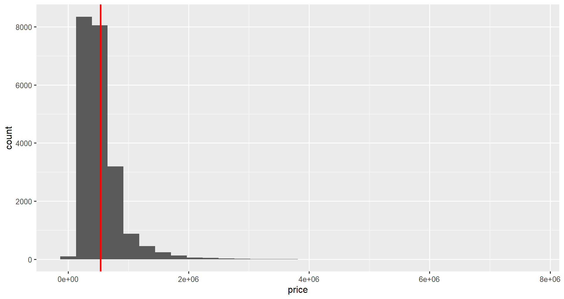
geom_vline()We can add descriptive statistics to our plot using the geom_vline() function. This adds a vertical line geometry to the plot.
First, we calculate a descriptive statistic, in this case, the mean price, using dplyr's summarize().
price_stats <- home_data |>
summarize(mean_price = mean(price))
price_stats
# A tibble: 1 × 1
mean_price
<dbl>
1 540088.The function takes the xintercept parameter, and optional color and linewidth attributes to customize the color and size of the lines, respectively. We will add a mean line using the plus sign as we did in the previous section.
ggplot(home_data, aes(x = price)) +
    geom_histogram() +
    geom_vline(aes(xintercept = mean_price), price_stats, color = "red", linewidth = 2)
Notice that in geom_ functions, the mapping and data arguments are swapped compared to ggplot().
To add a probability density line to the histogram, we first change the y-axis to be scaled to density. In the aes() function, we set y to after_stat(density).
We can then add a density layer to our graph using the geom_density() function. Here we set the color attribute to green and the linewidth attribute to 2.
ggplot(home_data, aes(x = price, y = after_stat(density))) +
    geom_histogram() +
    geom_vline(aes(xintercept = mean_price), price_stats, color = "red", linewidth = 2) +
    geom_density(color = "green", linewidth = 2)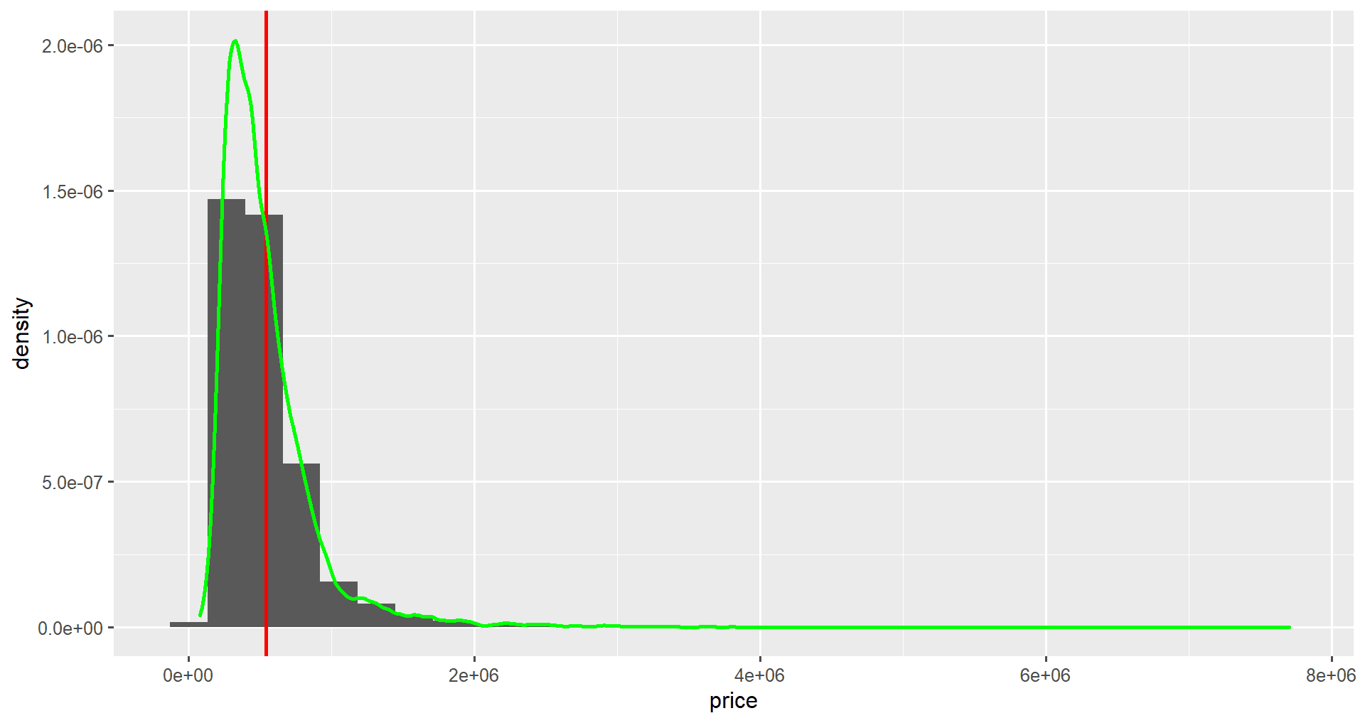
Notice that the numbers on the y-axis have changed.
As you are starting to see, the syntax for ggplot2 is simple but very powerful. We can add multiple layers on top of a simple graph to add more complexity to it with additive logic and some well-defined built-in functions.
We can update the binning of our ggplot2 histogram using the bin attribute. We set bin attributes equal to the number of bins we want to display on our graph. This will help us see more or less granular data in our histogram.
ggplot(data = home_data, aes(x = price)) +
  geom_histogram(bins = 100)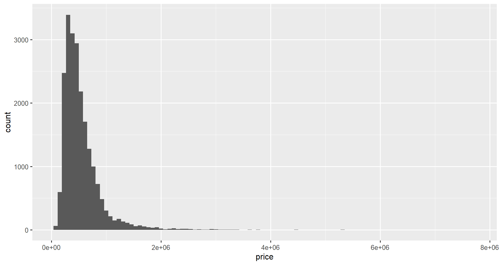
We can also set the bin width manually using the binwidth attribute of geom_histogram().
ggplot(data = home_data, aes(x = price)) +
  geom_histogram(binwidth = 50000)
Finally, you can align the boundaries using the center or boundary attributes. If you want the boundaries of bins to fall on specific multiples, you can use these attributes (only one can be used at a time). To ensure bins end up on integer values, set the attribute equal to 1.
ggplot(data = home_data, aes(x = price)) +
  geom_histogram(boundary = 1)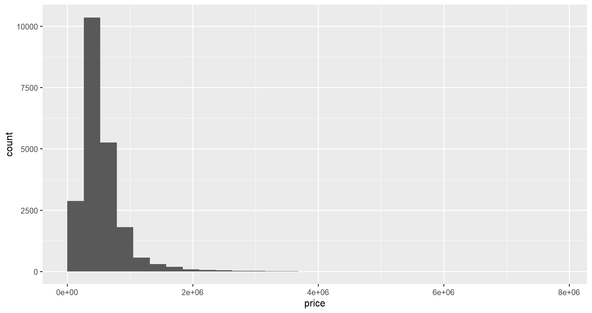
In this section, we will change the colors of the histogram. We can customize the color of the outlines of each bar using the color attribute, and we can change the fill of the bars using the fill attribute of geom_histogram(). We will fill the bars with blue and change the outline color to white.
ggplot(data = home_data, aes(x = price)) +
  geom_histogram(color = "white", fill = "blue")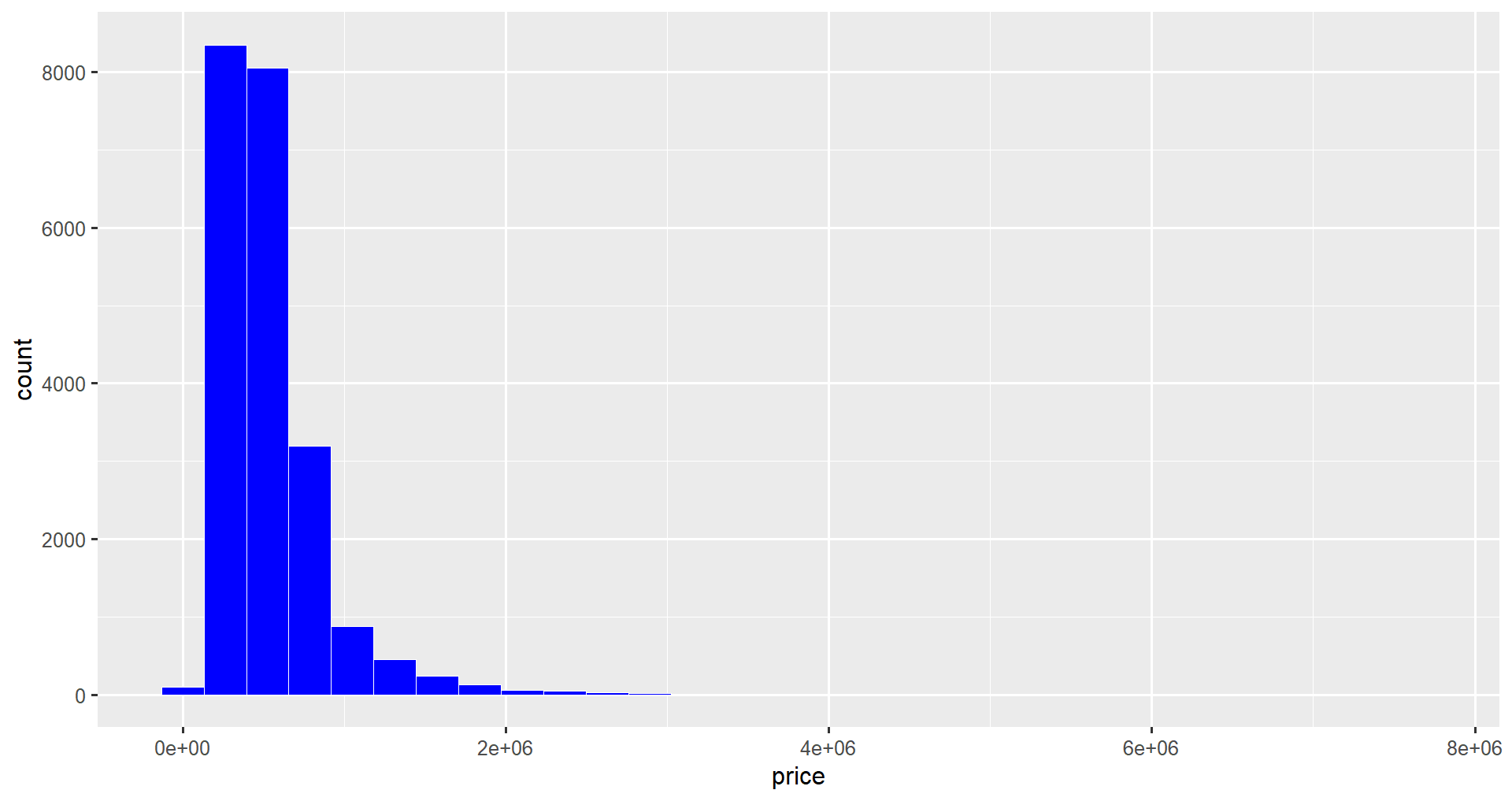
You can customize the colors of the histogram bars.
Changing the fill aesthetic (inside aes() the function) will change the interior colors of the bars based on the value of a variable in the dataset. That variable should be categorical (a factor) rather than integers, so we can convert it using the factor() function. For this example, we will look at the condition variable, a value ranging from 1 (bad condition) to 5 (great condition).
home_data <- home_data |>
    mutate(condition = factor(condition))

ggplot(data = home_data, aes(x = price, fill = condition)) +
    geom_histogram()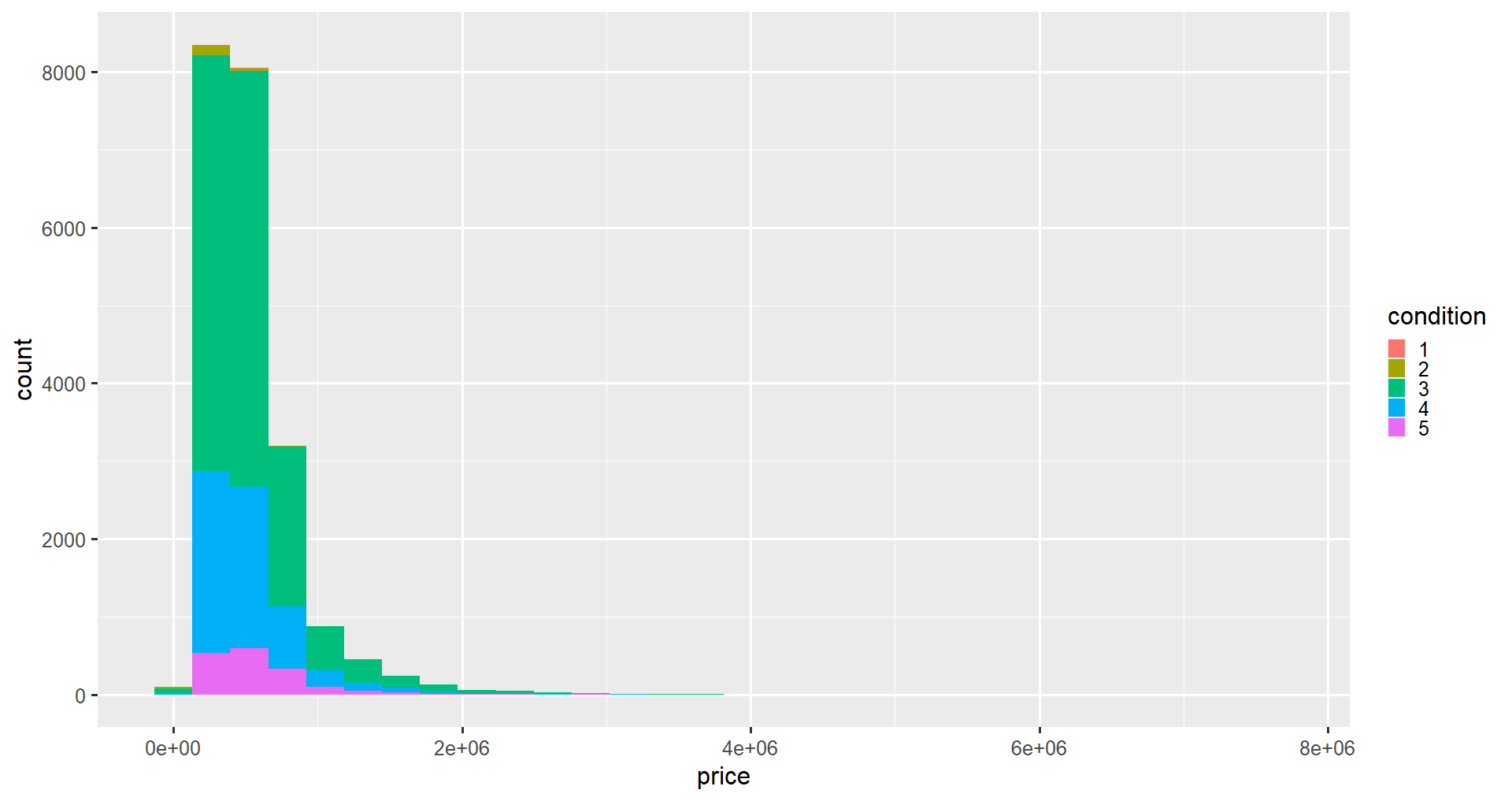
Next, we add titles and labels to our graph using the labs() function. We set the x, y, and title attributes to our desired labels.
ggplot(data = home_data, aes(x = price)) +
  geom_histogram() +
  labs(x ='Price (USD)', y='Number of Listings', title = 'Housing Price Distributions')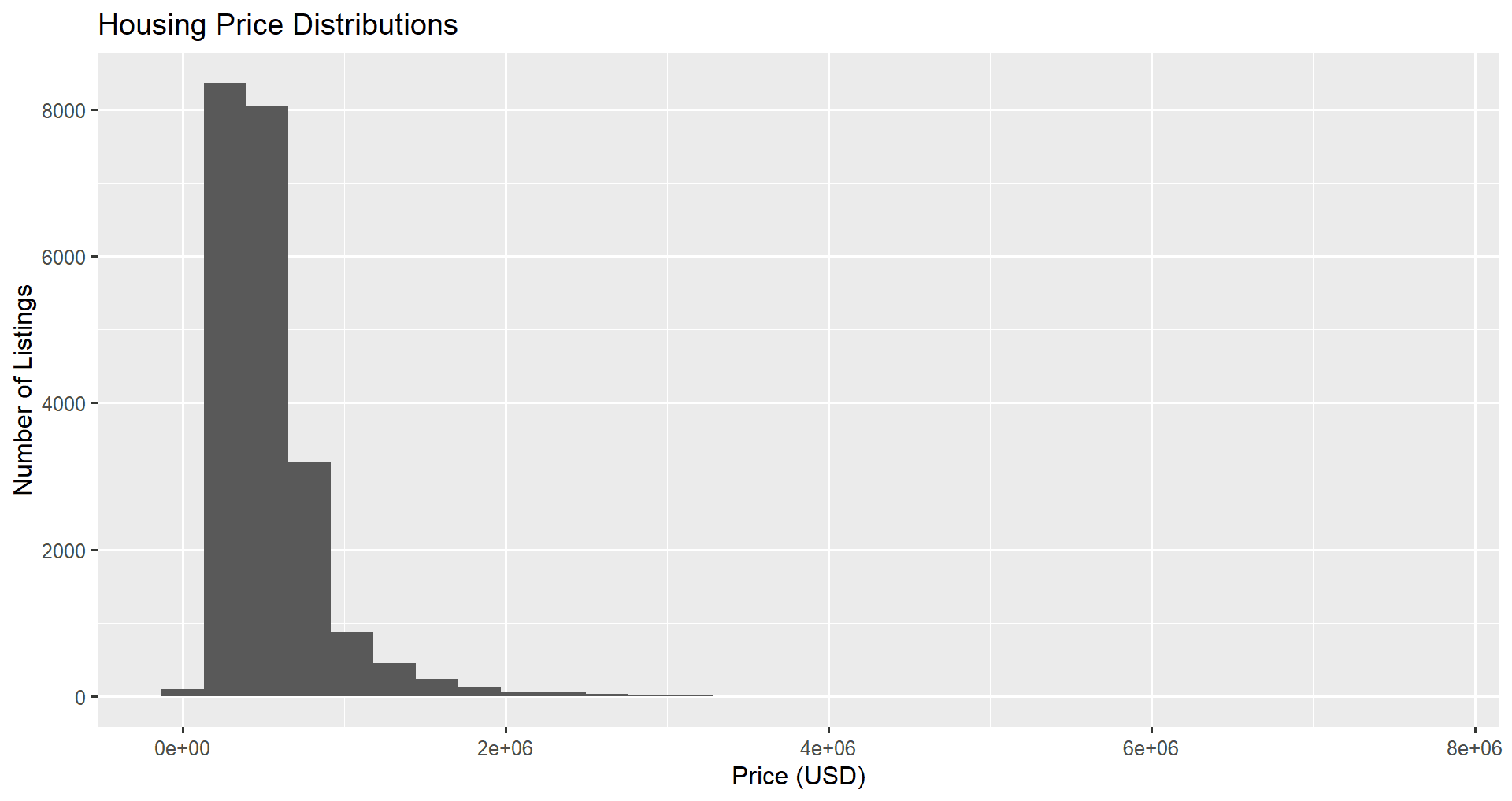
We can set the x-axis limits of our plot using the xlim() function to zoom in on the data we are interested in. For example, it is sometimes helpful to focus on the central part of the distribution rather than over the long tail we currently see when we view the whole plot.
Changing the y-axis limits is also possible (using ylim()), but this is less useful for histograms since the automatically calculated values are almost always ideal.
We will zoom in on prices between $0 and $2M.
ggplot(home_data, aes(x = price)) +
    geom_histogram(bins = 100) +
    xlim(0, 2000000)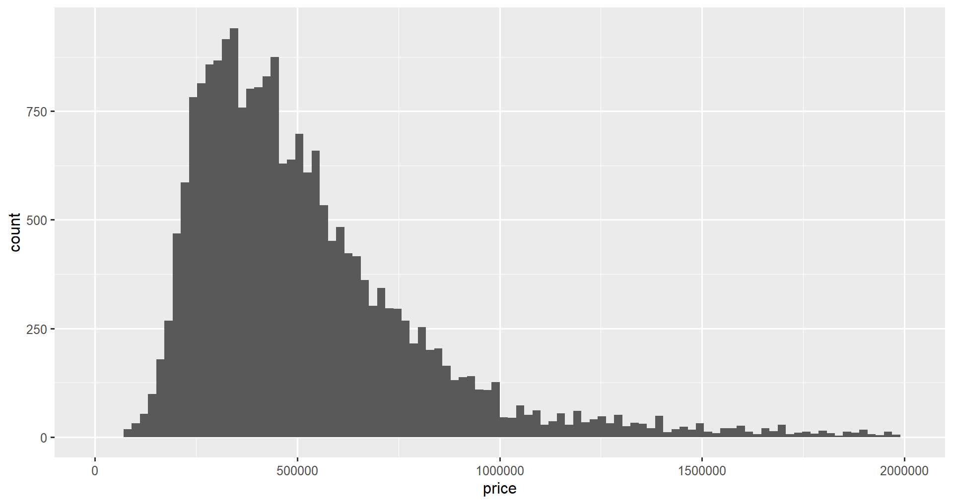
If we want to move the legend on our graph, for instance, when we visualize the condition in different colors, we can use the theme() function and the legend.position attribute. The values that legend.position takes are “bottom”, “top”, “right”, or “bottom”. You can also pass the coordinates you would like the legend to be in using c(x, y).
ggplot(home_data, aes(x = price, fill = condition)) +
    geom_histogram() +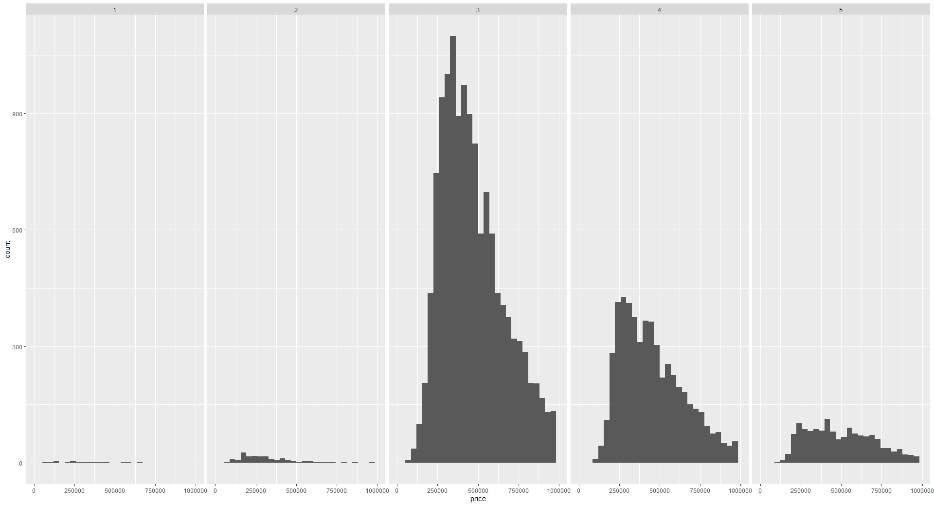
theme(legend.position = "bottom")Finally, we can visualize data in different groups in separate graphs using facets. This will split the visualization into several subplots for each category. This can be done using the facet_grid() function. We will visualize the distributions of prices by different condition values below.
ggplot(home_data, aes(x = price)) +
  geom_histogram() +  facet_grid(vars(condition))
Faceting is covered in more detail in the Facets for ggplot in R tutorial.
To create a histogram in ggplot2, you start by building the base with the ggplot() function and the data and aes() parameters. You then add the graph layers, starting with the type of graph function. For a histogram, you use the geom_histogram() function. You can then add on other customization layers like labs() for axis and graph titles, xlim() and ylim() to set the ranges of the axes, and theme() to move the legend and make other visual customizations to the graph.
ggplot2 makes building visualization in R easy. You can create simple graphs or more complex graphs, all while relying on the same simple additive syntax. It is the most popular graphing library in R.
ggplot2 is covered in depth in the Data Visualization in R skill track, beginning with Introduction to Data Visualization with ggplot2. You can learn to combine ggplot2 data visualizations with other tidyverse tools in the Tidyverse Fundamentals with R skill track. For a handy reference about everything you just learned, download a copy of the ggplot2 cheat sheet.
Learn more about R
Course
Course
Course
Shawn Plummer
9 min
DataCamp Team
8 min
Matt Crabtree
8 min
Mark Graus
10 min
Richie Cotton
71 min
Gary Alway
11 min