1. Meet Dr. Ignaz Semmelweis
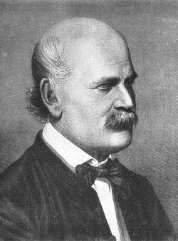
This is Dr. Ignaz Semmelweis, a Hungarian physician born in 1818 and active at the Vienna General Hospital. If Dr. Semmelweis looks troubled it's probably because he's thinking about childbed fever: A deadly disease affecting women that just have given birth. He is thinking about it because in the early 1840s at the Vienna General Hospital as many as 10% of the women giving birth die from it. He is thinking about it because he knows the cause of childbed fever: It's the contaminated hands of the doctors delivering the babies. And they won't listen to him and wash their hands!
In this notebook, we're going to reanalyze the data that made Semmelweis discover the importance of handwashing. Let's start by looking at the data that made Semmelweis realize that something was wrong with the procedures at Vienna General Hospital.
# Importar pandas
import pandas as pd
# Leer el archivo CSV en un DataFrame
yearly = pd.read_csv('datasets/yearly_deaths_by_clinic.csv')
# Imprimir el DataFrame
print(yearly)2. The alarming number of deaths
The table above shows the number of women giving birth at the two clinics at the Vienna General Hospital for the years 1841 to 1846. You'll notice that giving birth was very dangerous; an alarming number of women died as the result of childbirth, most of them from childbed fever.
We see this more clearly if we look at the proportion of deaths out of the number of women giving birth. Let's zoom in on the proportion of deaths at Clinic 1.
# Calcular la proporción de muertes por número de nacimientos
yearly['proportion_deaths'] = yearly['deaths'] / yearly['births']

# Extraer datos de la Clínica 1 y la Clínica 2
clinic_1 = yearly[yearly['clinic'] == 'clinic 1']
clinic_2 = yearly[yearly['clinic'] == 'clinic 2']

# Imprimir los datos de la Clínica 1
print(clinic_1)
3. Death at the clinics
If we now plot the proportion of deaths at both Clinic 1 and Clinic 2 we'll see a curious pattern…
# Importar pandas
import pandas as pd

# Leer el archivo CSV en un DataFrame
yearly = pd.read_csv('datasets/yearly_deaths_by_clinic.csv')

# Imprimir el DataFrame
print(yearly)

# Calcular la proporción de muertes por número de nacimientos
yearly['proportion_deaths'] = yearly['deaths'] / yearly['births']

# Extraer datos de la Clínica 1 y la Clínica 2
clinic_1 = yearly[yearly['clinic'] == 'clinic 1']
clinic_2 = yearly[yearly['clinic'] == 'clinic 2']

# Imprimir los datos de la Clínica 1
print(clinic_1)

# Importar matplotlib
import matplotlib.pyplot as plt

# Asegurarse de que los gráficos aparezcan en el notebook
%matplotlib inline

# Crear una figura y ejes
fig, ax = plt.subplots(figsize=(10, 6))

# Graficar la proporción de muertes anuales en las dos clínicas
ax.plot(clinic_1['year'], clinic_1['proportion_deaths'], label='Clinic 1')
ax.plot(clinic_2['year'], clinic_2['proportion_deaths'], label='Clinic 2')

# Etiquetas y título
ax.set_xlabel('Year')
ax.set_ylabel('Proportion of Deaths')
ax.set_title('Yearly Proportion of Deaths by Clinic')
ax.legend()

# Mostrar el gráfico
plt.show()
4. The handwashing begins
Why is the proportion of deaths consistently so much higher in Clinic 1? Semmelweis saw the same pattern and was puzzled and distressed. The only difference between the clinics was that many medical students served at Clinic 1, while mostly midwife students served at Clinic 2. While the midwives only tended to the women giving birth, the medical students also spent time in the autopsy rooms examining corpses.
Semmelweis started to suspect that something on the corpses spread from the hands of the medical students, caused childbed fever. So in a desperate attempt to stop the high mortality rates, he decreed: Wash your hands! This was an unorthodox and controversial request, nobody in Vienna knew about bacteria at this point in time.
Let's load in monthly data from Clinic 1 to see if the handwashing had any effect.
# Importar pandas
import pandas as pd

# Leer el archivo CSV en un DataFrame
monthly = pd.read_csv('datasets/monthly_deaths.csv')

# Convertir la columna 'date' a tipo datetime
monthly['date'] = pd.to_datetime(monthly['date'])

# Calcular la proporción de muertes por número de nacimientos
monthly['proportion_deaths'] = monthly['deaths'] / monthly['births']

# Imprimir las primeras filas del DataFrame
print(monthly.head())
5. The effect of handwashing
With the data loaded we can now look at the proportion of deaths over time. In the plot below we haven't marked where obligatory handwashing started, but it reduced the proportion of deaths to such a degree that you should be able to spot it!
import pandas as pd
import matplotlib.pyplot as plt

# Cargar y preparar los datos mensuales
monthly = pd.read_csv('datasets/monthly_deaths.csv')
monthly['date'] = pd.to_datetime(monthly['date'])
monthly['proportion_deaths'] = monthly['deaths'] / monthly['births']

# Graficar la proporción mensual de muertes a lo largo del tiempo para la Clínica 1
ax = monthly.plot(x='date', y='proportion_deaths', figsize=(12, 6), legend=False)
ax.set_xlabel('Date')
ax.set_ylabel('Proportion deaths')
ax.set_title('Monthly Proportion of Deaths Over Time for Clinic 1')
plt.axvline(pd.to_datetime('1847-06-01'), color='red', linestyle='--', label='Handwashing Introduced')
plt.legend()
plt.show()
6. The effect of handwashing highlighted
Starting from the summer of 1847 the proportion of deaths is drastically reduced and, yes, this was when Semmelweis made handwashing obligatory.
The effect of handwashing is made even more clear if we highlight this in the graph.
import pandas as pd
import matplotlib.pyplot as plt

# Convertir la columna 'date' a formato datetime
monthly['date'] = pd.to_datetime(monthly['date'])

# Fecha en que el lavado de manos se hizo obligatorio
handwashing_start = pd.to_datetime('1847-06-01')

# Dividir el DataFrame monthly en antes y después del inicio del lavado de manos
before_washing = monthly[monthly['date'] < handwashing_start]
after_washing = monthly[monthly['date'] >= handwashing_start]

# Crear el gráfico de la proporción mensual de muertes antes y después del lavado de manos
ax = before_washing.plot(x='date', y='proportion_deaths', label='Before Handwashing', figsize=(12, 6), color='red')
after_washing.plot(x='date', y='proportion_deaths', label='After Handwashing', ax=ax, color='green')

ax.set_xlabel('Date')
ax.set_ylabel('Proportion deaths')
ax.set_title('Monthly Proportion of Deaths Before and After Handwashing')
plt.axvline(handwashing_start, color='blue', linestyle='--', label='Handwashing Start')
plt.legend()
plt.show()
7. More handwashing, fewer deaths?
Again, the graph shows that handwashing had a huge effect. How much did it reduce the monthly proportion of deaths on average?
import pandas as pd
import matplotlib.pyplot as plt

# Convertir la columna 'date' a formato datetime
monthly['date'] = pd.to_datetime(monthly['date'])

# Fecha en que el lavado de manos se hizo obligatorio
handwashing_start = pd.to_datetime('1847-06-01')

# Dividir el DataFrame monthly en antes y después del inicio del lavado de manos
before_washing = monthly[monthly['date'] < handwashing_start]
after_washing = monthly[monthly['date'] >= handwashing_start]

# Crear el gráfico de la proporción mensual de muertes antes y después del lavado de manos
ax = before_washing.plot(x='date', y='proportion_deaths', label='Before Handwashing', figsize=(12, 6), color='red')
after_washing.plot(x='date', y='proportion_deaths', label='After Handwashing', ax=ax, color='green')

ax.set_xlabel('Date')
ax.set_ylabel('Proportion deaths')
ax.set_title('Monthly Proportion of Deaths Before and After Handwashing')
plt.axvline(handwashing_start, color='blue', linestyle='--', label='Handwashing Start')
plt.legend()
plt.show()

# Calcular la proporción media de muertes antes y después del lavado de manos
before_proportion = before_washing['proportion_deaths']
after_proportion = after_washing['proportion_deaths']

# Calcular la diferencia media
mean_diff = after_proportion.mean() - before_proportion.mean()

before_proportion.mean(), after_proportion.mean(), mean_diff
8. A Bootstrap analysis of Semmelweis handwashing data
It reduced the proportion of deaths by around 8 percentage points! From 10% on average to just 2% (which is still a high number by modern standards).
To get a feeling for the uncertainty around how much handwashing reduces mortalities we could look at a confidence interval (here calculated using the bootstrap method).