1. Meet Dr. Ignaz Semmelweis
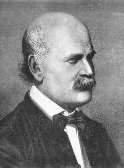
This is Dr. Ignaz Semmelweis, a Hungarian physician born in 1818 and active at the Vienna General Hospital. If Dr. Semmelweis looks troubled it's probably because he's thinking about childbed fever: A deadly disease affecting women that just have given birth. He is thinking about it because in the early 1840s at the Vienna General Hospital as many as 10% of the women giving birth die from it. He is thinking about it because he knows the cause of childbed fever: It's the contaminated hands of the doctors delivering the babies. And they won't listen to him and wash their hands!
In this notebook, we're going to reanalyze the data that made Semmelweis discover the importance of handwashing. Let's start by looking at the data that made Semmelweis realize that something was wrong with the procedures at Vienna General Hospital.
# Importing modules
# ... YOUR CODE FOR TASK 1 ...
import pandas as pd
import matplotlib.pyplot as plt
import seaborn as sns
import numpy as np
# Read datasets/yearly_deaths_by_clinic.csv into yearly
yearly = pd.read_csv('datasets/yearly_deaths_by_clinic.csv')
# Print out yearly
# ... YOUR CODE FOR TASK 1 ...
print(yearly)yearly.info()yearly[['births', 'deaths']].describe().T# change the clinic column as category
yearly['clinic'] = yearly['clinic'].astype('category')yearly.info()yearly.nunique()1.2 EDA plot , plot and plot!
# see the overall deaths trends
sns.boxplot(x = 'year', y = 'deaths', data = yearly);
sns.relplot(x = 'year', y = 'deaths', data = yearly, kind = 'line', col = 'clinic');sns.relplot(x = 'year', y = 'births', data = yearly, kind = 'line', col = 'clinic');Observartion:
- looks like clinic 2 was doing better handling deaths even though brith increasing
2. The alarming number of deaths
The table above shows the number of women giving birth at the two clinics at the Vienna General Hospital for the years 1841 to 1846. You'll notice that giving birth was very dangerous; an alarming number of women died as the result of childbirth, most of them from childbed fever.
We see this more clearly if we look at the proportion of deaths out of the number of women giving birth. Let's zoom in on the proportion of deaths at Clinic 1.
# Calculate proportion of deaths per no. births
# ... YOUR CODE FOR TASK 2 ...
yearly['proportion_deaths'] = yearly['deaths']/yearly['births']
# Extract Clinic 1 data into clinic_1 and Clinic 2 data into clinic_2
clinic_1 = yearly[yearly['clinic'] == 'clinic 1']
clinic_2 = yearly[yearly['clinic'] == 'clinic 2']

# Print out clinic_1
# ... YOUR CODE FOR TASK 2 ...
print(clinic_1)
3. Death at the clinics
If we now plot the proportion of deaths at both Clinic 1 and Clinic 2 we'll see a curious pattern…