1. TV, halftime shows, and the Big Game
Whether or not you like football, the Super Bowl is a spectacle. There's a little something for everyone at your Super Bowl party. Drama in the form of blowouts, comebacks, and controversy for the sports fan. There are the ridiculously expensive ads, some hilarious, others gut-wrenching, thought-provoking, and weird. The half-time shows with the biggest musicians in the world, sometimes riding giant mechanical tigers or leaping from the roof of the stadium. It's a grand show. And in this notebook, I explored how some of the elements of this show interact with each other and answered questions like:
- What are the most extreme game outcomes?
- How does the game affect television viewership?
- How have viewership, TV ratings, and ad cost evolved over time?
- Who are the most prolific musicians in terms of halftime show performances?
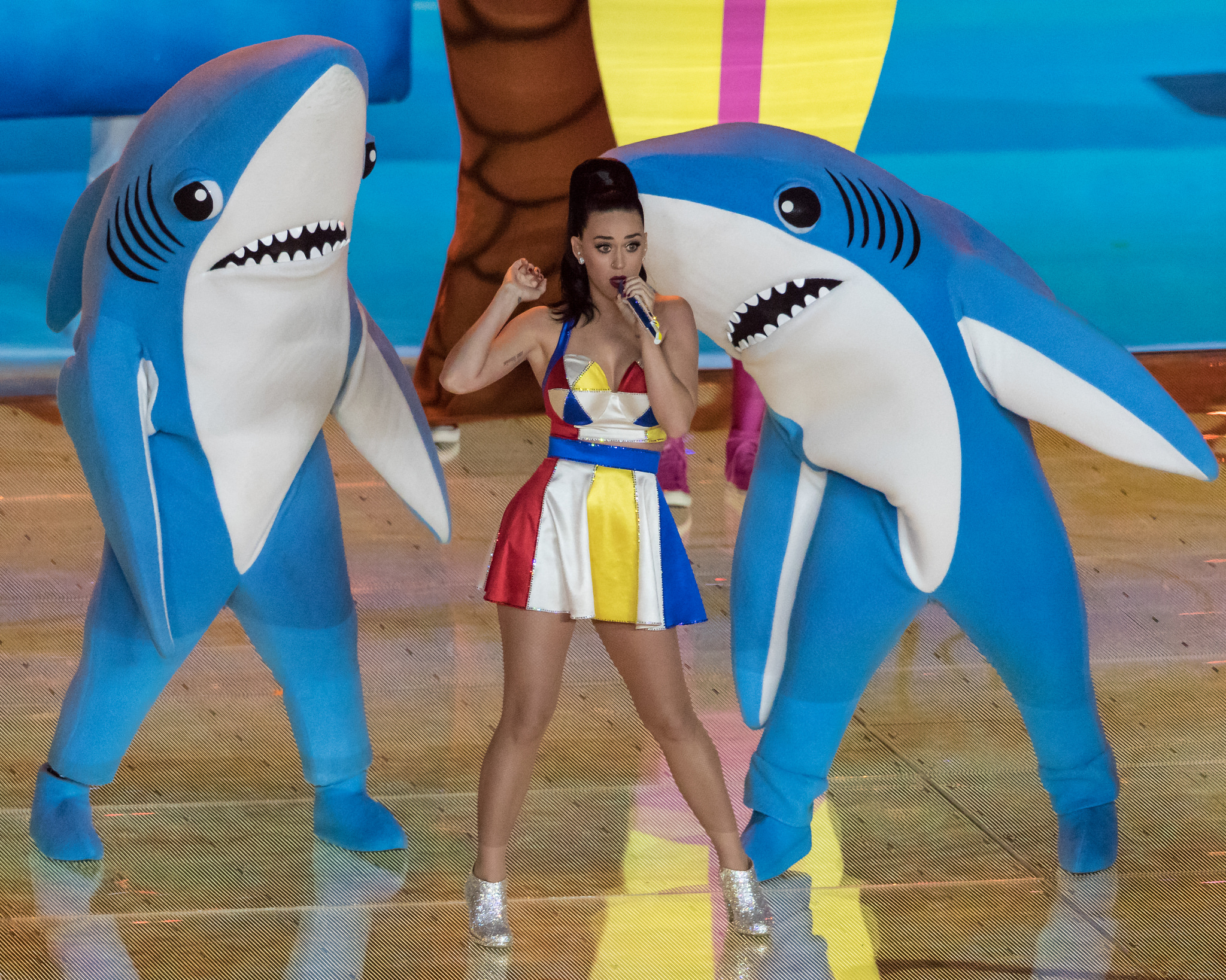 Left Shark Steals The Show. Katy Perry performing at halftime of Super Bowl XLIX. Photo by Huntley Paton. Attribution-ShareAlike 2.0 Generic (CC BY-SA 2.0).
The dataset I used was scraped and polished from Wikipedia. It is made up of three CSV files, one with game data, one with TV data, and one with halftime musician data for all 52 Super Bowls through 2018.
# Import pandas
import pandas as pd
# Load the CSV data into DataFrames
super_bowls = pd.read_csv('datasets/super_bowls.csv')
tv = pd.read_csv('datasets/tv.csv')
halftime_musicians = pd.read_csv('datasets/halftime_musicians.csv')
# Display the first five rows of each DataFrame
display(super_bowls.head())
display(tv.head())
display(halftime_musicians.head())2. Taking note of dataset issues
For the Super Bowl game data, we can see the dataset appears whole except for missing values in the backup quarterback columns (qb_winner_2 and qb_loser_2), which make sense given most starting QBs in the Super Bowl (qb_winner_1 and qb_loser_1) play the entire game.
From the visual inspection of TV and halftime musicians data, there is only one missing value displayed, but I suspect there are more. The Super Bowl goes all the way back to 1967, and the more granular columns (e.g. the number of songs for halftime musicians) probably weren't tracked reliably over time. Wikipedia is great but not perfect.
# Summary of the TV data to inspect
tv.info()

print('\n')

# Summary of the halftime musician data to inspect
halftime_musicians.info()
An inspection of the .info() output for tv and halftime_musicians shows us that there are multiple columns with null values.
3. Combined points distribution
For the TV data, the following columns have missing values and a lot of them:
total_us_viewers(amount of U.S. viewers who watched at least some part of the broadcast)rating_18_49(average % of U.S. adults 18-49 who live in a household with a TV that were watching for the entire broadcast)share_18_49(average % of U.S. adults 18-49 who live in a household with a TV in use that were watching for the entire broadcast)
Explaining the rating system used:
Rating points: This is a percentage of all the homes with TVs that are tuned into a specific show. Share: This is a percentage of TVs that are actually on at that time that are tuned into the show.
Imagine there are 100 homes with TVs. If a show gets a 5 rating, that means 5% of those homes (or 5 homes) are watching the show. But what if only 20 TVs are on in total? If the show also gets a 25 share, that means it captured a quarter (25%) of those viewers, which is a pretty good showing!
So, a high rating means a lot of people are watching overall, and a high share means the show is popular with people who are actually watching TV at that time.
For the halftime musician data, there are missing numbers of songs performed (num_songs) for about a third of the performances.
There are a lot of potential reasons for these missing values. Was the data ever tracked? Was it lost in history? Maybe. To conduct our analysis let's take note of where the dataset isn't perfect and start uncovering some insights.
Let's start by looking at combined points for each Super Bowl by visualizing the distribution. Let's also pinpoint the Super Bowls with the highest and lowest scores.
# Import matplotlib and set plotting style
from matplotlib import pyplot as plt
plt.style.use('seaborn')

# Plot a histogram of combined points
super_bowls['combined_pts'].hist()
plt.xlabel('Combined Points')
plt.ylabel('Number of Super Bowls')
plt.show()

# Display the Super Bowls with the highest and lowest combined scores
display(super_bowls[super_bowls['combined_pts'] > 70])
display(super_bowls[super_bowls['combined_pts'] < 25])
4. Point difference distribution
Most combined scores are around 40-50 points, with the extremes being roughly equal distance away in opposite directions. Going up to the highest combined scores at 74 and 75, we find two games featuring dominant quarterback performances. One even happened recently in 2018's Super Bowl LII where Tom Brady's Patriots lost to Nick Foles' underdog Eagles 41-33 for a combined score of 74.
Going down to the lowest combined scores, we have Super Bowl III and VII, which featured tough defenses that dominated. We also have Super Bowl IX in New Orleans in 1975, whose 16-6 score can be attributed to inclement weather.
Let's take a look at point difference now.
# Plot a histogram of point differences
plt.hist(super_bowls.difference_pts)
plt.xlabel('Point Difference')
plt.ylabel('Number of Super Bowls')
plt.show()

# Display the closest game(s) and biggest blowouts
display(super_bowls[super_bowls['difference_pts']==1])
display(super_bowls[super_bowls['difference_pts']>=35])
5. Do blowouts translate to lost viewers?
The vast majority of Super Bowls are close games. Makes sense. Both teams are likely to be deserving if they've made it this far. The closest game ever was when the Buffalo Bills lost to the New York Giants by 1 point in 1991, which was best remembered for Scott Norwood's last-second missed field goal attempt that went wide right, kicking off four Bills Super Bowl losses in a row. The biggest point discrepancy ever was 45 points (!) where Hall of Famer Joe Montana's led the San Francisco 49ers to victory in 1990, one year before the closest game ever.
Let's combine our game data and TV to see if large point differences translate to lost viewers? We can plot household share (average percentage of U.S. households with a TV in use that were watching for the entire broadcast) vs. point difference to find out.
# Join game and TV data, filtering out SB I because it was split over two networks
games_tv = pd.merge(tv[tv['super_bowl'] > 1], super_bowls, on='super_bowl')

# Import seaborn
import seaborn as sns

# Creating a scatter plot with a linear regression model fit
sns.regplot(x='difference_pts', y='share_household', data=games_tv)
6. Viewership and the ad industry over time
The downward sloping regression line and the 95% confidence interval for that regression suggest that bailing on the game if it is a blowout is common. Though it matches our intuition, we must take it with a grain of salt because the linear relationship in the data is weak due to our small sample size of 52 games.
Regardless of the score though, I think most people stay tuned for the halftime show, which is good news for the TV networks and advertisers. A 30-second spot costs about \$5 million now, but has it always been that way? And how have number of viewers and household ratings trended alongside ad cost? We can find out using line plots that share a "Super Bowl" x-axis.
# Create a figure with 3x1 subplot and activate the top subplot
plt.subplot(3, 1, 1)
plt.plot(tv['super_bowl'],tv['avg_us_viewers'],color='#648FFF')
plt.title('Average Number of US Viewers')

# Activate the middle subplot
plt.subplot(3, 1, 2)
plt.plot(tv['super_bowl'],tv['rating_household'],color='#DC267F')
plt.title('Household Rating')

# Activate the bottom subplot
plt.subplot(3, 1, 3)
plt.plot(tv['super_bowl'],tv['ad_cost'],color='#FFB000')
plt.title('Ad Cost')

# Improve the spacing between subplots
plt.tight_layout()
7. Halftime shows weren't always this great
We can see viewers increased before ad costs did. Maybe the networks weren't very data savvy and were slow to react? Makes sense since DataCamp didn't exist back then.
Another hypothesis: maybe halftime shows weren't that good in the earlier years? The modern spectacle of the Super Bowl has a lot to do with the cultural prestige of big halftime acts. I explored on YouTube and it turns out the old ones weren't up to today's standards. Some examples:
- Super Bowl XXVI in 1992: A Frosty The Snowman rap performed by children.
- Super Bowl XXIII in 1989: An Elvis impersonator that did magic tricks and didn't even sing one Elvis song.
It turns out Michael Jackson's Super Bowl XXVII performance, one of the most watched events in American TV history, was when the NFL realized the value of Super Bowl airtime and decided they needed to sign big name acts from then on out. The halftime shows before MJ indeed weren't that impressive, which we can see by filtering our halftime_musician data.
# Display all halftime musicians for Super Bowls up to and including Super Bowl XXVII
halftime_musicians[halftime_musicians['super_bowl']<=27]