Course
Introduction to Power BI
4 hr
711K
Conditional formatting enhances your visualizations and allows you to draw attention to critical metrics or red flags, making it easier to analyze and understand your data at a glance.
This tutorial will explore conditional formatting from basic to advanced applications. Plus, discover the biggest pitfalls when applying conditional formatting in Power BI and how you can avoid them in your reports.
Taking our Data Analyst in Power BI career track is a surefire way to learn everything you need to know to get certified and land a job.
Remember to download our Power BI cheat sheet and keep it on hand as you learn more about Power BI and conditional formatting.
DataCamp Power BI Cheat Sheet
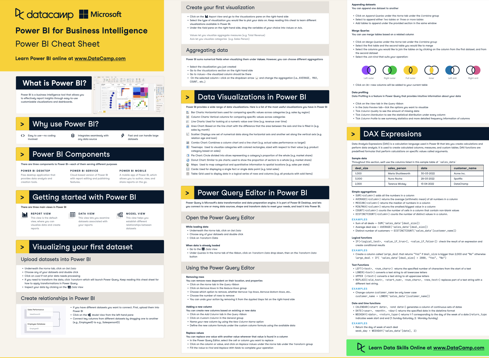
In Power BI, you can apply conditional formatting in many different ways, such as dynamically formatting individual elements in your visuals or changing the font color of data labels and chart titles.
Power BI offers an easy way of applying basic conditional formatting to change the background and font color of cells in a table or matrix. You can also add data bars (which fill the cell with a bar proportional to the value it represents) and icons (such as arrows or shapes) based on the values in the cells of a table or matrix.
The conditions for formatting can be simple (e.g., values above or below a certain threshold) or complex, involving DAX expressions with highly specific formatting rules.
Power BI evaluates each data point against the specified conditions and applies the formatting styles automatically whenever the underlying data changes.
These are the main types of conditional formatting you can apply to the table or matrix visuals in Power BI:
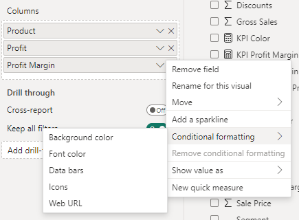
Image by author
These options allow you to change the background color or font color of cells or text based on their values. Background color formatting is commonly used to create heat maps within tables or matrices, making it easier to spot high and low values through color gradients.
There are three format style options here. You can apply conditional formatting based on a field value, a gradient, or rules.
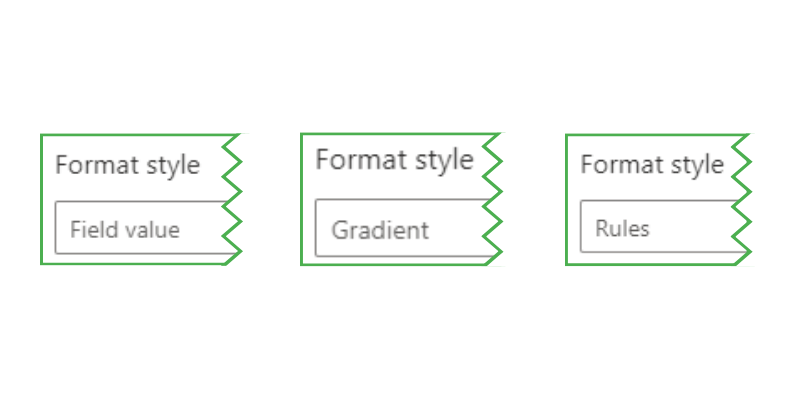
Image by author
Using this format style, you can apply colors based on the cell values or other fields in your data model. This option is more complex since it requires colors to be specified in a column or a DAX measure to work correctly.
We provide an example of how to do this in the next section.
The gradient format style applies a color scale across the range of values, often from a low-value color through a midpoint (optionally) to a high-value color.
Image by author
Rules-based formatting lets you set specific conditions (e.g., greater than, less than, or equal to a specific value) for when to apply certain background colors or font colors. This method offers more control than the gradient and is good for comparing values against a target or predefined threshold.
You need to specify each rule individually with a color that should be applied when those rules are met. Remember to apply each rule in the correct order, especially if your rules overlap.

Image by author
Here is an example of how the above rule would look in a table:
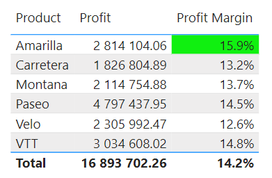
Image by author
Data bars add a horizontal bar within the cell. The length of the bar represents the cell's value compared to other values in the column. This is a useful way of visually gauging and comparing data points directly within the cell.
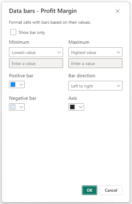
Image by author
Here is an example of how the bars look in a table:
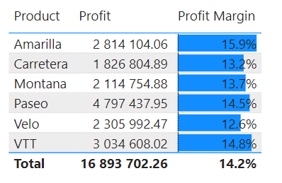
Image by author
Icon sets are applied the same way we did using the rules format style above, except you can add symbols or icons next to your data points based on the defined rules.
For example, you could use upward or downward arrows to indicate performance trends or, as in our example below, shapes to indicate whether certain targets have been met.
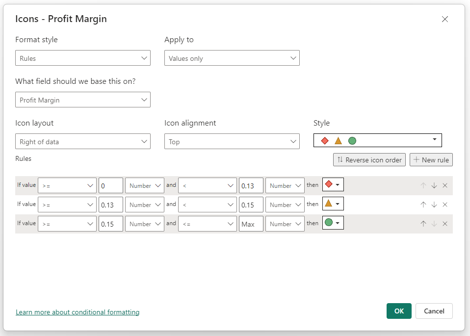
Image by author
Here is an example of how the above icon rules look in our table:
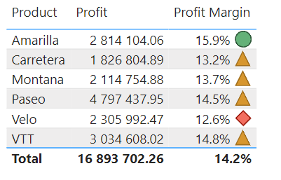
Image by author
Although not a visual style per se, this type of conditional formatting allows you to add hyperlinks to your tables based on the URL data in another field. This can be useful for creating drill-through experiences or linking to external resources for additional context.
As we saw in the previous section, applying rule-based conditional formatting to your charts is quick and easy with the built-in Power BI formatting menu.
However, what if you have several similar visuals, like cards, for displaying different metrics?
You would have to go through the same process for applying red-yellow-green rules to each card in your report. This is a tedious and highly manual process. Even worse, what if you just need to change the value for when the font color of each card turns yellow?
Instead, you can create DAX measures to define the conditions for when the colors should be applied. Not only that, but you can easily change a single DAX measure, and every visual that uses it for conditional formatting will be updated automatically.
Let's review a simple example using the SWITCH function. If you're unfamiliar with the function or how it works, check out our comprehensive SWITCH tutorial.
First, we create our measure, which assigns colors based on the difference between our profit margin and the target.
Profit Margin vs Target Color =
VAR Diff = [Profit Margin] - [Profit Margin Target]
RETURN
SWITCH (
    TRUE(),
    Diff > 0, "Green",
    Diff < 0, "Red",
    "Black" )
After creating a bar chart showing profit margin by product, we can go to the formatting pane for our visual. Under the “Columns” dropdown, we can select the “fx” icon to add conditional formatting to the colors of the bars.
Image by author
Like with the background color and font color conditional formatting options, we can choose between gradient, rules, or field value. For this example, we chose field value and added our new measure.
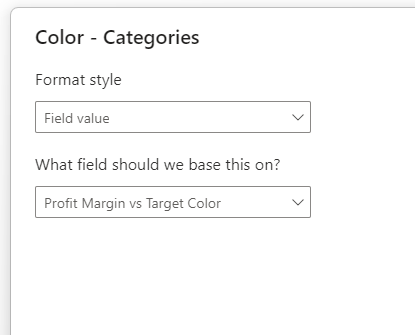
Image by author
Now, the colors of the columns in our bar chart will change depending on whether the profit margin target was reached.
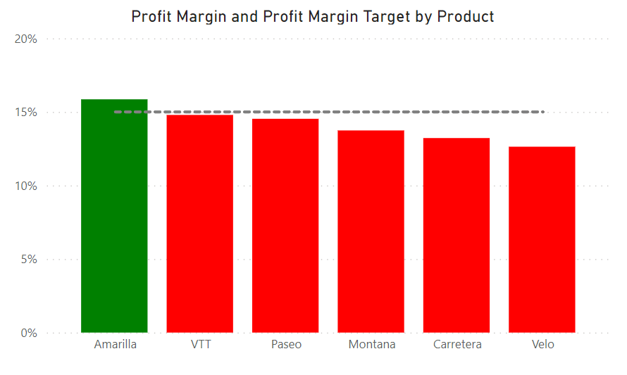
Image by author
Starting with a bar chart showing the total sales by month, we want to highlight the top-performing months so that they stand out to our users. First, we’ll apply basic conditional formatting based on the top three sales months. Then, we use an advanced technique to make the conditional formatting more dynamic.
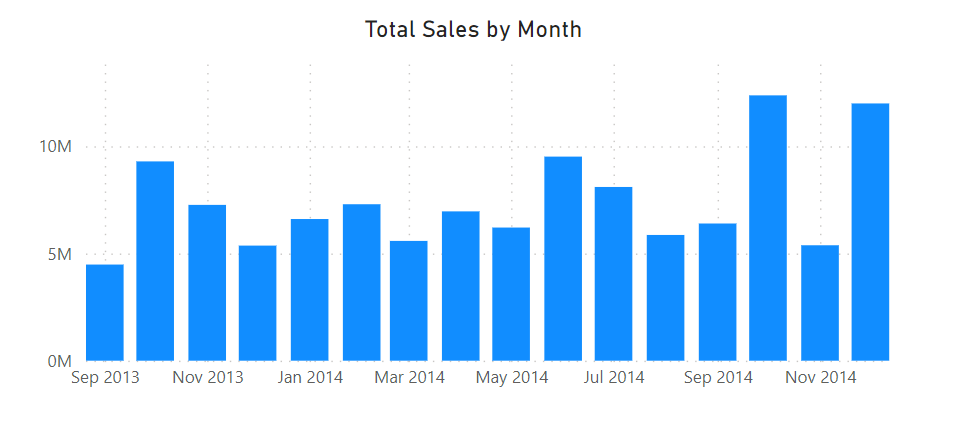
Image by author
For the first example, we create a measure that ranks the total monthly sales and highlights the top 3 in green while the other bars are gray.
Top 3 Monthly Sales =
VAR Ranking = RANKX ( ALL(Financials[Date]), [Total Sales], [Total Sales], DESC )
VAR Top3 = IF ( Ranking <= 3, "Green", "Gray" )
RETURN Top3
To improve the readability of our highlighted bars, we also create a measure for the font color of the data labels. In this case, the top three green highlighted bars will have a black font color while the other bars will have a white font color, essentially hiding those data labels from the bar chart.
Top 3 Monthly Sales Data Label =
IF ( [Top 3 Monthly Sales] = "Green", "Black", "White" )
Below is the result of applying this formatting, which is already looking much more striking:
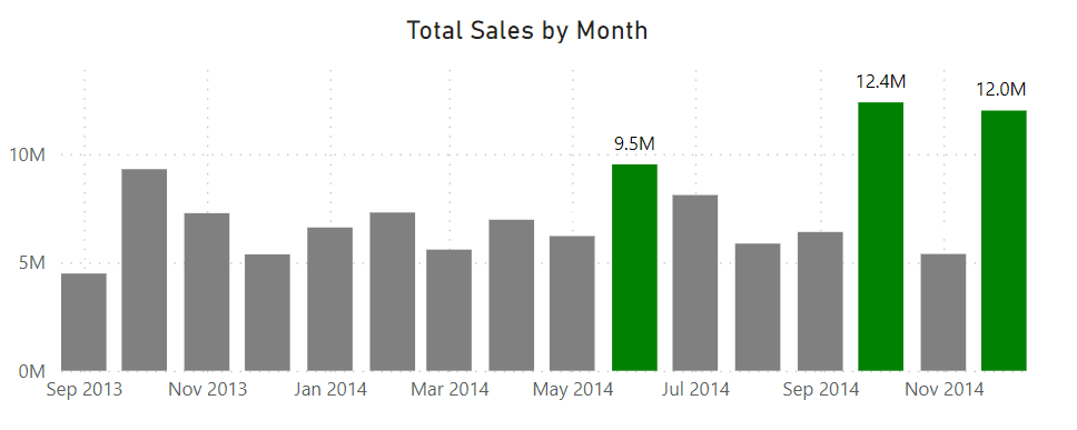
Image by author
In this second example, we take our conditional formatting a step further by allowing the user to select the number of months they would like to highlight in the bar chart.
We can achieve this by using parameters based on a numeric range. Go to the “Modeling” tab in the Ribbon, select “New parameter,” and then “Numeric range” from the drop-down menu.
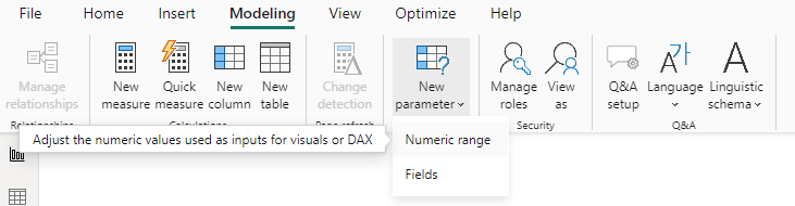
Image by author
The parameters dialog box asks us to enter a name for our parameter and the minimum, maximum, and desired increment. For this example, we set 5 as the maximum.
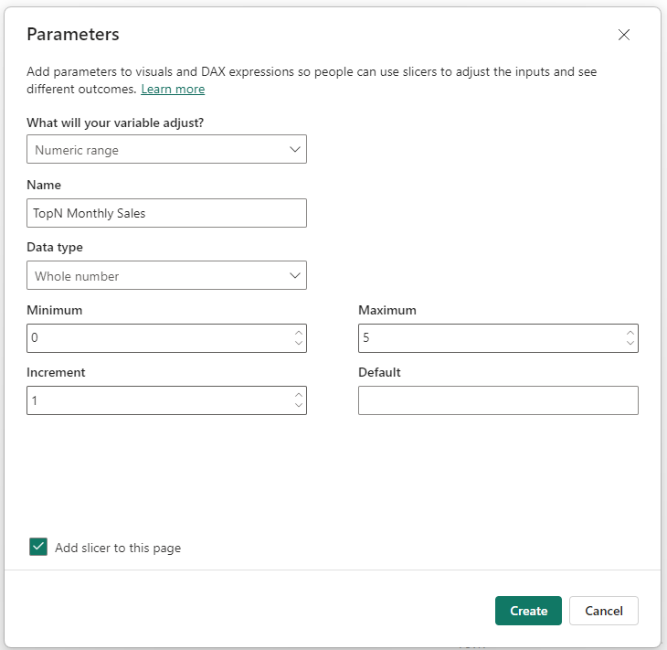
Image by author
Once we create the parameter, a new table gets added to our data model.
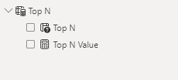
Image by author
Now, we can adjust our measure to use the “Top N Value” measure from this new “Top N” table.
Top N Monthly Sales =
VAR Ranking = RANKX ( ALL(Financials[Date]), [Total Sales], [Total Sales], DESC )
VAR _TopN = IF ( Ranking <= 'Top N'[Top N Value], "Green", "Grey" )
RETURN _TopN
We also adjust the measure for the font color of the data label so that it dynamically changes based on the number of highlighted columns.
Top N Monthly Sales Data Label =
IF ( [Top N Monthly Sales] = "Green", "Black", "White" )
The result is a dynamically formatted bar chart that the user can adjust as needed:
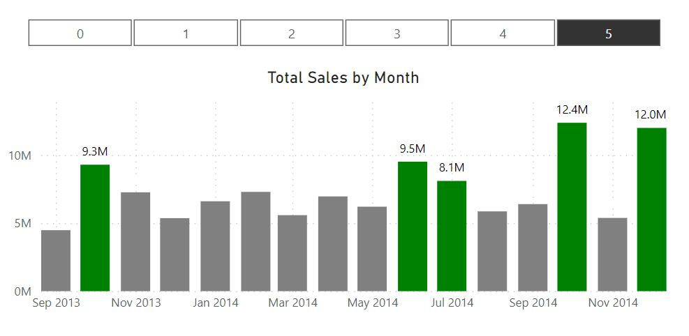
Image by author
Understand what you want to achieve with conditional formatting. For example, if you want to highlight specific outliers in your data, there might be better choices than icon sets. Having a clear objective with your report will guide your formatting choices.
Choose intuitive or meaningful colors for your users (e.g., red for decrease, green for increase) to make your visuals instantly understandable.
Also, consider whether your users may be color blind and improve accessibility in your reports by using color schemes that are distinguishable to all users.
Use a simple and consistent color palette to avoid overwhelming your audience. Too many colors can be distracting and may reduce the impact of your dashboard.
Reserve strong or contrasting colors for the most important data points you want to highlight.
Review and test your report regularly with end-users to ensure the conditional formatting is clear, intuitive, and adds value. Getting feedback from your users can go a long way toward ensuring your formatting is clear and easy to understand.
Also, be sure to keep an eye on the performance of your Power BI reports, especially if you use complex DAX expressions for conditional formatting, as they can impact report loading times.
Conditional formatting in Power BI is not a "set it and forget it" task. As your data changes or as you receive feedback from your users, be prepared to iterate and improve your formatting choices to keep your reports valuable and aligned with the original objectives of the report.
Conditional formatting overload.
Find a balance between highlighting key points and overloading your report with so many colors that they lose all their meaning.
Be selective with what you choose to highlight. Too much conditional formatting can make a report busy and hard to read. Focus on key metrics and insights that drive decision-making and tie in with the objective of the report or dashboard.
Use icons and data bars to add context or to simplify the understanding of the data without adding additional columns, charts, or other text. Arrows can indicate trends, while data bars can give a quick comparative view of a column in a table.
Using conditional formatting in Power BI, you can create eye-catching reports, but it should be applied carefully and with a clear objective in mind.
We covered several ways of applying conditional formatting, from basic to advanced. By following our tips, you can create visually appealing reports that are easy for your users to understand and interpret.
Check out our course on data visualization in Power BI to learn more about effectively visualizing and presenting your insights to your users.
Master the world's most popular business intelligence tool.
Continue Your Power BI Learning Journey!
Course
Course
Course
cheat-sheet
Richie Cotton
Tutorial
Joleen Bothma
Tutorial
DataCamp Team
Tutorial
Joleen Bothma
Tutorial
Aditya Sharma
Tutorial
Joleen Bothma