Power BI is an efficient and powerful business intelligence tool designed for managing and analyzing data, and creating dynamic interactive dashboards that can be easily shared with others. This cheat sheet is designed to get you started with Power BI and covers creating your first visualization, working with Power Query and DAX, and more.
Have this cheat sheet at your fingertips
Download PDFBecome a Power BI Data Analyst
Master the world's most popular business intelligence tool.
Visualizing your first dataset
Upload datasets into Power BI
- Underneath the Home tab, click on Get Data
- Choose any of your datasets and double click
- Click on Load if not prior data needs processing
- If you need to transform the data, click Transform which will launch Power Query. Keep reading this cheat sheet for how to apply transformations in Power Query.
- Inspect your data by clicking on the Data View
Create relationships with Power BI
- If you have different datasets you want to connect. First, upload them into Power BI
- Click on the Model View from the left-hand pane
- Connect key columns from different datasets by dragging one to another (e.g., EmployeeID to e.g., SalespersonID)
Create your first visualization
- Click on the Report View and go to the Visualizations pane on the right-hand side
- Select the type of visualization you would like to plot your data on. Keep reading this cheat to learn different visualizations available in Power BI.
- Under the Field pane on the right-hand side, drag the variables of your choice into Values or Axis.
Note that Values let you visualize aggregate measures (e.g. Total Revenue), and Axis let you visualize categories (e.g. Sales Person).
Aggregating data
Power BI sums numerical fields when visualizing them under Values. However, you can choose different aggregations
- Select the visualization you just created
- Go to the Visualizations section on the right-hand side
- Go to Values—the visualized column should be there
- On the selected column—click on the dropdown arrow and change the aggregation (i.e., AVERAGE, MAX, COUNT, etc..)
Data Visualizations in Power BI
Power BI provides a wide range of data visualizations. Here is a list of the most useful visualizations you have in Power BI:
- Bar Charts: Horizontal bars used for comparing specific values across categories (e.g. sales by region)
- Column Charts: Vertical columns for comparing specific values across categories
- Line Charts: Used for looking at a numeric value over time (e.g. revenue over time)
- Area Chart: Based on the line chart with the difference that the area between the axis and line is filled in (e.g. sales by month)
- Scatter: Displays one set of numerical data along the horizontal axis and another set along the vertical axis (e.g. relation age and loan)
- Combo Chart: Combines a column chart and a line chart (e.g. actual sales performance vs target)
- Treemaps: Used to visualize categories with colored rectangles, sized with respect to their value (e.g. product category based on sales)
- Pie Chart: Circle divided into slices representing a category's proportion of the whole (e.g. market share)
- Donut Chart: Similar to pie charts; used to show the proportion of sectors to a whole (e.g. market share)
- Maps: Used to map categorical and quantitative information to spatial locations (e.g. sales per state)
- Cards: Used for displaying a single fact or single data point (e.g. total sales)
- Table: Grid used to display data in a logical series of rows and columns (e.g. all products with sold items)
Power Query Editor in Power BI
Power Query is Microsoft’s data transformation and data preparation engine. It is part of Power BI Desktop, and lets you connect to one or many data sources, shape and transform data to meet your needs, and load it into Power BI.
Open the Power Query Editor
While loading data
- Underneath the Home tab, click on Get Data
- Choose any of your datasets and double click
- Click on Transform Data
When data is already loaded
- Go to the Data View
- Under Queries in the Home tab of the ribbon, click on the Transform Data drop-down, then on the Transform Data button
Using the Power Query Editor
Removing rows
You can remove rows dependent on their location, and properties
- Click on the Home tab in the Query ribbon
- Click on Remove Rows in the Reduce Rows group
- Choose which option to remove, whether Remove Top Rows, Remove Bottom Rows, etc..
- Choose the number of rows to remove
- You can undo your action by removing it from the Applied Steps list on the right-hand side
Adding a new column
You can create new columns based on existing or new data
- Click on the Add Column tab in the Query ribbon
- Click on Custom Column in the General group
- Name your new column by using the New Column Name option
- Define the new column formula under the custom column formula using the available data
Replace values
You can replace one value with another value wherever that value is found in a column
- In the Power Query Editor, select the cell or column you want to replace
- Click on the column or value, and click on Replace Values under the Home tab under the Transform group
- Fill the Value to Find and Replace With fields to complete your operation
Appending datasets
You can append one dataset to another
- Click on Append Queries under the Home tab under the Combine group
- Select to append either Two tables or Three or more tables
- Add tables to append under the provided section in the same window
Merge Queries
You can use merge tables based on a related column
- Click on Merge Queries under the Home tab under the Combine group
- Select the first table and the second table you would like to merge
- Select the columns you would like to join the tables on by clicking on the column from the first dataset, and from the second dataset
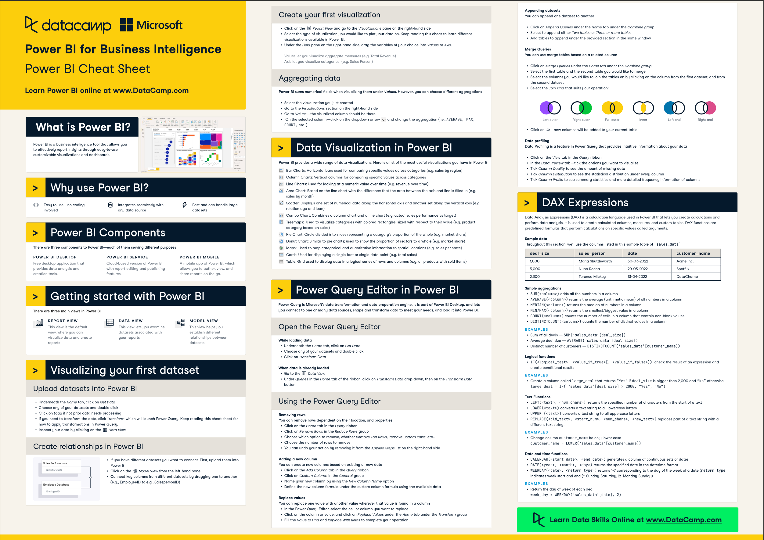
- Select the Join Kind that suits your operation

The different types of joins
Data Profiling
Data Profiling is a feature in Power Query that provides intuitive information about your data
- Click on the View tab in the Query ribbon
- In the Data Preview tab—tick the options you want to visualize
- Tick Column Quality to see the amount of missing data
- Tick Column Distribution to see the statistical distribution under every column
- Tick Column Profile to see summary statistics and more detailed frequency information of columns
DAX Expressions
Data Analysis Expressions (DAX) is a calculation language used in Power BI that lets you create calculations and perform data analysis. It is used to create calculated columns, measures, and custom tables. DAX functions are predefined formulas that perform calculations on specific values called arguments.
Simple aggregations
SUM(<column>)adds all the numbers in a columnAVERAGE(<column>)returns the average (arithmetic mean) of all numbers in a columnMEDIAN(<column>)returns the median of numbers in a columnMIN/MAX(<column>)returns the smallest/biggest value in a columnCOUNT(<column>)counts the number of cells in a column that contain non-blank valuesDISTINCTCOUNT(<column>)counts the number of distinct values in a column.
Logical functions
IF(<logical_test>, <value_if_true>[, <value_if_false>])check the result of an expression and create conditional results
Text functions
LEFT(<text>, <num_chars>)returns the specified number of characters from the start of a textLOWER(<text>)converts a text string to all lowercase lettersUPPER (<text>)converts a text string to all uppercase lettersREPLACE(<old_text>, <start_num>, <num_chars>, <new_text>)replaces part of a text string with a different text string.
Date and time functions
CALENDAR(<start date>, <end date>)generates a column of continuous sets of datesDATE(<year>, <month>, <day>)returns the specified date in the datetime formatWEEKDAY(<date>, <return_type>)returns 1-7 corresponding to the day of the week of a date (return_typeindicates week start and end (1: Sunday-Saturday, 2: Monday Sunday)
Learn more about Power BI
Here are a few extra Power BI resources to get you started: