Course
Introduction to Python
4 hr
6.7M

Tableau provides several options to augment and create new data fields. You can perform arithmetic, logical, spatial, and predictive modeling functions using calculated fields. Tableau is a powerful Business Intelligence (BI) tool, but there are limitations; that's where Python language comes to the rescue.
Python is popular programming among the data community. You can use it to extract, clean, process, and apply complex statistical functions to the data. It provides you with machine learning frameworks, data orchestrations, multiprocessing, and rich libraries to perform almost any task possible.
Python is a multipurpose language, and using it with Tableau gives us the freedom to perform highly complex tasks. In this tutorial, we are going to use Python for extracting and cleaning the data. Then, we will be using clean data to create data visualization on Tableau.
We will not be using Tabpy to create a Tableau Python server and execute Python scripts within Tableau. Instead, we will first extract and clean the data in Python (Jupyter Notebook) and then use Tableau to create interactive visualization.
Goodreads Data Viz | Tableau Public
This is a code-based step-by-step tutorial on Goodreads API and creating complex visualization on Tableau. Check out the link below to access the code and the Tableau dashboard.
In the first part of the tutorial, we will learn to use Goodreads API to access public data. In our case, we will be focusing on the user profile and converting it into a readable Pandas dataframe. Furthermore, we will clean the data and export it into CSV file format.
We will be using DataLab for running the Python code. It comes with the necessary Python packages for data science tasks.
If you are new to Python and want to set up the environment on your local machine, install Anaconda. It will install Python, Jupyter Notebook, and necessary Python Packages.
Before we start writing the code, we have to install the xmltodict package as it is not part of the DataLab or Anaconda data stack. We will use `pip` to install the missing Python package.
Note: The `!` symbol only works in Jupyter Notebooks. It lets us access the terminal within the Jupyter code cell.
!pip install xmltodict

>>> Collecting xmltodict
>>>   Using cached xmltodict-0.13.0-py2.py3-none-any.whl (10.0 kB)
>>> Installing collected packages: xmltodict
>>> Successfully installed xmltodict-0.13.0
In the next step, we will import the necessary packages.
import pandas as pd
import xmltodict
import urllib.requestTo extract user data, we need both user id and user name. In this section, we will parse the user (Abid) profile link.
Note: You can use your friend’s profile or use your profile link, and run this script.
Goodread_profile = "https://www.goodreads.com/user/show/73376016-abid"

user_id = ''.join(filter(lambda i: i.isdigit(), Goodread_profile))
user_name = Goodread_profile.split(user_id, 1)[1].split('-', 1)[1].replace('-', ' ')
user_id_name = user_id+'-'+user_name

print(user_id_name)

>>> 73376016-abidAt the end of 2020, Goodreads will stop providing developer API. You can read the full report here. To overcome this issue, we will be using API keys from old projects such as streamlit_goodreads_app. The project explains how to access the Goodreads user data using API.
Goodreads also provides you the option to download the data in CSV file format without an API key, but it is limited to a user, and it doesn't give us the freedom to extract real-time data.
In this section, we will be creating functions that will take user_id_name, version, shelf, per_page, and apiKey.
The function takes user inputs to prepare the URL and then downloads the data using urllib.request. Finally, we get the data in XML format.
apiKey = "ZRnySx6awjQuExO9tKEJXw"
version = "2"
shelf = "read"
per_page = "200"

def get_user_data(user_id, apiKey, version, shelf, per_page):
    api_url_base = "https://www.goodreads.com/review/list"
    final_url = (
        api_url_base
        + user_id
        + ".xml?key="
        + apiKey
        + "&v="
        + version
        + "&shelf="
        + shelf
        + "&per_page="
        + per_page
    )
    contents = urllib.request.urlopen(final_url).read()
    return contents
contents = get_user_data(user_id_name,apiKey,version, shelf, per_page)
print(contents[0:100])


>>> b'<?xml version="1.0" encoding="UTF-8"?>\n<GoodreadsResponse>\n <Request>\n <authentication>true</aut'Our initial data is in XML format, and there is no direct way to convert it into a structured database. So, we will transform it into JSON using the xmltodict Python package.
The XML data is converted into nested JSON format, and to display the first entry in book reviews data, we will use square brackets to access encapsulated data.
You can experiment with metadata and explore more options, but in this tutorial, we will be focusing on users reviewing data.
contents_json = xmltodict.parse(contents)
print(contents_json["GoodreadsResponse"]["reviews"]["review"][:1])

>>> [{'id': '4626706284', 'book': {'id': {'@type': 'integer', '#text': '57771224'}, 'isbn': '1250809606', 'isbn13': '9781250809605', 'text_reviews_count': {'@type': 'integer', '#text': '150'}, 'uri': 'kca://book/amzn1.gr.book.v3.tcNoY0o7ErAhczdQ', 'title': 'Good Intentions', 'title_without_series': 'Good Intentions', 'image_url': .........To convert JSON data type to Pandas dataframe, we will use the json_normalize function. The review data is present at the third level, and to access it, we will access GoodreadsResponse, reviews, and review.
Before we display the dataframe, we will filter out irrelevant data by dropping the books with missing date_updated column.
Learn various ways to ingest CSV files, spreadsheets, JSON, SQL databases, and APIs using Pandas by taking Streamlined Data Ingestion with pandas course.
df = pd.json_normalize(contents_json["GoodreadsResponse"]["reviews"]["review"])
df = df[df["date_updated"].notnull()]
df.head()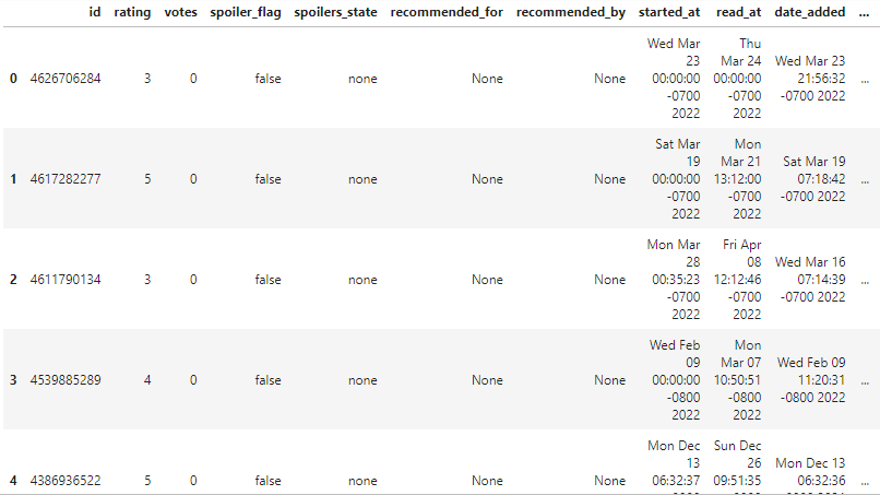
The raw dataframe looks reasonably clean, but we still need to reduce the number of columns.
As we can see, there are 61 columns.
df.shape
(200, 61)
Let’s drop the empty ones.
df.dropna(axis=1, how='all', inplace=True)
df.shape
(200, 58)
We have successfully dropped 3 columns with missing values.
We will now check all column names by using `df.columns` and select the most useful columns.
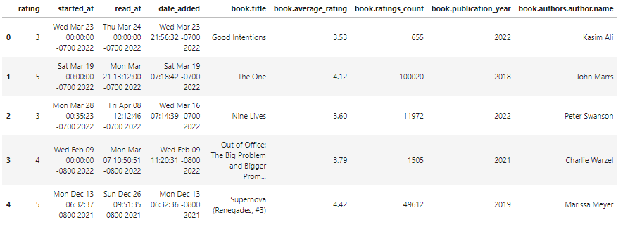
final_df = df[
    [
        "rating",
        "started_at",
        "read_at",
        "date_added",
        "book.title",
        "book.average_rating",
        'book.ratings_count',
        "book.publication_year",
        "book.authors.author.name"
    ]
]
final_df.head()
As we can observe, the final dataframe looks clean with the relevant data fields.
In the last section, we will export the dataframe into a CSV file that is compatible with Tableau. In the to_csv function, add the name of the file with the extension type and drop the index by changing the index argument to False.
final_df.to_csv("abid_goodreads_clean_data.csv",index=False)The CSV file will show in the current directory.
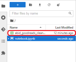
Goodreads Clean CSV File
You can also check out the Python Jupyter Notebook: Data Ingestion using Goodreads API. It will help you debug your code and if you want to skip the Python programming part, you can simply download the file by clicking on the Copy & Edit button and running the script.
In the second part, we will use clean data and create simple and complex data visualization in Tableau. Our goal is to plot interactive charts which will help us understand the user’s book reading behavior.
We will connect the CSV file by selecting the Text file option and selecting the abid_goodreads_clean_data.csv file. After that, we will change the Started At, Read At, and Date Added data fields to Date & Time, as shown below.
Note: It is a good practice to modify your data fields at the start.
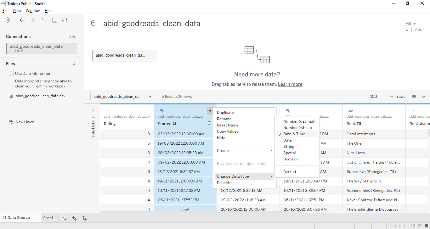
Connecting Data and Modifying Data Types
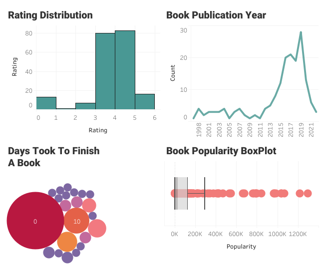
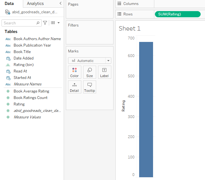
In this section, we will create the user book rating histogram.
User Rating Histogram Part 1
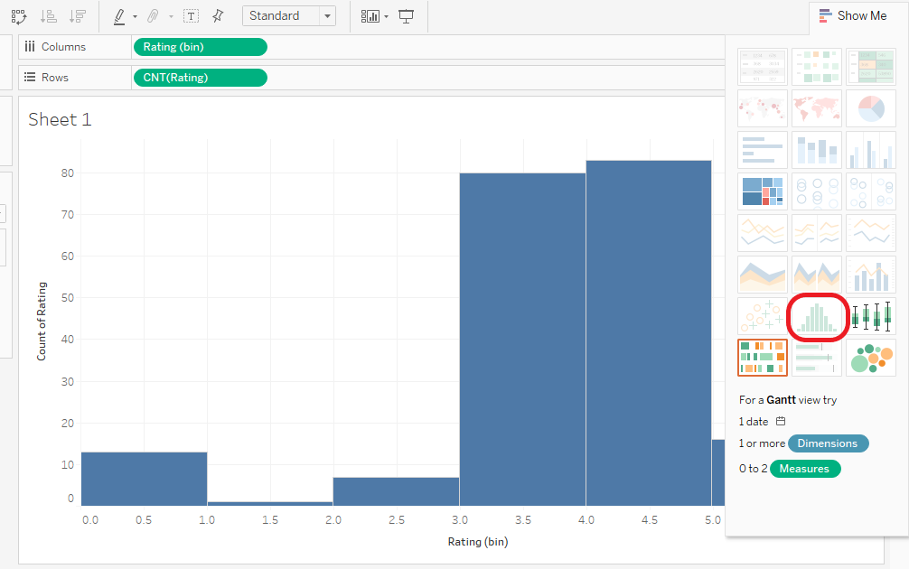
User Rating Histogram Part 2
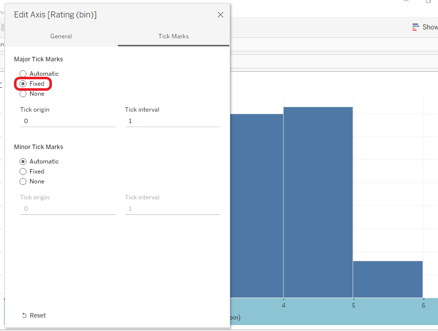
User Rating Histogram Part 3
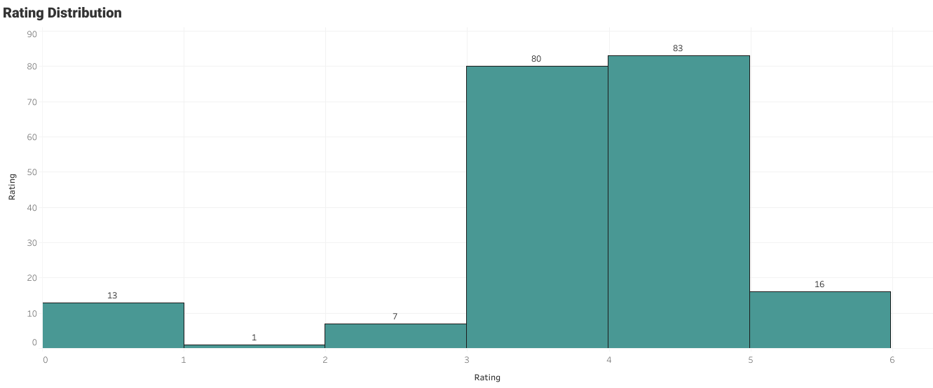
User Rating Histogram Part 4
The user had typically given ratings between 3 and 4. The zero ratings are the books that are not rated.
To plot line chart:
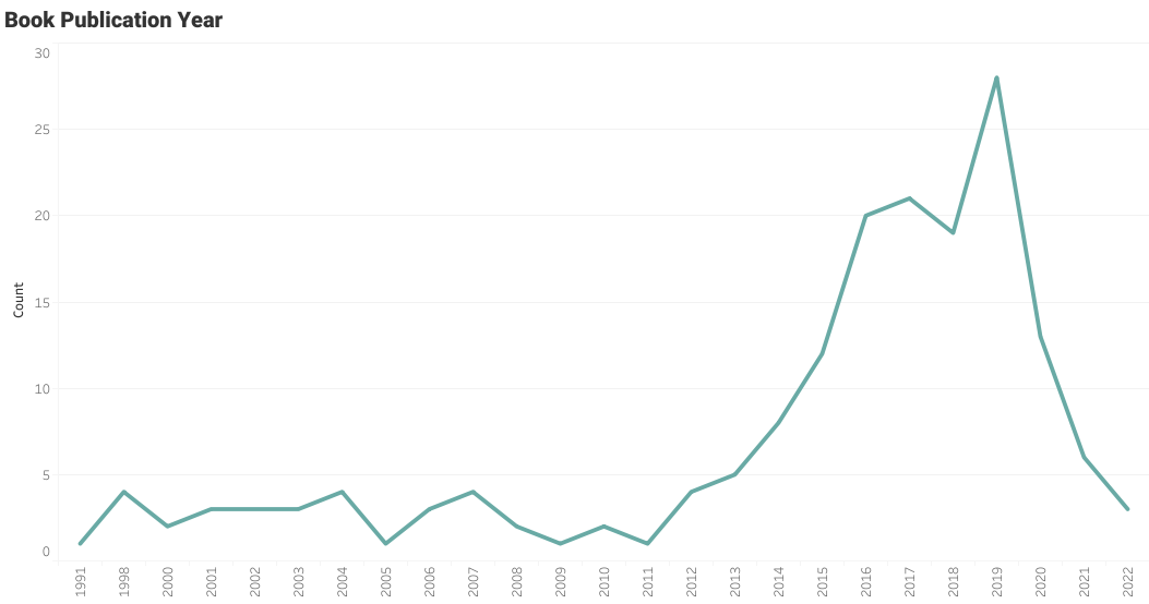
Book Publication Year Line Plot
The user has read some old books, but they are particularly interested in the books that are published between the years 2015 and 2020.
If you are feeling overwhelmed and want to learn the fundamentals of Tableau, you might find Tableau Tutorial for Beginners by Eugenia Anello helpful.
To plot box and whisker plot:
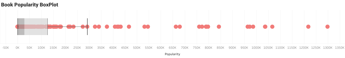
Number of Reviews per Book Boxplot
It seems like the user is reading less popular books and a few famous books. It means that the user has a unique taste based on the content, not on popularity.
We have created a simple but amazing visualization to learn about user books reading behavior. Next, we will learn more complex data visualization which includes creating a new calculated field, editing bins, and creating multiple layers.
In bubble plots, the labels represent the number of days it took a user to finish a book, and the size of the bubble represents the number of occurrences. We don’t have a data field for the duration, but we can create it using Started At and Read At.
In the first step, we have to create a new calculated field by clicking the down arrow in the Data panel and selecting Create Calculated Field.
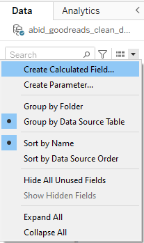
Creating Calculated Field
The new window will pop out, and you have to:
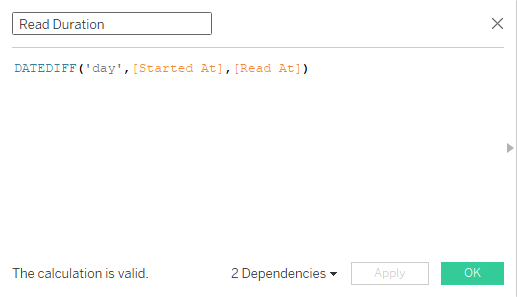
Read Duration in Days
The Read Duration data field is continuous, and to plot packet bubbles visualization, we have to divide the data field into smaller chunks known as bins.
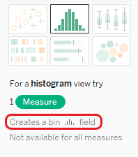
Creates a Bin Field
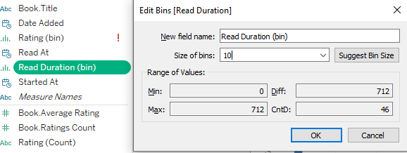
Editing Bins
We have crossed the hard path, and now it's time to see the fruits of our labors.
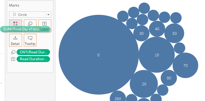
Unicolor Packed Bubbles Plot
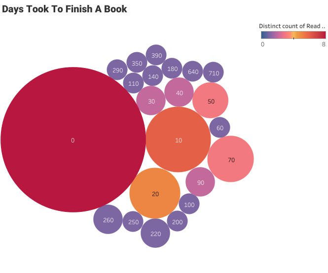
Packed Bubbles Plot
It took the user less than a day to finish most of the books. You can also see a few outliers above 300.
We can also create a Tableau dashboard by combining these visualizations. Learn how to create a Tableau dashboard by in this tutorial.
In this tutorial, we have learned the importance of Python and how to use it with Tableau. In the first section, we extracted Goodreads user data using developer API and converted the XML data into a clean and structured Pandas dataframe. In the second part, we used clean data to create both simple and complex data visualizations.
The combination of Python with Tableau opens a whole new world of possibilities. You can integrate data pipelines, implement machine learning models, run complex statistical analyses, and perform various tasks that are impossible to run on Tableau alone.
You can run the Python code on DataLab for free, and it comes with all the necessary packages for you to run this example. To create Tableau visualization, we have used a free version of Tableau called Tableau Public.
If you are new to Python and want to learn more about functionalities and syntax, check out Introduction to Data Science in Python course. Also, you can master the basics of Tableau visualization and customization by taking Tableau Fundamentals skill track. It consists of 5 courses that cover an introduction to Tableau, data analysis, creating interactive dashboards, working on a case study, and connecting multiple data sources.
Tableau and Python Courses at DataCamp
Course
Course
Course
Tutorial
Parul Pandey
Tutorial
Sejal Jaiswal
Tutorial
Parul Pandey
Tutorial
Parul Pandey
Tutorial
Joleen Bothma
Tutorial
Moez Ali