If you are working with real data and want to extract information quickly, Tableau is the perfect tool for you. With Tableau, you don’t need to write complicated lines of code in R or Python to instantly create dynamic data visualizations and you can solve all types of analytical problems.
A demonstration of its efficiency can be found in Tableau’s collection of 10 examples of interactive map visualizations, including examples that visually tell the stories of Manhattan’s population, analyze the US electricity system, and investigate the hidden causes behind US hourly workers earning minimum wage or less. Tableau also shows off a gallery with the Visualizations of the Day.
This is why more than 64,000 companies choose Tableau as a web platform to analyze the data in real-time, generating decision-driving insights and building optimal solutions to organizational challenges. Such companies include big organizations like Netflix, Lenovo, and LinkedIn. In this Tableau tutorial for beginners, we'll walk you through creating some basic visualizations with Tableau.
Introduction
Tableau is a powerful and flexible tool used to manage and analyze data. First, it enables the integration of data from multiple sources. Then, it facilitates the creation of beautiful and interactive dashboards that can be shared with other users. Finally, it’s accessible to everyone: Tableau’s intuitive interface is designed to be used by data professionals and non-technical users alike. There are five key components to Tableau, each one with a different scope:
- Tableau Desktop — A desktop application that allows users to collect, transform, and visualize the data. Tableau Desktop is available only with a subscription. The data visualizations can be saved both locally and online.
- Tableau Public — A free version of Tableau software that provides most of the functionalities provided by Tableau Desktop. Unlike Tableau Desktop, it can only accommodate CSV, Excel, and text files. There is also a limit of 15 million rows of data and any work you do cannot be saved locally - only on Tableau Server.
- Tableau Reader — A read-only application for opening and reading Tableau file types.
- Tableau Online — A cloud version of Tableau software that provides a way to publish and share dashboards online. It’s fully hosted by Tableau.
- Tableau Server — Like Tableau Online, it allows users to host and store data visualizations created with Tableau. The difference from Tableau Online is that it’s not fully hosted by Tableau, but rather on public cloud platforms like AWS, Google Cloud Platform, and Microsoft Azure.
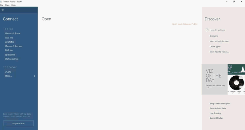
While Tableau Public is free, all other versions are paid and can be found on the official website. For this tutorial, we’ll focus on the free version of Tableau, Tableau Public. You can download it here.
Importing Data in Tableau
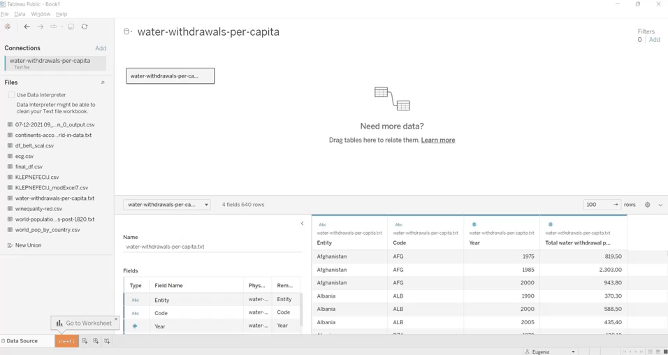
Once you’ve installed Tableau Public, we can open it and load the data. In this tutorial, we are going to use the dataset of water withdrawals per capita from Our World in Data. For context, water withdrawal refers to the quantity of freshwater taken from surface water, such as rivers, lakes, and groundwater, and used for agriculture, industry, and domestic purposes. As you probably know from the current news cycle, there is a large variability in the available quantity of freshwater across the world. We’ll be using Tableau to visualize these disparities between countries.
You’ll need to first download the CSV file, and then save it as a text file, as Tableau Public can only load certain file types. You can view which file types you can load on the Start Page. Click ‘Text File’ in the left menu and open your text file. The new page shows the data preview and the corresponding fields of the dataset. We can see that we have four fields and 640 rows. Each row corresponds to a different country and to a different year.
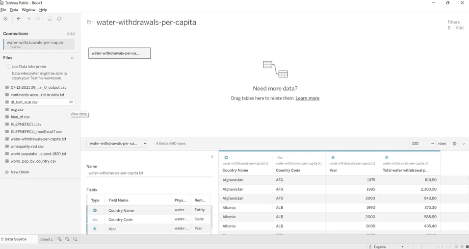
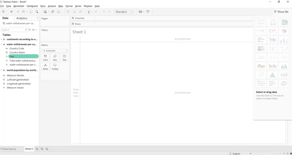
Many of Tableau's operations are similar to those used in Excel, such as renaming, changing the data type, or adding new fields. First, we'll modify the names of the first two fields into ‘Country Name’ and ‘Country Code’. Here, we don’t need to change the data type, since Tableau automatically recognizes the type of field. We'll also need to have the latitude and the longitude to build an interactive geographical map later. This is possible by changing the geographic role of the 'Country Name' field from 'None' to 'Country/Region'. Next, we press the Sheet 1 button, and latitude and longitude appear as additional fields.
Joining Datasets in Tableau
Start by downloading the dataset containing all countries and their corresponding continents from Our World in Data. Then, download the CSV file containing the population of each country here.
Once they are available in your file system, we can join the datasets. We drag the table containing the continents to the canvas. To build a relationship between the two tables, we need to specify the field names we wish to join from the datasets. The target field in the water withdrawals dataset is 'Country Name', while 'Entity' is the target field from the second table. The equal operator (=) is selected to combine tables. Follow the same procedure to combine the world population table with our target data.
Et voilà! Now the three tables are linked based on the target fields and matching field names. This step will be useful for the next data visualizations.
Adding Filters and Colors to the View
Now that we are satisfied with our data, we can open the first worksheet which will contain our first analysis. Let’s create a chart that shows the evolution of water withdrawals over time. On the left, we have our loaded tables that have a relationship with each other. For now, let’s focus only on the water withdrawals data. We distinguish the categorical fields marked in blue (such as 'Country Name') from the numerical fields (for example 'Year') that are colored in green. We also have the previously generated latitude and longitude fields.
To create the chart, we use the following steps:
- Drag the 'Year' field to the Columns shelf to create a column for each year.
- Drag the number of the water withdrawals to the Rows shelf.
- Add the country name to the View by inserting it into the Marks shelf. Since the aim is to distinguish the number of water withdrawals for each country, we select the mark type of the 'Country Name' and click the color option.
- The chart is difficult to read when it includes so many countries. Let’s narrow it down and focus only on three countries: the United States, China, and Egypt. Drag the 'Country Name' field onto the Filters shelf. Select only the values we are interested in and press 'Ok'.
Notice that there is high variability in terms of the quantity of freshwater across the world, in particular between the chosen countries. Later we can examine the relationship between water withdrawals and the populations of countries.
Map Views in Tableau
Here comes the fun part: In the previous section, we saw that a scatterplot isn’t an efficient way to display the water withdrawals of all the countries as there are so many. To create a chart that can accommodate all the countries, we can use the World Map, our location population data, and the latitude and longitude coordinates. These three fields are all necessary to create a map view. Check here for troubleshooting map views in Tableau.
Creating a map view requires the following steps:
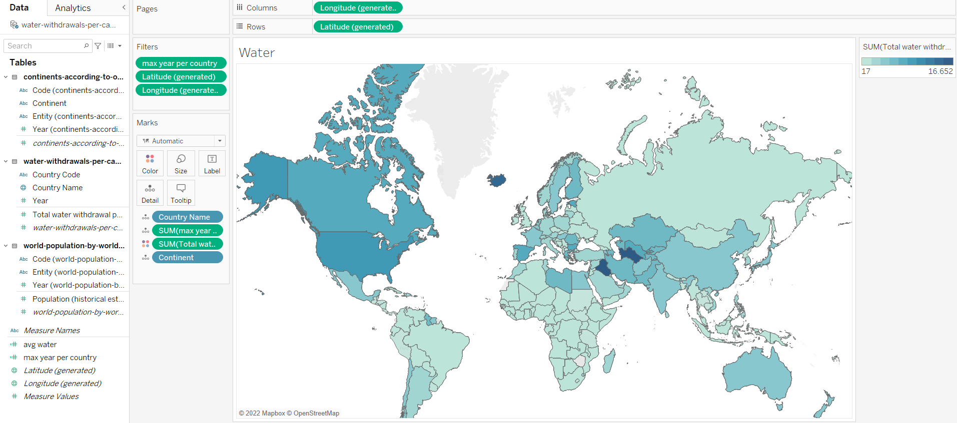
- The fastest way to create the initial world map is to click the 'Country Name' field, which will then be added automatically to the Marks field. However, there are two other alternatives: you can drag it to the Marks field or drop it below the area where the chart is being built. All these methods will create a map where every country present in the dataset is denoted with a dot.
- Add information on the quantity of freshwater across the world. But there is an issue in the dataset: some countries don’t have the water withdrawal information for each year, so we want to show the latest value for each country instead of filtering the year.
For this purpose, we create a calculated field, which consists of building a new field based on other fields. In this case, we want to select the most recent or highest value of the Year field within the three groups. This new field will be called “max year per country”. Use the following formula to calculate the field. For each country, continent, and year, specified by the expression FIXED, we find the most recent year, which corresponds to the maximum of the year MAX([Year]).
{FIXED [Country Name],[Continent],[Year]: MAX([Year])} - Insert the new calculated field into the Filters shelf. This step is important because the max year per country field becomes the context filter for this data visualization.
- Drag the max year per country field to the Marks field. Then, do the same for the 'Total Water Withdrawal Per Capita' field. Next, we can select the mark type of 'Total Water Withdrawal Per Capita' and click the color option.
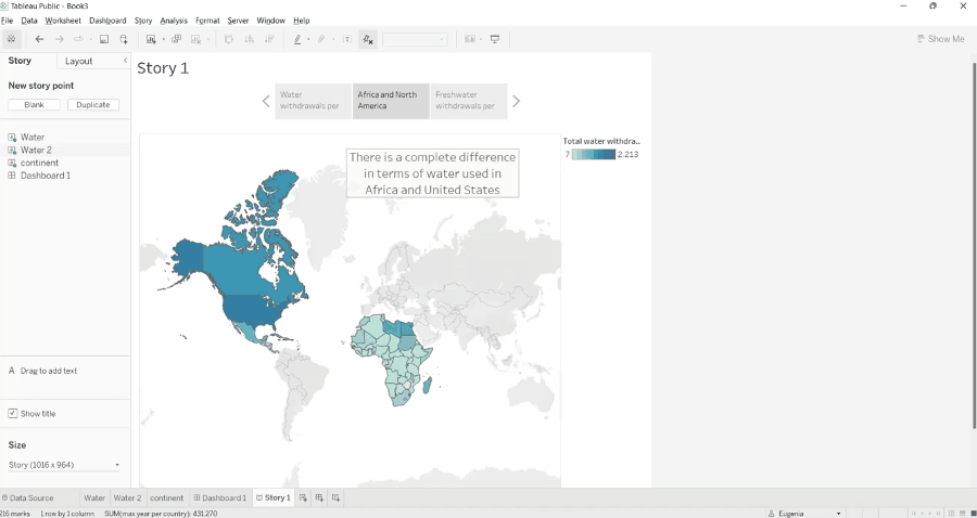
We can now observe how much water the countries are using and derive important insights. For example, there is a massive difference between the amount of water withdrawal in the United States (extremely high) and countries in Africa. All of these details are captured by this vivid representation.
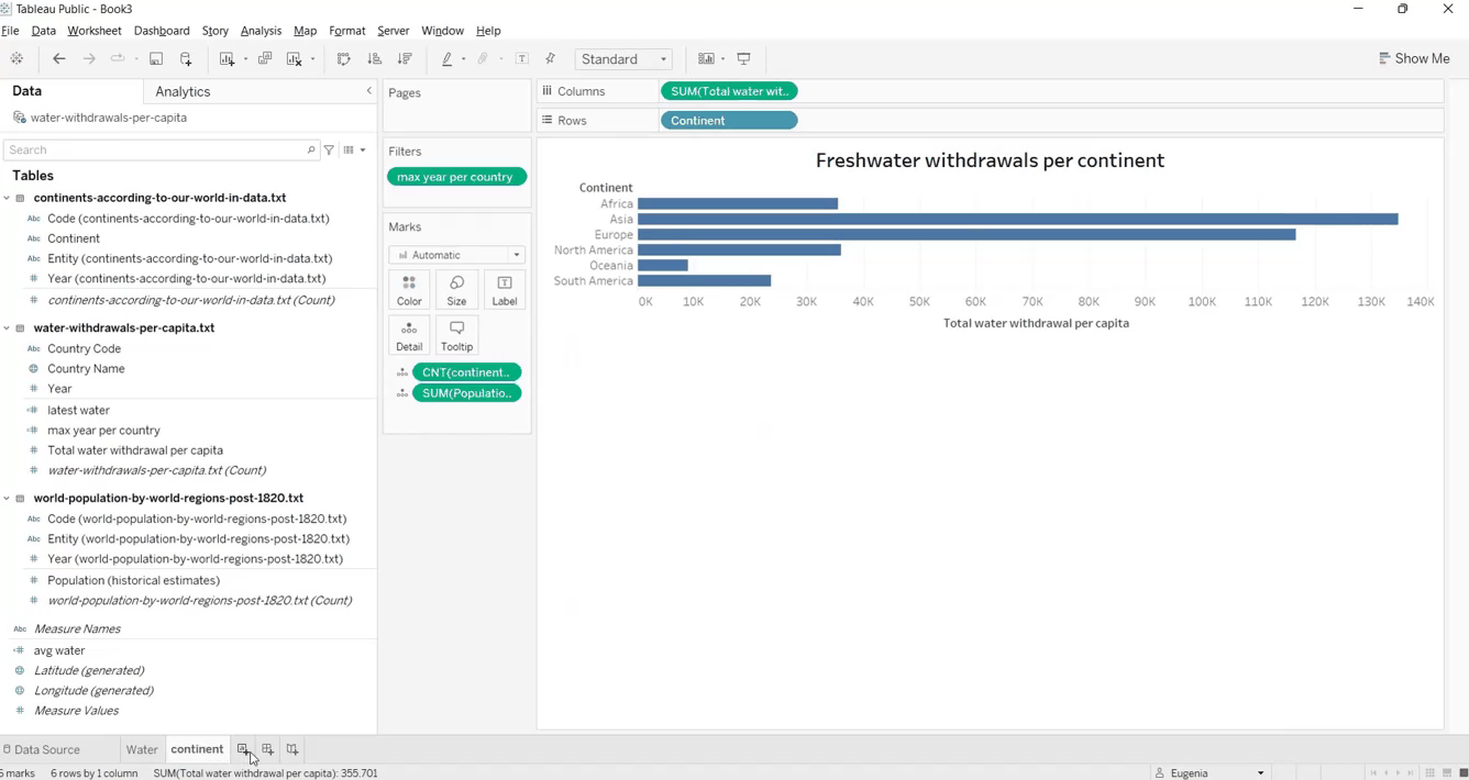
Building a Dashboard in Tableau
As you have seen, each data visualization needs to be created on a different worksheet. In this example, we save the previous world map in a worksheet with the name water, as to not confuse it later. Next, we created a barplot that shows the water withdrawals per continent, filtering with max year per country like before. This worksheet has been named continent.
After building two or more charts, it’s possible to combine them into a dashboard:
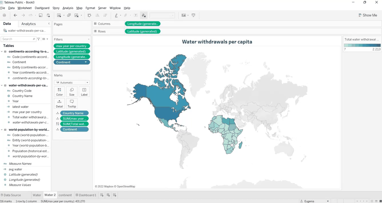
- Create the dashboard by clicking on the New Dashboard icon at the bottom of the window. It will open a new dashboard with the sheets created previously on the left-hand side.
- Start to combine them by dragging the Water worksheet onto the canvas.
- Do the same with the Continent worksheet, which will be placed at the bottom of the map.
Story Building
An effective alternative to the dashboard can be a Story. A story is composed of multiple views or dashboards and constitutes one of the key features of Tableau. As the name suggests, the main idea is to tell the story of your data by combining different data visualizations. There is also the possibility to add text descriptions to the charts.
So, let’s begin to create the story:
- Click the ‘New Story’ icon at the bottom
- Drag the existing sheets onto the story. It is similar to creating slides for a presentation, with a view for each slide and a navigator bar to go from one chart to another.
- The navigator bar assigns a default name for each view. If you prefer to specify the content of each chart, it’s better to change the names of the captions in the navigator bar.
- Add a text observation to the World Map.
Saving the Work
Now it’s the time to save all the work in Tableau Public, a free cloud service. There are three principal steps:
- Select File → Save to Tableau Public as
- You need to sign in with your Tableau account. You can create an account if you don’t already have one.
- Once you’re logged in, you can write the name you prefer for your worksheet.
The worksheet is now published on your Tableau Public profile page. Keep in mind that anyone can interact with your published work or download the worksheet.
Tableau’s Integration with R, Python, and SQL Server
One of the key reasons for Tableau’s popularity with Data Scientists is that it integrates seamlessly with the primary data science programming languages, R, Python, and SQL. So, as you master Tableau, you can also learn to integrate it with whichever programming language you choose and harness the power of two great data science tools simultaneously.
One way to use all these languages is to load the data retrieved with SQL Server, make statistical analysis with R and apply Machine Learning models to the data using Python. You can also use R or Python to calculate the new fields. To integrate R and Python, there are some prerequisites. To enable the communication between R and Tableau, the Rserve package needs to be installed in R. For Python, there are two possible options; the most popular option is to use TabPy to calculate new columns and build machine learning models. The other lightweight alternative is AltTabPy, which provides less advanced features than TabPy, but is incredibly efficient and requires fewer resources. Be advised that these integrations are not available with the free version of Tableau, so you’ll need to upgrade to a subscription to use them.
Learn More about Tableau
In learning Tableau, you gain an excellent tool that will allow you to work with any type of data and gain fast insights while creating gorgeous visualizations. You can do a deeper dive into Tableau with DataCamp’s courses: