With data volumes increasing rapidly across the globe, it has become increasingly complex to identify, process, and visualize this information into an easily understandable and shareable form so that it becomes actionable. This is where dashboards come in.
Dashboards are a key component in the analytics process because they provide a compact overview of information in a digestible form for a variety of stakeholders. The ultimate goal of a dashboard is to help its users make optimal decisions and use this ever-growing pool of data to their advantage.
This article will give insight into the art and science behind designing high-quality dashboards — and provide an overview of tools you can start using today to get dashboards deployed.
What are the different types of dashboards?
Choosing the right dashboard is crucial for delivering impactful data insights. However, with the increasing volume and complexity of data in addition to the variety of different audiences looking to consume data using dashboards, it’s natural to be overwhelmed with how to approach designing them. When building a dashboard, it is essential to understand which category of dashboard is best suited for your particular audience. The most common types of dashboards are as follows:
1. Operational Dashboards
Operational dashboards monitor real-time data, track the end-to-end performance of various business operations, and communicate insights through clear data visualizations. These dashboards are designed to be used in daily workflows and provide time-sensitive insights and alerts about real-time developments. Operational dashboards are consistently updated to help with at-a-glance decision-making. The primary audience for these dashboards are managers and operational teams. Examples include
- Marketing Dashboards—Website performance metrics such as bounce rate, user lifetime value, average session time, etc.
- Software Development—System crash analytics, uptime monitoring, cloud service billing monitoring, etc.
2. Strategic Dashboards
Strategic dashboards are mostly used by C-level executives, directors, or business owners to monitor long-term company OKRs and KPIs. They provide high-level updates on the performance of the overall organization or department. These dashboards update data less frequently than operational dashboards which are designed to be viewed daily. Strategic dashboards are complex in their creation because they need to accurately track organization-wide metrics that can be found in disparate data sources. Examples of such dashboards include
- Organization-wide—Tracking revenue and company OKRs at a glance.
- Department-wide—Tracking the marketing funnel from acquisition to purchase.
3. Analytical Dashboards
As the name implies, these dashboards are used to analyze and consume large amounts of complex data. Modern dashboarding tools provide consumers and practitioners with features like drill-down options, extensive filters, and the capability to handle large amounts of data. With analytical dashboards, one can go beyond glancing at metrics and investigate the drivers and dynamics behind the data itself.
The primary audience for analytical dashboards is more technically-minded and can range from practitioners such as data scientists and analysts to managers looking to dig through insights. Examples of analytical dashboards include:
- Finance—Financial performance dashboards with the ability to break down revenue by channels, products, assets, and more
- Marketing—Google analytics dashboards providing high-level metrics and the ability to drill down to channels, referrals, traffic sources, and more
How to Create Great Dashboards
The main objective of a dashboard is to reduce complexity and provide clarity. A good dashboard simplifies complex information through straightforward and clean data visualization. Here are some dashboard design best practices to effectively communicate insights with your audience:
Put yourself in the audiences’ shoes
If you wish to create an impactful dashboard, you should deeply empathize with the audience that will be using your dashboard. This means having a good understanding of your audience’s area of expertise and level of technical knowledge. Moreover, you should deeply think about what insights they care most about when designing your dashboards. For example, a marketing analyst will care much more about dashboards reporting on specific marketing campaigns. Conversely, marketing leaders will care much more about a dashboard reporting on the entirety of the marketing funnel. This is arguably one of the most important steps, as it will guarantee the adoption of your dashboards.
Clear the clutter
Dashboards can be messy. Especially since it’s very tempting to provide audiences with every type of graph, chart, and table at your disposal. To avoid making unreadable, cluttered dashboards ask yourself if what you’re including is relevant to the audience and remove unnecessary elements as much as you can. Additionally, recognize that building dashboards is an iterative process. So keep in mind your audience’s feedback as you build out your dashboards.
Use the grid layout feature
You should consider using a grid layout when you are designing your dashboard. According to Andy Cotgreave, Technical Evangelist at Tableau and co-author of the Big Book of Dashboards, humans are naturally geared to look at things from left to right and top to bottom. Using a grid layout helps your audience navigate dashboards independently and intuitively. In practice, this means starting off with high-level metrics on the top-left, and further drilling down the data as you go down and to the right of the grid.
Keep an eye on the fonts
Even though it can be tempting to use different fonts and sizes, as a general rule of thumb stick to one font with no more than 3 different sizes. You should follow the font hierarchy and keep headings larger than the body, as well as use a bold typeface to highlight key elements and headings. Varying font size and effects is also a great tool to point the audience’s attention to specific elements of your dashboard. However, ensure you use it in moderation.
Use colors creatively
It is fair to say that color is one of the most eye-catching aspects of any data visualization or dashboard. As such, put a lot of thought into choosing the color scheme of your data visualization. This means having a consistent color palette across your visualizations and using color systematically to distinguish between groups, levels of importance, and different kinds of information hierarchy.
Fast load time is a win
Load time is everything in digital products, and dashboards are no exception. No matter how informative and visually appealing your dashboard is, it will be barely adopted if it’s suffering from long load times. Long load times can occur because of high volumes of data, transformations that occur within the dashboard, a large number of filters, and highly complex visualizations that take time to render. A great way to minimize load times is by reducing clutter, and ensuring that complex data transformations are stored in views in databases.
Test your dashboard’s usability
One of the most important elements of designing a dashboard is that it needs to be tested. Once you are done building a prototype, you need to step into your audience’s shoes and think about how they are perceiving and using your dashboard. Take a note of the activity and see how you can make your dashboard more efficient and effective. For a successful project, testing is key. You get to learn how your dashboards are being perceived. That allows you to iterate on your design based on this testing feedback.
Iterate and collaborate
It’s completely acceptable if you don't get your dashboard right in one go. Creating dashboards is a long and comprehensive process and you must take your time to do it. In order to present your best dashboard, you need to give yourself time to examine it and get a better perspective. The best dashboards also go through tons of iteration and the constant process of making them better each day takes time—that's absolutely acceptable.
Tools to create awesome dashboards
Dashboarding is very easy to get started with and there are many tools you can use. However, with an overload of options, it’s easy to get stuck in analysis paralysis. In this section, we’ll break down the most commonly used tools data practitioners can use to create dashboards today. When evaluating which data tools to use for creating dashboards, consider the following features:
- Data source connectors: How easy is it to connect a tool to different data sources?
- Collaboration features: Does a tool provide collaboration features such as commenting, editing, sharing, and hosting?
- Rendering speed: How fast does it take a dashboard to render and load?
- Ease of use: Does it require programming knowledge, or is it a drag and drop interface with a low barrier to entry?
- Cost: Is it an open-source framework or does it require purchasing a license?
Here is a list of feature-rich tools to get started with building awesome dashboards and data visualizations:
1. Power BI
Microsoft’s Power BI is one of the most popular business intelligence tools out there. It has become the default choice for data practitioners and business users due to its simple interface and wide-ranging features it provides. It has a refined drag and drop interface paired with a huge list of data source connectors to help you build production-ready dashboards from the start. Power BI makes collaborating with other team members pretty easy, allowing you to build, edit, and share seamlessly—the experience is similar to using any other Microsoft product such as SharePoint.
KEY FEATURES
- Intuitive User Interface: The interface in Power BI is really intuitive, especially for someone used to the Microsoft suite.
- Low Cost: Reasonably priced compared to other fully powered BI solutions
- Azure Integration: Integrates really well with Azure cloud services like Azure Data Factory, Azure Synapse, and other data connectors
- AutoML Features: Power BI easily integrates automated ML from Azure Machine Learning to build models.
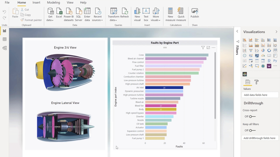
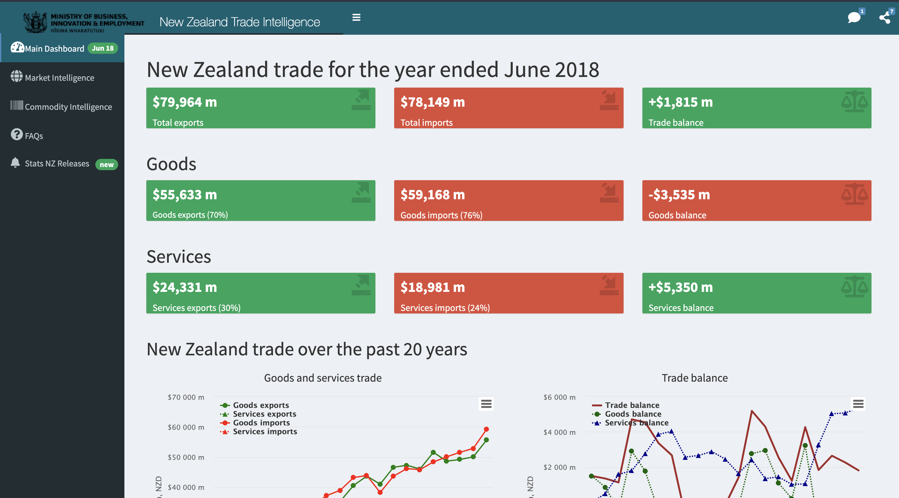
Examples of Power BI Dashboards
2. Tableau
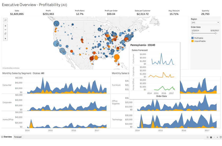
Tableau is one of the most feature-rich business intelligence tools available today. Founded in 2003 in Mountain View California, it has become one of the de facto business intelligence tools for modern analysts. It provides a drag and drop interface that empowers non-coding professionals to create dashboards with ease. Tableau supports the highest number of data source connectors, so fetching data from different sources is not a problem. It provides the ability to collaborate on projects and lets you share and host dashboards using Tableau Server. Rendering speeds can be optimized with the right planning, support of in-memory data storage, and data extracts. Tableau suggests using these performance tips to achieve blazingly fast rendering times.
Tableau also has a really strong and active community, which is supported by thousands of users and free access to Tableau Public. The pricing for the professional version of Tableau Desktop is on the higher end of the spectrum in comparison to other BI Tools.
KEY FEATURES
- Fast Rendering: With the support of in-memory storage and data extracts Tableau is great when working with big datasets
- Community: It has a super active community for inspiration and troubleshooting
- Refined Product: Tableau has been iterating and improving since 2003, therefore the experience of using it is really smooth and bug-free.
- Customizability: Features such as multiple visualizations, fonts, colors sizes, rows, columns, grids, screen sizes, and more help you make highly customizable dashboards
- Data Source Connectors: You can connect a wide variety of data, stored in different places using inbuilt tableau data connectors
Examples of Tableau Dashboards
3. Python’s Dash Package
Dash is an open-source library made by the creators of Plotly. It lets you build interactive python dashboards without having to learn HTML, CSS, and JavaScript. It is a free-to-use package that you can easily install. Instead of a drag-and-drop GUI, Dash provides a code-first approach to building charts and dashboards. It is targeted toward a more technical audience such as data analysts, data scientists, ML engineers, python developers, and data engineers. To connect to different data sources you can rely on existing python packages, but you would need to configure them using code which is an overhead.
Since this solution is python based, it allows a lot more flexibility to build highly customizable dashboards. However, there is a steep learning curve for someone not familiar with python and its different packages. Since you are managing things on your own, visualizing big datasets can sometimes become laggy. Moreover, publishing a dashboard built using Dash is not as simple as clicking a button—it requires you to package and deploy it on cloud services like AWS, Heroku, GCP, etc
KEY FEATURES
- Python Based: While being python-based means Dash has a steeper learning curve than drag-and-drop tools—is can also be considered a big pro—as it provides high levels of flexibility
- Version Control: Being a code first tool, you can store and save the different iterations of Dash dashboards with version control tools like Git
- Open Source: This is an open-source package, which means it’s free to use.
- Customizable: Sits at the top in terms of customizability, which is evident from their dashboard gallery
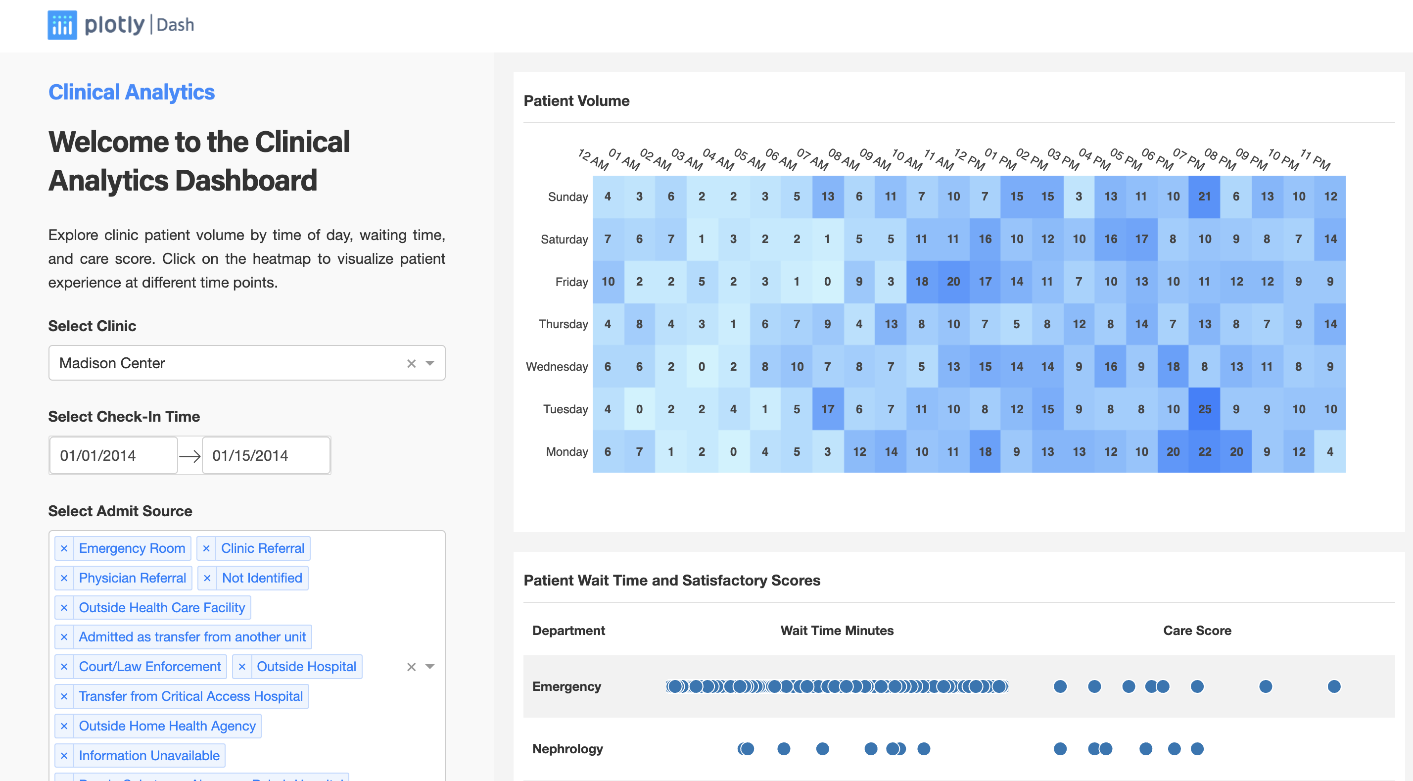
Examples of Dash Dashboards
4. Python’s Streamlit Package
Streamlit is another fully open-source python package that is more centered around creating and deploying machine-learning heavy data apps. However, it also makes a great dashboarding tool. This visualization package has been designed to cater to data scientists and the learning curve is pretty low for a python user. Streamlit has predefined methods for building simple visualizations. If you know basic data manipulation using pandas, this library is fairly easy to get started with. It offers features such as background refresh, data caching to speed up the frontend, and a screen recording feature for sharing.
KEY FEATURES
- Python Based: Similar to Dash, it provides high levels of flexibility
- Low learning curve: Building streamlit dashboards is similar to using pandas on jupyter, so it provides a low learning curve for any python user.
- Version Control: Being a code first tool, you can store and save the different iterations of Streamlit dashboards with version control tools like Git
- Open Source: Streamlit is free to use
Examples of Streamlit Dashboards
5. R’s Shiny Package
Arguably one of R’s killer apps, Shiny is one of the best coding-based dashboarding tools out there. Shiny allows practitioners to develop full-fledged web apps in R without any knowledge of HTML, CSS, or JavaScript. Having been released in 2012, Shiny has a decade’s worth of iteration and improvements which makes it an extremely stable and feature-rich open-source dashboarding tool. Similar to other coding-based tools in this article, it provides a high level of flexibility and customizability and works really well with other R packages.
KEY FEATURES:
- R Based: Similar to other coding tools on this list, it provides high levels of flexibility
- Version Control: Being a code first tool, you can store and save the different iterations of Streamlit dashboards with version control tools like Git
- Open Source: This is an open-source package, which means it’s free to use.
- Customizable: Sits at the top in terms of customizability, which is evident from their dashboard gallery
Examples of Shiny Dashboards:
Break the rules
There is no better way to communicate data than a dashboard with a user-centered design and high-quality data visualizations. Every dashboard is different in terms of goals, requirements, and limitations. There is, however, one common element driving the success of each of them, and it's an active iterative process. Remember that no dashboard is perfect the first time. Constant feedback and improvements are the only way to make your dashboard more efficient and intuitive.
Also, a dashboard doesn’t have to be fully utilitarian. The tradeoff between aesthetics and functionality is often a false dichotomy. So feel free to not adhere to strict guidelines, and have fun with your dashboards and visualizations, just as long as you keep in mind your audience, and how they interact with your creations.
For more resources on data visualizations, dashboarding, and data storytelling—check out the following stories: