“This is my favorite part about analytics: Taking boring flat data and bringing it to life through visualization"—John Tukey
Every day we are increasingly interacting with data and having to make sense of it. At work, data practitioners and non-practitioners alike have to make decisions based on thousands if not millions of rows of data they may have never encountered before. At home, we increasingly have access to data that allows us to optimize our habits, protect our health, and be responsible citizens. How do we make sure that we’re making sense of this information efficiently when making data-informed decisions? This is where data visualization comes in.
Data visualization is one of the most important skills in data science. Bringing data to life with insightful visuals is the most effective way to communicate data insights. Whether it’s data analysts breaking down their findings to non-technical stakeholders, data scientists describing the impact of the models they deploy in production, or citizen data practitioners putting their data literacy skills to work. Data visualization is also the centerpiece of data storytelling, which advocates for the use of visuals, narrative, and data for driving action out of insights.
The beauty of data visualization is how accessible and relatable it is. The spectrum of tools for visualizing data effectively ranges from drag-and-drop tools like Excel, Power BI, and Tableau to more technical tools like Python and R. As such, data visualization is often seen as the gateway drug for many aspiring data practitioners into the field.
In this article, we provide a list of 10 must-read books that will elevate your data visualization skills. Whether you’re a seasoned data practitioner looking to sharpen your visual design and storytelling skills, or a new entrant looking to grasp the foundations of data visualization, there’s something here for everyone.
1. Effective Data Storytelling: How to Drive Change with Data, Narrative, and Visuals by Brent Dykes
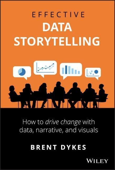
Data storytelling skills are becoming table stakes for anyone presenting on data. Often called the “last mile of analytics”, data storytelling provides a framework for breaking down data insights to technical and non-technical audiences alike. In his seminal book, Brent Dykes breaks down the value behind data storytelling and the key components of a successful data story.
According to Dykes—who appeared on the DataFramed podcast—rather than focusing exclusively on how to visualize data, we should also leverage narrative and storytelling to drive decisions out of insights. In his book, Dykes developed a framework for data storytelling, an approach that combines three central elements: data, narrative, and visuals.
Effective Data Storytelling is an innovative book. It goes beyond the traditional focus on data visualization to reflect on the power of narrative and the psychology of telling stories with data. It will teach you the essential skills to present your insights through persuasive and memorable data stories. For these reasons, it is a must-have for anyone who regularly communicates with data.
2. Storytelling With Data: A Data Visualization Guide for Business Professionals by Cole Nussbaumer Knaflic
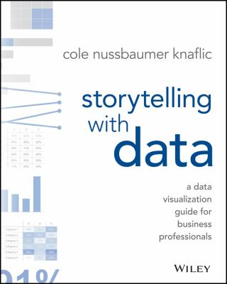
In the same vein, Cole Nussbaumer Knaflic’s book on Storytelling with Data breaks down the different ways to deliver a data story. Visualizations provide the visual layer to our data stories when working with data. However, how to present and speak effectively through data to tell a compelling story is not an easy task. Bridging this gap is precisely what Cole Nussbaumer Knaflic attempts to do with her book.
Storytelling with Data is filled with practical resources and case studies for business and data practitioners looking to use data visualizations effectively. Whether deciding which charts to use, how to structure a data story, or how to declutter a graph, the combination of theory and practice makes the book a great resource for both novel and advanced data visualizations practitioners.
3. Information Dashboard Design: Displaying Data for At-a-glance Monitoring by Stephen Few
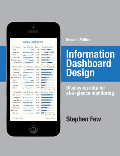
Dashboards are the most effective ways to provide at-a-glance views of complex data landscapes. However, dashboards can easily be designed in cumbersome and inefficient ways. The goal of Information Dashboard Design by Stephen Few is to help practitioners avoid common mistakes and traps when developing their dashboards.
Conceived as a practical guide, the book presents best practices when designing dashboards. It goes into great detail, providing many examples to illustrate both effective and ineffective dashboards and how to avoid common dashboard design pitfalls. In addition to explaining how to create great dashboards, Stephen Few offers a valuable introduction to the principles of design theory and data visualization in the light of recent advancements in the field of neuroscience.
4. The Big Book of Dashboards. Visualize Your Data Using Real-World Business Scenarios by Steve Wexler, Jeffrey Shaffer, and Andy Cotgreave
Anyone working in business intelligence teams should read this book. Co-authored by Steve Wexler, Jeffrey Shaffer, and Andy Cotgreave, The Big Book of Dashboards is the definitive guide to creating effective dashboards.
With numerous examples based on real use-cases of dashboards from various sectors, such as health, finance, marketing, and sports—this book is ideal for those willing to take their dashboard design skills to the next level. Particularly oriented to Tableau users, it covers best practices when designing dashboards, from empathizing with the audience to perfecting data visualizations within a dashboard.
You can also learn more about the book directly from co-author Andy Cotgreave, who discussed data visualization and storytelling skills on the DataFramed podcast.
5. The Functional Art by Alberto Cairo
In The Functional Art, data journalist Alberto Cairo addresses one of the most pivotal questions when developing data visualizations: how to create beautiful, captivating visualizations without compromising usefulness and insights. In other words, how to make the art behind data visualization functional.
While this question is often seen as a trade-off, Alberto Cairo demonstrates the opposite. Departing from a detailed review of industry best practices, Alberto Cairo goes on to navigate the peculiarities of our brain when it comes to perceiving and remembering information.
Functional Art has a clear goal: combining best practices in data science and our knowledge of human perception and cognition to create compelling visualizations that are at the same time beautiful and functional for end-users.
6. The Visual Display of Quantitative Information by Edward R. Tufte
To understand a subject in-depth, at some point, one must go back to the classics. The Visual Display of Quantitative Information by Edward R. Tufte is commonly considered one of the earliest books on data visualization.
The world has changed quite a bit since its first publication in 1983—technological progress has made data visualization tasks much more accessible than in Tufte’s times—and some of the ideas in the pages are becoming outdated. However, The Visual Display of Quantitative Information still provides many timeless best practices about design theory and how to create effective graphs. In addition, the book contains an exceptional array of graphs, charts, and tables, with more than 200 illustrations and detailed analyses that can be very handy for those looking for inspiration.
7. The Accidental Analyst by Eileen Mcdaniel and Stephen McDaniel
As data volumes grow and invade more and more jobs, more professionals—irrespective of their backgrounds—are having to work with data in their day-to-day. If you see yourself as an accidental analyst who didn’t plan to work with and analyze data in their role, this book is for you.
The Accidental Analyst by Eileen Mcdaniel and Stephen McDaniel provides an intuitive, step-by-step framework to address the complexities of data analysis and visualization. The so-called “Seven C's of Data Analysis” define a straightforward course of action to successfully organize, analyze and visualize data following industry best practices.
Coupled with illustrated examples and many tips and tricks, the book is a resource for both experts and novel practitioners struggling to make sense of their data and communicate with it.
8. Beautiful Visualization. Looking at Data Through the Eyes of Experts by Julie Steele and Noah Iliinsky
What makes a data visualization compelling and insightful? This is what Beautiful Visualization attempts to answer, seen through the eyes of experts in the field.
Co-authored by Julie Steele and Noah Iliinsky, Beautiful Visualization analyzes the process of data visualization by looking at real-world data visualizations projects. It contains expert takes from 24 data visualization experts—from designers and scientists to artists and statisticians—who expand on their methods, approach, and philosophy when they visualize data.
The book is a great resource for those who want to learn how experts approach the process of visual design. Thanks to the wide variety of voices, readers from any background will likely grasp new insights that will take their data visualization skills to the next level.
9. Information Graphics by Sandra Rendgen and Julius Wiedemann
Information Graphics is a fascinating, brilliantly crafted book that explores the development of visual communication in the era of big data.
Co-authored by Sandra Rendgen and Julius Wiedemann, the book is divided into two parts. The first one contains some introductory essays on the early history of data visualization (for example, one of the essays looks at primitive cave paintings as a means of communication) and the theories underpinning it. The second part includes more than 200 projects and 400 examples of graphical information from around the world spanning fields such as journalism, government, education, business, and more.
Conceived and designed for a wide audience, anyone interested in the history and practice of modern visual communication would find this useful.
10. Knowledge Is Beautiful by David McCandless
Is it possible to understand the world through data visualizations? In the visually stunning Knowledge is Beautiful—David McCandless makes a great attempt.
Knowledge is Beautiful presents a wide catalog of compelling and colorful visualizations and infographics that try to explain the world as we know it. The graphs are a great example of McCandless’ simple, elegant and boundary-breaking style—and attempt to distill insights from art, science, history, health, media, and more. Additionally, a bonus point for those interested in digging into the data used: every single visualization is paired with an open dataset.
If you’re interested to learn more about data visualization—you can find plenty more resources listed below:
- DataFramed Episode #69—Effective Data Storytelling: How to Turn Insights into Actions with Brent Dykes
- 8 Rules for Better Data Storytelling
Discover more resources in our blog and cheat sheets