1. Craft data stories with a message in mind
Subtle differences in design can profoundly impact the audience’s interpretation of a data visualization. These designs can come in the form of color choice, title, and annotations.
One chilling example is Simon Scarr’s Iraq Bloody Toll that emphasizes the death toll from the US military engagement in Iraq. The downward bar chart colored in red is strongly evocative of the bloodbath in Iraq, making the visual metaphor highly memorable. Interestingly, a simple reorientation and color change alters the message entirely.
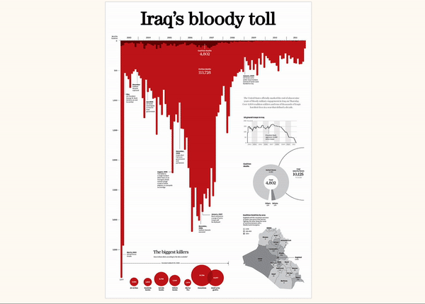 Figure 1: Iraq’s Bloody Toll by Simon Scarr [Source]
Data storytellers ought to wield this power to convey arguments responsibly and deliberately. When delivering a supposedly objective data story, data storytellers should pay attention to details in charts that might amplify biases. For instance, axes should start with zero to avoid misleading correlations.
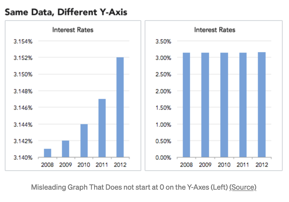 Figure 2. The same data points can convey dramatically different results [Source]
2. Position elements in a data story appropriately
The Gutenberg principle states that a user’s eyes travel according to a Z-shaped path from top-left to the bottom-right when reading content.
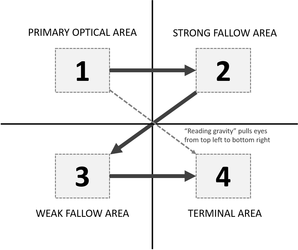 Figure 3. The Gutenberg principle [Source]
Applied to data stories, this principle tells us that the most important information should be on the top left. More granular details should be fleshed out towards the bottom of the chart. A call-to-action can also be included in the bottom-right of the chart where the terminal section is.
3. Understand your audience using design principles
Design principles can be used to understand an audience’s experience with data stories. In the book Design of Everyday Things, the author Don Norman argues that end-users process all objects on three levels of emotions–visceral, behavioral, and reflective.
-
The visceral level: Within the first second of seeing a chart, users judge a chart based on its appearance. That is the visceral level of processing, which refers to the ingrained and automatic qualities of human emotions. As such, a chart’s aesthetic is key to keeping an audience’s attention on the data story.
-
The behavioral level: The user then judges a visualization based on its usefulness, which is referred to as the behavioral level of processing. In other words, the audience must be able to see the author’s point with the visualization.
-
The reflective level: After interacting with the visualization, users reflect on their experience. For instance, a user is likely to reuse a data dashboard if they find their experience pleasant upon reflection.
More Tips on Data Storytelling
This article covered how data teams can enhance data stories with thoughtful designs. In the second part of the blog post, we will provide more actionable tips for presenting excellent data stories.