
Course
Pivot Tables in Google Sheets
2 hr
70.7K
In the information age, many options are available to work with your data; however, PivotTables are one of the most simple and effective ways to analyze your data. In this tutorial, we’ll walk you through how to create PivotTables in Excel, and how to leverage them for data insights.
PivotTables in Excel offer several benefits that enable you to summarize and analyze large amounts of data to help quickly identify trends and patterns. They are a popular user-friendly tool enabling technical/non-technical people alike to dive deeper into their data.
At the most basic level, PivotTables enable you to create a data matrix in a row and column formats. You can apply filtering, sorting, aggregation, and summarization of your data in various ways.
Below is an example of a PivotTable in action.
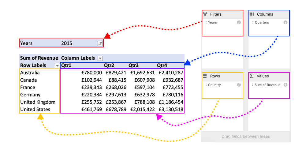
When working with PivotTables, there are four key components that you'll work with:
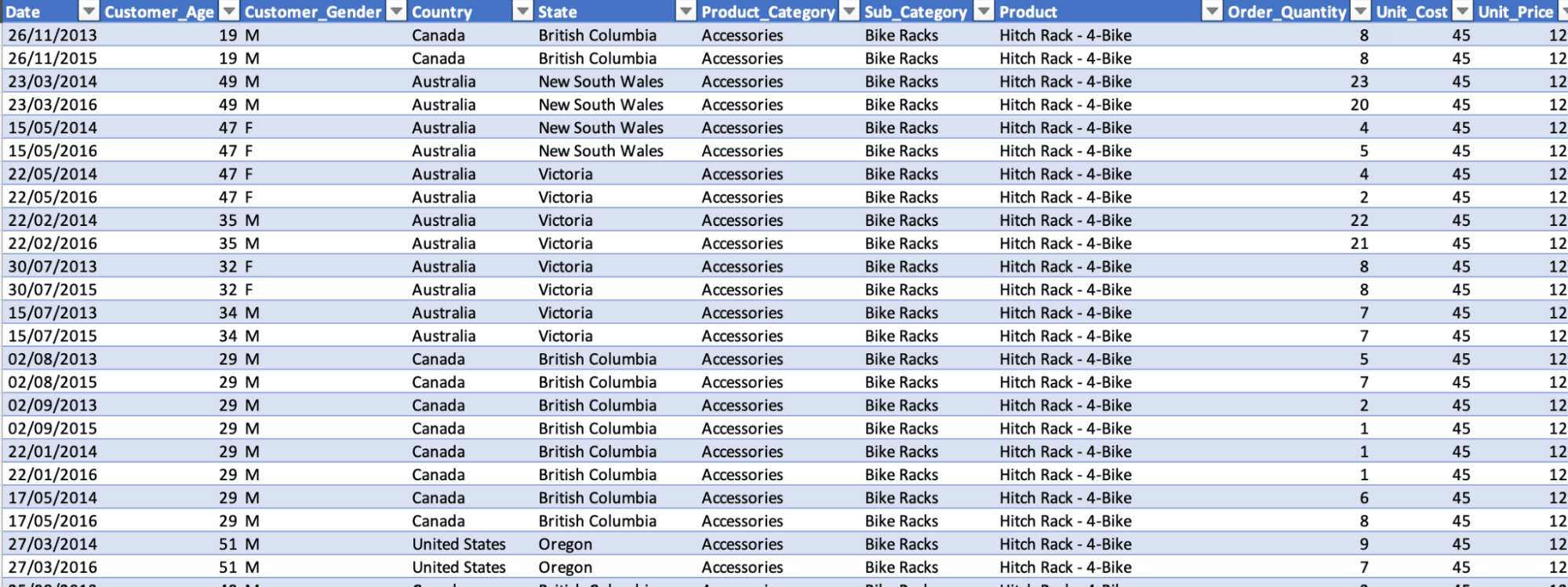
This tutorial will use a dataset about global Bicycle sales from 2011 to 2016. This dataset's demographic information about customers and products is ordered with profit, cost, and revenue columns. You'll create a PivotTable from this dataset, enabling you to analyze the data within.
The data is available here for you to follow along.
Let's start by reviewing a sample of the data for this tutorial. We have a table that contains 11 columns, including date, text, and numerical field types. From this subset of data, we see many ways we can work with this data to carry out our analysis and find some valuable insights.
To create your first PivotTable, select the table from which you want to create your data, navigate to the Insert tab, and select PivotTable from the options below.
Once you’ve done that, you’ll be shown a new pop-up window that asks whether you want to change the data range you’d like to create a PivotTable from and whether you want to PivotTable to be in a new worksheet or an existing worksheet. For this tutorial, the default options are what we need. Click OK and create a PivotTable in the new sheet below.
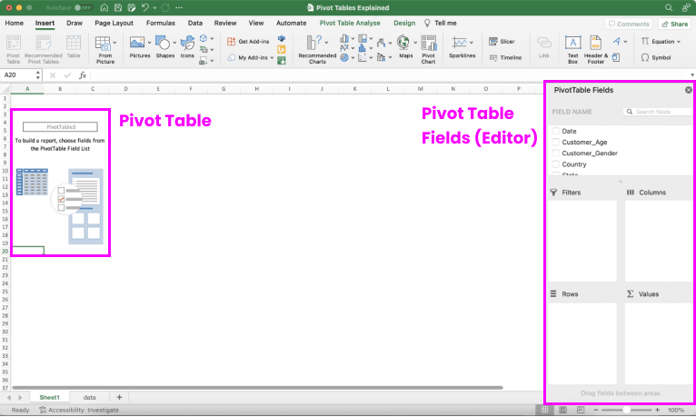
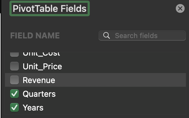
Our new sheet shows the shell of our PivotTable that has automatically been created for you. On the left-hand side of the screen, you can see an outline showing where the PivotTable will appear once it’s been built. On the right-hand side, you’ll see the PivotTable fields pane that will appear where you’ll do the majority of your work with.
When your data is already in a table within Excel, PivotTable will automatically include everything inside. However, it’s important to note that if your data is not inside a table element, you can manually select the data you want to include by highlighting the data to include and creating a PivotTable the same way as before.
We will assume that each row is associated with an individual customer; therefore, there are no repeat orders. This is a highly simplified view of the dataset, but as there was no unique customer identifier, it’ll be easier for this tutorial to assume a single customer.
First, we’ll start by bringing a category field into the rows section. We will use Country for our category; we need to find it from the list of fields in the PivotTable editor and then drag it into the Rows section. Next, we’ll need to look at the value we would like to evaluate - in this case, we want to count customers, but since we do not have an ID field, we can use the Customer_Age field, which we can drag into the Values section. By default, the aggregation is SUM, but we must update this to COUNT. We can fix this by right-clicking on the Customer_Age in the Values section, selecting Field Settings, changing Summarise from Sum to Count, and clicking OK.
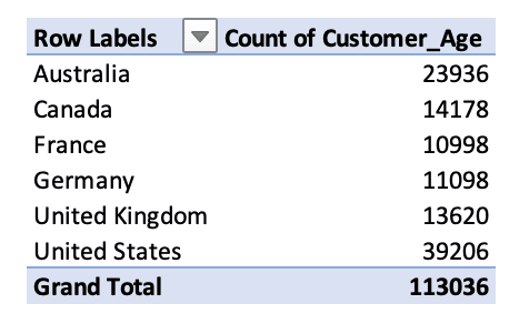
Great job! We can now see a count of customers by the Country they ordered from. This is good to see, but let’s organize it by Country with the most customers. To do this, you’ll need to right-click on a value in the Count of Customer_Age column, select Sort, and then Sort Largest to Smallest. We can see that the United States had the most customers, with 39,206.
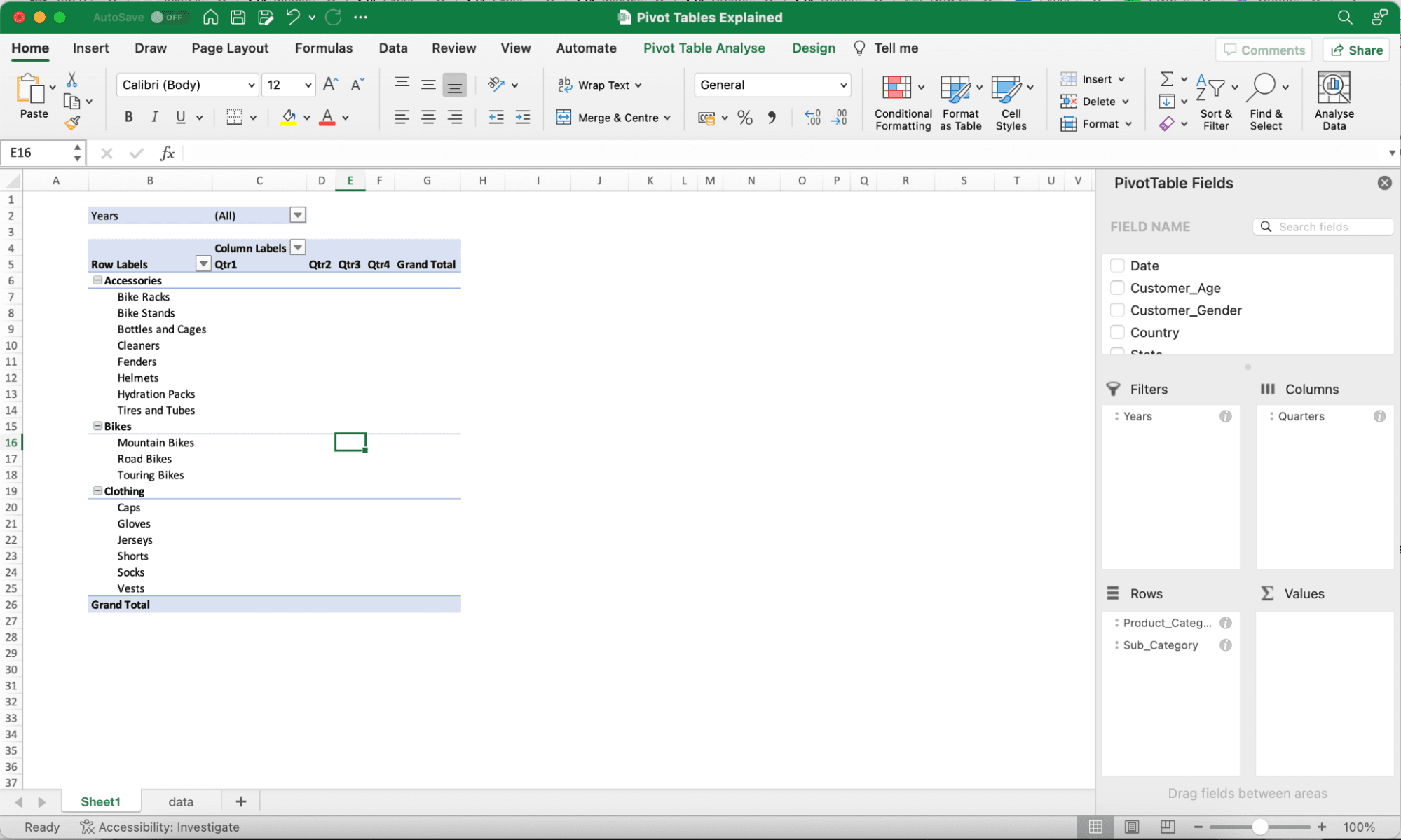
Now we’re familiar with how to set up a basic PivotTable, let’s take this a step further and look at adding filters and columns and refreshing PivotTables. Let’s remove the rows and values we added in the previous step by right-clicking on them and selecting the Remove field. We now have a completely blank slate to work with.
For this PivotTable, the question we will try to answer is, “In 2015, which quarter generated the most revenue, and what product/sub-category did it belong to?”
Let’s start by adding the rows we would like to analyze this data by; in our case, it will be Product_Category and Sub_Category. Next, for our columns, we want to see a breakdown of Quarters. But wait, we don’t have a Quarters column… that’s not a problem; Excel has automatically detected a date from our data, so when you drag Date into columns, you’ll see two new fields appear: Years and Quarters. Since we don’t need to view the data at an individual date level, we can remove this field from our Columns section.
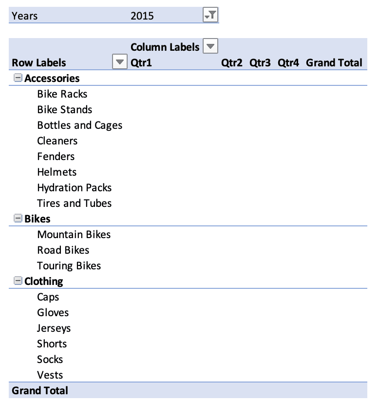
Since we want to filter to 2015 for our question, we can move the Years field into the Filter section. Your PivotTable should now look something like this:
Now that we have the structure of our table, we can pre-select the year we’d like to filter by clicking on the dropdown for Years and selecting 2015. This is now how our PivotTable appears.
Currently, our data points are at a singular level so the unit price and unit cost are associated with a single item. We’d like to correctly summarize the information and therefore need to move from our PivotTable and back into our data table.
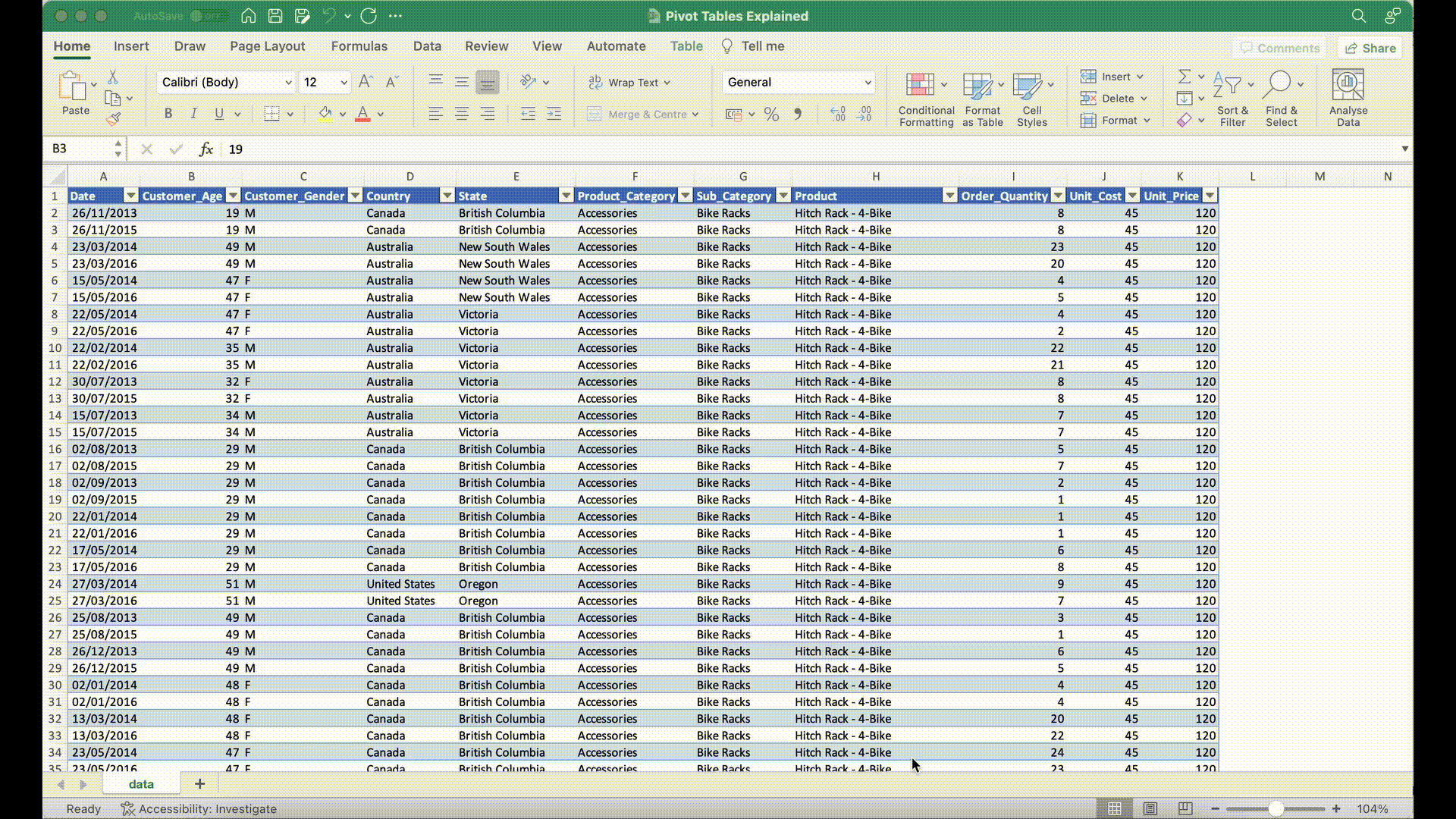
In the data tab, we will need to create a new calculated column to work out the revenue per row. For our calculation, we need to multiply Order Quantity by Unit Price.
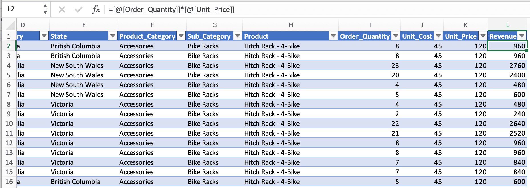
To add a new column to our data, navigate back to the data sheet, and next to our Unit Price column in row L2, we’ll add our new calculation; our formula will be:
[@[Order_Quantity]]*[@[Unit_Price]]
Now we have a new column that we can utilize in our PivotTable. Navigate back to the sheet where your PivotTable is, and we can see that the field doesn’t appear currently. To refresh our PivotTable, right-click on any field and select Refresh.
Our new column has been added, and we can drag this into the Values section. If you’d like to add more columns, you can use our Excel Cheatsheet to see other types of calculations that you can utilize.
It looks messy, so let’s clean it up by removing all the grand totals, which you can do by going to the Design tab. Now open the Grand Totals dropdown and select Off for Rows and Columns. Next, let’s update the figures to show in currency. Highlight the values in the table, and on the Home tab, update the values to Currency.
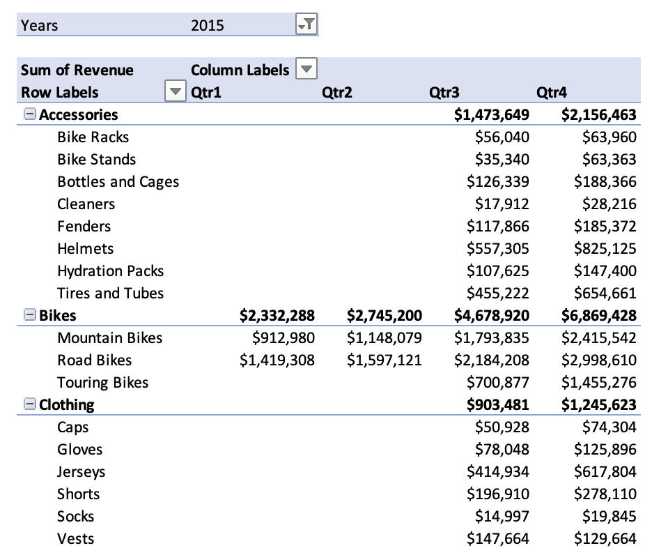
Great, now we have our finalized PivotTable. From this, we can see that Bikes generated our highest revenue in 2015, particularly in Q4. Additionally, of the bikes the company sells, we can see that Road Bikes are the most popular and generate the most revenue for the organization.
This tutorial was a good introduction to PivotTables using Excel; if you could follow along easily, well done! If you got stuck along the way, you can find the solution file here.
Try experimenting with a more complex dataset, applying different attributes, playing with them, and seeing if you can make some sense of the data.
If you’d like to test more of your skills in Excel, think about checking out our Data Analysis in Excel course, if you haven't already.
Gain the skills to maximize Excel—no experience required.
Learn Excel with DataCamp
Course
Course
Course
Tutorial
Aditya Sharma
Tutorial
Javier Canales Luna
Tutorial
Allan Ouko
Tutorial
Joleen Bothma
Tutorial
Elena Kosourova
code-along
Agata Bak-Geerinck