Course
Introduction to Data Visualization with Matplotlib
4 hr
223.1K
Welcome to part eight of our month-long data demystified series. As part of Data Literacy Month, this series will clarify key concepts from the world of data, answer the questions you may be too afraid to ask and have fun along the way. If you want to start at the beginning, read our first entry in the series: What is a Dataset?

This week, we’ll cover common data visualizations and how to interpret them. Data visualization is often called the gateway drug into data science. This blog post will look at data visualizations that capture a trend and how to interpret them.
Capturing trends is one of the most useful applications of data visualization. Throughout the remainder of this section, we’ll look at the most popular visualizations that capture trends. Most notably, line charts, spline charts, area charts, and their variations. Let’s get started!
A line chart connects a series of points with straight line segments. Line charts are commonly used to visualize trends over time. Line charts are ubiquitous. Businesses use line charts to capture business metrics like revenue and profit over time; scientists use line charts to illustrate the relationship between two variables.
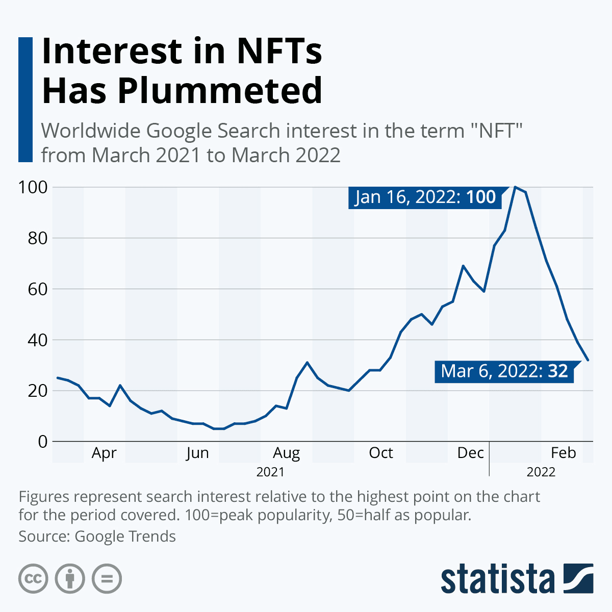
The interest in NFTs has increased throughout 2021, reaching a maximum in January 2022, before rapidly declining in tandem with the prices of major cryptocurrencies like bitcoin. (Source: Statista)
Interpreting line charts is intuitive. Here are some things to think about when interpreting line charts.
One note of caution, though—anyone reading a line chart should pay attention to the vertical axis and consider whether it starts at zero or not. Line charts whose y-axis doesn’t begin at zero could make small changes appear like wild fluctuations.
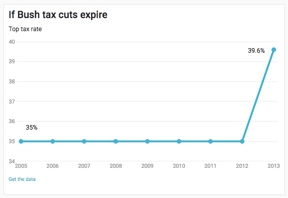
A line chart that does not start with zero can be used to mislead the audience (Source: Chad Skelton)
A spline chart is a line chart that uses curves (instead of straight lines) to connect data points.
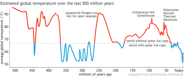
A spline chart that shows gradual changes in earth’s temperature over the past 500 million years (Source: climate.gov)
A spline chart is equally competent at conveying trends over time as a line chart; it is superior to a line chart at conveying smooth and gradual changes. For example, a store’s monthly revenue can be plotted with a spline chart to convey that the sales occur gradually over the month, not in a single day.
As its name suggests, a multi-line chart contains more than one line chart plotted on the same or different axes. It is helpful to compare the trends of two related variables. To analyze a multi-line chart, take a deep look at the chart and try to understand the following about it:
Here are some examples of helpful multi-line and multi-spline charts.
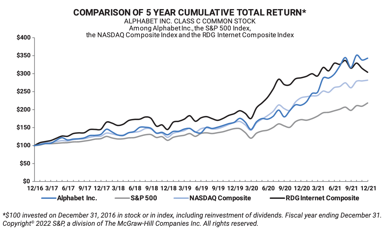
Alphabet’s Annual Report in 2021 uses a multi-spline chart to compare its stock performance against the wider market. (Source: Alphabet Investor Reporting)
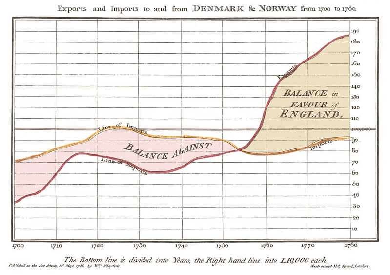
William Playfair, the creator of line charts, used a multi-spline chart to compare the imports and exports of England as early as 1786. The vertical difference between the lines indicates England’s balance of accounts in that year (Source: Datylon)
A common mistake is to conclude that two independent trends are related from just a cursory glance at a multi-line chart. This is precisely the correlation vs. causation fallacy happening in action, which we covered in an earlier entry in the data demystified series.
In the example below, one can easily conclude that there is a relationship between the number of people who drowned by falling into a pool and the number of films Nicolas Cage has appeared in.
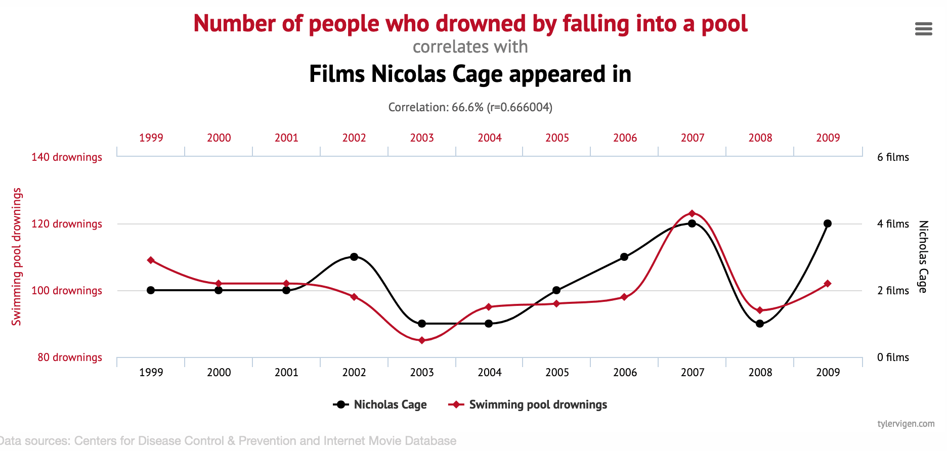
Beware of spurious correlations! (Source: Tyler Vigen)
An area chart shows how a numeric value progresses by shading the area between the line and the x-axis. It is similar to a line chart, except the area under each line is shaded.
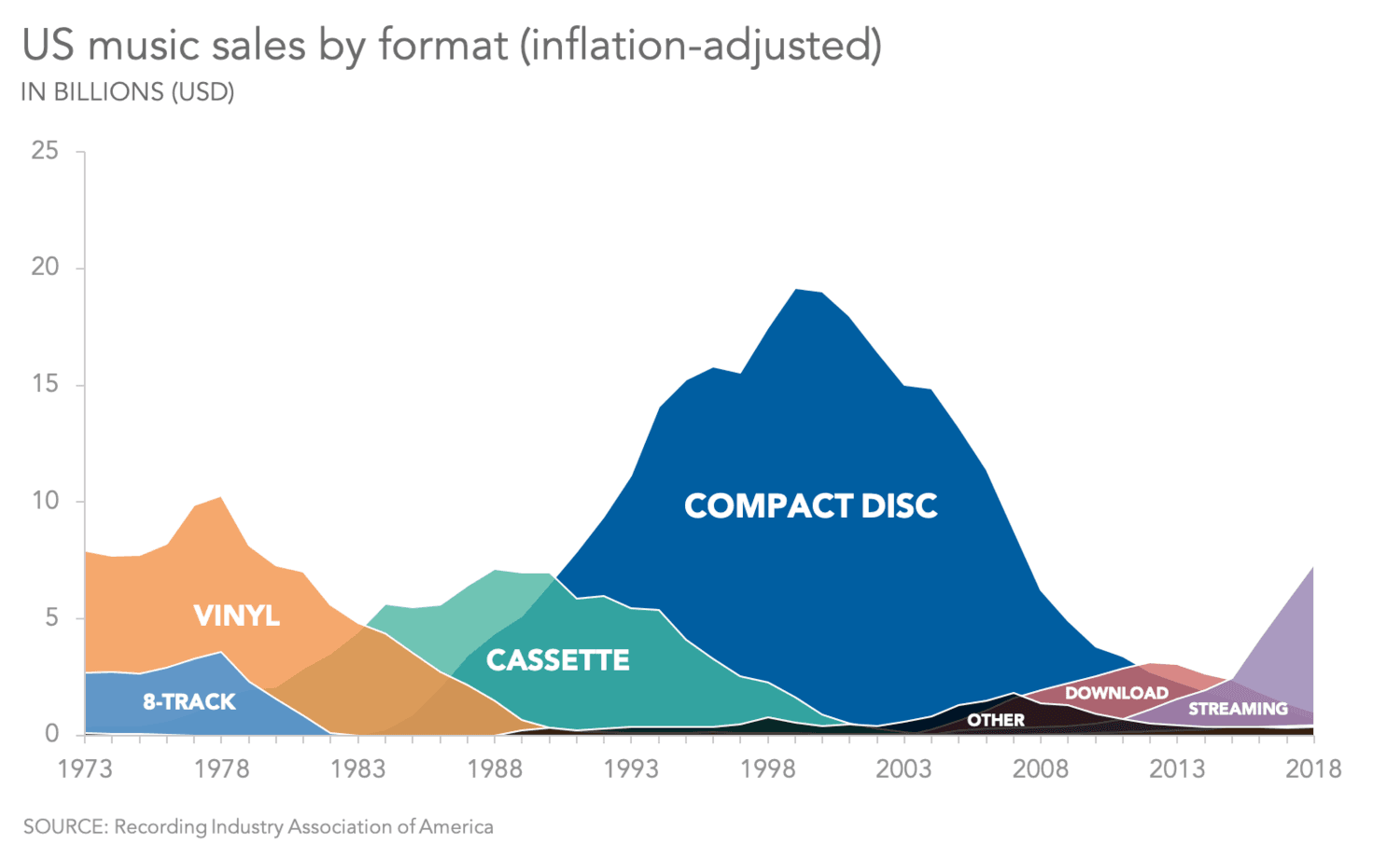
An area chart (Source: Storytelling with Data)
You can compare the area under the graph as the cumulative amount of the data series over time. When multiple area charts are plotted on the same chart, you can make a comparison of several subcategories over time.
Despite the usefulness of area charts, you should be aware of their caveats. Comparing the relative areas of multiple data series might be challenging as area charts can quickly become too cluttered.
A stacked area chart consists of multiple area charts stacked on top of one another. It is best at tracking the breakdown of a data series over time.
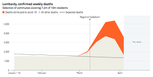
Figure 8: A stacked bar chart that illustrates the deadliness of the pandemic (Source: The Economist)
Here is a stacked area chart that estimates the actual toll of the pandemic in 2020. To do so, the author used a shaded region to attribute a portion of mortality in Lombardy to covid-19. The darker shade is noteworthy to emphasize the spike in cumulative deaths attributable to covid-19, which is a useful data storytelling technique.
We hope you enjoyed this short introduction to data visualization. In the next series entry, we’ll look at data visualizations that capture relationships. To start your data learning journey today, check out the following resources.
Data Visualization courses
Course
Course
Course
blog
Richie Cotton
5 min
blog
Richie Cotton
8 min
blog
Richie Cotton
5 min
blog
Richie Cotton
6 min
blog
Richie Cotton
4 min
cheat-sheet
Richie Cotton