Course
Data Visualization in Google Sheets
4 hr
45.8K
Welcome to part nine of our month-long data demystified series. As part of Data Literacy Month, this series will clarify key concepts from the world of data, answer the questions you may be too afraid to ask and have fun along the way. If you want to start at the beginning, read our first entry in the series: What is a Dataset?

This week, we’ll cover common data visualizations and how to interpret them. Data visualization is often called the gateway drug into data science; this blog post will look at data visualizations that capture relationships and how to interpret them.
Capturing relationships between different data points is a crucial application of data visualization. This section will look at the most popular visualizations that capture relationships. Most notably, bar charts, scatter plots, bubble charts, and more.
A bar chart compares the value of multiple categories. It consists of rectangles whose lengths are proportional to the value of each category. Bar charts are prevalent because they are easy to read. Businesses commonly use bar charts to make comparisons, like comparing the market share of different brands or the revenue of different regions.
There are multiple types of bar charts, each suited for a different purpose.
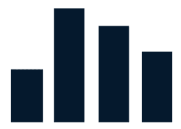 |
In a vertical bar chart, also known as a column chart, the horizontal axis represents the categories while the vertical axis contains the value. |
 |
In a horizontal bar chart, the categories are placed on the vertical axis. It is a better alternative than a column chart when the names of the categories are long. |
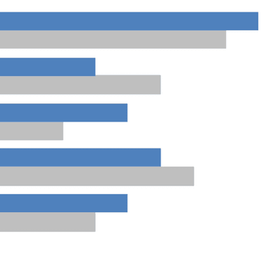 |
A clustered bar chart is a vertical or horizontal bar chart that displays more than one data series in one category. It is useful for showing change over time or comparing multiple data series within a category. |
A rule of thumb when creating a bar chart is to start the axis or baseline at zero. Else, you run the risk of exaggerating minor differences between categories. Another tip is to order the bar charts in a meaningful order. Here are some examples of effective bar charts.
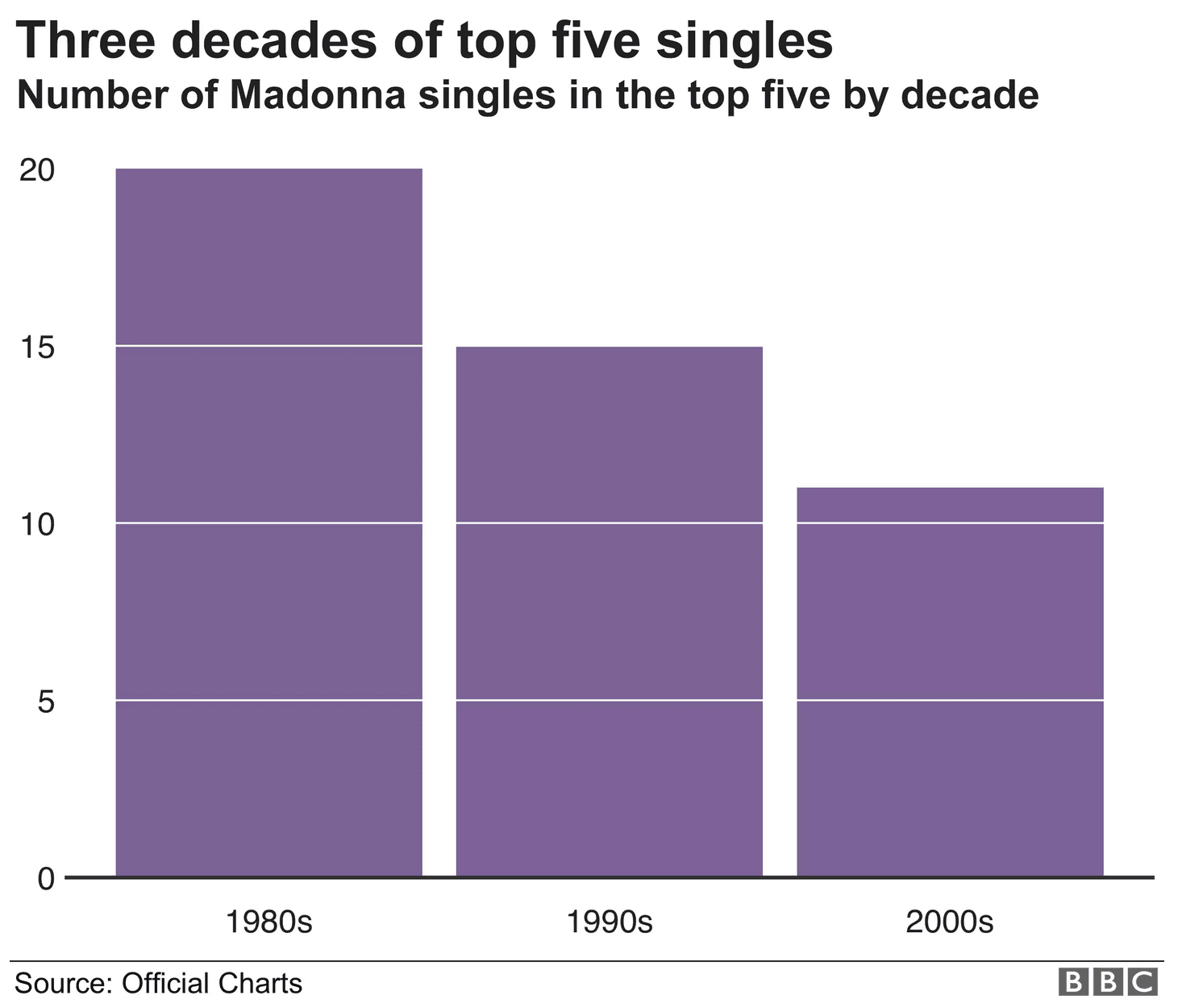
A vertical bar chart. Notice how the baseline starts at zero and that the categories are ranked by decade. (Source: BBC)
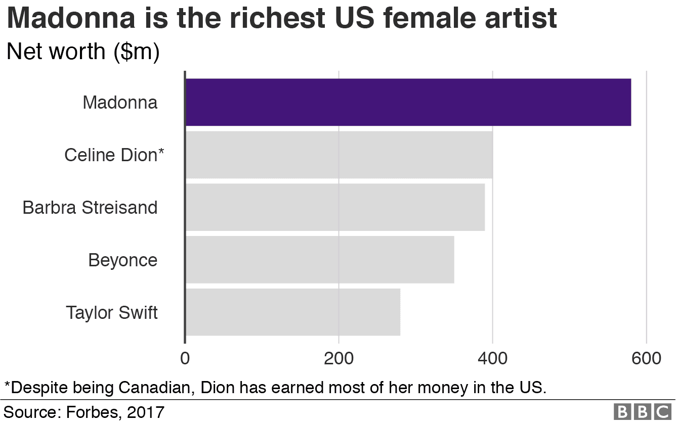
A horizontal bar chart comparing the wealth of US female artists. (Source: BBC)
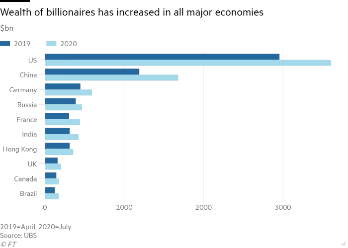
A clustered horizontal chart that compares multiple categories in 2019 and 2020 (Source: BBC)
A scatterplot shows the relationship between two variables by plotting multiple data points. It is often used in data exploration to understand the data and quickly surface potential correlations.
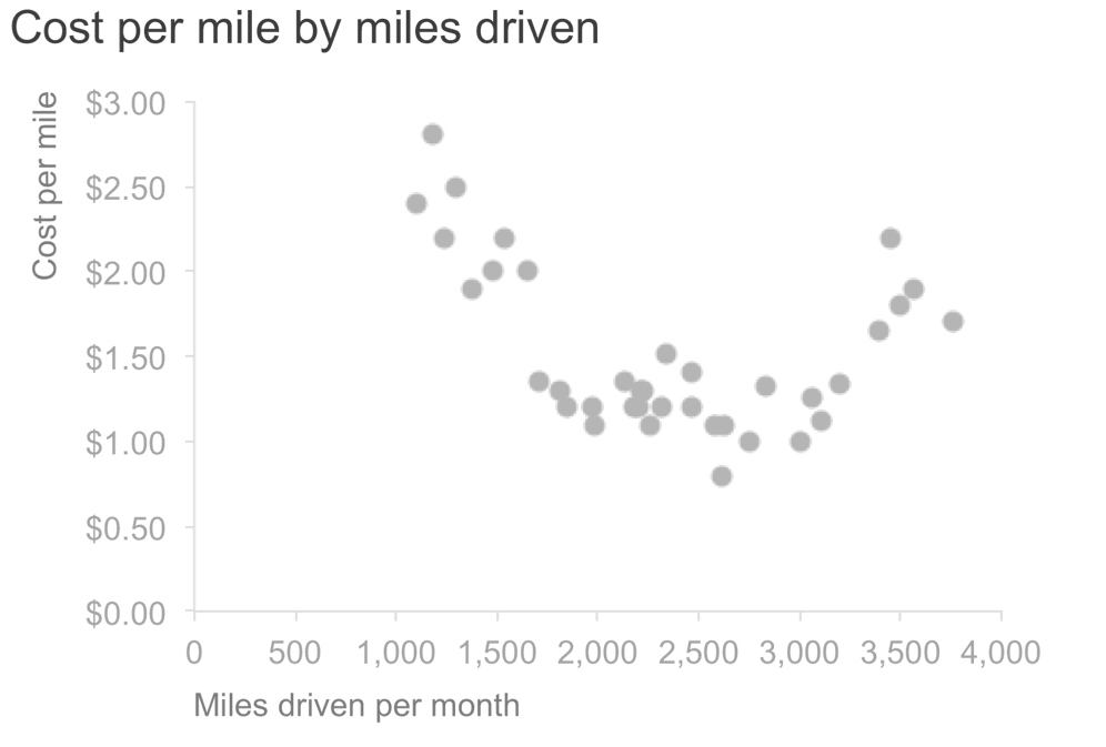
A scatter plot comparing cost per mile and miles driven per month (Source: Storytelling with Data)
Here are some practical concepts to consider for interpreting a scatter plot.
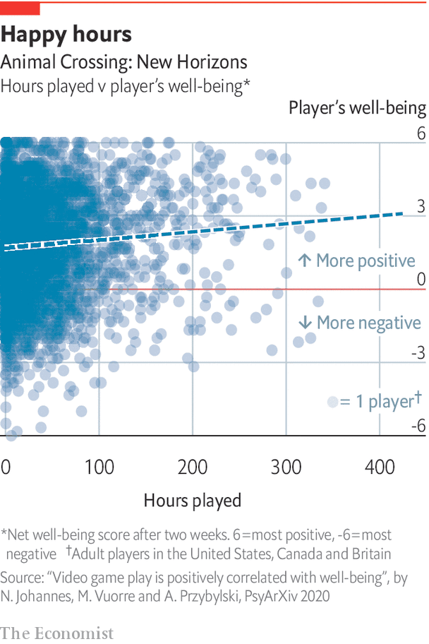
The Economist shows that video games are good for mental health with a scatter plot (Source: The Economist)
A connected scatterplot is a scatterplot with connected data points. It is helpful for visualizing the evolution of two variables with time.
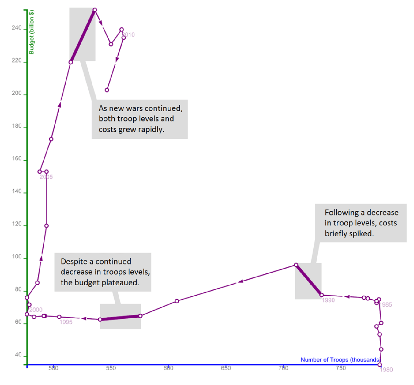
A connected scatterplot showing the relationship between the number of troops and military budget over time (Source: Steve Haroz)
The above scatterplot depicts the relationship between military budget and the number of troops over time. It uses arrows to show the evolution over time. Reading a connected scatter plot might be counterintuitive to some. Thus, helpful annotations are critical to a well-crafted connected scatterplot.
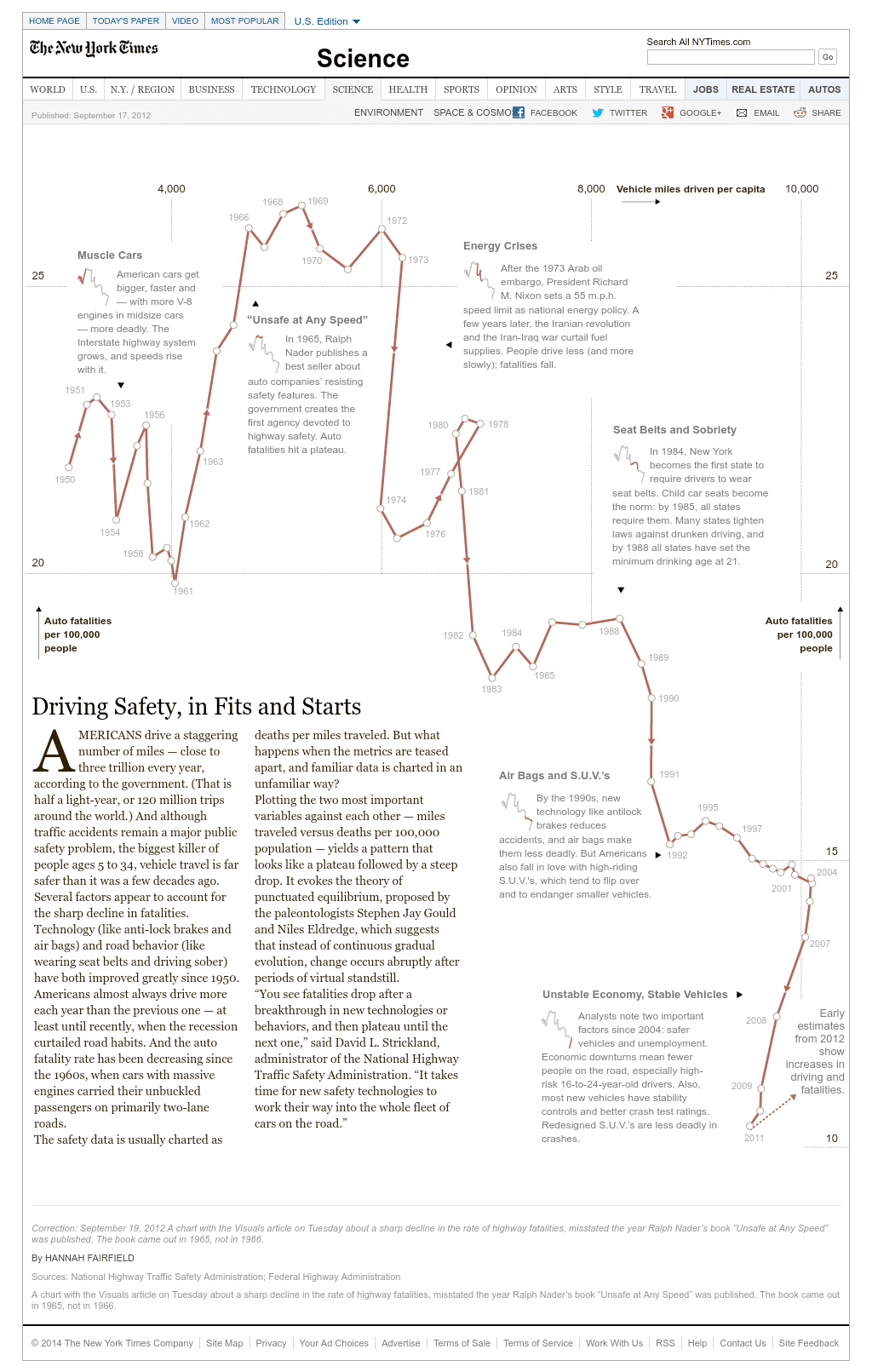
Using a connected scatterplot to depict the evolution of car safety (Source: New York Times)
A bubble chart is an extension of the scatterplot that shows the relationship between three variables using the x-axis, y-axis, and the size of the bubble. You can also include a fourth dimension variable in a bubble chart by giving each data point colors.
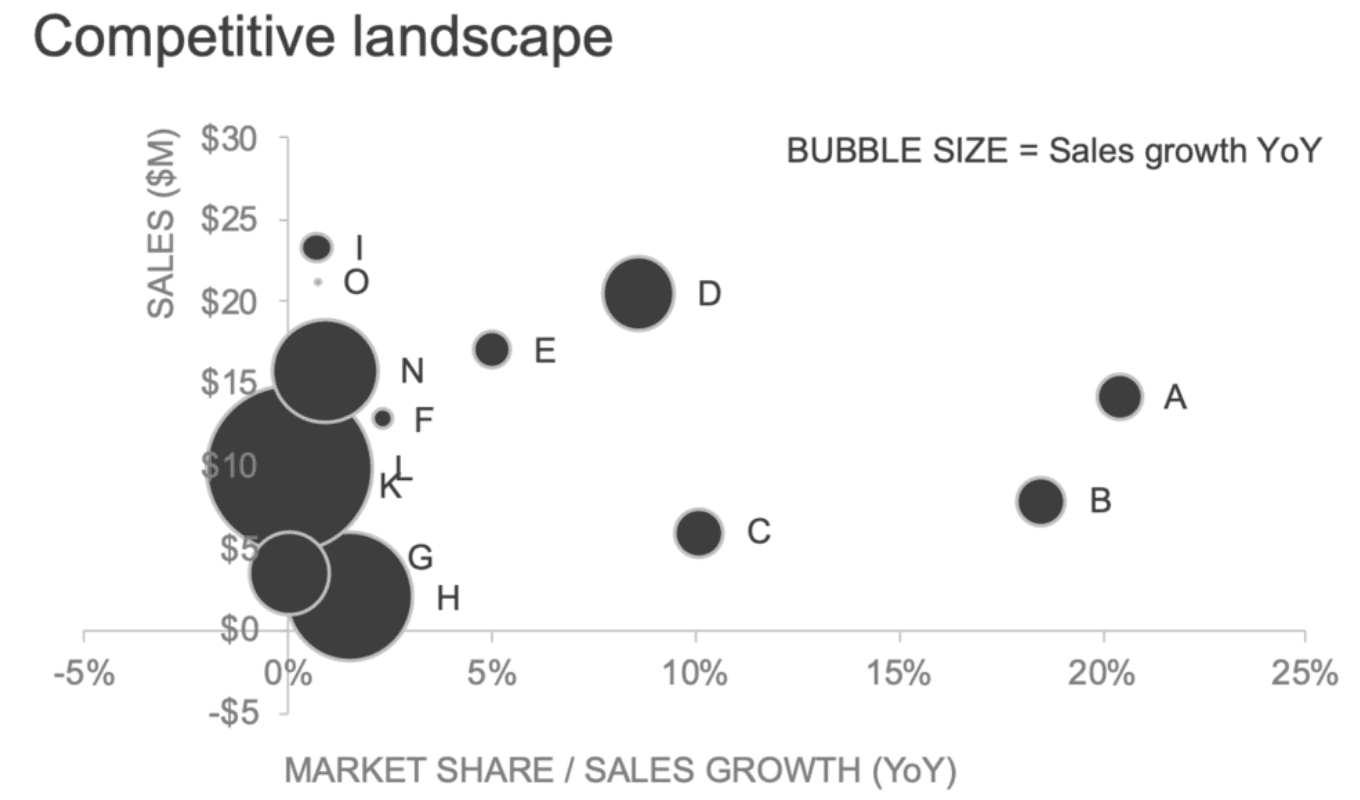
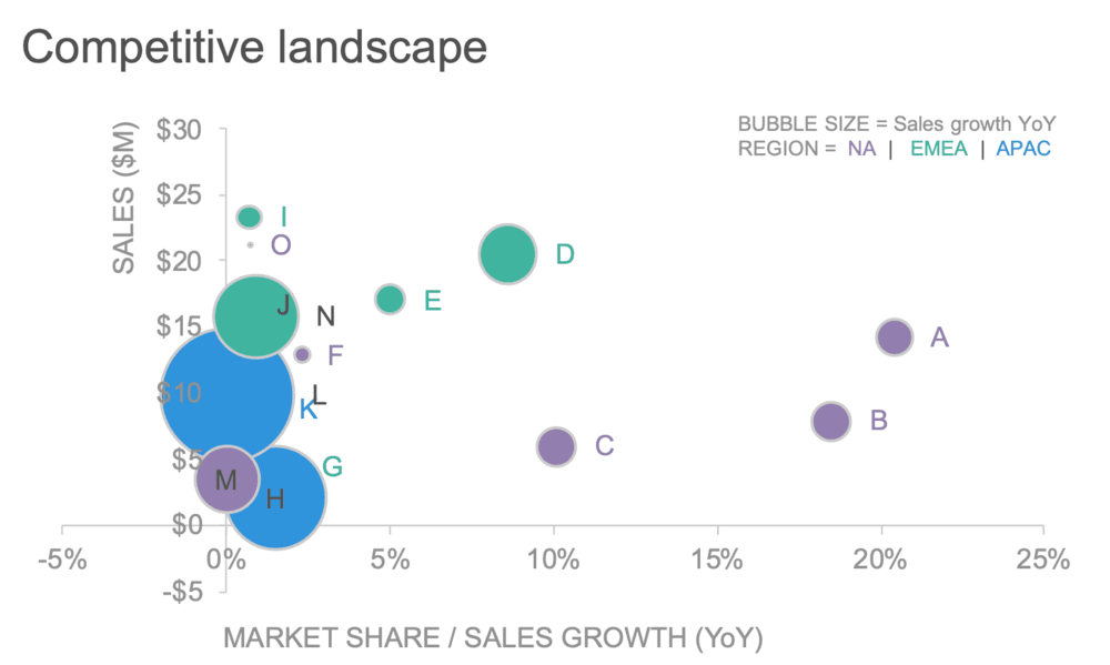
Bubble charts and colored bubble charts in action (Source: Storytelling with Data)
Anyone using bubble charts should note that a bubble chart can overwhelm the reader. Thus, it is helpful to complement bubble charts with interactive narration. A great example of this comes from Hans Rosling’s bubble chart, depicting the relationship between life expectancy, GDP per capita, and population size.
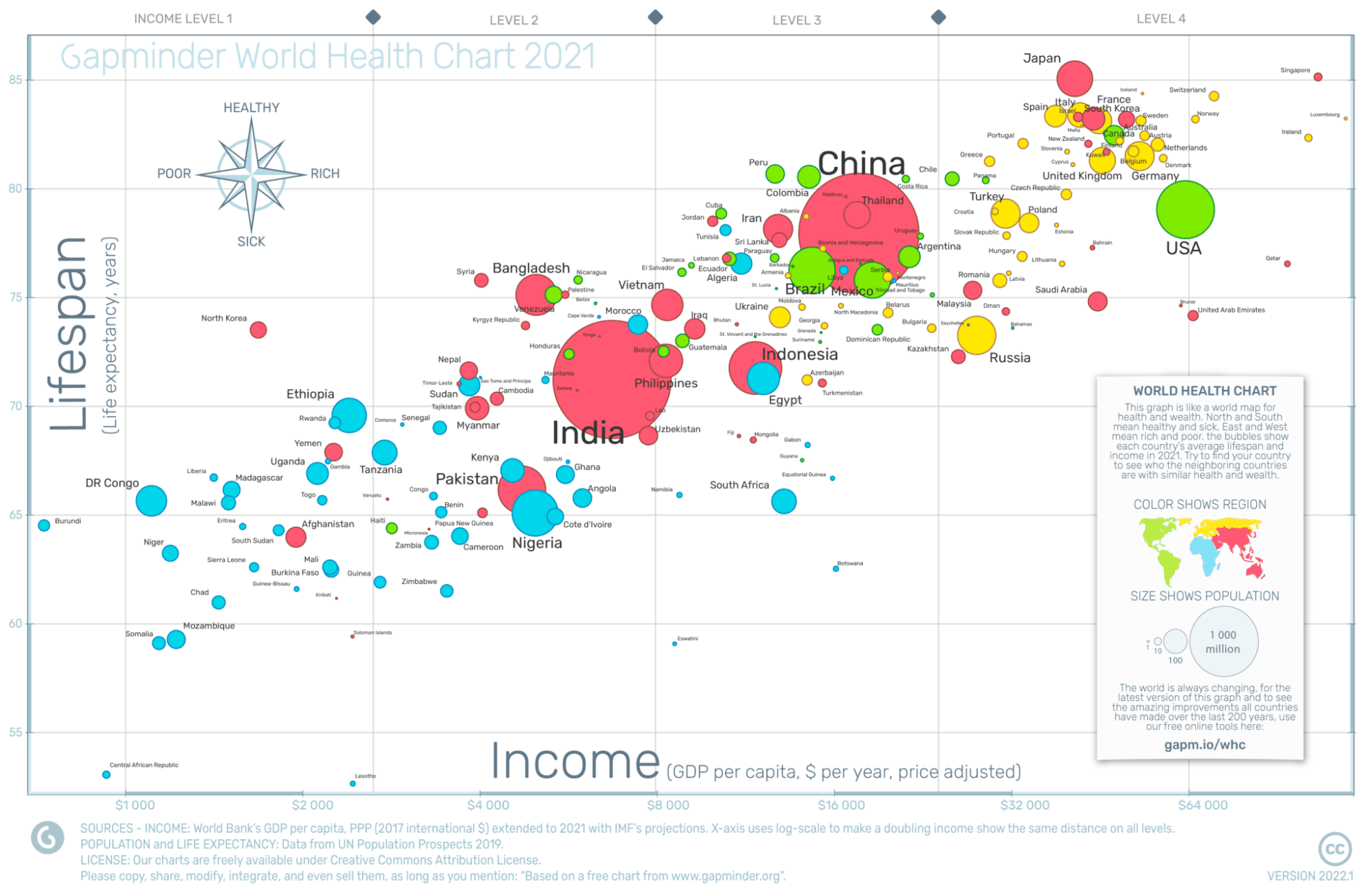
The Gapminder bubble chart is one of the most notable uses of bubble charts
We hope you enjoyed this short introduction to data visualization. In the next series entry, we’ll look at data visualizations that capture distributions. If you want to get started on your data visualization learning journey today, check out the following resources.
Data Visualizations courses
Course
Course
Course
blog
Richie Cotton
10 min
blog
Richie Cotton
8 min
blog
Richie Cotton
8 min
blog
Richie Cotton
5 min
blog
Richie Cotton
6 min
cheat-sheet
Richie Cotton