
Courses
Support Vector Machines in R
4 ชม.
11K
Ever tried to visualize a distribution, only to get a histogram that changes shape every time you change the bin size?
Here’s how it usually goes. You pick 10 bins and see a smooth curve. Then, you switch to 30 and there are multiple peaks. The data stayed the same, but different bin counts give different interpretations. That's the biggest problem with histograms: they don't show you the distribution, they show you one version of it. And that version is influenced by a parameter you set randomly.
KDE takes a different approach. Instead of slicing data into bins, it places a small smooth curve on each data point and sums them all up. This gives you a single, continuous estimate of the distribution behind.
In this article, you'll get the intuition behind KDE, a walkthrough of the formula, an explanation of how bandwidth controls smoothness, and practical examples in Python and R.
Are you new to histograms? Here’s a comprehensive guide to Frequency Histograms that will get you started.
Kernel density estimation is a nonparametric method for estimating the probability density function of a dataset.
The nonparametric part is what makes it different.
With parametric methods, you assume your data follows a specific distribution - normal, exponential - and then fit parameters to match it. If that assumption is wrong, your model is wrong. KDE doesn’t make assumptions like that. It lets the data speak for itself and builds an estimate of the underlying distribution directly from the observations.
The output is a smooth curve that shows you where values are likely to fall - and how likely that is. High points on the curve mean dense regions. Low points mean sparse ones.
Histograms are the default tool for visualizing distributions, but they have a problem: the shape you see depends on the number of bins you choose. And that bin parameter number is up to you to choose. Two people can look at the same dataset and draw completely different conclusions just by picking different bin counts.
With KDE, instead of forcing data into bins, it produces a smooth, continuous curve that doesn't change based on an arbitrary parameter you set upfront.
That makes it handy for a couple of things:
You take each data point and place a small, smooth curve on top of it. That curve is called a kernel. Then, just sum all those individual curves together into one.
You end up with a single smooth curve that shows the density of your data. Where points cluster together, multiple kernels overlap and stack up, so the curve rises. Where data is sparse, the kernels barely overlap and the curve stays low. Every point contributes equally to the final estimate.
Imagine you recorded final exam scores for a class of students. Instead of binning them into a histogram, KDE places a small smooth curve on each score. Where scores cluster - say, around 70-75 - the curves stack up and the estimate rises. A single student who scored 95 adds just a small bump at the tail.
The visual below shows exactly this. Most of the students scored around the average, and one student scored much higher:
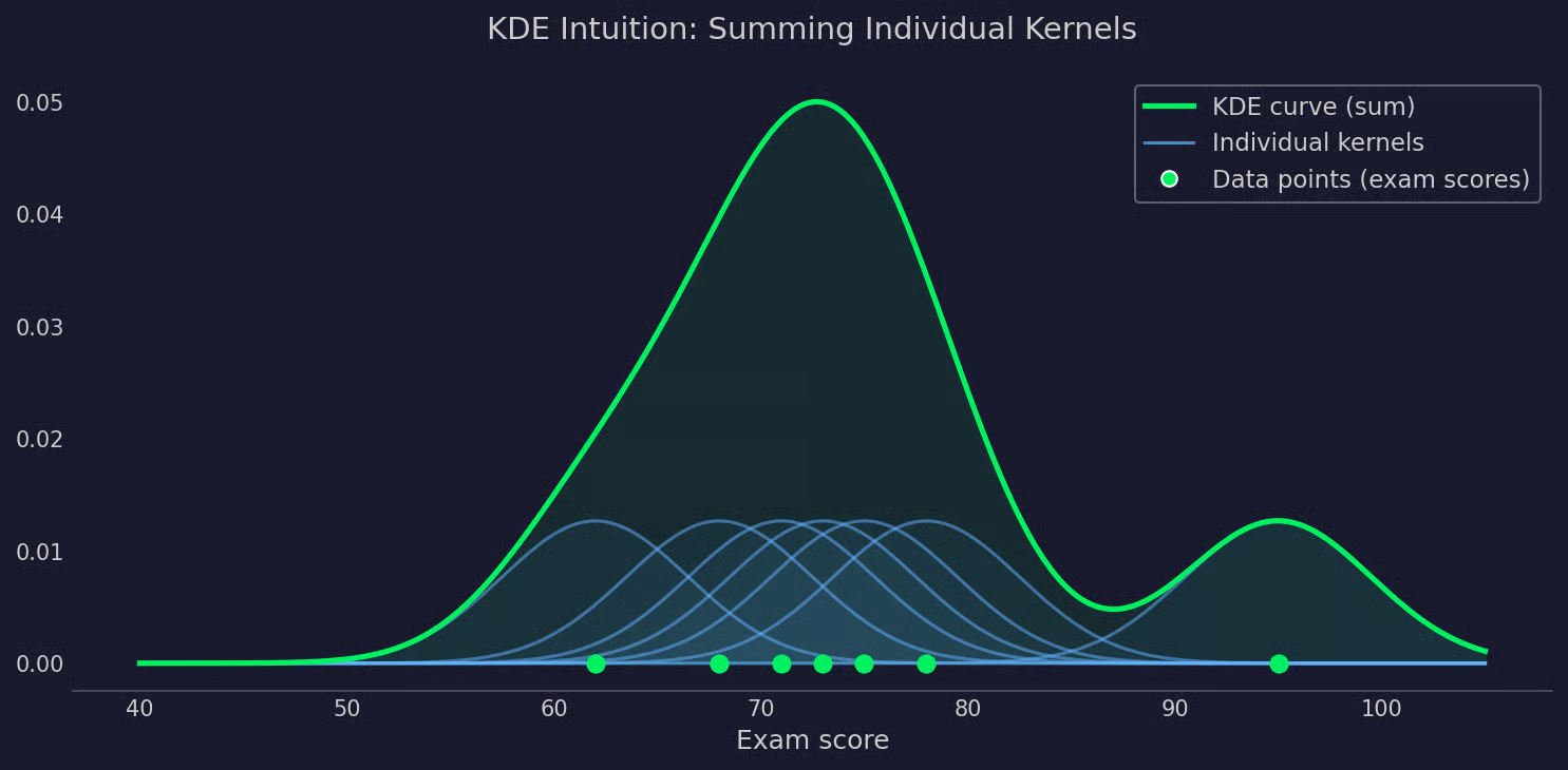
KDE visualized
The KDE formula looks more intimidating than it is.
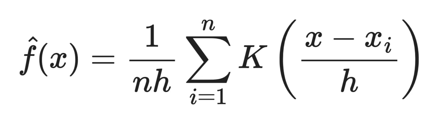
KDE formula
Here's what each part means:
n is the number of data points
x_i are the individual data points in your dataset
K is the kernel function - the smooth curve placed on each point
h is the bandwidth - controls how wide each kernel is
x is the point where you're evaluating the density
In plain English, the formula says: for any point x, look at how close every data point x_i is to it, weight that closeness using the kernel function K, and average the result across all n points. Do this for every x along the range and you get the full density curve.
The bandwidth h sits in the denominator of the fraction inside K. A smaller h makes the kernel narrower, so only very close points influence the estimate. A larger h spreads the influence wider. More on this in later in the article.
The kernel is the smooth curve you place on each data point. It defines how that point's influence spreads to its neighbors.
Every kernel is centered at a data point and assigns weights based on distance. Points close to the center get high weight. Points far away get low weight or none at all. The exact shape of that weighting depends on which kernel you pick.
There are three common choices:
In most cases, kernel choice doesn't matter much. Two different kernels applied to the same data with the same bandwidth will produce curves that are nearly identical. What matters a lot more is bandwidth - and that's what we'll look at next.
Bandwidth is the single parameter that has the biggest impact on your KDE output, even more than the kernel you pick.
It controls how wide each kernel is. A narrow kernel only pulls in influence from nearby points. A wide kernel spreads that influence across a much larger range. The result is either a curve that tracks the data closely or one that smooths over it.
A small bandwidth makes each kernel tight and narrow. The estimate reacts sharply to every data point, which means it picks up real structure of the data, but also noise.
In practice, this looks like a spiky curve with multiple small peaks. Some of those peaks show real clusters in your data. Others are just artifacts of having too little smoothing. It's hard to tell which is which, and that's the problem.
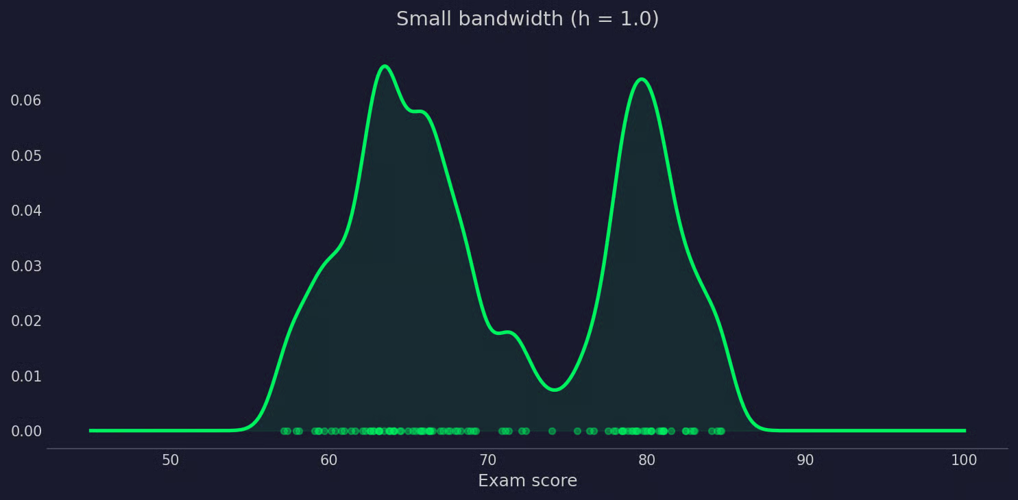
KDE with small bandwidth
A large bandwidth spreads each kernel wide. Neighboring kernels overlap, and the final curve comes out smooth.
If it becomes too smooth, you start losing real structure. Two distinct clusters can blur into a single curve. A distribution with a heavy tail might look symmetric. The visual representation might be hiding things from you.
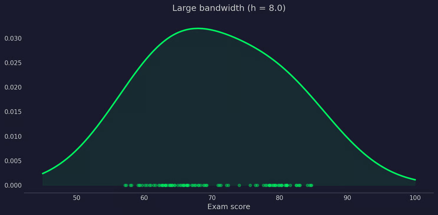
KDE with large bandwidth
There's no universally correct bandwidth. The goal is to find a value that's smooth enough to filter out noise but not so smooth that it erases real patterns.
Most libraries do this with automatic bandwidth selection methods. Silverman's rule of thumb is the most common. It picks a bandwidth based on the sample size and standard deviation of your data. It works well for roughly normal distributions but can over-smooth multimodal ones.
If you're unsure, try a couple of bandwidth values and compare the curves. The differences will tell you a lot about your data.
Both histograms and KDE show you the distribution of your data - but they do that in a very different way.
A histogram splits your data into discrete bins and counts how many points fall into each one. It's fast, intuitive, and easy to explain to a non-technical audience.
The problem is bin sensitivity. If you change the number of bins, the shape changes. There's no objectively correct bin count, which means two people can look at the same data and draw different conclusions just from that one choice.
Histograms also produce a stepped, discontinuous shape. That's fine for a quick look, but it can obscure the true underlying distribution.
KDE gives you a smooth, continuous curve with no bins involved. It's better at revealing the actual shape of a distribution - things like skew, multiple peaks, or heavy tails that a histogram might miss or misrepresent depending on bin choice.
The trade-off is that KDE introduces its own parameter - bandwidth - and requires more computation. It's also less intuitive to explain, since the y-axis shows probability density, not counts, which can confuse readers unfamiliar with the concept.
Use a histogram when you need a quick, interpretable summary of your data or when your audience isn't familiar with density estimates. Use KDE when the shape of the distribution matters - for example, when you're comparing groups or trying to detect multiple modes in your data.
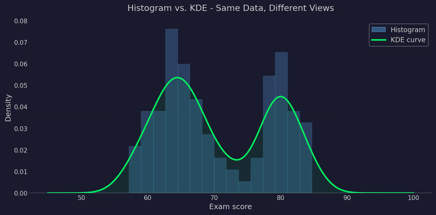
Histogram compared to KDE
In practice, they're often used together: a histogram for the counts, a KDE curve overlaid on top for the shape.
Python gives you a couple of ways to compute and plot KDE, depending on whether you need a quick chart or more control over the estimate itself.
The fastest way to get a KDE plot is seaborn.kdeplot(). This is all it takes:
import seaborn as sns
import numpy as np

np.random.seed(42)
scores = np.concatenate([
    np.random.normal(65, 4, 60),
    np.random.normal(80, 3, 40)
])

sns.kdeplot(scores, bw_adjust=1)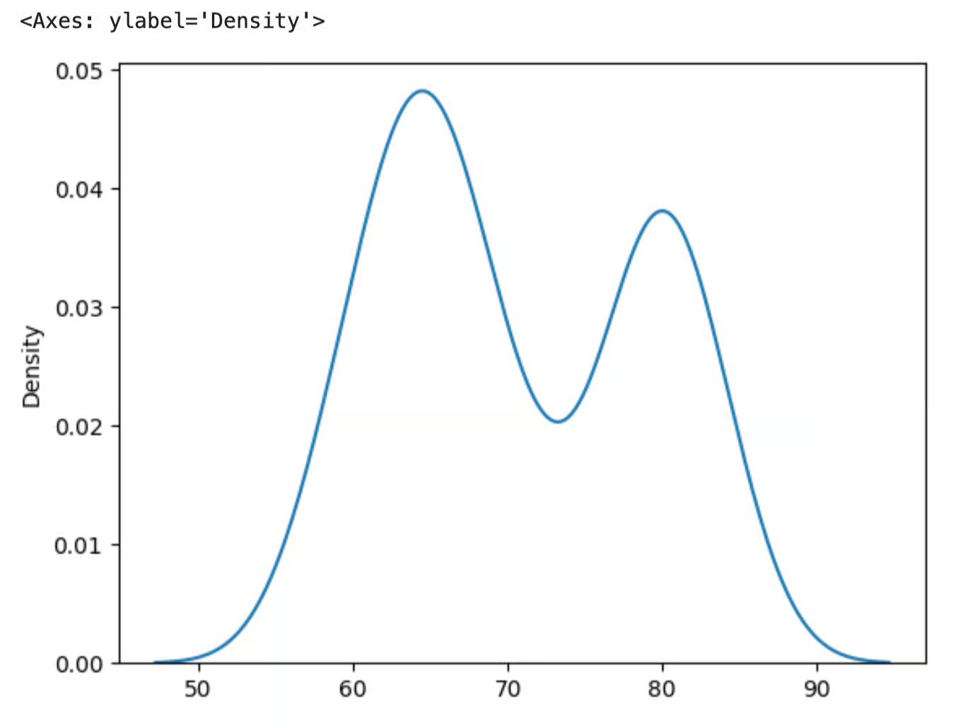
KDE with seaborn
The bw_adjust parameter scales the automatically selected bandwidth. Values below 1 tighten the curve, values above 1 smooth it out. It's a multiplier on top of whatever bandwidth seaborn internally picks, so you don't need to set a raw bandwidth value yourself.
The y-axis shows probability density, not counts. The curve tells you how likely a value is relative to the rest of the distribution. Higher means more data is concentrated there.
If you need the actual density values - not just a plot - use scipy.stats.gaussian_kde. This gives you a callable object you can evaluate at any point.
from scipy.stats import gaussian_kde
import numpy as np
import matplotlib.pyplot as plt

kde = gaussian_kde(scores, bw_method="scott")
x = np.linspace(45, 100, 500)
density = kde(x)

plt.plot(x, density)
bw_method="scott" uses Scott's rule to automatically pick the bandwidth. It’s a good default for most cases. You can also pass a scalar to set bandwidth manually.
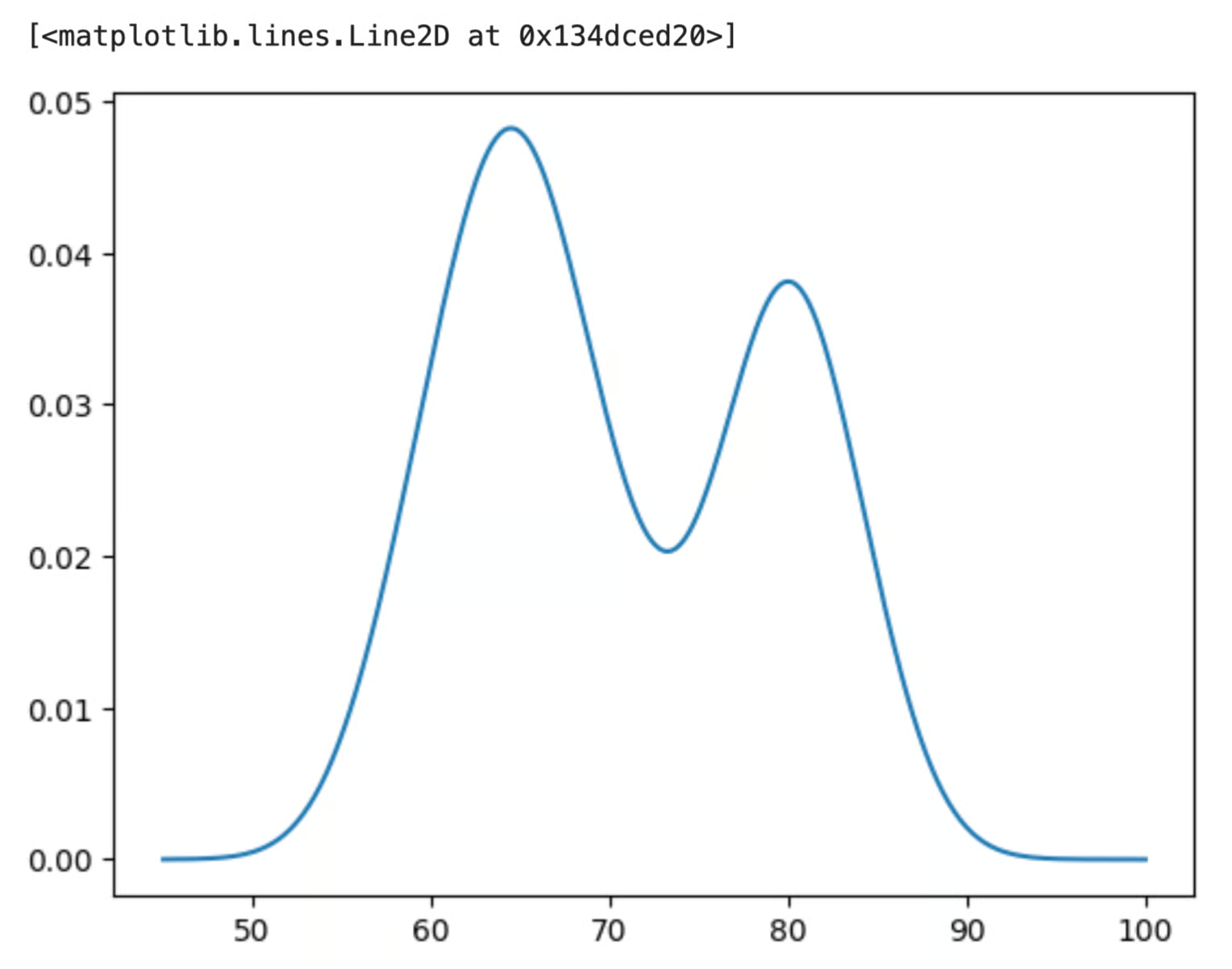
KDE with scipy and matplotlib
In R, KDE is built into the base language. You don't need any extra packages.
The density() function takes a numeric vector and returns a KDE object.
set.seed(42)
scores <- c(rnorm(60, mean = 65, sd = 4),
            rnorm(40, mean = 80, sd = 3))

kde <- density(scores, bw = "SJ")
The bw argument controls bandwidth selection. "SJ" uses the Sheather-Jones method, which handles multimodal distributions better than the default. You can also pass a numeric value to manually set the bandwidth.
The result is a list object with two key components:
kde$x: the sequence of points where the density was evaluatedkde$y: the corresponding density valuesJust pass the result directly to plot().
plot(kde,
     main = "Exam Score Distribution",
     xlab = "Score",
     ylab = "Density")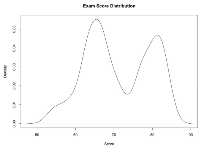
KDE plotted in R
To overlay the KDE on a histogram, use hist() with freq = FALSE first, then add the curve with lines().
hist(scores, freq = FALSE, main = "Histogram + KDE", xlab = "Score")
lines(kde, col = "blue", lwd = 2)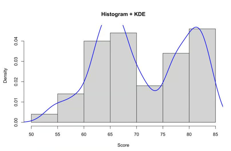
Histogram with KDE in R
freq = FALSE scales the histogram to density so both the bars and the curve share the same y-axis.
KDE is a genuinely useful visual, but like anything, it comes with trade-offs worth knowing before you use it to replace histograms.
The biggest selling point is that KDE makes no assumptions about your data's distribution. You don't need to decide upfront whether your data is normal, exponential, or anything else. The shape comes from the data itself, which makes KDE flexible enough to handle multimodal distributions and anything else that doesn't fit a standard parametric form.
The output is also a smooth, continuous curve rather than a stepped approximation. That makes it easier to spot patterns - things like multiple peaks or long tails - that a histogram might hide from you depending on bin choice.
And because KDE works on raw data without requiring you to fit a model first, it's a good first step in any exploratory analysis.
Bandwidth selection is the main weakness. If you get it wrong, the estimate either chases noise or smooths over real patterns in the data. Automatic methods like Silverman's rule work well for roughly normal data, but they can mislead you with complex distributions. You often need to manually check a couple of bandwidth values before trusting the result.
Performance can become a problem at scale. KDE evaluates a kernel function for every data point at every evaluation location, which means computation grows fast as your dataset gets larger. For most exploratory work this isn't an issue, but it can be slow on datasets with hundreds of thousands of points.
Boundary effects are a subtler problem. Standard KDE assumes data can extend infinitely in both directions. When your data has a hard boundary - like values that can't go below zero - the estimate leaks probability mass past that boundary, which produces a curve that's artificially low near the edge. There are boundary-corrected versions of KDE, but they're less commonly implemented in standard libraries.
KDE gives you a cleaner way to look at your data's distribution than histograms. There are no bin choices and no parametric assumptions - just a smooth curve that shows what's actually in your dataset.
Bandwidth is the one parameter that really matters. Try a couple of values, compare the curves, use automated options, and make sure the estimate matches what you know about your data before drawing conclusions from it.
The best way to build intuition for KDE is to run it on real data. Pick a dataset you're already familiar with, apply KDE, and compare with a histogram to see what you’ve been missing.
Interested in data visualization? Check our course on Data Visualization with Seaborn if you’re using Python, or Data Visualization with ggplot2 if you’re using R.
Learn with DataCamp
Courses
Courses
Courses
blogs
Moez Ali
15 นาที
Tutorials
Vinod Chugani
Tutorials
Dario Radečić
Tutorials
Josef Waples
Tutorials
Vidhi Chugh
Tutorials
Asael Alonzo Matamoros