Curso
Introducción a Python
4 h
6.9M
The Python programming language is a great option for data science and predictive analytics, as it comes equipped with multiple packages which cover most of your data analysis needs. For machine learning in Python, Scikit-learn (sklearn) is a great option and is built on NumPy, SciPy, and Matplotlib (N-dimensional arrays, scientific computing, and data visualization respectively).
In this tutorial, you’ll see how you can easily load in data from a database with sqlite3, how you can explore your data and improve its data quality with pandas and matplotlib, and how you can then use the Scikit-Learn package to extract some valid insights out of your data.
If you would like to take a machine learning course, check out DataCamp’s Supervised Learning with scikit-learn course.
In this project, you’ll test out several machine learning models from sklearn to predict the number of games that a Major-League Baseball team won that season, based on the teams statistics and other variables from that season. If I were a gambling man (and I most certainly am a gambling man), I could build a model using historic data from previous seasons to forecast the upcoming one. Given the time series nature of the data, you could generate indicators such as average wins per year over the previous five years, and other such factors, to make a highly accurate model. That is outside the scope of this tutorial, however and you will treat each row as independent. Each row of our data will consist of a single team for a specific year.
Sean Lahman compiled this data on his website and it was transformed to a sqlite database here.
You will read in the data by querying a sqlite database using the sqlite3 package and converting to a DataFrame with pandas. Your data will be filtered to only include currently active modern teams and only years where the team played 150 or more games.
First, download the file “lahman2016.sqlite” (here). Then, load Pandas and rename to pd for efficiency sake. You might remember that pd is the common alias for Pandas. Lastly, load sqlite3 and connect to the database, like this:
# import `pandas` and `sqlite3`import pandas as pdimport sqlite3# Connecting to SQLite Databaseconn = sqlite3.connect('lahman2016.sqlite')Next, you write a query, execute it and fetch the results.
# Querying Database for all seasons where a team played 150 or more games and is still active today. query = '''select * from Teams inner join TeamsFranchiseson Teams.franchID == TeamsFranchises.franchIDwhere Teams.G >= 150 and TeamsFranchises.active == 'Y';'''# Creating dataframe from query.Teams = conn.execute(query).fetchall()Tip: If you want to learn more about using SQL with Python, consider taking DataCamp’s Introduction to Databases in Python course.
Using pandas, you then convert the results to a DataFrame and print the first 5 rows using the head() method:
Each of the columns contain data related to a specific team and year. Some of the more important variables are listed below. A full list of the variables can be found here.
yearID - YearteamID - TeamfranchID - Franchise (links to TeamsFranchise table)G - Games playedW - WinsLgWin - League Champion(Y or N)WSWin - World Series Winner (Y or N)R - Runs scoredAB - At batsH - Hits by battersHR - Homeruns by battersBB - Walks by battersSO - Strikeouts by battersSB - Stolen basesCS - Caught stealingHBP - Batters hit by pitchSF - Sacrifice fliesRA - Opponents runs scoredER - Earned runs allowedERA - Earned run averageCG - Complete gamesSHO - ShutoutsSV - SavesIPOuts - Outs Pitched (innings pitched x 3)HA - Hits allowedHRA - Homeruns allowedBBA - Walks allowedSOA - Strikeouts by pitchersE - ErrorsDP - Double PlaysFP - Fielding percentagename - Team’s full nameFor those of you who maybe aren’t that familiar to baseball, here’s a brief explanation of how the game works, with some of the variables included.
Baseball is played between two teams (which you’ll find back in the data by name or teamID) of nine players each. These two teams take turns batting and fielding. The batting team attempts to score runs by taking turns batting a ball that is thrown by the pitcher of the fielding team, then running counter-clockwise around a series of four bases: first, second, third, and home plate. The fielding team tries to prevent runs by getting hitters or base runners out in any of several ways and a run (R) is scored when a player advances around the bases and returns to home plate. A player on the batting team who reaches base safely will attempt to advance to subsequent bases during teammates’ turns batting, such as on a hit (H), stolen base (SB), or by other means.

The teams switch between batting and fielding whenever the fielding team records three outs. One turn batting for both teams, beginning with the visiting team, constitutes an inning. A game is composed of nine innings, and the team with the greater number of runs at the end of the game wins. Baseball has no game clock and although most games end in the ninth inning, if a game is tied after nine innings it goes into extra innings and will continue indefinitely until one team has a lead at the end of an extra inning.
For a detailed explanation of the game of baseball, checkout the official rules of Major League Baseball.
As you can see above, the DataFrame doesn’t have column headers. You can add headers by passing a list of your headers to the columns attribute from pandas.
The len() function will let you know how many rows you’re dealing with: 2,287 is not a huge number of data points to work with, so hopefully there aren’t too many null values.
Prior to assessing the data quality, let’s first eliminate the columns that aren’t necessary or are derived from the target column (Wins). This is where knowledge of the data you are working with starts to become very valuable. It doesn’t matter how much you know about coding or statistics if you don’t have any knowledge of the data that you’re working with. Being a lifelong baseball fan certainly helped me with this project.
As you read above, null values influence the data quality, which in turn can cause issues with machine learning algorithms.
That’s why you’ll remove those next. There are a few ways to eliminate null values, but it might be a better idea to first display the count of null values for each column so you can decide how to best handle them.
And here’s where you’ll see a trade-off: you need clean data, but you also don’t have a large amount of data to spare. Two of the columns have a relatively small amount of null values. There are 110 null values in the SO (Strike Outs) column and 22 in the DP (Double Play) column. Two of the columns have a relatively large amount of them. There are 419 null values in the CS (Caught Stealing) column and 1777 in the HBP (Hit by Pitch) column.
If you eliminate the rows where the columns have a small number of null values, you’re losing a little over five percent of our data. Since you’re trying to predict wins, runs scored and runs allowed are highly correlated with the target. You want data in those columns to be very accurate.
Strike outs (SO) and double plays (DP) aren’t as important.
I think you’re better off keeping the rows and filling the null values with the median value from each of the columns by using the fillna() method. Caught stealing (CS) and hit by pitch (HBP) aren’t very important variables either. With so many null values in these columns, it’s best to eliminate the columns all together.
Now that you’ve cleaned up your data, you can do some exploration. You can get a better feel for the data set with a few simple visualizations. matplotlib is an excellent library for data visualization.
You import matplotlib.pyplot and rename it as plt for efficiency. If you’re working with a Jupyter notebook, you need to use the %matplotlib inline magic.
You’ll start by plotting a histogram of the target column so you can see the distribution of wins.
# import the pyplot module from matplotlibimport matplotlib.pyplot as plt# matplotlib plots inline %matplotlib inline# Plotting distribution of winsplt.hist(df['W'])plt.xlabel('Wins')plt.title('Distribution of Wins')plt.show()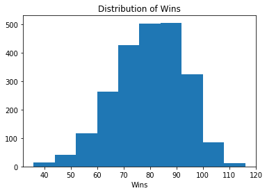
Note that if you're not using a Jupyter notebook, you have to make use of plt.show() to show the plots.
Print out the average wins (W) per year. You can use the mean() method for this.
It can be useful to create bins for your target column while exploring your data, but you need to make sure not to include any feature that you generate from your target column when you train the model. Including a column of labels generated from the target column in your training set would be like giving your model the answers to the test.
To create your win labels, you’ll create a function called assign_win_bins which will take in an integer value (wins) and return an integer of 1-5 depending on the input value.
Next, you’ll create a new column win_bins by using the apply() method on the wins column and passing in the assign_win_bins() function.
Now let’s make a scatter graph with the year on the x-axis and wins on the y-axis and highlight the win_bins column with colors.
# Plotting scatter graph of Year vs. Winsplt.scatter(df['yearID'], df['W'], c=df['win_bins'])plt.title('Wins Scatter Plot')plt.xlabel('Year')plt.ylabel('Wins')plt.show()
As you can see in the above scatter plot, there are very few seasons from before 1900 and the game was much different back then. Because of that, it makes sense to eliminate those rows from the data set.
When dealing with continuous data and creating linear models, integer values such as a year can cause issues. It is unlikely that the number 1950 will have the same relationship to the rest of the data that the model will infer.
You can avoid these issues by creating new variables that label the data based on the yearID value.
Anyone who follows the game of baseball knows that, as Major League Baseball (MLB) progressed, different eras emerged where the amount of runs per game increased or decreased significantly. The dead ball era of the early 1900s is an example of a low scoring era and the steroid era at the turn of the 21st century is an example of a high scoring era.
Let’s make a graph below that indicates how much scoring there was for each year.
You’ll start by creating dictionaries runs_per_year and games_per_year. Loop through the dataframe using the iterrows() method. Populate the runs_per_year dictionary with years as keys and how many runs were scored that year as the value. Populate the games_per_year dictionary with years as keys and how many games were played that year as the value.
Next, create a dictionary called mlb_runs_per_game. Iterate through the games_per_year dictionary with the items() method. Populate the mlb_runs_per_game dictionary with years as keys and the number of runs scored per game, league wide, as the value.
Finally, create your plot from the mlb_runs_per_game dictionary by putting the years on the x-axis and runs per game on the y-axis.
# Create lists from mlb_runs_per_game dictionarylists = sorted(mlb_runs_per_game.items())x, y = zip(*lists)# Create line plot of Year vs. MLB runs per Gameplt.plot(x, y)plt.title('MLB Yearly Runs per Game')plt.xlabel('Year')plt.ylabel('MLB Runs per Game')plt.show()
Now that you have a better idea of scoring trends, you can create new variables that indicate a specific era that each row of data falls in based on the yearID. You’ll follow the same process as you did above when you created the win_bins column.
This time however, you will create dummy columns; a new column for each era. You can use the get_dummies() method for this.
Since you already did the work to determine MLB runs per game for each year, add that data to the data set.
Now you’ll convert the years into decades by creating dummy columns for each decade. Then you can drop the columns that you don’t need anymore.
The bottom line in the game of baseball is how many runs you score and how many runs you allow. You can significantly increase the accuracy of your model by creating columns which are ratios of other columns of data. Runs per game and runs allowed per game will be great features to add to our data set.
Pandas makes this very simple as you create a new column by dividing the R column by the G column to create the R_per_game column.
Now look at how each of the two new variables relate to the target wins column by making a couple scatter graphs. Plot the runs per game on the x-axis of one graph and runs allowed per game on the x-axis of the other. Plot the W column on each y-axis.
# Create scatter plots for runs per game vs. wins and runs allowed per game vs. winsfig = plt.figure(figsize=(12, 6))ax1 = fig.add_subplot(1,2,1)ax2 = fig.add_subplot(1,2,2)ax1.scatter(df['R_per_game'], df['W'], c='blue')ax1.set_title('Runs per Game vs. Wins')ax1.set_ylabel('Wins')ax1.set_xlabel('Runs per Game')ax2.scatter(df['RA_per_game'], df['W'], c='red')ax2.set_title('Runs Allowed per Game vs. Wins')ax2.set_xlabel('Runs Allowed per Game')plt.show()
Before getting into any machine learning models, it can be useful to see how each of the variables is correlated with the target variable. Pandas makes this easy with the corr() method.
Another feature you can add to the dataset are labels derived from a K-means cluster algorithm provided by sklearn. K-means is a simple clustering algorithm that partitions the data based on the number of k centroids you indicate. Each data point is assigned to a cluster based on which centroid has the lowest Euclidian distance from the data point.
You can learn more about K-means clustering here.
First, create a DataFrame that leaves out the target variable:
One aspect of K-means clustering that you must determine before using the model is how many clusters you want. You can get a better idea of your ideal number of clusters by using sklearn’s silhouette_score() function. This function returns the mean silhouette coefficient over all samples. You want a higher silhouette score, and the score decreases as more clusters are added.
Now you can initialize the model. Set your number of clusters to 6 and the random state to 1. Determine the Euclidian distances for each data point by using the fit_transform() method and then visualize the clusters with a scatter plot.
# Create K-means model and determine euclidian distances for each data pointkmeans_model = KMeans(n_clusters=6, random_state=1)distances = kmeans_model.fit_transform(data_attributes)# Create scatter plot using labels from K-means model as colorlabels = kmeans_model.labels_plt.scatter(distances[:,0], distances[:,1], c=labels)plt.title('Kmeans Clusters')plt.show()
Now add the labels from your clusters into the data set as a new column. Also add the string “labels” to the attributes list, for use later.
Before you can build your model, you need to split your data into train and test sets. You do this because if you do decide to train your model on the same data that you test the model, your model can easily overfit the data: the model will more memorize the data instead of learning from it, which results in excessively complex models for your data. That also explains why an overfitted model will perform very poorly when you would try to make predictions with new data.
But don’t worry just yet, there are a number of ways to cross-validate your model.
This time, you will simply take a random sample of 75 percent of our data for the train data set and use the other 25 percent for your test data set. Create a list numeric_cols with all of the columns you will use in your model. Next, create a new DataFrame data from the df DataFrame with the columns in the numeric_cols list. Then, also create your train and test data sets by sampling the DataFrame data.
Mean Absolute Error (MAE) is the metric you’ll use to determine how accurate your model is. It measures how close the predictions are to the eventual outcomes. Specifically, for this data, that means that this error metric will provide you with the average absolute value that your prediction missed its mark.
This means that if, on average, your predictions miss the target amount by 5 wins, your error metric will be 5.
The first model you will train will be a linear regression model. You can import LinearRegression and mean_absolute_error from sklearn.linear_model and sklearn.metrics respectively, and then create a model lr. Next, you’ll fit the model, make predictions and determine mean absolute error of the model.
If you recall from above, the average number of wins was about 79 wins. On average, the model is off by only 2.687 wins.
Now try a Ridge regression model. Import RidgeCV from sklearn.linear_model and create model rrm. The RidgeCV model allows you to set the alpha parameter, which is a complexity parameter that controls the amount of shrinkage (read more here). The model will use cross-validation to deterime which of the alpha parameters you provide is ideal.
Again, fit your model, make predictions and determine the mean absolute error.
This model performed slightly better, and is off by 2.673 wins, on average.
This concludes the first part of this tutorial series in which you have seen how you can use scikit-Learn to analyze sports data. You imported the data from an SQLite database, cleaned it up, explored aspects of it visually, and engineered several new features. You learned how to create a K-means clustering model, a couple different Linear Regression models, and how to test your predictions with the mean absolute error metric.
In the second part, you’ll see how to use classification models to predict which players make it into the MLB Hall of Fame.
Python Courses
Curso
Curso
Curso
Tutorial
Daniel Poston
Tutorial
Kevin Babitz
Tutorial
Kurtis Pykes
Tutorial
Hugo Bowne-Anderson
Tutorial
Aditya Sharma
code-along
George Boorman