Seven Tricks for Better Data Storytelling: Part II
In a recent episode of DataFramed, Andy Cotgrave, technical evangelist at Tableau, shared the importance of data storytelling in driving change with analytics. In this two-part blog post, we deep dive into seven concrete tips that Andy provided on data storytelling
Google로 계속하기계속 진행하시면 다음 사항에 동의하는 것으로 간주됩니다: 이용약관 및 개인정보 처리방침 그리고 귀하의 데이터가 미국에 저장된다는 점에 동의하는 것으로 간주됩니다.
4. Use a narrative structure in data stories.
Stories generally follow a common arc – the protagonist faces a challenge, goes on to resolve it, then returns to normalcy. An example of this arc is the Hero’s Journey.
Figure 1: The hero’s journey
The audience is 22 times more likely to remember a fact when told a story. Clearly, data visualizations stand to benefit from adopting the age-old narrative structure.
Adopting the narrative structure, a data story starts with a background on the current situation, continues with evidence that builds up to the central insight, and ends with a call to action. (Figure 2)
Figure 3A: To set the scene, the data story first established the impact of COVID-19 on poverty-stricken countries. [Source]
Figure 3B: The data story provided rising insights by highlighting the widening chasm between the haves and the have-nots pre-pandemic and post-pandemic.
Figure 3C: The data story closes with a call to action–for greater investments in women, communities, and innovations.
5. Adapt data stories to the medium
It is tempting to reuse existing charts across multiple mediums. Data storytellers who do so are doing themselves a disservice.
Charts that are not optimized for their medium might fail to deliver their message effectively. A chart originally designed for email might contain minuscule texts that cannot be read on a screen.
The Economist portrayed how data stories can be adapted from print media to social media. The printed chart (designed for serious readers) was dense in information. It was streamlined for Instagram (designed for casual scrollers).
Figure 4: The Economist’s printed chart (left) is adapted for social media (right) [Source]
6. Declutter your data stories
Clutter makes data stories harder to read. The additional cognitive load distracts the audience from the main message.
The onus is on the data storyteller to identify and remove superfluous elements that do not contribute to the intended message. The result of decluttering is striking.
Label data directly (as opposed to using a legend)
Remove data markers
Use special effects (bold, underline, italics, shadows) sparingly
7. Explain data stories in stages
When presenting complex data stories, one practical tip is to reveal the elements of the chart gradually. When the information is presented in digestible pieces, the audience is more likely to engage with the presentation.
A prime example is the talk “The Joy of Stats” by Hans Rosling. Watch how Rosling masterfully told his data story.
Data storytelling is here to stay
Data storytelling will soon become a necessary skill set for all in the coming decade as data insights become a cornerstone of organizations. To learn more tips and tricks on data storytelling, listen to Andy’s podcast, or learn from his most recent webinar on DataCamp.
With proper design skills, data teams have the power to frame arguments and persuade with data. That was the key takeaway from a recent episode of DataFramed featuring Andy Cotgrave, the technical evangelist at Tableau.
Effective data storytelling enables data practitioners to cross the last mile of analytics, enabling them to drive action with their insights. In a recent webinar, Brent Dykes discussed how data, narrative, and visuals can drive effective data stories.
In this episode of DataFramed, we speak with Andy Cotgreave, Technical Evangelist at Tableau about the role of data storytelling when driving change with analytics, and the importance of the analyst role within a data-driven organization.
Brent, Lea and Andy shed light on the art of blending analytics with storytelling, a key to making data-driven insights both understandable and influential within any organization.


 DataCamp Team · 5 min

 Adel Nehme · 51 min

4. Use a narrative structure in data stories.
Stories generally follow a common arc – the protagonist faces a challenge, goes on to resolve it, then returns to normalcy. An example of this arc is the Hero’s Journey.
The audience is 22 times more likely to remember a fact when told a story. Clearly, data visualizations stand to benefit from adopting the age-old narrative structure.
Adopting the narrative structure, a data story starts with a background on the current situation, continues with evidence that builds up to the central insight, and ends with a call to action. (Figure 2)
An excellent example of a data story, the Goalkeeper’s Report by the Gates Foundation demonstrated how the pandemic exacerbated inequality. (Figures 3A, 3B, and 3C)
5. Adapt data stories to the medium
It is tempting to reuse existing charts across multiple mediums. Data storytellers who do so are doing themselves a disservice.
Charts that are not optimized for their medium might fail to deliver their message effectively. A chart originally designed for email might contain minuscule texts that cannot be read on a screen.
The Economist portrayed how data stories can be adapted from print media to social media. The printed chart (designed for serious readers) was dense in information. It was streamlined for Instagram (designed for casual scrollers).
6. Declutter your data stories
Clutter makes data stories harder to read. The additional cognitive load distracts the audience from the main message.
The onus is on the data storyteller to identify and remove superfluous elements that do not contribute to the intended message. The result of decluttering is striking.
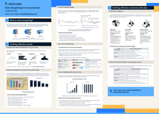
In particular, our whitepaper “8 Rules for Better Data Storytelling” suggests data storytellers to:
7. Explain data stories in stages
When presenting complex data stories, one practical tip is to reveal the elements of the chart gradually. When the information is presented in digestible pieces, the audience is more likely to engage with the presentation.
A prime example is the talk “The Joy of Stats” by Hans Rosling. Watch how Rosling masterfully told his data story.
Data storytelling is here to stay
Data storytelling will soon become a necessary skill set for all in the coming decade as data insights become a cornerstone of organizations. To learn more tips and tricks on data storytelling, listen to Andy’s podcast, or learn from his most recent webinar on DataCamp.