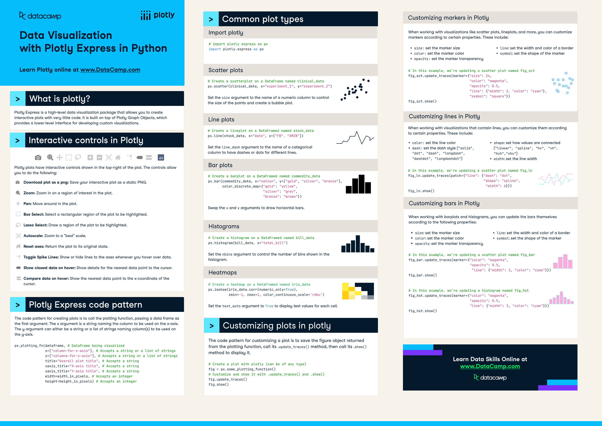
What is plotly?
Have this cheat sheet at your fingertips
Download PDFInteractive controls in Plotly
Plotly plots have interactive controls shown in the top-right of the plot. The controls allow you to do the following:
- Pan: Move around in the plot.
- Box Select: Select a rectangular region of the plot to be highlighted.
- Lasso Select: Draw a region of the plot to be highlighted.
- Autoscale: Zoom to a "best" scale.
- Reset axes: Return the plot to its original state.
- Toggle Spike Lines: Show or hide lines to the axes whenever you hover over data.
- Show closest data on hover: Show details for the nearest data point to the cursor.
- Compare data on hover: Show the nearest data point to the x-coordinate of the cursor.
Plotly Express code pattern
The code pattern for creating plots is to call the plotting function, passing a data frame as the first argument. The x argument is a string naming the column to be used on the x-axis. The y argument can either be a string or a list of strings naming column(s) to be used on the y-axis.
px.plotting_fn(dataframe, # Dataframe being visualized
               x=["column-for-x-axis"], # Accepts a string or a list of strings
               y=["columns-for-y-axis"], # Accepts a string or a list of strings

               title="Overall plot title", # Accepts a string
               xaxis_title="X-axis title", # Accepts a string
               yaxis_title="Y-axis title", # Accepts a string
               width=width_in_pixels, # Accepts an integer
               height=height_in_pixels) # Accepts an integer
Common plot types
# First import plotly express as px
import plotly.express as px
Scatter plots
# Create a scatterplot on a DataFrame named clinical_data

px.scatter(clinical_data, x="experiment_1", y="experiment_2")
Set the size argument to the name of a numeric column to control the size of the points and create a bubble plot.
Line plots
# Create a lineplot on a DataFramed named stock_data
px.line(stock_data, x="date", y=["FB", "AMZN"])
Set the line_dash argument to the name of a categorical column to have dashes or dots for different lines.
Bar plots
# Create a barplot on a DataFramed named commodity_data
px.bar(commodity_data, x="nation", y=["gold", "silver", "bronze"],
       color_discrete_map={"gold": "yellow",

                           "silver": "grey",
                           "bronze": "brown"})
Swap the x and y arguments to draw horizontal bars.
Histograms
# Create a histogram on a DataFramed named bill_data
px.histogram(bill_data, x="total_bill")
Set the nbins argument to control the number of bins shown in the histogram.
Heatmaps
# Create a heatmap on a DataFramed named iris_data
px.imshow(iris_data.corr(numeric_only=True),
zmin=-1, zmax=1, color_continuous_scale='rdbu')
Set the text_auto argument to True to display text values for each cell.
Customizing plots in plotly
The code pattern for customizing a plot is to save the figure object returned from the plotting function, call its .update_traces() method, then call its .show() method to display it.
# Create a plot with plotly (can be of any type)
fig = px.some_plotting_function()

# Customize and show it with .update_traces() and .show()
fig.update_traces()
fig.show()
Customizing markers in Plotly
When working with visualizations like scatter plots, lineplots, and more, you can customize markers according to certain properties. These include:
size: set the marker sizecolor: set the marker coloropacity: set the marker transparencyline: set the width and color of a bordersymbol: set the shape of the marker
# In this example, we’re updating a scatter plot named fig_sct
fig_sct.update_traces(marker={ "size" : 24,
                           "color": "magenta",
                           "opacity": 0.5,
                           "line": {"width": 2, "color": "cyan"},
                           "symbol": "square"})
fig_sct.show()
Customizing lines in Plotly
When working with visualizations that contain lines, you can customize them according to certain properties. These include:
color: set the line colordash: set the dash style ("solid", "dot", "dash", "longdash", "dashdot", "longdashdot")shape: set how values are connected ("linear", "spline", "hv", "vh", "hvh","vhv")width: set the line width
# In this example, we’re updating a scatter plot named fig_ln

fig_ln.update_traces(patch={"line": {"dash": "dot",
                           "shape": "spline",
                           "width": 6}})
fig_ln.show()
Customizing bars in Plotly
When working with barplots and histograms, you can update the bars themselves according to the following properties:
size: set the marker sizecolor: set the marker coloropacity: set the marker transparencyline: set the width and color of a bordersymbol: set the shape of the marker
# In this example, we’re updating a scatter plot named fig_bar
fig_bar.update_traces(marker={"color": "magenta",
                              "opacity": 0.5,
                              "line": {"width": 2, "color": "cyan"}})
fig_bar.show()

# In this example, we’re updating a histogram named fig_hst
fig_hst.update_traces(marker={"color": "magenta",
                              "opacity": 0.5,
                              "line": {"width": 2, "color": "cyan"}})
fig_hst.show()
Have this cheat sheet at your fingertips
Download PDF