
courses
Google Sheets로 배우는 통계 입문
4
47.1K
Raw data looks manageable until you try to answer a simple question:
Suddenly, the sheet is doing that thing where it has all the information and none of the answers.
That’s where pivot tables help.
In Google Sheets, they give you a quick way to group, calculate, and reorganize data without writing formulas first.
In this guide, I’ll walk you through how to create a pivot table in Google Sheets, use the editor, and adjust it based on what you need.
To create a pivot table in Google Sheets, follow these steps:
Select the full dataset you want to summarize. Click any cell inside your table, then drag to highlight the complete range.
Before selecting, check the structure of your data:
If your dataset includes totals, exclude them because pivot tables should work from raw data.
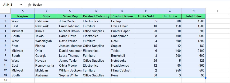
Select your data. Image by Author.
Once your data is selected, go to the ribbon and click Insert > Pivot table. A Create Pivot Table dialog box will appear, asking where you want the pivot table to appear.
You will see two options:
Select one and click Create. After this, Google Sheets opens a blank pivot table and the editor on the right.
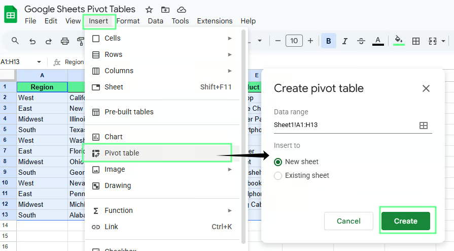
Create a pivot table in Google Sheets to a new sheet. Image by Author.
Once you click create, the pivot table editor will appear on the right side of the screen in the new sheet. It has four sections:
Each section controls how your data is grouped and summarized.
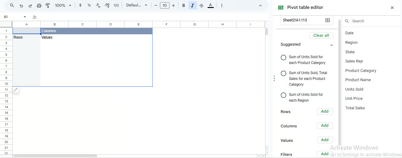
Pivot table editor panel. Image by Author.
The pivot table editor controls how your data is grouped and calculated. You don’t need to memorize the editor. You just need to know what each part controls.
Rows group your data vertically. When you add a field, the table creates one row for each unique value in that column.
For example, if you add Region to Rows, the pivot table will create one row for each region, such as East, West, and South.
If you want more detail, you can add another field under it.
Add Product below Region
Now each region expands into products. You will see something like:
Columns group data across the top. They work the same way as Rows, but horizontally.
For example, if you add Product to Columns, each product becomes a column header.
This helps when you want to compare categories side by side.
If rows already have Region, adding Product to columns shows how each product performs within each region.
Tip: Keep this simple. Too many columns make the table harder to read.
Values define what gets calculated. When you add a numeric field, Google Sheets applies a calculation. It usually defaults to SUM(). One could also do COUNT() or AVERAGE().
For example, if you add Revenue to Values, you will get a SUM() of Revenue.
If your pivot table is grouped by Region, then adding Revenue to Values will show total revenue for each region.
Tip: If your numbers look wrong, check the source data first. A column stored as text will not sum correctly.
Filters control which data is included in the pivot table. They do not change your original dataset; they only change what is visible in the summary.
For example, if you add Region to Filters, you can choose to show only East or West data without changing the source table itself.
If the result does not look right, the problem is often in the source data, not in the pivot table itself.
Check these:
That last one happens a lot. Putting a field in Rows instead of Values changes the whole layout. To fix this, remove it and add it to the correct section.
To summarize data in a pivot table, add a numeric field to Values and choose how you want it calculated.
You will mainly use these three:
SUM() for totals
COUNT() for number of entries
AVERAGE() for typical values
Each one gives a different view of the same dataset.
Here’s an example to understand this better.
Let's say I want to calculate how much sales each region generates. For this, set up the pivot table like this:
Add Region to Rows
Add Total Sales to Values
In Summarize by field, Google Sheets will apply the SUM() of Total Sales, so you’ll see total sales for each region.
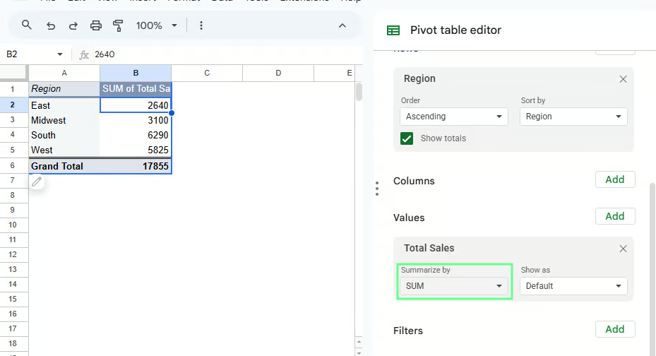
Summarize the data using a Pivot table. Image by Author.
You can change the calculation from the Summarize by dropdown:
Switch to AVERAGE() to see average sales per transaction
Switch to COUNT() to see how many sales entries each region has
If the numbers look off, check a few things:
Most issues come from one of these.
Grouping reduces detail, so the table is easier to read. You can group data in three ways:
Use category fields like Region, State, or Product Category when you want to combine similar items into one group.
For example, if you want to see how much each product category contributes to total sales:
Add Product Category to Rows
Add Total Sales to Values
The pivot table will show one total per category, such as Electronics, Furniture, and Office Supplies.
If you need more detail, you can layer another field under it.
Add Product Name below Product Category
Now each category expands into individual products, so you can see what drives the totals within each group.
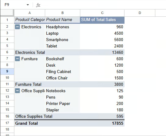
Group data by category using a Pivot table. Image by Author.
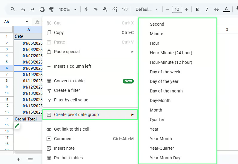
Dates often create long, hard-to-read lists. Grouping turns them into time periods.
For example, to analyze sales over time:
Add Date to Rows
Right-click any date in the pivot table
Select Create pivot data group and choose Month or Year
Instead of seeing every single date, you’ll see grouped values like Jan 2025 or 2026.
If grouping doesn’t work, check the data type because dates stored as text won’t group.
Group data by dates using a pivot table. Image by Author.
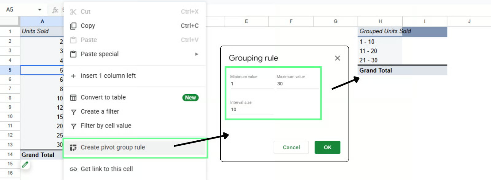
Use numeric grouping when you don’t need exact values and want to see the distribution instead.
For example, to analyze how orders are spread by quantity:
Add Units Sold to Rows
Right-click a value
Select Create pivot group rule
Set your range, for example:
The pivot table will group values into ranges like 1–10, 11–20, and 21–30.
Group data by numeric range using a pivot table. Image by Author.
Use grouping when:
If your pivot table shows too much data, use filters to narrow it down. With filters, you can focus on one region, one product, or any segment without changing the original dataset.
Assume your pivot table is set up like this:
Product Category in Rows
Total Sales in Values
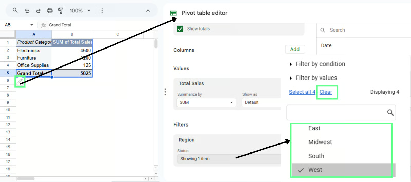
Now you want to see category-wise sales for a specific region. To add this filter:
Click anywhere in the pivot table
Open the Pivot table editor (right side panel)
In Filters, click Add
Select Region
Once added, a filter dropdown appears:
Open the Region dropdown
Uncheck all
Select West
The pivot table updates to show only West. All totals and calculations adjust based on that selection.
You can switch the selection anytime:
No need to rebuild the table. Just change the filter.
Filter the data using a pivot table. Image by Author.
Use filters when:
Once the table works, clean it up so people can actually read it. Let’s see how to do it:
Sorting helps you see the top or bottom performers quickly. For example, to find which category or region has the highest sales:
Click anywhere in the pivot table
Open the Pivot table editor
Under Rows (such as Product Category or Region)
Use Sort by and select SUM of Total Sales
Set order to Descending
The highest value moves to the top. Switch to ascending if you want the lowest first.
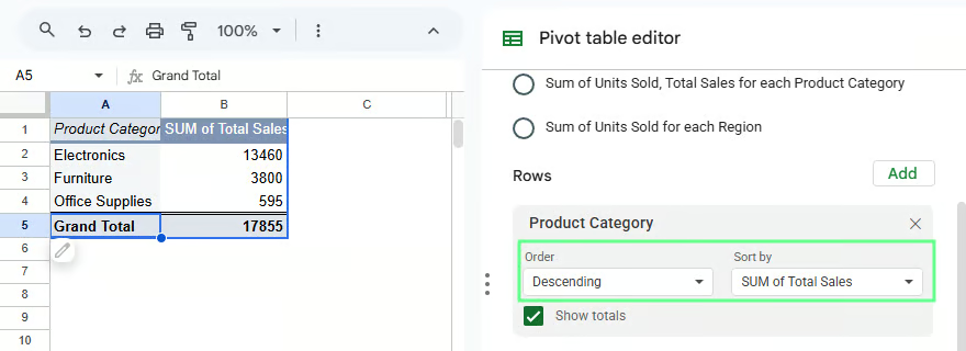
Sort the data in the pivot table. Image by Author.
You can change how values are calculated at any time. For example, to switch from total sales to average sales:
Go to Values
Click Total Sales
In Summarize by, select AVERAGE()
The table now shows average values instead of totals. Other options like COUNT() are useful when you want frequency instead of totals.
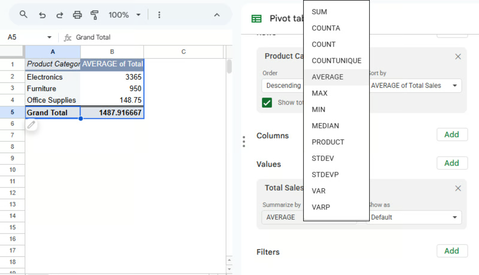
Use other aggregation types to calculate in the pivot table. Image by Author.
Formatting makes the table easier to read. For example, to display sales as currency:
Values now appear in a readable format.
You can also use percentages or add decimals depending on what you’re showing. This only changes how values appear, not the data itself.
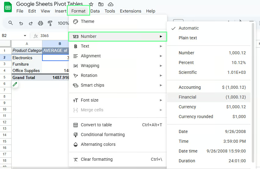
Format the numbers in the Pivot table. Image by Author.
Default labels can get awkward. For example, “SUM of Total Sales” is correct but not something you want to present.
To rename it:
This is a minor change, but it makes the table easier to read.
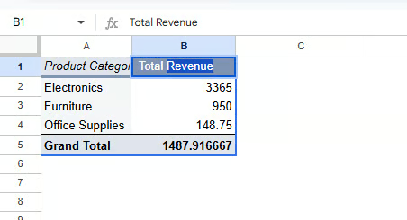
Change the name of the fields in the pivot table. Image by Author.
If your dataset does not already have the value you need, create it using a calculated field. This way, you can run your own calculation inside the pivot table without changing the original data.
A calculated field creates a new value based on existing columns. For example, instead of using Total Sales directly, create a new metric like profit.
The pivot table will calculate it for you.
Here’s how to create one:
You will see a formula box where you can use your column names.
For example, let’s say my dataset has:
Now, instead of relying on Total Sales, I can calculate it inside the pivot table. In the calculated field, I enter the following formula:
='Units Sold' * 'Unit Price'Press enter and rename it to Revenue in the pivot table. The pivot table will now calculate revenue automatically for each group.
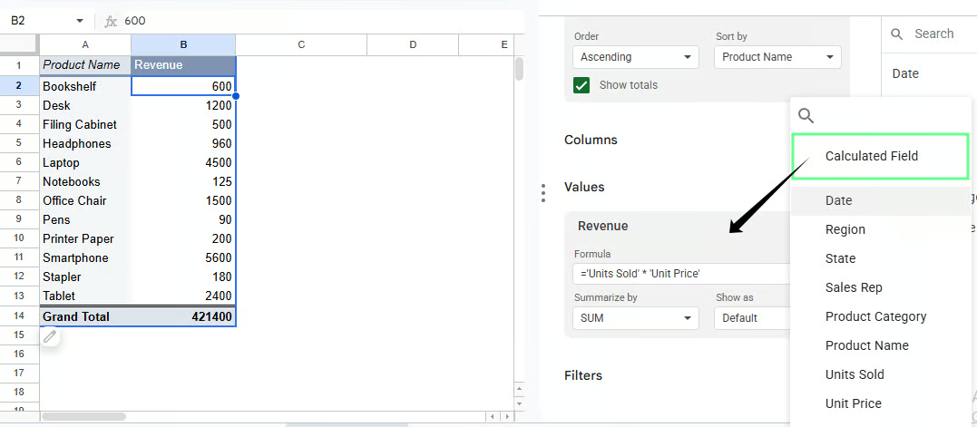
Calculated fields in a pivot table. Image by Author.
If your pivot table is grouped by Region, the calculated field will show profit for each region. If grouped by Product Category, it will show profit per category.
You do not need to rebuild anything. The calculation adjusts based on how your pivot table is structured.
A few things to remember:
Pivot table in Excel and Google Sheets offer the same core functionality. They help you summarize and analyze data. But here are some key differences:
|
Google Sheets |
Excel |
|
Simple, clean interface and beginner-friendly |
More complex interface with a steeper learning curve |
|
Real-time editing and sharing |
Limited collaboration (better with OneDrive) |
|
Cloud-based so works in a browser |
Desktop-based so works offline |
|
Slower with large datasets |
Handles large datasets efficiently |
|
Basic pivot table features |
More advanced pivot tools and controls |
|
Manual grouping required |
Auto groups by month, year, etc. |
|
Limited chart options |
Advanced charts and pivot charts |
|
Fewer customization options |
Features like slicers and deeper formatting |
|
Good for lightweight analysis |
Better for complex analysis and reporting |
Quick way to remember:
Sometimes you run into issues and do not know what went wrong. Most of the time, the problem is small and easy to fix once you know where to look.
Here are some common issues you may come across and their solutions:
If your pivot table does not reflect new data, it may be because the pivot table is linked to a fixed range.
To fix it:
Tip: Use a full column range like A:I if your data keeps growing.
Some rows or columns may be missing in the pivot table because the wrong range was selected while creating the pivot table.
To fix it:
Even missing one column can change your results.
Sometimes the dataset may not have proper headers, which is why fields do not appear correctly in the pivot table.
To fix it:
Your numbers may look incorrect because the pivot table is using the wrong calculation, like COUNT() instead of SUM().
To fix it:
Go to Values in the Pivot table editor
Click the field (for example, Total Sales)
Change Summarize by to the correct option
Totals or calculations may not work because your numeric values could be stored as text.
To fix it:
Here are some small habits that make a big difference in how easy Pivot tables are to use:
Clean your data first because if the data is messy, the pivot table will be messy too.
Use clear, consistent column names like Region, Total Sales, or Units Sold.
Avoid empty headers or duplicates.
Begin with one field in Rows and one in Values, then build from there.
Don’t overload the structure because too many rows, columns, or nested fields make the table harder to read.
At this point, you know how to build, adjust, and read a pivot table. Now it’s time to use it on real data.
Start with a dataset you already have. It could be anything, like sales data, survey responses, or any other data with rows and columns.
Build a simple table first:
Then change one thing at a time:
If you’re following along, don’t try every feature at once. Pick one question and use a pivot table to answer it. Then move to the next.
Learn with DataCamp
courses
courses
courses
tutorials
Aditya Sharma
tutorials
Ryan Sheehy
tutorials
Parul Pandey
tutorials
Laiba Siddiqui
tutorials
Filip Schouwenaars
tutorials
Aditya Sharma