
Kurs
Einführung in Statistik mit Google Sheets
4 Std.
47.1K
Rohdaten wirken machbar – bis du eine einfache Frage beantworten willst:
Plötzlich hat das Sheet alle Informationen – aber keine Antworten.
Genau hier helfen Pivot-Tabellen.
In Google Sheets kannst du damit Daten schnell gruppieren, berechnen und neu anordnen – ganz ohne zuerst Formeln zu schreiben.
In diesem Guide zeige ich dir, wie du in Google Sheets eine Pivot-Tabelle erstellst, den Editor nutzt und die Ansicht an deinen Bedarf anpasst.
Folge diesen Schritten, um eine Pivot-Tabelle in Google Sheets zu erstellen:
Markiere den kompletten Datensatz, den du zusammenfassen willst. Klicke in eine beliebige Zelle deiner Tabelle und ziehe dann, um den gesamten Bereich zu markieren.
Prüfe vorab die Struktur deiner Daten:
Wenn dein Datensatz Zwischensummen enthält, schließe sie aus – Pivot-Tabellen arbeiten mit Rohdaten.
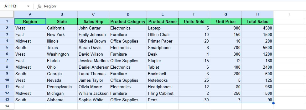
Wähle deine Daten aus. Bild: Autor.
Wenn die Daten markiert sind, gehe in die Menüleiste und klicke auf Einfügen > Pivot-Tabelle. Es öffnet sich das Dialogfeld Pivot-Tabelle erstellen, in dem du den Zielort auswählst.
Du hast zwei Optionen:
Wähle aus und klicke auf Erstellen. Danach öffnet Google Sheets eine leere Pivot-Tabelle und rechts den Editor.
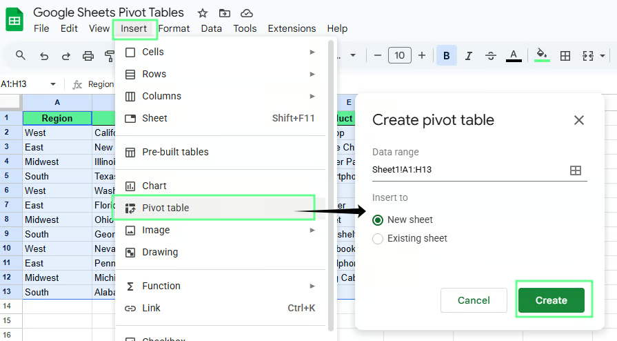
Erstelle eine Pivot-Tabelle in Google Sheets auf einem neuen Blatt. Bild: Autor.
Nach dem Klick auf Erstellen erscheint rechts im neuen Blatt der Pivot-Tabellen-Editor. Er hat vier Bereiche:
Jeder Bereich steuert, wie deine Daten gruppiert und zusammengefasst werden.
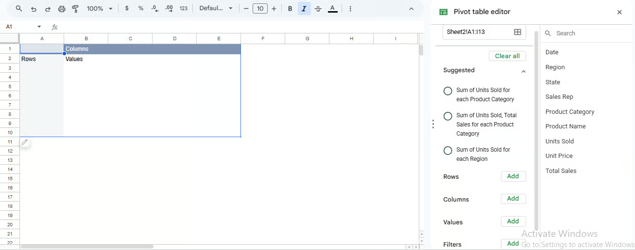
Pivot-Tabellen-Editor. Bild: Autor.
Der Editor steuert, wie deine Daten gruppiert und berechnet werden. Du musst ihn nicht auswendig kennen – wichtig ist, was welcher Teil bewirkt.
Zeilen gruppieren Daten vertikal. Wenn du ein Feld hinzufügst, erzeugt die Tabelle für jeden eindeutigen Wert in dieser Spalte eine Zeile.
Fügst du zum Beispiel Region zu Zeilen hinzu, erstellt die Pivot-Tabelle je eine Zeile für Ost, West und Süd.
Wenn du mehr Details willst, füge darunter ein weiteres Feld hinzu.
Product unter Region hinzufügen
Jetzt klappt jede Region in Produkte auf. Du siehst etwa:
Spalten gruppieren Daten oben quer. Sie funktionieren wie Zeilen, nur horizontal.
Wenn du z. B. Product zu Spalten hinzufügst, wird jedes Produkt zur Spaltenüberschrift.
So kannst du Kategorien direkt nebeneinander vergleichen.
Wenn die Zeilen bereits Region enthalten, zeigt Product in den Spalten, wie jedes Produkt in jeder Region performt.
Tipp: Halte es übersichtlich. Zu viele Spalten machen die Tabelle schwer lesbar.
Werte bestimmen, was berechnet wird. Wenn du ein numerisches Feld hinzufügst, wendet Google Sheets eine Berechnung an – standardmäßig meist SUM(). Möglich sind auch COUNT() oder AVERAGE().
Fügst du z. B. Revenue zu Werte hinzu, erhältst du die SUM() von Revenue.
Ist die Pivot-Tabelle nach Region gruppiert, zeigt Revenue in Werte den Gesamtumsatz je Region.
Tipp: Wirken Zahlen falsch, prüfe zuerst die Quelldaten. Als Text gespeicherte Zahlen lassen sich nicht korrekt summieren.
Filter steuern, welche Daten in der Pivot-Tabelle enthalten sind. Sie ändern nicht den Originaldatensatz, sondern nur die sichtbare Zusammenfassung.
Fügst du z. B. Region zu Filtern hinzu, kannst du nur Ost oder West anzeigen, ohne die Quelldaten zu verändern.
Wenn das Ergebnis nicht passt, liegt es oft an den Quelldaten – nicht an der Pivot-Tabelle.
Prüfe Folgendes:
Letzteres passiert häufig. Ein Feld in Zeilen statt in Werte ändert das ganze Layout. Lösung: Entfernen und im richtigen Bereich erneut hinzufügen.
Um Daten zusammenzufassen, füge ein numerisches Feld zu Werte hinzu und wähle die gewünschte Berechnung.
Meist nutzt du diese drei:
SUM() für Summen
COUNT() für die Anzahl der Einträge
AVERAGE() für Durchschnittswerte
Jede Option bietet eine andere Sicht auf denselben Datensatz.
Hier ein Beispiel zur Veranschaulichung.
Angenommen, ich will sehen, wie viel Umsatz jede Region generiert. Richte die Pivot-Tabelle so ein:
Region zu Zeilen hinzufügen
Total Sales zu Werte hinzufügen
Unter Zusammenfassen nach wendet Google Sheets SUM() auf Total Sales an – du siehst also den Gesamtumsatz je Region.
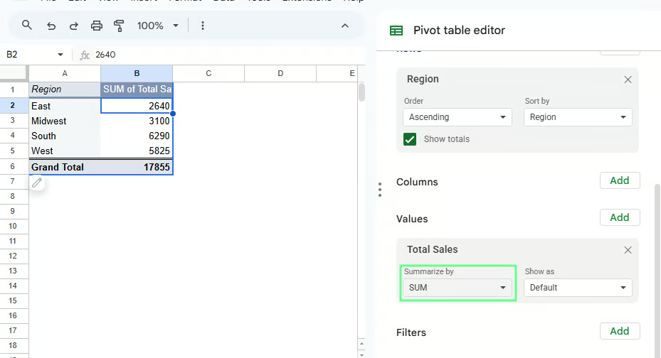
Daten mit einer Pivot-Tabelle zusammenfassen. Bild: Autor.
Du kannst die Berechnung im Dropdown Zusammenfassen nach ändern:
Wechsle zu AVERAGE(), um den durchschnittlichen Umsatz pro Transaktion zu sehen
Wechsle zu COUNT(), um die Anzahl der Umsatzzeilen je Region zu sehen
Wenn die Werte merkwürdig aussehen, prüfe Folgendes:
Die meisten Probleme hängen mit einem dieser Punkte zusammen.
Gruppieren reduziert Details und macht die Tabelle leichter lesbar. Du kannst auf drei Arten gruppieren:
Nutze Kategoriefelder wie Region, State oder Product Category, wenn du ähnliche Elemente zu einer Gruppe zusammenfassen willst.
Wenn du z. B. sehen willst, wie stark jede Produktkategorie zum Gesamtumsatz beiträgt:
Product Category zu Zeilen hinzufügen
Total Sales zu Werte hinzufügen
Die Pivot-Tabelle zeigt eine Summe pro Kategorie, z. B. Electronics, Furniture und Office Supplies.
Wenn du mehr Details brauchst, kannst du ein weiteres Feld darunter schichten.
Product Name unter Product Category hinzufügen
Jetzt klappt jede Kategorie in einzelne Produkte auf – so siehst du, was die Summen in jeder Gruppe treibt.
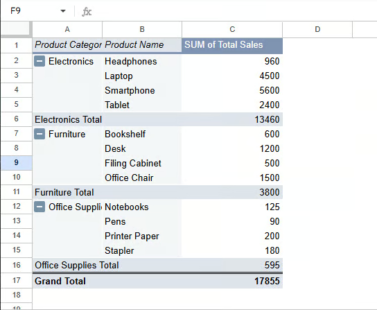
Daten nach Kategorie mit einer Pivot-Tabelle gruppieren. Bild: Autor.
Datumswerte erzeugen oft lange, schwer lesbare Listen. Gruppieren macht daraus Zeiträume.
Zum Beispiel für eine Zeitreihenanalyse der Umsätze:
Date zu Zeilen hinzufügen
Mit Rechtsklick auf ein Datum in der Pivot-Tabelle
Pivot-Datengruppe erstellen wählen und Monat oder Jahr auswählen
Statt jedes einzelne Datum siehst du Gruppen wie Jan 2025 oder 2026.
Wenn das Gruppieren nicht funktioniert, prüfe den Datentyp – als Text gespeicherte Daten lassen sich nicht gruppieren.
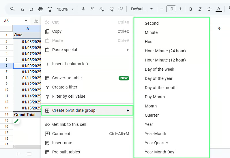
Daten nach Datum mit einer Pivot-Tabelle gruppieren. Bild: Autor.
Nutze numerische Gruppierung, wenn du keine exakten Werte brauchst, sondern die Verteilung sehen willst.
Zum Beispiel, um die Bestellmengen zu analysieren:
Units Sold zu Zeilen hinzufügen
Auf einen Wert rechtsklicken
Pivot-Gruppierungsregel erstellen auswählen
Lege deinen Bereich fest, zum Beispiel:
Die Pivot-Tabelle gruppiert nun in Bereiche wie 1–10, 11–20 und 21–30.
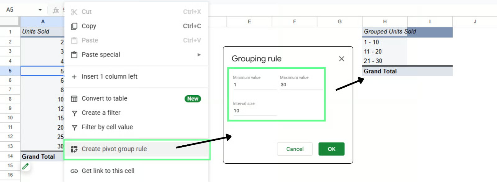
Daten nach Zahlenbereichen gruppieren. Bild: Autor.
Setze Gruppierungen ein, wenn:
Wenn deine Pivot-Tabelle zu viele Daten zeigt, grenze sie mit Filtern ein. So fokussierst du auf eine Region, ein Produkt oder ein Segment, ohne den Originaldatensatz zu ändern.
Angenommen, deine Pivot-Tabelle ist so aufgebaut:
Product Category in Zeilen
Total Sales in Werte
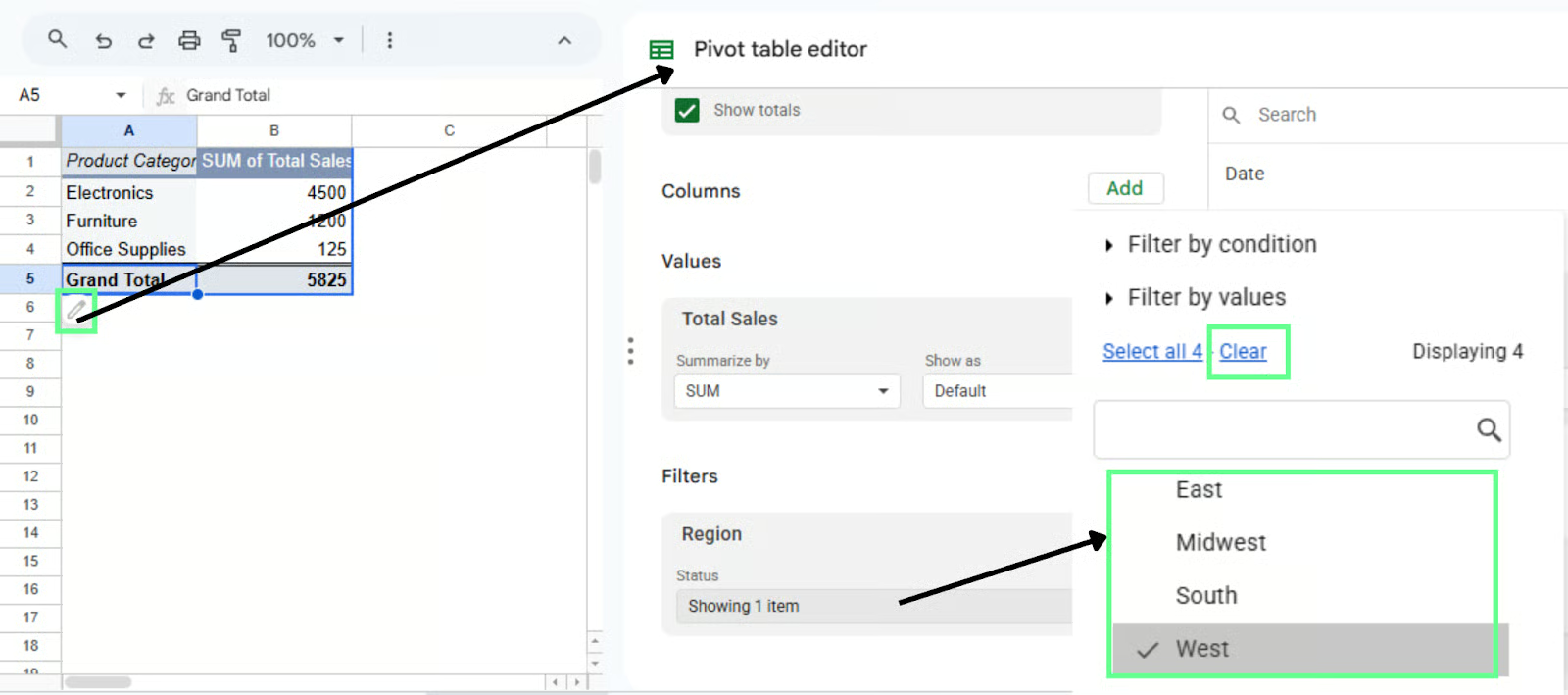
Jetzt willst du die Umsätze je Kategorie für eine bestimmte Region sehen. So fügst du den Filter hinzu:
Irgendwo in die Pivot-Tabelle klicken
Den Pivot-Tabellen-Editor öffnen (rechtes Seitenpanel)
Unter Filter auf Hinzufügen klicken
Region auswählen
Danach erscheint ein Filter-Dropdown:
Öffne das Dropdown Region
Alle abwählen
West auswählen
Die Pivot-Tabelle zeigt nun nur West. Alle Summen und Berechnungen passen sich an.
Du kannst die Auswahl jederzeit ändern:
Du musst die Tabelle nicht neu bauen. Ändere einfach den Filter.
Daten mit einer Pivot-Tabelle filtern. Bild: Autor.
Nutze Filter, wenn:
Wenn die Tabelle fachlich passt, mach sie lesbar. So geht’s:
Sortieren hilft, Top- oder Low-Performer schnell zu erkennen. Um z. B. die umsatzstärkste Kategorie oder Region zu finden:
Irgendwo in die Pivot-Tabelle klicken
PIVOT-Tabellen-Editor öffnen
Unter Zeilen (z. B. Product Category oder Region)
Bei Sortieren nach SUM von Total Sales wählen
Reihenfolge auf Absteigend setzen
Der höchste Wert steht nun oben. Aufsteigend zeigt den kleinsten zuerst.
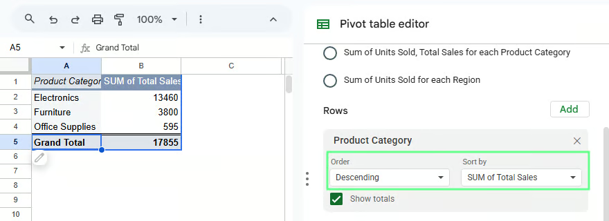
Daten in der Pivot-Tabelle sortieren. Bild: Autor.
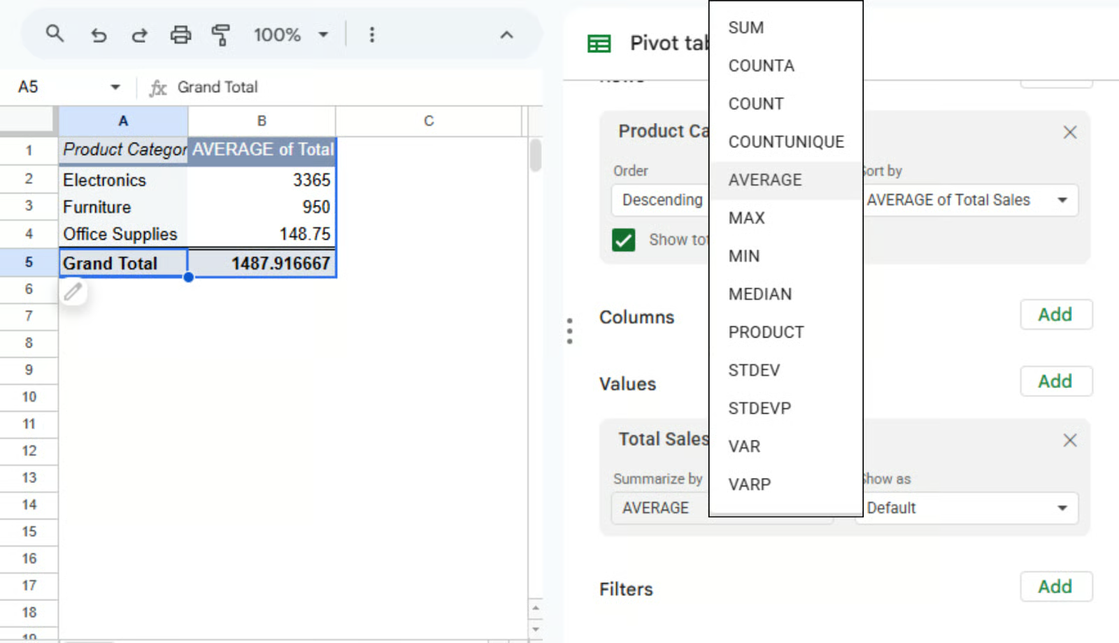
Du kannst jederzeit ändern, wie Werte berechnet werden. Zum Beispiel von Gesamtumsatz auf Durchschnittsumsatz:
Gehe zu Werte
Klicke auf Total Sales
Wähle unter Zusammenfassen nach AVERAGE()
Die Tabelle zeigt nun Durchschnittswerte statt Summen. Weitere Optionen wie COUNT() sind praktisch, wenn du Häufigkeiten statt Summen brauchst.
Andere Aggregationsarten in der Pivot-Tabelle nutzen. Bild: Autor.
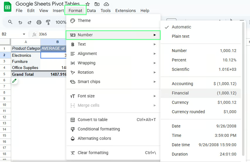
Formatierung macht die Tabelle besser lesbar. Um Umsätze z. B. als Währung anzuzeigen:
Die Werte erscheinen nun gut lesbar.
Du kannst auch Prozente oder Dezimalstellen nutzen – je nachdem, was du zeigst. Das ändert nur die Anzeige, nicht die Daten.
Zahlen in der Pivot-Tabelle formatieren. Bild: Autor.
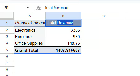
Standardbeschriftungen sind oft sperrig. „SUM von Total Sales“ ist korrekt, aber nichts für die Präsentation.
So benennst du um:
Kleine Änderung, große Wirkung für die Lesbarkeit.
Feldnamen in der Pivot-Tabelle ändern. Bild: Autor.
Fehlt in deinem Datensatz ein benötigter Wert, erstelle ihn als berechnetes Feld. So führst du deine eigene Berechnung in der Pivot-Tabelle aus, ohne die Originaldaten zu ändern.
Ein berechnetes Feld erzeugt einen neuen Wert auf Basis vorhandener Spalten. Statt Total Sales direkt zu nutzen, kannst du z. B. eine Kennzahl wie Gewinn berechnen.
Die Pivot-Tabelle übernimmt die Berechnung für dich.
So erstellst du ein berechnetes Feld:
Es erscheint ein Formelfeld, in dem du deine Spaltennamen verwenden kannst.
Angenommen, mein Datensatz hat:
Statt mich auf Total Sales zu verlassen, kann ich sie in der Pivot-Tabelle berechnen. Im berechneten Feld gebe ich ein:
='Units Sold' * 'Unit Price'Drücke Eingabe und benenne das Feld in der Pivot-Tabelle in Revenue um. Die Pivot-Tabelle berechnet den Umsatz nun automatisch für jede Gruppe.
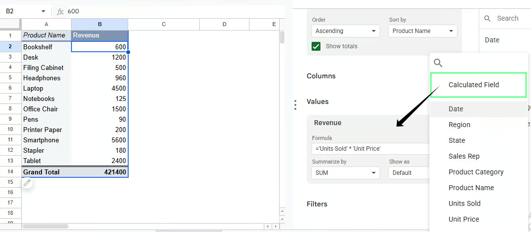
Berechnete Felder in einer Pivot-Tabelle. Bild: Autor.
Wenn deine Pivot-Tabelle nach Region gruppiert ist, zeigt das berechnete Feld den Gewinn je Region. Bei Product Category zeigt es den Gewinn pro Kategorie.
Du musst nichts neu aufbauen. Die Berechnung passt sich der Struktur deiner Pivot-Tabelle an.
Merke dir:
Pivot-Tabelle in Excel und Google Sheets bieten dieselben Kernfunktionen. Beide helfen dir, Daten zu verdichten und zu analysieren. Es gibt jedoch einige Unterschiede:
|
Google Sheets |
Excel |
|
Einfache, aufgeräumte Oberfläche, einsteigerfreundlich |
Komplexere Oberfläche mit steilerer Lernkurve |
|
Gemeinsames Bearbeiten in Echtzeit |
Eingeschränkte Zusammenarbeit (besser mit OneDrive) |
|
Cloudbasiert, läuft im Browser |
Desktopbasiert, funktioniert offline |
|
Langsamer bei großen Datensätzen |
Bewältigt große Datensätze effizient |
|
Grundlegende Pivot-Funktionen |
Erweiterte Pivot-Tools und -Steuerungen |
|
Manuelles Gruppieren erforderlich |
Automatisches Gruppieren nach Monat, Jahr etc. |
|
Begrenzte Diagrammoptionen |
Erweiterte Diagramme und Pivot-Charts |
|
Weniger Möglichkeiten zur Anpassung |
Features wie Slicer und tiefere Formatierung |
|
Gut für leichte Analysen |
Besser für komplexe Analysen und Reporting |
Schnell gemerkt:
Manchmal hakt es – und du weißt nicht, warum. Meist ist es eine Kleinigkeit, die sich leicht beheben lässt, wenn du weißt, wo du schauen musst.
Hier sind typische Probleme und ihre Lösungen:
Wenn neue Daten nicht erscheinen, ist die Pivot-Tabelle womöglich mit einem festen Bereich verknüpft.
So behebst du es:
Tipp: Nutze einen ganzen Spaltenbereich wie A:I, wenn deine Daten laufend wachsen.
Fehlende Zeilen oder Spalten entstehen oft, wenn beim Erstellen der Pivot-Tabelle ein falscher Bereich gewählt wurde.
So behebst du es:
Schon eine fehlende Spalte kann das Ergebnis verändern.
Ohne saubere Überschriften erscheinen Felder in der Pivot-Tabelle oft nicht korrekt.
So behebst du es:
Zahlen wirken inkorrekt, weil die falsche Berechnung verwendet wird – etwa COUNT() statt SUM().
So behebst du es:
Gehe im Pivot-Tabellen-Editor zu Werte
Feld anklicken (z. B. Total Sales)
Unter Zusammenfassen nach die richtige Option wählen
Summen oder Berechnungen funktionieren nicht, weil numerische Werte als Text gespeichert sind.
So behebst du es:
Diese kleinen Gewohnheiten machen Pivot-Tabellen deutlich angenehmer in der Nutzung:
Bereinige deine Daten zuerst – sind sie unordentlich, wird es die Pivot-Tabelle auch.
Nutze klare, einheitliche Spaltennamen wie Region, Total Sales oder Units Sold.
Vermeide leere Überschriften oder Duplikate.
Starte mit einem Feld in Zeilen und einem numerischen Feld in Werte und baue dann aus.
Überlade die Struktur nicht – zu viele Zeilen, Spalten oder verschachtelte Felder verschlechtern die Lesbarkeit.
Jetzt weißt du, wie du eine Pivot-Tabelle erstellst, anpasst und interpretierst. Zeit, das mit echten Daten auszuprobieren.
Starte mit einem Datensatz, den du schon hast – Verkaufszahlen, Umfrageantworten oder jede andere Tabelle mit Zeilen und Spalten.
Baue zuerst eine einfache Tabelle:
Ändere dann jeweils nur eine Sache:
Wenn du mitarbeitest, teste nicht alles auf einmal. Formuliere eine Frage und beantworte sie mit einer Pivot-Tabelle. Dann die nächste.
Mit DataCamp lernen
Kurs
Kurs
Kurs
Blog
Nathaniel Taylor-Leach
4 Min.
Tutorial
Aditya Sharma
Tutorial
Allan Ouko
Tutorial
Laiba Siddiqui
Tutorial
Satyabrata Pal
Tutorial
Sejal Jaiswal