Nearly every data science project involves studying correlations among variables. A correlation is the statistical summary of the relationship between two sets of variables. It is a core part of data exploratory analysis, and is a critical aspect of numerous advanced machine learning techniques. If you are considering breaking into data science, sooner or later in your data science journey you will need to learn correlation.
In this tutorial, we will explain what correlation is and its relevance when conducting data science projects. We will also have a look at the different correlation coefficients we can use to measure the strength and direction of the relationship between variables. We will use Python code to provide practical examples of how to measure and visualize correlations in a simple manner.
- What is Correlation?
- Correlation coefficients
- Calculating correlation in Python
- Correlation does not imply causation
- Conclusion
What is Correlation?
Correlation is the statistical analysis of the relationship or dependency between two variables. Correlation allows us to study both the strength and direction of the relationship between two sets of variables.
Studying correlation can be very useful in many data science tasks. First, it is a key component in data exploratory analysis; the initial study we conduct in our data to see how it looks, to summarize its main characteristics, and to discover partners and anomalies.
Second, correlations have many real-world applications. They can help us answer questions, such as whether there is a link between democracy and economic growth, or whether the use of cars correlates to the level of air pollution.
Finally, the study of correlation is critical in the field of machine learning. For example, some algorithms will not work properly if two or more variables are closely related, usually known as multicollinearity. Correlation is also the basis of Principal Component Analysis, a linear dimensionality reduction technique which is very useful in machine learning projects.
There are different types of correlation:
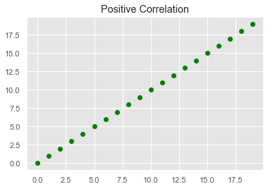
- Positive Correlation: Two variables are said to be positively correlated when their values move in the same direction. For example, in the image below, as the value for X increases, so does the value for Y at a constant rate:
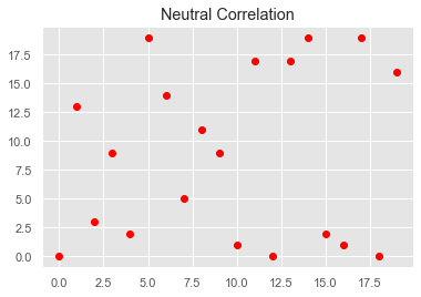
- Neutral Correlation: No relationship in the change of variables X and Y. In this case, the values are completely random and do not show any sign of correlation, as shown in the following image:
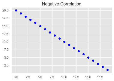
- Negative Correlation: Finally, variables X and Y will be negatively correlated when their values change in opposite directions, so here as the value for X increases, the value for Y decreases at a constant rate:
Plotting our data is the fastest and most effective way to discover the type of correlation between variables. The typical way to visualize the dependencies between two variables is with a scatterplot. A scatterplot is a graph in which the x-axis is the value of the first variable, and the y-axis is the value of the second variable. The last three images were types of scatterplots. Check out this video tutorial to see how to create a scatterplot in Python.
However, sometimes we will need not only to visualize correlation, but also to measure how strong the correlation is. This is where correlation coefficients come into play.
Correlation coefficients
A correlation coefficient is a statistical summary that measures the strength and direction to which two variables are associated with one another.
One of the advantages of correlation coefficients is that they estimate the correlation between two variables in a standardized way, meaning that the value of the coefficient will always be on the same scale, ranging from -1.0 to 1.0.
There are several correlation coefficients. Choosing one or another depends on what we know about the structure of the relationship between the variables. However, data scientists normally stick to the most famous one: Pearson's correlation coefficient.
Pearson's correlation coefficient
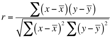
The Pearson's correlation coefficient (r) is a score that measures the strength of a linear relationship between two variables. It is calculated by dividing the covariance of variables X and Y by the product of the standard deviation of each variable, as shown in the following formula:
The coefficient is based on two assumptions. First, it assumes that the variables follow a normal or gaussian distribution. If the data is not normally distributed, then other coefficients may be more reliable.
Second, it assumes that there is a linear relationship between the two variables, meaning that the changes in the data can be modelled using a linear function (i.e. their values increase or decrease simultaneously at a constant rate). If the relationship between the two variables is closer to some straight line, then their (linear) correlation is stronger and the absolute value of Pearson's correlation coefficient is higher. For example, in the next image, all the data points can be perfectly modeled using a straight line, resulting in a correlation coefficient equal to 1.0.
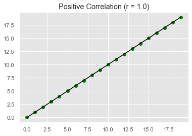
A coefficient of -1.0 indicates a perfect negative correlation, whereas a coefficient of 1.0 shows a perfect positive correlation. On the contrary, a coefficient of 0.0 indicates that there is no linear correlation between the variables.
Interpreting the coefficient becomes more difficult when its value is approaching zero. Several rules of thumb have been proposed to interpret the values of the coefficient. One of the most popular was formulated by Dennis E. Hinkle and his co-authors in their book Applied Statistics for the Behavioral Sciences:
 Rule of Thumb for Interpreting Correlation Coefficient. Hinkle, Wiersma, & Jurs.
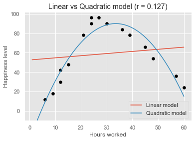
It is important to highlight that a Pearson's correlation coefficient close to 0.0 only indicates that there is no linear relationship between the variables. But it could happen that there is a strong, non-linear relationship instead. If a relationship between two variables is nonlinear, the rate of increase or decrease may change as one variable changes, drawing a curve-like pattern in the data. Such a trend could be better modeled by a nonlinear function, such as a quadratic or cubic function.
For example, the following image shows how the happiness level of workers varies depending on the hours worked per week. We can see that as the number of hours increases, happiness also goes up, but it starts declining beyond 35 hours approximately. The linear model (red line) is not well-suited to fit the data. Instead, a quadratic model (blue line), also known as a polynomial model with a degree of 2, seems a much better candidate to fit the curvy shape of the data. When the relationship is nonlinear, correlation generally underestimates how strong it is. This is the case in our example, where the coefficient is equal to 0.127, telling little about the nonlinear relationship between happiness and hours worked.
Other correlation coefficients
The biggest limitation of Pearson's correlation coefficient is that it assumes a linear relationship between the two variables. However, more often than not, variables are associated with a nonlinear relationship. Also, the data at hand may have a non-Gaussian distribution. To address this shortcoming, statisticians have proposed other types of estimates, namely the Spearman's rho and Kendall's tau correlation coefficients.
While Pearson's coefficient assumes linear relationships, Spearman's and Kendall's coefficients assume that the relationship between the variables is just monotonic. In a monotonic relationship, the variables tend to move in the same relative direction, but not necessarily at a constant rate. In other words, every linear relationship is monotonic, but not every monotonic relationship is linear.
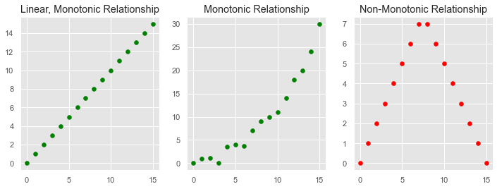
Instead of calculating the coefficients using the covariance and standard deviations of the variables, they are based on the relative rank of the values of the variables. This particularity makes them robust estimates against extreme values, and suitable to handle certain types of nonlinearities.
As with the Pearson correlation coefficient, the scores of Spearman's and Kendall's coefficients are between -1 and 1 for perfectly negatively correlated variables and perfectly positively correlated, respectively.
However, data scientists can generally stick to Pearson's correlation coefficient. The appeal of rank-based estimates is mostly for smaller data sets and specific hypothesis tests.
Calculating correlation in Python
There are various Python packages that can help us measure correlation. In this section, we will focus on the correlation functions available in three well-known packages: SciPy, NumPy, and pandas.
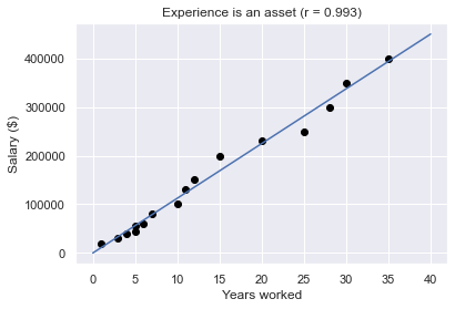
To try the functions, imagine we want to study the relationship between work experience (measured in years) and salary (measured in dollars) in a small yet successful startup comprising 16 workers.
experience = [1, 3, 4, 5, 5, 6, 7, 10, 11, 12, 15, 20, 25, 28, 30,35]

salary = [20000, 30000, 40000, 45000, 55000, 60000, 80000, 100000, 130000, 150000, 200000, 230000, 250000, 300000, 350000, 400000]
As we can see in the next graph, there is a strong positive correlation between the two variables, meaning that employees with more experience tend to have higher salaries.
SciPy is a great library to perform statistical operations. The scipy.stats module includes the pearsonr(x, y) function to calculate Pearson's correlation coefficient between two data samples.
import scipy.stats as stats

corr, _ = stats.pearsonr (experience, salary)
corr
0.9929845761480398
We could calculate Spearman's and Kendall's coefficient in the same fashion:
spearman_corr, _ = stats.spearmanr(experience, salary)
spearman_corr
0.9992644353546791

kendall_corr, _ = stats.kendalltau(experience, salary)
kendall_corr
0.9958246164193105
NumPy is a popular package that offers an extensive collection of advanced mathematical functions, including np.corrcoef() that returns a matrix of Pearson's correlation coefficients:
import numpy as np

np.corrcoef(experience, salary)
array([[1.        , 0.99298458],
       [0.99298458, 1.        ]])
A correlation matrix is a table showing correlation coefficients between variables. Each cell in the table shows the correlation between two variables. The diagonal of the matrix includes the coefficients between each variable and itself, which is always equal to 1.0. The other values in the matrix represent the correlation between experience and salary. In this case, as we are only calculating correlation for two variables, the values are the same.
Finally, we will usually need to calculate correlation for our variables stored in pandas DataFrames. Imagine we have our DataFrame with information about the workers of the startup:

If we wanted to calculate the correlation between two columns, we could use the pandas method .corr(), as follows:
import pandas as pd

df['experience'].corr(df['salary'])
0.9929845761480398
The .corr() includes the parameter "method", which can be used to calculate the three correlation coefficients. By default, it calculated Pearson's.
print(df['experience'].corr(df['salary'], method='spearman'))
print(df['experience'].corr(df['salary'], method='kendall'))
0.9992644353546791
0.9958246164193105
In case we wanted to explore the correlation between all the pairs of variables, we could simply use the .corr() method directly to our DataFrame, which results again in a correlation matrix with the coefficient of all the pairs of variables:
df.corr()

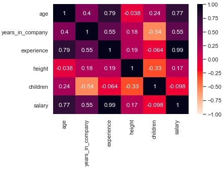
The correlation matrix can be very big and difficult to interpret if our DataFrame has many columns. To extract the insights of our matrix in a more effective way, we could use a heatmap; a data visualization technique where each value is represented by a color, according to its intensity in a given scale. The fastest way to create a heatmap is by using the function heatmap(), available in the seaborn library:
import seaborn as sns

sns.heatmap(df.corr(), vmin=-1, vmax=1,
annot=True,cmap="rocket_r")
plt.show()
Correlation does not imply causation
We could not finish this tutorial without mentioning an important remark: correlation does not imply causation.
The correlation only quantifies the strength and the direction of the relationship between two variables. There might be a strong correlation between two variables, but it does not allow us to conclude that one causes the other. When strong correlations are not causal, we call them spurious correlations.
Two scenarios could lead to spurious correlations:
- First, it could happen that there might be a third, "confounding" variable that is causing the two variables. Imagine there is a strong positive correlation between ice cream consumption and the number of heatstrokes in a given population. One may come to the absurd conclusion that eating ice cream is causing heatstrokes. However, what happens is both variables depend on a third one, most likely, the temperature. The higher the temperature, the more people will love to have ice cream, and also the more people will be likely to have a heatstroke.
- A second reason to be cautious with correlation is that dependencies between variables could be simply due to chance. This happens all the time, but more likely when we deal with small samples.
Finally, another reason to take correlation with caution is the world we live in is complex. A stronger correlation between two variables can easily lead us to conclude that one caused the other. The belief that a given effect has only one cause is called monocausality, but this is rarely the case. Several variables can be behind a certain effect. Thus, in order to consider causality, we first need to assume all the elements of a system and evaluate them not only quantitatively (i.e. through statistical methods) but also qualitatively.
For these reasons, before making any conclusion about relationships in our data, it is important to conduct a more thorough and detailed analysis to identify possible spurious correlations.
Conclusion
We hope you enjoyed this tutorial. Correlation is an important topic that every aspiring data scientist should learn. At DataCamp, we have a wide number of courses of statistics where we deal with correlation, causation, and other key statistical concepts, both with Python and R.
Once you have a solid understanding, we recommend you try DataLab, DataCamp's AI-enabled data notebook to write code and apply what you've learned without any installation hassle.