Course
Introduction to Python
4 hr
6.9M
Run and edit the code from this tutorial online
Run codePrincipal component analysis (PCA) is a linear dimensionality reduction technique that can be used to extract information from a high-dimensional space by projecting it into a lower-dimensional sub-space. If you are familiar with the language of linear algebra, you could also say that principal component analysis is finding the eigenvectors of the covariance matrix to identify the directions of maximum variance in the data.
One important thing to note about PCA is that it is an unsupervised dimensionality reduction technique, so you can cluster similar data points based on the correlation between them without any supervision (or labels).
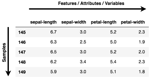
Note: Features, Dimensions, and Variables are all referring to the same thing. You will find them being used interchangeably.
Data Visualization: When working on any data related problem, the challenge in today's world is the sheer volume of data, and the variables/features that define that data. To solve a problem where data is the key, you need extensive data exploration like finding out how the variables are correlated or understanding the distribution of a few variables. Considering that there are a large number of variables or dimensions along which the data is distributed, visualization can be a challenge and almost impossible.
Hence, PCA can do that for you since it projects the data into a lower dimension, thereby allowing you to visualize the data in a 2D or 3D space with a naked eye.
Speeding Up a Machine Learning (ML) Algorithm: Since PCA's main idea is dimensionality reduction, you can leverage that to speed up your machine learning algorithm's training and testing time considering your data has a lot of features, and the ML algorithm's learning is too slow.
At an abstract level, you take a dataset having many features, and you simplify that dataset by selecting a few Principal Components from original features.
Principal components are the key to PCA; they represent what's underneath the hood of your data. In a layman term, when the data is projected into a lower dimension (assume three dimensions) from a higher space, the three dimensions are nothing but the three principal components that captures (or holds) most of the variance (information) of your data.
Principal components have both direction and magnitude. The direction represents across which principal axes the data is mostly spread out or has most variance and the magnitude signifies the amount of variance that principal component captures of the data when projected onto that axis. The principal components are a straight line, and the first principal component holds the most variance in the data. Each subsequent principal component is orthogonal to the last and has a lesser variance. In this way, given a set of x correlated variables over y samples you achieve a set of u uncorrelated principal components over the same y samples.
The reason you achieve uncorrelated principal components from the original features is that the correlated features contribute to the same principal component, thereby reducing the original data features into uncorrelated principal components; each representing a different set of correlated features with different amounts of variability. Each principal component represents a percentage of the total variability captured from the data.
In today's tutorial, we will apply PCA for the purpose of gaining insights through data visualization, and we will also apply PCA for the purpose of speeding up our machine learning algorithm. To accomplish the above two tasks, you will use two famous datasets: Breast Cancer and CIFAR - 10. The first is a numerical dataset; the second is an image dataset.
Before you go ahead and load the data, it's good to understand and look at the data that you will be working with!
The Breast Cancer data set is a real-valued multivariate data that consists of two classes, where each class signifies whether a patient has breast cancer or not. The two categories are: malignant and benign.
The malignant class has 212 samples, whereas the benign class has 357 samples.
It has 30 features shared across all classes: radius, texture, perimeter, area, smoothness, fractal dimension, etc.
You can download the breast cancer dataset from here, or rather an easy way is by loading it with the help of the sklearn library.
The CIFAR-10 (Canadian Institute For Advanced Research) dataset consists of 60000 images each of 32x32x3 color images having ten classes, with 6000 images per category.
The dataset consists of 50000 training images and 10000 test images.
The classes in the dataset are airplane, automobile, bird, cat, deer, dog, frog, horse, ship, truck.
You can download the CIFAR dataset from here, or you can also load it on the fly with the help of a deep learning library like Keras.
Now you will be loading and analyzing the Breast Cancer and CIFAR-10 datasets. By now you have an idea regarding the dimensionality of both datasets.
So, let's quickly explore both datasets.
Let's first explore the Breast Cancer dataset.
You will use sklearn's module datasets and import the Breast Cancer dataset from it.
from sklearn.datasets import load_breast_cancer
load_breast_cancer will give you both labels and the data. To fetch the data, you will call .data and for fetching the labels .target.
The data has 569 samples with thirty features, and each sample has a label associated with it. There are two labels in this dataset.
breast = load_breast_cancer()
breast_data = breast.data
Let's check the shape of the data.
breast_data.shape
(569, 30)
Even though for this tutorial, you do not need the labels but still for better understanding, let's load the labels and check the shape.
breast_labels = breast.target
breast_labels.shape
(569,)
Now you will import numpy since you will be reshaping the breast_labels to concatenate it with the breast_data so that you can finally create a DataFrame which will have both the data and labels.
import numpy as np
labels = np.reshape(breast_labels,(569,1))
After reshaping the labels, you will concatenate the data and labels along the second axis, which means the final shape of the array will be 569 x 31.
final_breast_data = np.concatenate([breast_data,labels],axis=1)
final_breast_data.shape
(569, 31)
Now you will import pandas to create the DataFrame of the final data to represent the data in a tabular fashion.
import pandas as pd
breast_dataset = pd.DataFrame(final_breast_data)
Let's quickly print the features that are there in the breast cancer dataset!
features = breast.feature_names
features
array(['mean radius', 'mean texture', 'mean perimeter', 'mean area',
       'mean smoothness', 'mean compactness', 'mean concavity',
       'mean concave points', 'mean symmetry', 'mean fractal dimension',
       'radius error', 'texture error', 'perimeter error', 'area error',
       'smoothness error', 'compactness error', 'concavity error',
       'concave points error', 'symmetry error',
       'fractal dimension error', 'worst radius', 'worst texture',
       'worst perimeter', 'worst area', 'worst smoothness',
       'worst compactness', 'worst concavity', 'worst concave points',
       'worst symmetry', 'worst fractal dimension'], dtype='<U23')
If you note in the features array, the label field is missing. Hence, you will have to manually add it to the features array since you will be equating this array with the column names of your breast_dataset dataframe.
features_labels = np.append(features,'label')
Great! Now you will embed the column names to the breast_dataset dataframe.
breast_dataset.columns = features_labels
Let's print the first few rows of the dataframe.
breast_dataset.head()
| mean radius | mean texture | mean perimeter | mean area | mean smoothness | mean compactness | mean concavity | mean concave points | mean symmetry | mean fractal dimension | ... | worst texture | worst perimeter | worst area | worst smoothness | worst compactness | worst concavity | worst concave points | worst symmetry | worst fractal dimension | label | |
|---|---|---|---|---|---|---|---|---|---|---|---|---|---|---|---|---|---|---|---|---|---|
| 0 | 17.99 | 10.38 | 122.80 | 1001.0 | 0.11840 | 0.27760 | 0.3001 | 0.14710 | 0.2419 | 0.07871 | ... | 17.33 | 184.60 | 2019.0 | 0.1622 | 0.6656 | 0.7119 | 0.2654 | 0.4601 | 0.11890 | 0.0 |
| 1 | 20.57 | 17.77 | 132.90 | 1326.0 | 0.08474 | 0.07864 | 0.0869 | 0.07017 | 0.1812 | 0.05667 | ... | 23.41 | 158.80 | 1956.0 | 0.1238 | 0.1866 | 0.2416 | 0.1860 | 0.2750 | 0.08902 | 0.0 |
| 2 | 19.69 | 21.25 | 130.00 | 1203.0 | 0.10960 | 0.15990 | 0.1974 | 0.12790 | 0.2069 | 0.05999 | ... | 25.53 | 152.50 | 1709.0 | 0.1444 | 0.4245 | 0.4504 | 0.2430 | 0.3613 | 0.08758 | 0.0 |
| 3 | 11.42 | 20.38 | 77.58 | 386.1 | 0.14250 | 0.28390 | 0.2414 | 0.10520 | 0.2597 | 0.09744 | ... | 26.50 | 98.87 | 567.7 | 0.2098 | 0.8663 | 0.6869 | 0.2575 | 0.6638 | 0.17300 | 0.0 |
| 4 | 20.29 | 14.34 | 135.10 | 1297.0 | 0.10030 | 0.13280 | 0.1980 | 0.10430 | 0.1809 | 0.05883 | ... | 16.67 | 152.20 | 1575.0 | 0.1374 | 0.2050 | 0.4000 | 0.1625 | 0.2364 | 0.07678 | 0.0 |
5 rows × 31 columns
Since the original labels are in 0,1 format, you will change the labels to benign and malignant using .replace function. You will use inplace=True which will modify the dataframe breast_dataset.
breast_dataset['label'].replace(0, 'Benign',inplace=True)
breast_dataset['label'].replace(1, 'Malignant',inplace=True)
Let's print the last few rows of the breast_dataset.
breast_dataset.tail()
| mean radius | mean texture | mean perimeter | mean area | mean smoothness | mean compactness | mean concavity | mean concave points | mean symmetry | mean fractal dimension | ... | worst texture | worst perimeter | worst area | worst smoothness | worst compactness | worst concavity | worst concave points | worst symmetry | worst fractal dimension | label | |
|---|---|---|---|---|---|---|---|---|---|---|---|---|---|---|---|---|---|---|---|---|---|
| 564 | 21.56 | 22.39 | 142.00 | 1479.0 | 0.11100 | 0.11590 | 0.24390 | 0.13890 | 0.1726 | 0.05623 | ... | 26.40 | 166.10 | 2027.0 | 0.14100 | 0.21130 | 0.4107 | 0.2216 | 0.2060 | 0.07115 | Benign |
| 565 | 20.13 | 28.25 | 131.20 | 1261.0 | 0.09780 | 0.10340 | 0.14400 | 0.09791 | 0.1752 | 0.05533 | ... | 38.25 | 155.00 | 1731.0 | 0.11660 | 0.19220 | 0.3215 | 0.1628 | 0.2572 | 0.06637 | Benign |
| 566 | 16.60 | 28.08 | 108.30 | 858.1 | 0.08455 | 0.10230 | 0.09251 | 0.05302 | 0.1590 | 0.05648 | ... | 34.12 | 126.70 | 1124.0 | 0.11390 | 0.30940 | 0.3403 | 0.1418 | 0.2218 | 0.07820 | Benign |
| 567 | 20.60 | 29.33 | 140.10 | 1265.0 | 0.11780 | 0.27700 | 0.35140 | 0.15200 | 0.2397 | 0.07016 | ... | 39.42 | 184.60 | 1821.0 | 0.16500 | 0.86810 | 0.9387 | 0.2650 | 0.4087 | 0.12400 | Benign |
| 568 | 7.76 | 24.54 | 47.92 | 181.0 | 0.05263 | 0.04362 | 0.00000 | 0.00000 | 0.1587 | 0.05884 | ... | 30.37 | 59.16 | 268.6 | 0.08996 | 0.06444 | 0.0000 | 0.0000 | 0.2871 | 0.07039 | Malignant |
5 rows × 31 columns
Next, you'll explore the CIFAR - 10 image dataset
You can load the CIFAR - 10 dataset using a deep learning library called Keras.
from keras.datasets import cifar10
Once imported, you will use the .load_data() method to download the data, it will download and store the data in your Keras directory. This can take some time based on your internet speed.
(x_train, y_train), (x_test, y_test) = cifar10.load_data()
The above line of code returns training and test images along with the labels.
Let's quickly print the shape of training and testing images shape.
print('Traning data shape:', x_train.shape)
print('Testing data shape:', x_test.shape)
Traning data shape: (50000, 32, 32, 3)
Testing data shape: (10000, 32, 32, 3)
Let's also print the shape of the labels.
y_train.shape,y_test.shape
((50000, 1), (10000, 1))
Let's also find out the total number of labels and the various kinds of classes the data has.
# Find the unique numbers from the train labels
classes = np.unique(y_train)
nClasses = len(classes)
print('Total number of outputs : ', nClasses)
print('Output classes : ', classes)
Total number of outputs :  10
Output classes :  [0 1 2 3 4 5 6 7 8 9]
Now to plot the CIFAR-10 images, you will import matplotlib and also use a magic (%) command %matplotlib inline to tell the jupyter notebook to show the output within the notebook itself!
import matplotlib.pyplot as plt
%matplotlib inline
For a better understanding, let's create a dictionary that will have class names with their corresponding categorical class labels.
label_dict = {
 0: 'airplane',
 1: 'automobile',
 2: 'bird',
 3: 'cat',
 4: 'deer',
 5: 'dog',
 6: 'frog',
 7: 'horse',
 8: 'ship',
 9: 'truck',
}
plt.figure(figsize=[5,5])

# Display the first image in training data
plt.subplot(121)
curr_img = np.reshape(x_train[0], (32,32,3))
plt.imshow(curr_img)
print(plt.title("(Label: " + str(label_dict[y_train[0][0]]) + ")"))

# Display the first image in testing data
plt.subplot(122)
curr_img = np.reshape(x_test[0],(32,32,3))
plt.imshow(curr_img)
print(plt.title("(Label: " + str(label_dict[y_test[0][0]]) + ")"))
Text(0.5, 1.0, '(Label: frog)')
Text(0.5, 1.0, '(Label: cat)')
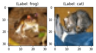
Even though the above two images are blurry, you can still somehow observe that the first image is a frog with the label frog, while the second image is of a cat with the label cat.
Now comes the most exciting part of this tutorial. As you learned earlier that PCA projects turn high-dimensional data into a low-dimensional principal component, now is the time to visualize that with the help of Python!
You start by Standardizing the data since PCA's output is influenced based on the scale of the features of the data.
It is a common practice to normalize your data before feeding it to any machine learning algorithm.
To apply normalization, you will import StandardScaler module from the sklearn library and select only the features from the breast_dataset you created in the Data Exploration step. Once you have the features, you will then apply scaling by doing fit_transform on the feature data.
While applying StandardScaler, each feature of your data should be normally distributed such that it will scale the distribution to a mean of zero and a standard deviation of one.
from sklearn.preprocessing import StandardScaler
x = breast_dataset.loc[:, features].values
x = StandardScaler().fit_transform(x) # normalizing the features
x.shape
(569, 30)
Let's check whether the normalized data has a mean of zero and a standard deviation of one.
np.mean(x),np.std(x)
(-6.826538293184326e-17, 1.0)
Let's convert the normalized features into a tabular format with the help of DataFrame.
feat_cols = ['feature'+str(i) for i in range(x.shape[1])]
normalised_breast = pd.DataFrame(x,columns=feat_cols)
normalised_breast.tail()
| feature0 | feature1 | feature2 | feature3 | feature4 | feature5 | feature6 | feature7 | feature8 | feature9 | ... | feature20 | feature21 | feature22 | feature23 | feature24 | feature25 | feature26 | feature27 | feature28 | feature29 | |
|---|---|---|---|---|---|---|---|---|---|---|---|---|---|---|---|---|---|---|---|---|---|
| 564 | 2.110995 | 0.721473 | 2.060786 | 2.343856 | 1.041842 | 0.219060 | 1.947285 | 2.320965 | -0.312589 | -0.931027 | ... | 1.901185 | 0.117700 | 1.752563 | 2.015301 | 0.378365 | -0.273318 | 0.664512 | 1.629151 | -1.360158 | -0.709091 |
| 565 | 1.704854 | 2.085134 | 1.615931 | 1.723842 | 0.102458 | -0.017833 | 0.693043 | 1.263669 | -0.217664 | -1.058611 | ... | 1.536720 | 2.047399 | 1.421940 | 1.494959 | -0.691230 | -0.394820 | 0.236573 | 0.733827 | -0.531855 | -0.973978 |
| 566 | 0.702284 | 2.045574 | 0.672676 | 0.577953 | -0.840484 | -0.038680 | 0.046588 | 0.105777 | -0.809117 | -0.895587 | ... | 0.561361 | 1.374854 | 0.579001 | 0.427906 | -0.809587 | 0.350735 | 0.326767 | 0.414069 | -1.104549 | -0.318409 |
| 567 | 1.838341 | 2.336457 | 1.982524 | 1.735218 | 1.525767 | 3.272144 | 3.296944 | 2.658866 | 2.137194 | 1.043695 | ... | 1.961239 | 2.237926 | 2.303601 | 1.653171 | 1.430427 | 3.904848 | 3.197605 | 2.289985 | 1.919083 | 2.219635 |
| 568 | -1.808401 | 1.221792 | -1.814389 | -1.347789 | -3.112085 | -1.150752 | -1.114873 | -1.261820 | -0.820070 | -0.561032 | ... | -1.410893 | 0.764190 | -1.432735 | -1.075813 | -1.859019 | -1.207552 | -1.305831 | -1.745063 | -0.048138 | -0.751207 |
5 rows × 30 columns
Now comes the critical part, the next few lines of code will be projecting the thirty-dimensional Breast Cancer data to two-dimensional principal components.
You will use the sklearn library to import the PCA module, and in the PCA method, you will pass the number of components (n_components=2) and finally call fit_transform on the aggregate data. Here, several components represent the lower dimension in which you will project your higher dimension data.
from sklearn.decomposition import PCA
pca_breast = PCA(n_components=2)
principalComponents_breast = pca_breast.fit_transform(x)
Next, let's create a DataFrame that will have the principal component values for all 569 samples.
principal_breast_Df = pd.DataFrame(data = principalComponents_breast
             , columns = ['principal component 1', 'principal component 2'])
principal_breast_Df.tail()
| principal component 1 | principal component 2 | |
|---|---|---|
| 564 | 6.439315 | -3.576817 |
| 565 | 3.793382 | -3.584048 |
| 566 | 1.256179 | -1.902297 |
| 567 | 10.374794 | 1.672010 |
| 568 | -5.475243 | -0.670637 |
explained_variance_ratio. It will provide you with the amount of information or variance each principal component holds after projecting the data to a lower dimensional subspace.print('Explained variability per principal component: {}'.format(pca_breast.explained_variance_ratio_))
Explained variability per principal component: [0.44272026 0.18971182]
From the above output, you can observe that the principal component 1 holds 44.2% of the information while the principal component 2 holds only 19% of the information. Also, the other point to note is that while projecting thirty-dimensional data to a two-dimensional data, 36.8% information was lost.
Let's plot the visualization of the 569 samples along the principal component - 1 and principal component - 2 axis. It should give you good insight into how your samples are distributed among the two classes.
plt.figure()
plt.figure(figsize=(10,10))
plt.xticks(fontsize=12)
plt.yticks(fontsize=14)
plt.xlabel('Principal Component - 1',fontsize=20)
plt.ylabel('Principal Component - 2',fontsize=20)
plt.title("Principal Component Analysis of Breast Cancer Dataset",fontsize=20)
targets = ['Benign', 'Malignant']
colors = ['r', 'g']
for target, color in zip(targets,colors):
    indicesToKeep = breast_dataset['label'] == target
    plt.scatter(principal_breast_Df.loc[indicesToKeep, 'principal component 1']
               , principal_breast_Df.loc[indicesToKeep, 'principal component 2'], c = color, s = 50)

plt.legend(targets,prop={'size': 15})
<matplotlib.legend.Legend at 0x14552a630>


<Figure size 432x288 with 0 Axes>
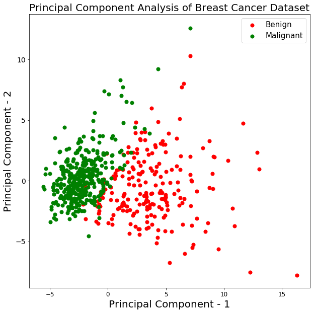
From the above graph, you can observe that the two classes benign and malignant, when projected to a two-dimensional space, can be linearly separable up to some extent. Other observations can be that the benign class is spread out as compared to the malignant class.
The following lines of code for visualizing the CIFAR-10 data is pretty similar to the PCA visualization of the Breast Cancer data.
normalize the pixels between 0 and 1 inclusive.np.min(x_train),np.max(x_train)
(0.0, 1.0)
x_train = x_train/255.0
np.min(x_train),np.max(x_train)
(0.0, 0.00392156862745098)
x_train.shape
(50000, 32, 32, 3)
Next, you will create a DataFrame that will hold the pixel values of the images along with their respective labels in a row-column format.
But before that, let's reshape the image dimensions from three to one (flatten the images).
x_train_flat = x_train.reshape(-1,3072)
feat_cols = ['pixel'+str(i) for i in range(x_train_flat.shape[1])]
df_cifar = pd.DataFrame(x_train_flat,columns=feat_cols)
df_cifar['label'] = y_train
print('Size of the dataframe: {}'.format(df_cifar.shape))
Size of the dataframe: (50000, 3073)
Perfect! The size of the dataframe is correct since there are 50,000 training images, each having 3072 pixels and an additional column for labels so in total 3073.
PCA will be applied on all the columns except the last one, which is the label for each image.
df_cifar.head()
| pixel0 | pixel1 | pixel2 | pixel3 | pixel4 | pixel5 | pixel6 | pixel7 | pixel8 | pixel9 | ... | pixel3063 | pixel3064 | pixel3065 | pixel3066 | pixel3067 | pixel3068 | pixel3069 | pixel3070 | pixel3071 | label | |
|---|---|---|---|---|---|---|---|---|---|---|---|---|---|---|---|---|---|---|---|---|---|
| 0 | 0.231373 | 0.243137 | 0.247059 | 0.168627 | 0.180392 | 0.176471 | 0.196078 | 0.188235 | 0.168627 | 0.266667 | ... | 0.847059 | 0.721569 | 0.549020 | 0.592157 | 0.462745 | 0.329412 | 0.482353 | 0.360784 | 0.282353 | 6 |
| 1 | 0.603922 | 0.694118 | 0.733333 | 0.494118 | 0.537255 | 0.533333 | 0.411765 | 0.407843 | 0.372549 | 0.400000 | ... | 0.560784 | 0.521569 | 0.545098 | 0.560784 | 0.525490 | 0.556863 | 0.560784 | 0.521569 | 0.564706 | 9 |
| 2 | 1.000000 | 1.000000 | 1.000000 | 0.992157 | 0.992157 | 0.992157 | 0.992157 | 0.992157 | 0.992157 | 0.992157 | ... | 0.305882 | 0.333333 | 0.325490 | 0.309804 | 0.333333 | 0.325490 | 0.313725 | 0.337255 | 0.329412 | 9 |
| 3 | 0.109804 | 0.098039 | 0.039216 | 0.145098 | 0.133333 | 0.074510 | 0.149020 | 0.137255 | 0.078431 | 0.164706 | ... | 0.211765 | 0.184314 | 0.109804 | 0.247059 | 0.219608 | 0.145098 | 0.282353 | 0.254902 | 0.180392 | 4 |
| 4 | 0.666667 | 0.705882 | 0.776471 | 0.658824 | 0.698039 | 0.768627 | 0.694118 | 0.725490 | 0.796078 | 0.717647 | ... | 0.294118 | 0.309804 | 0.321569 | 0.278431 | 0.294118 | 0.305882 | 0.286275 | 0.301961 | 0.313725 | 1 |
5 rows × 3073 columns
fit_transform on the training data, this can take few seconds since there are 50,000 samplespca_cifar = PCA(n_components=2)
principalComponents_cifar = pca_cifar.fit_transform(df_cifar.iloc[:,:-1])
Then you will convert the principal components for each of the 50,000 images from a numpy array to a pandas DataFrame.
principal_cifar_Df = pd.DataFrame(data = principalComponents_cifar
             , columns = ['principal component 1', 'principal component 2'])
principal_cifar_Df['y'] = y_train
principal_cifar_Df.head()
| principal component 1 | principal component 2 | y | |
|---|---|---|---|
| 0 | -6.401018 | 2.729039 | 6 |
| 1 | 0.829783 | -0.949943 | 9 |
| 2 | 7.730200 | -11.522102 | 9 |
| 3 | -10.347817 | 0.010738 | 4 |
| 4 | -2.625651 | -4.969240 | 1 |
variance the principal components hold.print('Explained variability per principal component: {}'.format(pca_cifar.explained_variance_ratio_))
Explained variability per principal component: [0.2907663 0.11253144]
Well, it looks like a decent amount of information was retained by the principal components 1 and 2, given that the data was projected from 3072 dimensions to a mere two principal components.
Its time to visualize the CIFAR-10 data in a two-dimensional space. Remember that there is some semantic class overlap in this dataset which means that a frog can have a slightly similar shape of a cat or a deer with a dog; especially when projected in a two-dimensional space. The differences between them might not be captured that well.
import seaborn as sns
plt.figure(figsize=(16,10))
sns.scatterplot(
    x="principal component 1", y="principal component 2",
    hue="y",
    palette=sns.color_palette("hls", 10),
    data=principal_cifar_Df,
    legend="full",
    alpha=0.3
)
<matplotlib.axes._subplots.AxesSubplot at 0x12a5ba8d0>
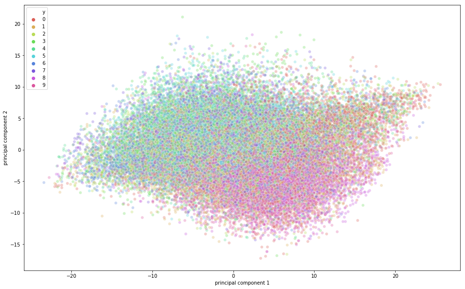
From the above figure, you can observe that some variation was captured by the principal components since there is some structure in the points when projected along the two principal component axis. The points belonging to the same class are close to each other, and the points or images that are very different semantically are further away from each other.
In this final segment of the tutorial, you will be learning about how you can speed up your Deep Learning Model's training process using PCA.
Note: To learn basic terminologies that will be used in this section, please feel free to check out this tutorial.
First, let's normalize the training and testing images. If you remember the training images were normalized in the PCA visualization part, so you only need to normalize the testing images. So, let's quickly do that!
x_test = x_test/255.0
x_test = x_test.reshape(-1,32,32,3)
Let's reshape the test data.
x_test_flat = x_test.reshape(-1,3072)
Next, you will make the instance of the PCA model.
Here, you can also pass how much variance you want PCA to capture. Let's pass 0.9 as a parameter to the PCA model, which means that PCA will hold 90% of the variance and the number of components required to capture 90% variance will be used.
Note that earlier you passed n_components as a parameter and you could then find out how much variance was captured by those two components. But here we explicitly mention how much variance we would like PCA to capture and hence, the n_components will vary based on the variance parameter.
If you do not pass any variance, then the number of components will be equal to the original dimension of the data.
pca = PCA(0.9)
Then you will fit the PCA instance on the training images.
pca.fit(x_train_flat)
PCA(copy=True, iterated_power='auto', n_components=0.9, random_state=None,
  svd_solver='auto', tol=0.0, whiten=False)
Now let's find out how many n_components PCA used to capture 0.9 variance.
pca.n_components_
99
From the above output, you can observe that to achieve 90% variance, the dimension was reduced to 99 principal components from the actual 3072 dimensions.
Finally, you will apply transform on both the training and test set to generate a transformed dataset from the parameters generated from the fit method.
train_img_pca = pca.transform(x_train_flat)
test_img_pca = pca.transform(x_test_flat)
Next, let's quickly import the necessary libraries to run the deep learning model.
from keras.models import Sequential
from keras.layers import Dense
from keras.utils import np_utils
from keras.optimizers import RMSprop
Now, you will convert your training and testing labels to one-hot encoding vector.
y_train = np_utils.to_categorical(y_train)
y_test = np_utils.to_categorical(y_test)
Let's define the number of epochs, number of classes, and the batch size for your model.
batch_size = 128
num_classes = 10
epochs = 20
Next, you will define your Sequential model!
model = Sequential()
model.add(Dense(1024, activation='relu', input_shape=(99,)))
model.add(Dense(1024, activation='relu'))
model.add(Dense(512, activation='relu'))
model.add(Dense(256, activation='relu'))
model.add(Dense(num_classes, activation='softmax'))
Let's print the model summary.
model.summary()
_________________________________________________________________
Layer (type)                 Output Shape              Param #
=================================================================
dense_1 (Dense)              (None, 1024)              102400
_________________________________________________________________
dense_2 (Dense)              (None, 1024)              1049600
_________________________________________________________________
dense_3 (Dense)              (None, 512)               524800
_________________________________________________________________
dense_4 (Dense)              (None, 256)               131328
_________________________________________________________________
dense_5 (Dense)              (None, 10)                2570
=================================================================
Total params: 1,810,698
Trainable params: 1,810,698
Non-trainable params: 0
_________________________________________________________________
Finally, it's time to compile and train the model!
model.compile(loss='categorical_crossentropy',
              optimizer=RMSprop(),
              metrics=['accuracy'])

history = model.fit(train_img_pca, y_train,batch_size=batch_size,epochs=epochs,verbose=1,
                    validation_data=(test_img_pca, y_test))
WARNING:tensorflow:From /Users/adityasharma/blog/lib/python3.7/site-packages/keras/backend/tensorflow_backend.py:2704: calling reduce_sum (from tensorflow.python.ops.math_ops) with keep_dims is deprecated and will be removed in a future version.
Instructions for updating:
keep_dims is deprecated, use keepdims instead
WARNING:tensorflow:From /Users/adityasharma/blog/lib/python3.7/site-packages/keras/backend/tensorflow_backend.py:1257: calling reduce_mean (from tensorflow.python.ops.math_ops) with keep_dims is deprecated and will be removed in a future version.
Instructions for updating:
keep_dims is deprecated, use keepdims instead
Train on 50000 samples, validate on 10000 samples
Epoch 1/20
50000/50000 [==============================] - 7s - loss: 1.9032 - acc: 0.2962 - val_loss: 1.6925 - val_acc: 0.3875
Epoch 2/20
50000/50000 [==============================] - 7s - loss: 1.6480 - acc: 0.4055 - val_loss: 1.5313 - val_acc: 0.4412
Epoch 3/20
50000/50000 [==============================] - 7s - loss: 1.5205 - acc: 0.4534 - val_loss: 1.4609 - val_acc: 0.4695
Epoch 4/20
50000/50000 [==============================] - 7s - loss: 1.4322 - acc: 0.4849 - val_loss: 1.6164 - val_acc: 0.4503
Epoch 5/20
50000/50000 [==============================] - 7s - loss: 1.3621 - acc: 0.5120 - val_loss: 1.3626 - val_acc: 0.5081
Epoch 6/20
50000/50000 [==============================] - 7s - loss: 1.2995 - acc: 0.5330 - val_loss: 1.4100 - val_acc: 0.4940
Epoch 7/20
50000/50000 [==============================] - 7s - loss: 1.2473 - acc: 0.5529 - val_loss: 1.3589 - val_acc: 0.5251
Epoch 8/20
50000/50000 [==============================] - 7s - loss: 1.2010 - acc: 0.5669 - val_loss: 1.3315 - val_acc: 0.5232
Epoch 9/20
50000/50000 [==============================] - 7s - loss: 1.1524 - acc: 0.5868 - val_loss: 1.3903 - val_acc: 0.5197
Epoch 10/20
50000/50000 [==============================] - 7s - loss: 1.1134 - acc: 0.6013 - val_loss: 1.2722 - val_acc: 0.5499
Epoch 11/20
50000/50000 [==============================] - 7s - loss: 1.0691 - acc: 0.6160 - val_loss: 1.5911 - val_acc: 0.4768
Epoch 12/20
50000/50000 [==============================] - 7s - loss: 1.0325 - acc: 0.6289 - val_loss: 1.2515 - val_acc: 0.5602
Epoch 13/20
50000/50000 [==============================] - 7s - loss: 0.9977 - acc: 0.6420 - val_loss: 1.5678 - val_acc: 0.4914
Epoch 14/20
50000/50000 [==============================] - 8s - loss: 0.9567 - acc: 0.6567 - val_loss: 1.3525 - val_acc: 0.5418
Epoch 15/20
50000/50000 [==============================] - 9s - loss: 0.9158 - acc: 0.6713 - val_loss: 1.3525 - val_acc: 0.5540
Epoch 16/20
50000/50000 [==============================] - 10s - loss: 0.8948 - acc: 0.6816 - val_loss: 1.5633 - val_acc: 0.5156
Epoch 17/20
50000/50000 [==============================] - 9s - loss: 0.8690 - acc: 0.6903 - val_loss: 1.6980 - val_acc: 0.5084
Epoch 18/20
50000/50000 [==============================] - 9s - loss: 0.8586 - acc: 0.7002 - val_loss: 1.6325 - val_acc: 0.5247
Epoch 19/20
50000/50000 [==============================] - 8s - loss: 0.9367 - acc: 0.6853 - val_loss: 1.8253 - val_acc: 0.5165
Epoch 20/20
50000/50000 [==============================] - 8s - loss: 2.3761 - acc: 0.5971 - val_loss: 6.0192 - val_acc: 0.4409
From the above output, you can observe that the time taken for training each epoch was just 7 seconds on a CPU. The model did a decent job on the training data, achieving 70% accuracy while it achieved only 56% accuracy on the test dat. This means that it overfitted the training data. However, remember that the data was projected to 99 dimensions from 3072 dimensions and despite that it did a great job!
Finally, let's see how much time the model takes to train on the original dataset and how much accuracy it can achieve using the same deep learning model.
model = Sequential()
model.add(Dense(1024, activation='relu', input_shape=(3072,)))
model.add(Dense(1024, activation='relu'))
model.add(Dense(512, activation='relu'))
model.add(Dense(256, activation='relu'))
model.add(Dense(num_classes, activation='softmax'))
model.compile(loss='categorical_crossentropy',
              optimizer=RMSprop(),
              metrics=['accuracy'])

history = model.fit(x_train_flat, y_train,batch_size=batch_size,epochs=epochs,verbose=1,
                    validation_data=(x_test_flat, y_test))
Train on 50000 samples, validate on 10000 samples
Epoch 1/20
50000/50000 [==============================] - 23s - loss: 2.0657 - acc: 0.2200 - val_loss: 2.0277 - val_acc: 0.2485
Epoch 2/20
50000/50000 [==============================] - 22s - loss: 1.8727 - acc: 0.3166 - val_loss: 1.8428 - val_acc: 0.3215
Epoch 3/20
50000/50000 [==============================] - 22s - loss: 1.7801 - acc: 0.3526 - val_loss: 1.7657 - val_acc: 0.3605
Epoch 4/20
50000/50000 [==============================] - 22s - loss: 1.7141 - acc: 0.3796 - val_loss: 1.6345 - val_acc: 0.4132
Epoch 5/20
50000/50000 [==============================] - 22s - loss: 1.6566 - acc: 0.4001 - val_loss: 1.6384 - val_acc: 0.4076
Epoch 6/20
50000/50000 [==============================] - 22s - loss: 1.6083 - acc: 0.4209 - val_loss: 1.7507 - val_acc: 0.3574
Epoch 7/20
50000/50000 [==============================] - 22s - loss: 1.5626 - acc: 0.4374 - val_loss: 1.7125 - val_acc: 0.4010
Epoch 8/20
50000/50000 [==============================] - 22s - loss: 1.5252 - acc: 0.4486 - val_loss: 1.5914 - val_acc: 0.4321
Epoch 9/20
50000/50000 [==============================] - 24s - loss: 1.4924 - acc: 0.4620 - val_loss: 1.5352 - val_acc: 0.4616
Epoch 10/20
50000/50000 [==============================] - 25s - loss: 1.4627 - acc: 0.4728 - val_loss: 1.4561 - val_acc: 0.4798
Epoch 11/20
50000/50000 [==============================] - 24s - loss: 1.4349 - acc: 0.4820 - val_loss: 1.5044 - val_acc: 0.4723
Epoch 12/20
50000/50000 [==============================] - 24s - loss: 1.4120 - acc: 0.4919 - val_loss: 1.4740 - val_acc: 0.4790
Epoch 13/20
50000/50000 [==============================] - 23s - loss: 1.3913 - acc: 0.4981 - val_loss: 1.4430 - val_acc: 0.4891
Epoch 14/20
50000/50000 [==============================] - 27s - loss: 1.3678 - acc: 0.5098 - val_loss: 1.4323 - val_acc: 0.4888
Epoch 15/20
50000/50000 [==============================] - 27s - loss: 1.3508 - acc: 0.5148 - val_loss: 1.6179 - val_acc: 0.4372
Epoch 16/20
50000/50000 [==============================] - 25s - loss: 1.3443 - acc: 0.5167 - val_loss: 1.5868 - val_acc: 0.4656
Epoch 17/20
50000/50000 [==============================] - 25s - loss: 1.3734 - acc: 0.5101 - val_loss: 1.4756 - val_acc: 0.4913
Epoch 18/20
50000/50000 [==============================] - 26s - loss: 5.5126 - acc: 0.3591 - val_loss: 5.7580 - val_acc: 0.3084
Epoch 19/20
50000/50000 [==============================] - 27s - loss: 5.6346 - acc: 0.3395 - val_loss: 3.7362 - val_acc: 0.3402
Epoch 20/20
50000/50000 [==============================] - 26s - loss: 6.4199 - acc: 0.3030 - val_loss: 13.9429 - val_acc: 0.1326
Voila! From the above output, it is quite evident that the time taken for training each epoch was around 23 seconds on a CPU which was almost three times more than the model trained on the PCA output.
Moreover, both the training and testing accuracy is less than the accuracy you achieved with the 99 principal components as an input to the model.
So, by applying PCA on the training data you were able to train your deep learning algorithm not only fast, but it also achieved better accuracy on the testing data when compared with the deep learning algorithm trained with original training data.
Go Further!
Congratulations on finishing the tutorial.
This tutorial was an excellent and comprehensive introduction to PCA in Python, which covered both the theoretical, as well as, the practical concepts of PCA.
If you want to dive deeper into dimensionality reduction techniques then consider reading about t-distributed Stochastic Neighbor Embedding commonly known as tSNE, which is a non-linear probabilistic dimensionality reduction technique.
If you would like to learn more about unsupervised learning techniques like PCA, take DataCamp's Unsupervised Learning in Python course.
References for further learning:
Learn more about Python
Course
Course
Course
Tutorial
Zoumana Keita
Tutorial
Avinash Navlani
Tutorial
Karlijn Willems
Tutorial
Duong Vu
code-along
George Cunningham
code-along
George Boorman