Course
Introduction to Portfolio Risk Management in Python
4 hr
29.1K
After collecting data and spending hours cleaning it, you can finally start exploring! This stage, often called Exploratory Data Analysis (EDA), is perhaps the most important step in a data project. The insights gained from EDA affect everything down the line.
For example, one of the must-do steps in EDA is checking the shapes of distributions. Correctly identifying the shape influences many decisions later on in the project such as:
and so on. While there are visuals to do the task, you need more reliable metrics to quantify various characteristics of distributions. Two of such metrics are skewness and kurtosis. You can use them to assess the resemblance between your distributions and a perfect, normal distribution.
By finishing this article, you will learn in detail:
Let’s get started!
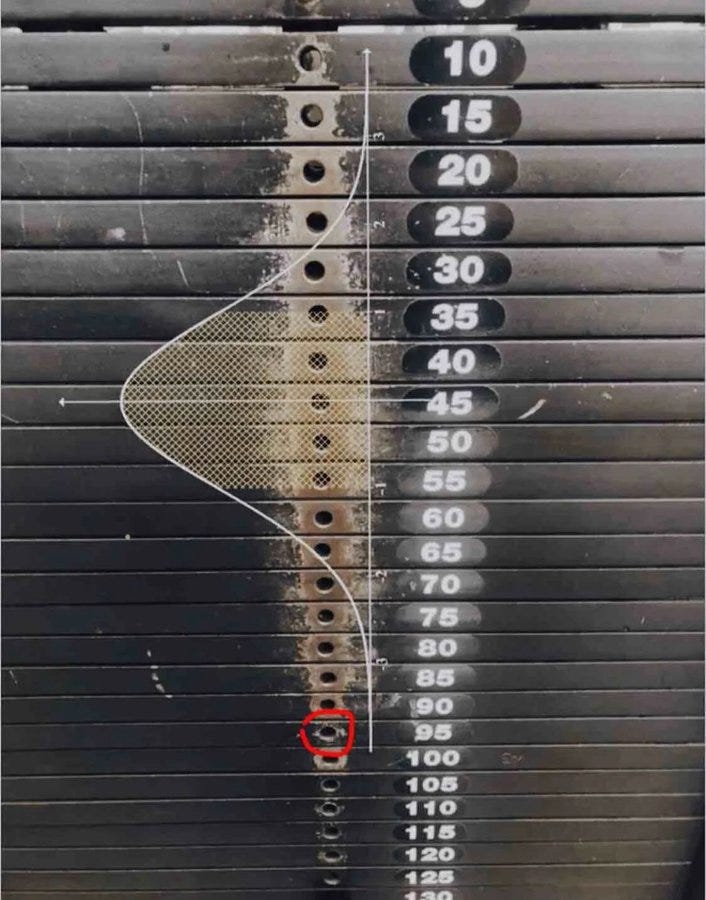
We see normal distribution everywhere: human body measurements, weights of objects, IQ scores, test results, or even at the gym:
Besides being nature’s favorite distribution, it is universally loved by almost all machine learning algorithms. While some want it to improve and stabilize their performance, some outright refuse to work well with anything other than normal distribution (I am talking to you, linear models).
So, to satisfy the algorithms’ need for normalcy, we need a way to measure how similar or (dissimilar) our own distributions are compared to the perfect bell-shaped curve.

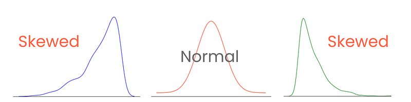
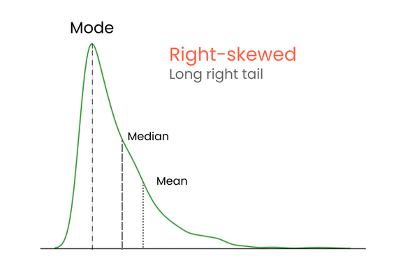
Let’s start with the tails. In a perfect normal distribution, the tails are equal in length. But, when there is asymmetry between the tails, giving it a leaned, squished-to-one-side look, we say it is skewed. And you guessed it, we measure the extent of this asymmetry with skewness.
Correctly categorizing and measuring skewness provides insights into how values are spread around the mean and influence the choices of statistical techniques and data transformations. For example, highly skewed distributions might benefit from normalization or scaling techniques to make them resemble normal distribution. This would aid in model performance.
There are three types of skewness: positive, negative, and zero skewness.
Let’s start with the last one. A distribution with zero skewness has the following characteristics:
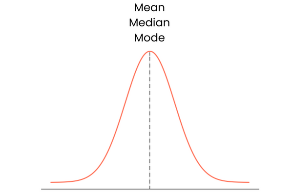
In practice, mean, median, and mode may not form a perfect overlapping straight line. They may be slightly away from each other but the difference would be too small to matter.
In a distribution with positive skewness (right-skewed):
In a distribution with negative skewness (left-skewed):
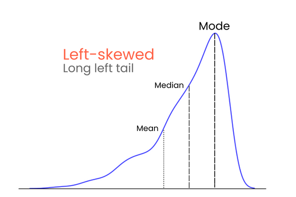
To remember the differences between positive and negative skewness, think of it this way: if you want to increase the mean of a distribution, you should add much higher values than the mean to the distribution. To lower the mean, you should do the opposite — introduce much lower values than the mean to the distribution. So, if the majority of the extreme values is higher than the mean, the skewness will be positive because they increase the mean. If the majority of extreme values is smaller than the mean, the skewness is negative because they decrease the mean.
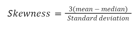
There are many ways to calculate skewness, but the simplest one is Pearson’s second skewness coefficient, also known as median skewness.
Let’s implement the formula manually in Python:
import numpy as np
import pandas as pd
import seaborn as sns

# Example dataset
diamonds = sns.load_dataset("diamonds")
diamond_prices = diamonds["price"]

mean_price = diamond_prices.mean()
median_price = diamond_prices.median()
std = diamond_prices.std()

skewness = (3 * (mean_price - median_price)) / std

>>> print(
   f"The Pierson's second skewness score of diamond prices distribution is {skewness:.5f}"
)

The Pierson's second skewness score of diamond prices distribution is 1.15189
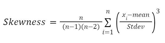
Another formula highly influenced by the works of Karl Pearson is the moment-based formula to approximate skewness. It is more reliable and given as follows:
Here:
Let’s implement it in Python too:
def moment_based_skew(distribution):
   n = len(distribution)
   mean = np.mean(distribution)
   std = np.std(distribution)

   # Divide the formula into two parts
   first_part = n / ((n - 1) * (n - 2))
   second_part = np.sum(((distribution - mean) / std) ** 3)

   skewness = first_part * second_part

   return skewness

>>> moment_based_skew(diamond_prices)
1.618440289857168
If you don’t want to calculate skewness manually (like me), you can use built-in methods from pandas or scipy:
# Pandas version
diamond_prices.skew()
1.618395283383529

# SciPy version
from scipy.stats import skew

skew(diamond_prices)
1.6183502776053016
While all formulas to approximate skewness return different scores, their differences are too small to be significant or change the categorization of the skew. For example, all methods we have used today leverage different formulas under the hood, but the results are very close.
Once you calculate skewness, you can categorize the extent of the skew:
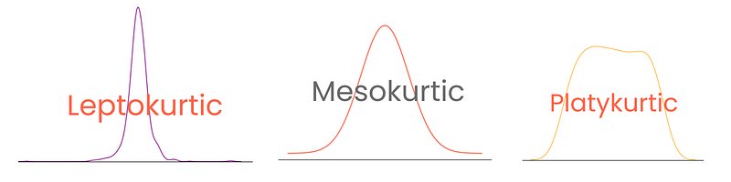
While skewness focuses on the spread (tails) of normal distribution, kurtosis focuses more on the height. It tells us how peaked or flat our normal (or normal-like) distribution is. The term, which means curved or arched from Greek, was first coined by, unsurprisingly, from the British mathematician Karl Pearson (he spent his life studying probability distributions).
High kurtosis indicates:
On the other hand, low kurtosis indicates:
Depending on the degree, distributions have three types of kurtosis:
Note that here, excess kurtosis is defined as kurtosis - 3, treating the kurtosis of normal distribution as 0. This way, kurtosis scores are more interpretable.
You can calculate kurtosis in Python in the same way as skewness using pandas or SciPy:
from scipy.stats import kurtosis

kurtosis(diamond_prices)
2.177382669056634
Pandas offers two functions for kurtosis: kurt and kurtosis. The first one is exclusive to Pandas Series, while you can use the other on DataFrames.
diamond_prices.kurt()
2.17769575924869

# Select numeric features and calculate kurtosis
diamonds.select_dtypes(include="number").kurtosis()
carat     1.256635
depth     5.739415
table     2.801857
price     2.177696
x        -0.618161
y        91.214557
z        47.086619
dtype: float64
Again, the numbers differ for the distribution because pandas and SciPy use different formulas.
If you want a manual calculation of kurtosis, you can use the following formula:
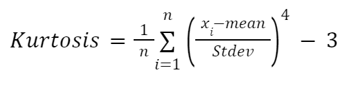
Here:
We will implement the formula inside a function again:
def moment_based_kurtosis(distribution):
   n = len(distribution)
   mean = np.mean(distribution)
   std = np.std(distribution)

   kurtosis = (1 / n) * sum(((distribution - mean) / std) ** 4) - 3

   return kurtosis

>>> moment_based_kurtosis(diamond_prices)
2.1773826690576463
And we find out that diamond prices have an excess kurtosis of 2.18, which means if we plot the distribution, it will have a sharper peak than a normal distribution.
So, let’s do that!
One of the best visuals to see the shape and, thus, the skewness and kurtosis of distributions is a kernel density estimate (KDE) plot. It is available to use through Seaborn:
import matplotlib.pyplot as plt

sns.kdeplot(diamond_prices)

plt.title("KDE plot of diamond prices")
plt.xlabel("Price ($)")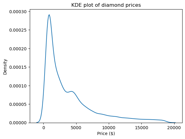
This plot is in accordance with the numbers we saw up to this point: the distribution has a long right tail, indicating a positive skewness, and it has a very sharp peak, which corresponds with high kurtosis.
KDE isn’t the only plot to see the shape. We can use histograms as well:
sns.histplot(diamonds["carat"])

plt.xlabel("Carat")
plt.title("A histogram of the carat of diamonds")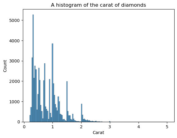
The disadvantage of histograms is that you have to choose the number of bins (the count of bars) yourself. Here, there are too many bars creating noise in the visual — we can’t clearly define the shape. So, let’s decrease the number of bins:
sns.histplot(diamonds["carat"], bins=25)

plt.xlabel("Carat")
plt.title("A histogram of the carat of diamonds")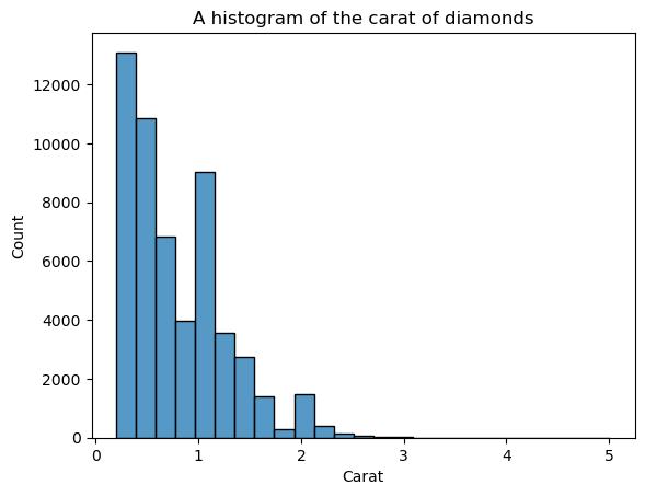
Now, the shape is more well-defined but we can improve it more. By setting kde=True inside histplot, we can plot a KDE of the distribution on top of the bars:
sns.histplot(diamonds["carat"], bins=25, kde=True)

plt.xlabel("Carat")
plt.title("A histogram of the carat of diamonds")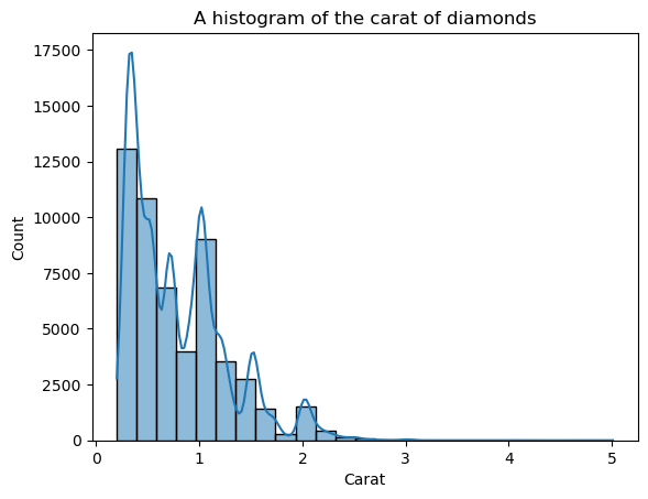
The overlayed KDE line looks jagged, not the smooth curve that enables us to see the general shape. The reason for the jaggedness is that the carat distribution is naturally spiky and far from the normal distribution.
But, we can decrease the KDE’s sensitivity to these fluctuations by adjusting the bandwidth. This is done using the bw_adjust parameter, which defaults to 1:
# Change the bandwidth from 1 to 3
sns.kdeplot(diamonds["carat"], bw_adjust=3, color="red")

plt.title("KDE of diamond carats");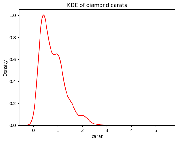
This version looks much less spiky than the overlaid KDE plot. To adjust the KDE bandwidth when using a histogram overlaid with a KDE, you can use the kde_kws parameter:
ax = sns.histplot(
   diamonds["carat"],
   kde=True,
   kde_kws=dict(bw_adjust=3),
   bins=25,
)

plt.title("An overlaid histogram of diamond carats");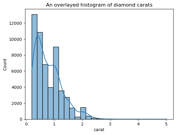
kde_kws accepts any parameter that is acceptable by kdeplot function that controls the KDE computation.
One trick you can use when plotting KDEs is to remove everything except the KDE line. Since the main point of a KDE is to see the distribution shape, other details of the plot like the axis ticks, the spines, and labels are sometimes unnecessary:
sns.kdeplot(diamond_prices, color="red")

# Remove the spine from three sides
sns.despine(top=True, right=True, left=True)

# Remove the ticks and ticklabels
plt.xticks([])
plt.yticks([])
plt.ylabel("")
plt.xlabel("")

# Set a title
plt.title("Diamond prices", fontdict=dict(fontsize=20));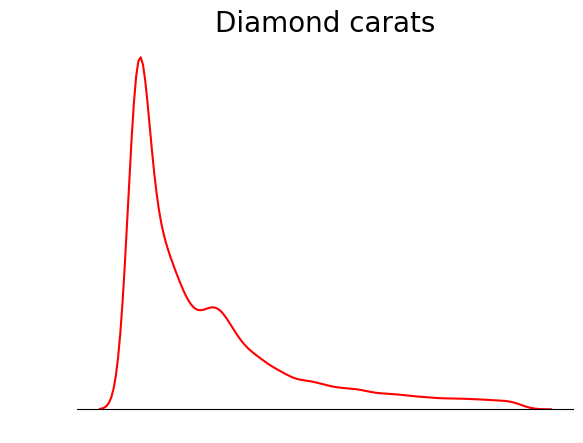
This plot is much tidier. You can further improve the plot by adding lines to denote the position of mean, median, and mode:
sns.kdeplot(diamond_prices, color="red")

sns.despine(top=True, right=True, left=True)
plt.xticks([])
plt.yticks([])
plt.ylabel("")
plt.xlabel("")
plt.title("Diamond prices", fontdict=dict(fontsize=20))

# Find the mean, median, mode
mean_price = diamonds["price"].mean()
median_price = diamonds["price"].median()
mode_price = diamonds["price"].mode().squeeze()

# Add vertical lines at the position of mean, median, mode
plt.axvline(mean_price, label="Mean")
plt.axvline(median_price, color="black", label="Median")
plt.axvline(mode_price, color="green", label="Mode")

plt.legend();
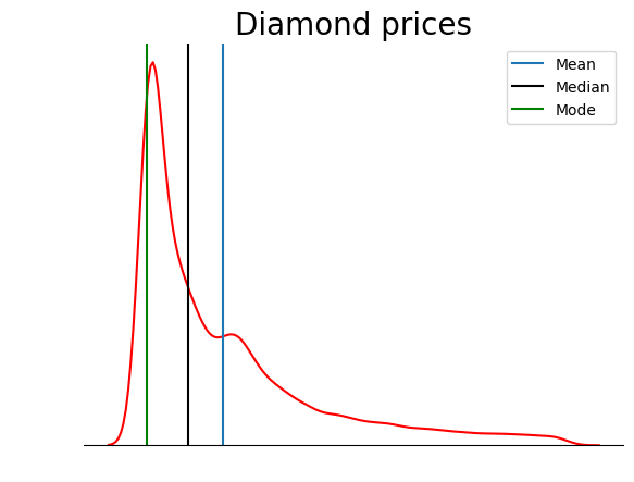
This plot verifies what we discussed in the types of skewness section: in a positively skewed distribution, the mean is higher than the median, and the mode is lower than both mean and median.
Skewness and kurtosis, often overlooked in Exploratory Data Analysis, reveal significant insights about the nature of distributions.
Skewness hints at data tilt, whether leaning left or right, revealing its asymmetry (if any). Positive skew means a tail stretching right, while negative skew veers in the opposite direction.
Kurtosis is all about peaks and tails. High kurtosis sharpens peaks and weighs down the tails, while low kurtosis spreads data, lightening the tails.
If you want to learn more about skewness and kurtosis, you can check out these excellent quantitative analysis courses taught by industry experts on DataCamp:
Learn More!
Course
Course
blog
Kurtis Pykes
15 min
Tutorial
Arunn Thevapalan
Tutorial
Josef Waples
Tutorial
Aditya Sharma
Tutorial
Austin Chia
Tutorial
DataCamp Team