What will I learn?
Experience is the best teacher: case study courses on DataCamp focus on a particular problem and test your ability to apply your knowledge to find the solution. In this new Tableau course, you’ll learn one of the most important soft skills a data analyst can learn: adaptability, as the issues businesses face which analysts address with actionable insights can be extremely variable. Furthermore, you’ll also gain a deeper understanding of how Tableau can be used not only to report information but also to discover actionable business insights.
Why should I take this course?
Customer churn, or the percentage of customers in a given period who do not renew, is a costly problem. According to Bain & Company, increasing customer retention by 5% can lead to a 25% increase in profits. There are several reasons behind this figure: returning customers don’t require as much marketing expenditure, they have a tendency to spend more money on your products after six months of buying from you, and they are more likely to drive word-of-mouth marketing (which is both free and the most trusted form of marketing according to Nielsen).
Reducing the opportunity cost of customer churn is one of the roles analysts, marketers, and managers play in guiding data-driven decision-making. Tableau is one of the most widely used tools for analyzing and visualizing data thanks to its user-friendly interface. As you’ll discover in this course, it can be applied to answering business questions such as this.
Taking this course will help you gain a better understanding of Tableau by applying the skills you learned in the prerequisite courses (see below) and will also increase your employability by demonstrating your Tableau skills.
What are the prerequisites for this course?
There are three courses we recommend you take before starting this course:
- Introduction to Tableau for getting used to the Tableau interface, its different features, and building visualizations.
- Analyzing Data in Tableau for creating calculated fields.
- Creating Dashboards in Tableau for the steps you need to take to create interactive dashboards and later stories.
What’s in this course?
Chapter 1
In this first chapter, you'll start exploring the new dataset and revisit creating calculated fields in Tableau to better understand why customers are churning.
Chapter 2
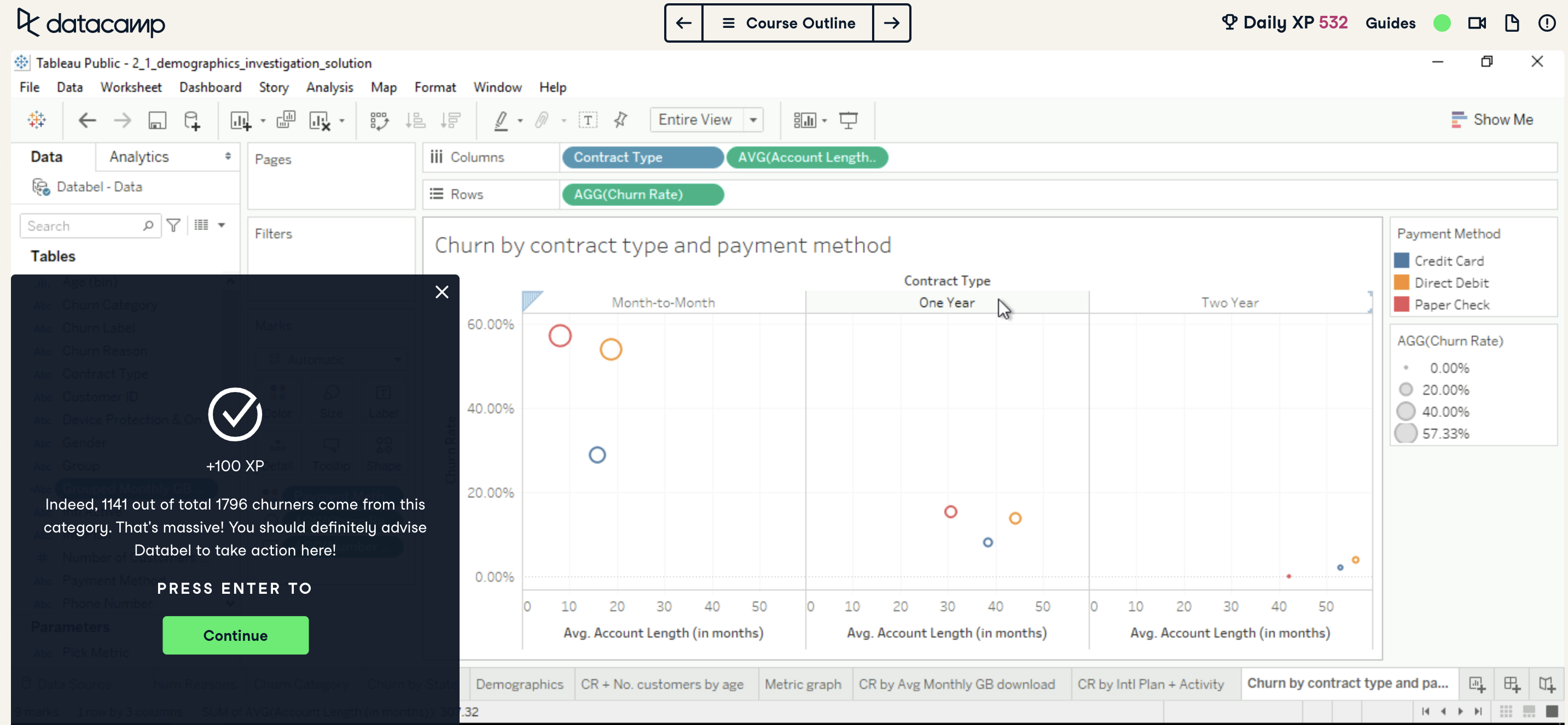
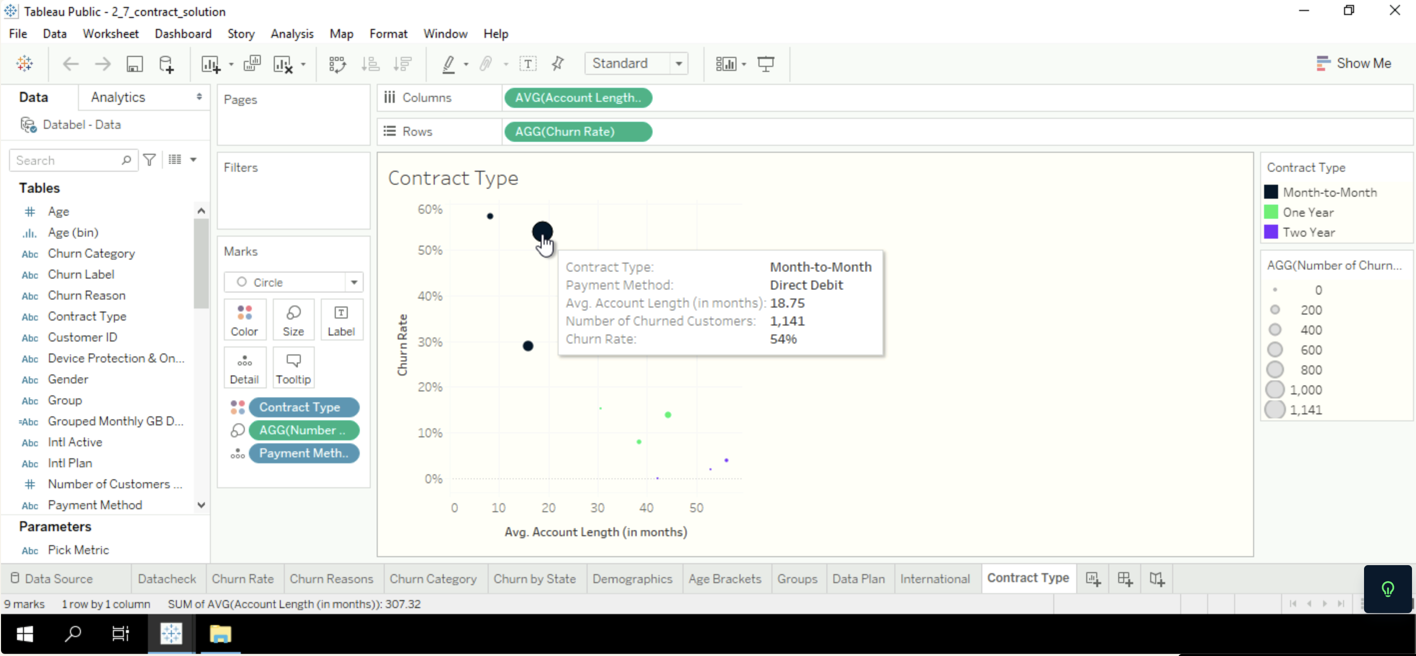
You'll continue by leveraging the Tableau knowledge you gained from the prerequisite courses to investigate further why customers are leaving Databel.
Chapter 3
In the last chapter, you'll create Tableau interactive dashboards and arrange them into stories, so that you can share your results with stakeholders.
Additional tips
- This course’s instructions will recommend you use your own workbook as much as you can rather than loading solution workbooks from the course itself—although, you can do so to continue where you left off if you can’™ do the case study in one go.
- There can be different ways to go about each exercise, but the aim of each is to build a visualization/calculation that enables you to easily answer the question at the end. Don’t worry too much if you’re not following the instructions exactly, or if DataCamp’s workbooks look different from yours.
In this example, DataCamp and Shaun came up with different visualizations but both answer the question correctly.
- That being said, after you’ve answered the question correctly, comparing how you got your answer with DataCamp’s solution can be a great way to broaden your understanding of what you can do in Tableau.
- You’ll be able to add your visualizations to your Tableau Public profile (if you have one) in the final, optional, exercise of the course so that you can preserve and present what you’ve created.
Important information for current Tableau learners on DataCamp
This course will be added to our Tableau Fundamentals Track, and therefore we’ll be launching a new version of this track which includes this course. If you’re currently enrolled in the track you’ll be given the option of switching to the new version, but you can stick with the current version and complete it if you’d prefer. If you have already completed it, you’ll be given a similar set of options: switch to the new track and “re-earn” your statement of accomplishment by completing this course alone, or retain your current one. Anyone who does switch to the new version will also have 24 hours if they would like to change their minds.
You can read more about how to switch tracks and what happens when DataCamp switches tracks through our Help Center.
In any case, we’d highly recommend taking this course for the reasons stated in this piece!
Ready to take the next step towards creating beautiful and interactive data visualizations? Get started in this course today!