HomeTutorialsTableau

Creating Stories in Tableau

Find out everything you need to know about creating stories in Tableau with this step-by-step tutorial.
Nov 2022  · 7 min read

What is a Story in Tableau?

Stories are universal tools of engagement. They move through us, guiding us on a journey marked by peril, victory, loss, and love. While stories are as old as time, Tableau offers a modern and powerful medium to share stories. 

So, what exactly is a Tableau story? It’s a lot like a traditional story, but in this case, you can think of the central question as being the hero, the data, the exposition, and the charts as a series of conflicts leading to the climax and the call to action as the plot resolution. And, of course, the visual aesthetics become your personal writing style! 

In essence, a Tableau story narrates key insights to answer a data question via a series of logically connected visuals. We build Tableau stories using a collection of sheets in a Tableau workbook called story points.

You might think, why use Tableau stories at all?  Isn’t PowerPoint a good enough presentation tool? There are a few reasons why you might want to leverage Tableau instead. 

A Tableau story employs effective storytelling techniques, including creating a logical progression via the story toolbar at the top of the storyboard, allowing users to move easily from left to right. It also allows you to add annotations directly onto your charts to describe some of the most important elements of your story. In addition, its interactive widgets are a great way to capture your audience’s attention. Tableau’s inbuilt aesthetic designs are an added bonus.

How to Create Stunning Tableau Stories

Unfortunately, not all stories are created equal. Just take a look at book or movie ratings online – not all stories win the hearts and minds of their intended audience. 

To create incredible Tableau stories, remember to follow visualization best practices and apply the following rules:

Lead with the end

Think about how your presentation will look like. Imagine what you want to convey to the audience and how the story will fulfill your goal. This visualization process is an important step to bridge the gap between the “how” of the mechanics of performing the analysis and the “why” of the significance of producing such an analysis. Remember the impact you wish the presentation to have on your audience.

Literally “lead with the end”

Stakeholders generally lack the time and patience to sit through yet another presentation, so get to the point. You should state your thesis in one or two bullet points in the first story point. The charts that follow are supporting arguments for your thesis.

Use the seven types of data stories

This concept was originally introduced by Ben Jones, co-founder and CEO of Data Literacy, previously Technical Evangelism Director at Tableau. It describes seven data story types to leverage to build a powerful data story: changes over time, drill down, zoom out, contrast, intersection, factors, and outliers. Each story type has its own set of visual templates. Check out this sample workbook to give you an idea of charts to use in your next story.

Annotate your charts 

Beware of the curse of knowledge! You shouldn’t assume that your end users have all the necessary context to understand the chart on its own. While you may have turned the data upside down to find meaningful insights and patterns, your stakeholders are most likely seeing the chart for the first time. 

Now that we’ve introduced Tableau stories, let’s dive into more detail! We’ll work with the Spotify Music Dataset from DataCamp to build a Tableau story.

Building Your First Tableau Story

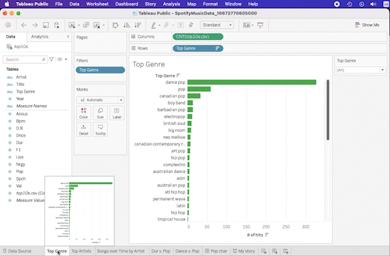
To open a new story tab, click on the New Story icon. You can also navigate to the menu bar at the top and select Story > New Story. To add worksheets or a dashboard to your first story point, navigate to the left pane and drag the sheet onto the blank canvas.

Tableau New Story.gif

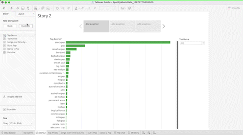
Once you’ve done that, you’ll have the option to add a new story point, either duplicated from the story point you just created or a blank new story point. If you duplicate, everything included in your data point will be ported to the new story point; charts, captions, and annotations.

Tableau Duplicate.gif

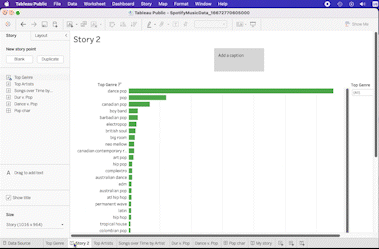
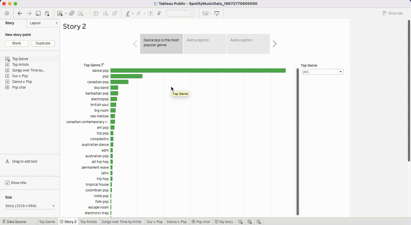
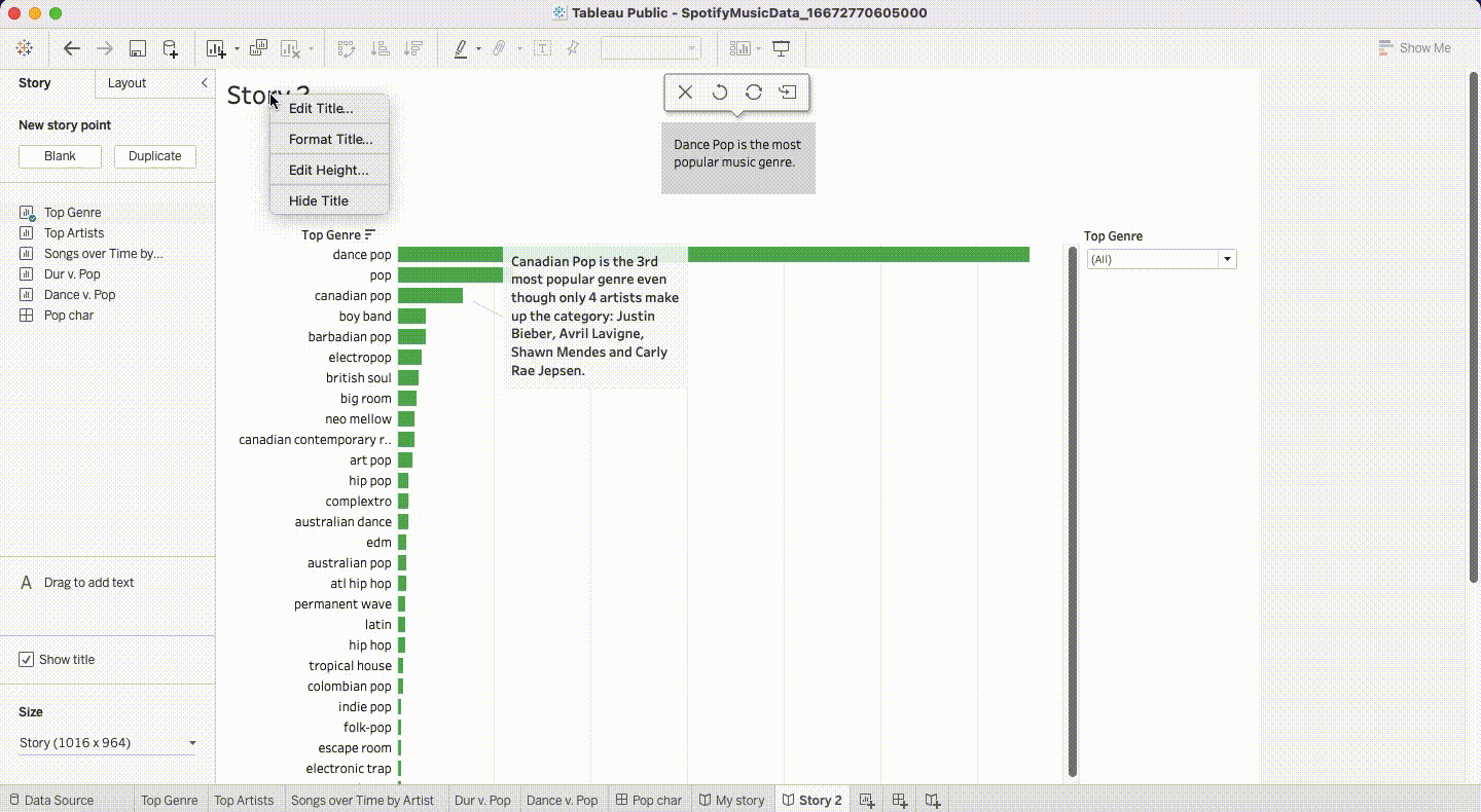
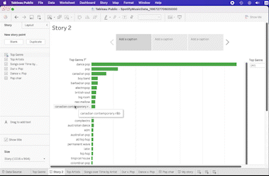
You can also add a caption at the top to describe the story point. Keep them brief; they are the chapter headers of your story, so one or two sentences are enough.

Tableau Chapter Headers.gif

In addition to the captions, you can also annotate specific data points in your data story. Annotations are especially useful to elucidate trends or patterns that may not otherwise be obvious to an outsider.

Tableau Annotations.gif

Updating and Reformatting Objects

Once you’ve added elements to your story, you can tweak and reformat them to be more insightful and aesthetic. For instance, you can hide the story title by right-clicking on the title > Hide Title. If you want to unhide it, go to Story > Show Title.

Tableau Hide Tile..gif

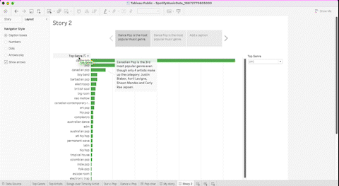
You can also change the story toolbar if you do not wish to add captions in an effort to declutter the space. Go to the left pane, click on Layout and choose the setting you like.

Tableau Layout.gif

If you’re looking to edit the caption text, simply click in the box and start editing. For annotations, either double-click to edit or right-click> Edit.

Now, if you want to replace a chart, navigate to the left pane, drag the new sheet over the existing story point and drop it. The old chart is now removed from the story.

Tableau Replace Chart.gif

To format your story, navigate to the menu bar at the top and select Story > Format. You can update the fonts, the shading, the alignment, and the borders.

Tableau Format

Resizing a story is also important based on the platform you choose to present it from. For screens with higher resolution or desktop computers, Desktop Browser (1000*800 pixels) might be a good option. 

For embeds, you can choose Web Page, Blog, or Small Blog in Tableau. For screens with lower resolution, select an option with a lower pixel count from the list by clicking on Size in the lower left pane of your story.

You can also delete Tableau story elements if you decide not to use them. To delete chart annotations, right-click on it and select Remove

For story points, go to the story toolbar at the top and click on the X. To delete all elements from the Tableau story, go to the menu at the top, and select Story > Clear. If you decide to revert back, you can click on the ⬅️ arrow to the right of the Tableau logo.

Tableau Clear.gif

Build Your Own Tableau Stories

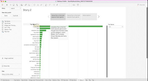
Tableau stories are powerful tools to explore a data question in a meaningful way and lead your audience to take action. To become a Tableau story expert, make sure to check out our newly released Data Analyst with Tableau track. If you need a refresher on some Tableau fundamentals, our Tableau for Beginner and Visualizing Data with Python & Tableau tutorials are great ways to get started. Happy exploring!

Tableau Story FAQs

What is the difference between a dashboard and a story?

A Tableau dashboard is a collection of charts assembled on a single view, whereas a story is a collection of charts or dashboards assembled on multiple views. 

The views in a story are logically and linearly connected to convey the progression of a data story. A dashboard is ideal for operational analytics to measure real-time metrics of the health of a business.

Stories, on the other hand, are great for exploring a specific ad hoc stakeholder question and providing answers here and now on the business, which may not always hold true in the future. To learn more about creating Tableau dashboards, check out this Tableau Dashboard tutorial.

What are some disadvantages of using stories?

The main disadvantage is tied to the nature of a story itself. While the static elements are great for providing context around important data points, they can also be a burden if you are looking to operationalize the analysis. A story is a helpful tool for ad hoc analysis that requires exploring a specific, point-in-time question. It’s not a great BI tool for an end user’s daily use.

How do I publish a story to my Tableau Public account?

The same way you would publish a sheet or a dashboard! Go to File > Save to Tableau Public. Enter your credentials, and voilà! The story is published to your account.

How do I insert an image using Tableau story?

Unlike a dashboard, you can’t natively add an image to a story. However, there is a way to add an image. First, save an image on a dashboard (or as a dashboard). Navigate back to your story. Create a new story point. Finally, drag the dashboard from the left pane onto the blank canvas. Your image now appears in your story.

Topics

Tableau Courses

Course

Creating Dashboards in Tableau

3 hr
30.6K
Dashboards are a must-have in a data-driven world. Increase your impact on business performance with Tableau dashboards.
See DetailsRight Arrow
Start Course
See MoreRight Arrow
Related

Data Sets and Where to Find Them: Navigating the Landscape of Information

Are you struggling to find interesting data sets to analyze? Do you have a plan for what to do with a sample data set once you’ve found it? If you have data set questions, this tutorial is for you! We’ll go over the basics of what a data set is, where to find one, how to clean and explore it, and where to showcase your data story.
Amberle McKee's photo

Amberle McKee

11 min

You’re invited! Join us for Radar: The Analytics Edition

Join us for a full day of events sharing best practices from thought leaders in the analytics space
DataCamp Team's photo

DataCamp Team

4 min

Your Guide to Tableau Certifications: Certification Levels, Costs, and How to Pass Them

Unlock Tableau certification success! Explore certification levels, costs, and expert strategies to pass. Start your journey to becoming a Tableau pro today.
Adel Nehme's photo

Adel Nehme

15 min

10 Top Data Analytics Conferences for 2024

Discover the most popular analytics conferences and events scheduled for 2024.
Javier Canales Luna's photo

Javier Canales Luna

7 min

A Complete Guide to Alteryx Certifications

Advance your career with our Alteryx certification guide. Learn key strategies, tips, and resources to excel in data science.
Matt Crabtree's photo

Matt Crabtree

9 min

Mastering Bayesian Optimization in Data Science

Unlock the power of Bayesian Optimization for hyperparameter tuning in Machine Learning. Master theoretical foundations and practical applications with Python to enhance model accuracy.
Zoumana Keita 's photo

Zoumana Keita

11 min

See MoreSee More