Cours
Dashboards are a key component in the analytics process because they provide a compact overview of information in a digestible form for various stakeholders. The ultimate goal of a dashboard is to help its users make optimal decisions and use this ever-growing pool of data to their advantage. This checklist contains key information to keep in mind when designing your following dashboard.
Know your dashboard type
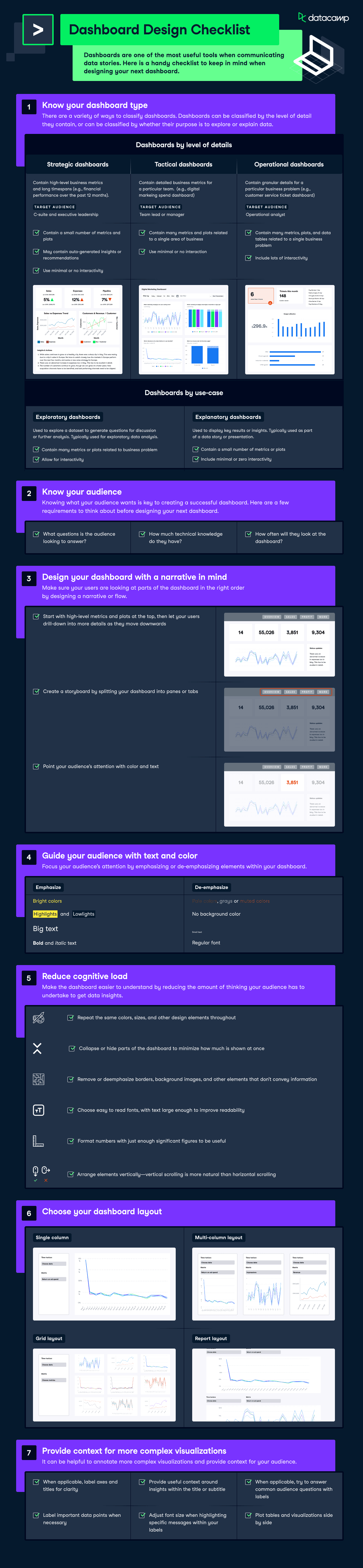
There are a variety of ways to classify dashboards. Dashboards can be classified by the level of detail they contain or by whether their purpose is to explore or explain data.
Dashboards by the level of details
- Strategic dashboards: Contain high-level business metrics and long timespans (e.g., financial performance over the past 12 months)—best fit for c-suite and executive leadership.
- Tactical dashboards: Contain detailed business metrics for a particular team. (e.g., digital markeing spend dashboard). Best suited for a team lead or manager.
- Operational dashboards: Contain granular details for a particular business problem (e.g., customer service ticket dashboard). Best suited for analysts on the ground.
Dashboards by use-case
- Exploratory dashboards: Used to explore a dataset to generate questions for discussion or further analysis. Typically used for exploratory data analysis.
- Explanatory dashboards: Used to display key results or insights. Typically used as part of a data story or presentation.
Know your audience
Knowing what your audience wants is key to creating a successful dashboard. Here are a few requirements to think about before designing your following dashboard. Key questions to ask:
- What questions is the audience looking to answer?
- How much technical knowledge do they have?
- How often will they look at the dashboard?
Design your dashboard with a narrative in mind
Make sure your users look at the dashboard parts in the correct order by designing a narrative or flow. Here are some considerations when designing a dashboard with a narrative in mind.
- Start with high-level metrics and plots at the top, then let your users drill down into more details as they move downwards.
- Create a storyboard by splitting your dashboard into panes or tabs.
- Point your audience’s attention with color and text
Guide your audience with text and color
Focus your audience’s attention by emphasizing or de-emphasizing elements within your dashboard.
Emphasizing
- Bright colors
- Highlights or lowlights
- Big text
- Font or italic text
De-emphasizing
- Pale or muted colors
- No background colors
- Small text
- Regular font
Reduce cognitive load
Make the dashboard easier to understand by reducing the amount of thinking your audience has to undertake to get data insights. Here are some considerations to make when reducing cognitive load.
- Repeat the same colors, sizes, and other design elements throughout your dashboard.
- Collapse or hide parts of the dashboard to minimize how much is shown at once.
- Remove or de-emphasize borders, background images, and other elements that don't convey information.
- Choose easy-to-read fonts with text large enough to improve readability.
- Format numbers with just enough significant figures to be useful.
- Arrange elements vertically—vertical scrolling is more natural than horizontal scrolling.
Choose your dashboard layout
Dashboards can have a range of layouts, from single-column to multi-column layouts, and even report layouts. Check out the infographic at the top of the page for a detailed overview.
Provide context for more complex visualizations
It can be helpful to annotate more complex visualizations and provide context for your audience. Here are some considerations to keep in mind when providing context for complex visualizations.
- When applicable, label axes and titles for clarity
- Provide useful context around insights within the title or subtitle
- When applicable, try to answer common audience questions with labels
- Label important data points when necessary
- Adjust font size when highlighting specific messages within your labels
- Plot tables and visualizations side by side