Course
In the Facebook Live code along session on the 4th of January, we checked out Google trends data of keywords 'diet', 'gym' and 'finance' to see how they vary over time. We asked ourselves if there could be more searches for these terms in January when we're all trying to turn over a new leaf?
In this tutorial, you'll go through the code that we put together during the session step by step. You're not going to do much mathematics. The emphasis of this tutorial will be squarely on a visual exploration of the dataset in question.
For more on pandas, check out DataCamp's Data Manipulation with Python track. For more on time series with pandas, check out the Manipulating Time Series Data in Python course.
Importing Packages and Data
So the question remains: could there be more searches for these terms in January when we're all trying to turn over a new leaf?
Let's find out by going here and checking out the data. Note that this tutorial is inspired by this FiveThirtyEight piece.
You can also download the data as a .csv, save to file and import into your very own Python environment to perform your own analysis. You'll do this now. Let's get it!
To start, you'll import some packages: in this case, you'll make use of numpy, pandas, matplotlib and seaborn.
Additionally, if you want the images to be plotted in the Jupyter Notebook, you can make use of the IPython magic by adding %matplotlib inline to your code. Alternatively, you can also switch to the Seaborn defaults with sns.set():
# Import packages
import numpy as np
import pandas as pd
import matplotlib.pyplot as plt
import seaborn as sns
%matplotlib inline
sns.set()
Import data that you downloaded with .read_csv() and check out first several rows with .head().
Note that you add the skiprows argument to skip the first row at the start of the file.
 df = pd.read_csv('data/multiTimeline.csv', skiprows=1)
df.head()| Month | diet: (Worldwide) | gym: (Worldwide) | finance: (Worldwide) | |
|---|---|---|---|---|
| 0 | 2004-01 | 100 | 31 | 48 |
| 1 | 2004-02 | 75 | 26 | 49 |
| 2 | 2004-03 | 67 | 24 | 47 |
| 3 | 2004-04 | 70 | 22 | 48 |
| 4 | 2004-05 | 72 | 22 | 43 |
You can also use the .info() method to check out your data types, number of rows and more:
df.info()
<class 'pandas.core.frame.DataFrame'>
RangeIndex: 168 entries, 0 to 167
Data columns (total 4 columns):
Month                   168 non-null object
diet: (Worldwide)       168 non-null int64
gym: (Worldwide)        168 non-null int64
finance: (Worldwide)    168 non-null int64
dtypes: int64(3), object(1)
memory usage: 5.3+ KB
Now that you've imported your data from Google trends and had a brief look at it, it's time to wrangle your data and get it into the form you want to prepare it for data analysis.
Wrangle your Data
The first thing that you want to do is rename the columns of your DataFrame df so that they have no whitespaces in them. There are multiple ways to do this, but for now, you'll reassign to df.columns a list of what you want the columns to be called.
Double check the result of your reassignment by calling df.head():
df.columns = ['month', 'diet', 'gym', 'finance']
df.head()
| month | diet | gym | finance | |
|---|---|---|---|---|
| 0 | 2004-01 | 100 | 31 | 48 |
| 1 | 2004-02 | 75 | 26 | 49 |
| 2 | 2004-03 | 67 | 24 | 47 |
| 3 | 2004-04 | 70 | 22 | 48 |
| 4 | 2004-05 | 72 | 22 | 43 |
Next, you'll turn the 'month' column into a DateTime data type and make it the index of the DataFrame.
Note that you do this because you saw in the result of the .info() method that the 'Month' column was actually an of data type object. Now, that generic data type encapsulates everything from strings to integers, etc. That's not exactly what you want when you want to be looking at time series data. That's why you'll use .to_datetime() to convert the 'month' column in your DataFrame to a DateTime.
Be careful! Make sure to include the inplace argument when you're setting the index of the DataFrame df so that you actually alter the original index and set it to the 'month' column.
df.month = pd.to_datetime(df.month)
df.set_index('month', inplace=True)
df.head()
| diet | gym | finance | |
|---|---|---|---|
| month | |||
| 2004-01-01 | 100 | 31 | 48 |
| 2004-02-01 | 75 | 26 | 49 |
| 2004-03-01 | 67 | 24 | 47 |
| 2004-04-01 | 70 | 22 | 48 |
| 2004-05-01 | 72 | 22 | 43 |
Now it's time to explore your DataFrame visually.
A bit of Exploratory Data Analysis (EDA)
You can use a built-in pandas visualization method .plot() to plot your data as 3 line plots on a single figure (one for each column, namely, 'diet', 'gym', and 'finance').
Note that you can also specify some arguments to this method, such as figsize, linewidthand fontsize to set the figure size, line width and font size of the plot, respectively.
Additionally, you'll see that what you see on the x-axis is not the months, as the default label suggests, but the years. To make your plot a bit more accurate, you'll specify the label on the x-axis to 'Year' and also set the font size to 20.
Tip: if you want to suppress the Matplotlib output, just add a semicolon ; to your last line of code!
df.plot(figsize=(20,10), linewidth=5, fontsize=20)
plt.xlabel('Year', fontsize=20);

Note that this data is relative. As you can read on Google trends:
Numbers represent search interest relative to the highest point on the chart for the given region and time. A value of 100 is the peak popularity for the term. A value of 50 means that the term is half as popular. Likewise a score of 0 means the term was less than 1% as popular as the peak.
If you want, you can also plot the 'diet' column by itself as a time series:
df[['diet']].plot(figsize=(20,10), linewidth=5, fontsize=20)
plt.xlabel('Year', fontsize=20);
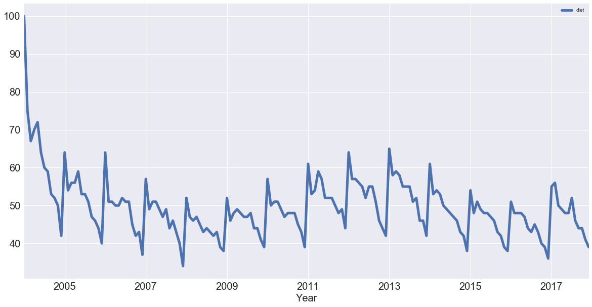
Note: the first thing to notice is that there is seasonality: each January, there's a big jump. Also, there seems to be a trend: it seems to go slightly up, then down, back up and then back down. In other words, it looks like there are trends and seasonal components to these time series.
With this in mind, you'll learn how to identify trends in your time series!
Trends and Seasonality in Time Series Data
Identifying Trends in Time Series
There are several ways to think about identifying trends in time series. One popular way is by taking a rolling average, which means that, for each time point, you take the average of the points on either side of it. Note that the number of points is specified by a window size, which you need to choose.
What happens then because you take the average is it tends to smooth out noise and seasonality. You'll see an example of that right now. Check out this rolling average of 'diet' using the built-in pandas methods.
When it comes to determining the window size, here, it makes sense to first try out one of twelve months, as you're talking about yearly seasonality.
diet = df[['diet']]
diet.rolling(12).mean().plot(figsize=(20,10), linewidth=5, fontsize=20)
plt.xlabel('Year', fontsize=20);
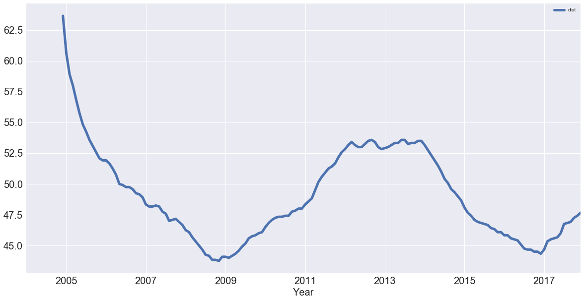
Note that in the code chunk above you used two sets of squared brackets to extract the 'diet' column as a DataFrame; If you would have used one set, like df['diet'], you would have created a pandas Series.
In the code chunk above, you also chained methods: you called methods on an object one after another. Method chaining is pretty popular and pandas is one of the packages that really allows you to use that style of programming to the max!
Now you have the trend that you're looking for! You have removed most of the seasonality compared to the previous plot.
You can also plot the rolling average of 'gym' using built-in pandas methods with the same window size as you took for the 'diet' data:
gym = df[['gym']]
gym.rolling(12).mean().plot(figsize=(20,10), linewidth=5, fontsize=20)
plt.xlabel('Year', fontsize=20);
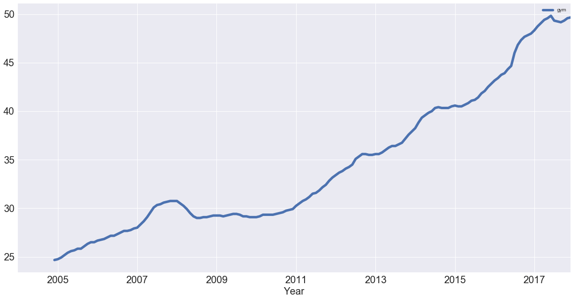
You have successfully removed the seasonality and you see an upward trend for "gym"! But how do these two search terms compare?
You can figure this out by plotting the trends of 'gym' and 'diet' on a single figure:
df_rm = pd.concat([diet.rolling(12).mean(), gym.rolling(12).mean()], axis=1)
df_rm.plot(figsize=(20,10), linewidth=5, fontsize=20)
plt.xlabel('Year', fontsize=20);
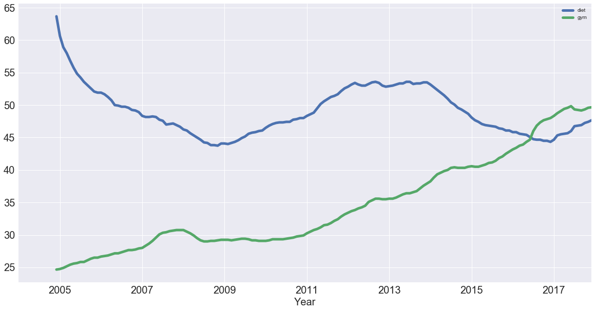
You created a new DataFrame df_rm that has two columns with the rolling average of 'diet' and 'gym'. You used the pd.concat() function, which takes a list of the columns as a first argument and, since you want to concatenate them as columns, you also added the axis argument, which you set to 1.
Next, you plotted the DataFrame with the plot() method, just like you did before! So now, removing the seasonality, you see that diet potentially has some form of seasonality, whereas gym is actually increasing!
With the trends in the data identified, it's time to think about seasonality, which is the repetitive nature of your time series. As you saw in the beginning of this tutorial, it looked like there were trends and seasonal components to the time series of the data.
Seasonal Patterns in Time Series Data
One way to think about the seasonal components to the time series of your data is to remove the trend from a time series, so that you can more easily investigate seasonality. To remove the trend, you can subtract the trend you computed above (rolling mean) from the original signal. This, however, will be dependent on how many data points you averaged over.
Another way to remove the trend is called "differencing", where you look at the difference between successive data points (called "first-order differencing", because you're only looking at the difference between one data point and the one before it).
First-order differencing
You can use pandas and the diff() and plot() methods to compute and plot the first order difference of the 'diet' Series:
diet.diff().plot(figsize=(20,10), linewidth=5, fontsize=20)
plt.xlabel('Year', fontsize=20);
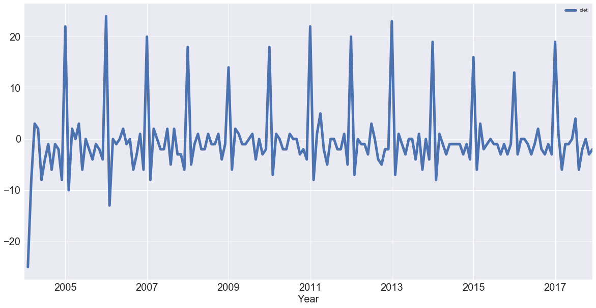
See that you have removed much of the trend and you can really see the peaks in January every year. Each January, there is a huge spike of 20 or more percent on the highest search item you've seen!
Note: you can also perform 2nd order differencing, which means that you would be looking at the difference between one data point and the two that precede it, if the trend is not yet entirely removed. See here for more on differencing.
Differencing is super helpful in turning your time series into a stationary time series. You won't get too much into these here but a stationary time series is one whose statistical properties (such as mean and variance) don't change over time. These time series are useful because many time series forecasting methods are based on the assumption that the time series is approximately stationary.
With all of this at hand, you'll now analyze your periodicity in your times series by looking at its autocorrelation function. But before that, you'll take a short detour into correlation.
Periodicity and Autocorrelation
A time series is periodic if it repeats itself at equally spaced intervals, say, every 12 months.
Another way to think of this is that if the time series has a peak somewhere, then it will have a peak 12 months after that and, if it has a trough somewhere, it will also have a trough 12 months after that.
Yet another way of thinking about this is that the time series is correlated with itself shifted by 12 months. That means that, if you took the time series and moved it 12 months backwards or forwards, it would map onto itself in some way.
Considering the correlation of a time series with such a shifted version of itself is captured by the concept of autocorrelation.
You'll get to this in a minute.
First, let's remind yourself about correlation and take an intuitive approach to this concept!
The correlation coefficient of two variables captures how linearly related they are. To understand this, you'll take a look at a practical example with the help of the iris data set, which contains measurements of flowers.
To study this in further detail, you'll import the iris dataset from scikit-learn, turn it into a DataFrame and view the first rows with the help of .head():
from sklearn import datasets
iris = datasets.load_iris()
df_iris = pd.DataFrame(data= np.c_[iris['data'], iris['target']],
                     columns= iris['feature_names'] + ['target'])
df_iris.head()
| sepal length (cm) | sepal width (cm) | petal length (cm) | petal width (cm) | target | |
|---|---|---|---|---|---|
| 0 | 5.1 | 3.5 | 1.4 | 0.2 | 0.0 |
| 1 | 4.9 | 3.0 | 1.4 | 0.2 | 0.0 |
| 2 | 4.7 | 3.2 | 1.3 | 0.2 | 0.0 |
| 3 | 4.6 | 3.1 | 1.5 | 0.2 | 0.0 |
| 4 | 5.0 | 3.6 | 1.4 | 0.2 | 0.0 |
Just as a reminder for you to understand this data set, all flowers contain a sepal and a petal. The sepal encloses the petals and is typically green and leaf-like, while the petals are typically colored leaves. The 'target' column, which is the target variable, is the species of the iris flowers, which can either be Versicolor, Virginica or Setosa. In the table above, they are encoded as 0, 1, and 2.
Now, to think about correlation, you'll take a look at how the sepal length of the iris flowers is correlated with the sepal width. To do this, you'll use pandas or seaborn to build a scatter plot of 'sepal length' against 'sepal width':
sns.lmplot(x='sepal length (cm)', y='sepal width (cm)', fit_reg=False, data=df_iris);
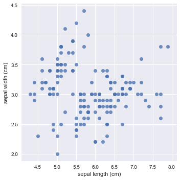
Note that you turned off the linear regression by setting the fit_reg argument to False.
Are sepal length and width positively or negatively correlated across all flowers? Are they positively or negatively correlated within each species? This is an essential distinction.
Remember that the former means that as the sepal length increases, the sepal width also increases in a linear manner. The latter means that if the sepal length increases, the sepal width would decrease in a linear fashion.
At first sight, it seems that there is a negative correlation in the above plot: as the sepal length increases, you see that the sepal width decreases slightly.
Let's now build a scatter plot of 'sepal length' against 'sepal width', coloured by the target (species):
sns.lmplot(x='sepal length (cm)', y='sepal width (cm)', fit_reg=False, data=df_iris, hue='target');
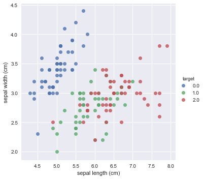
At first sight, it seems like the above plot exhibits a positive correlation: for each species of the iris flower, you see that when the sepal length increases, the sepal width also increases.
Visualizations are a great way to get an intuition of correlation, but the way you could think about that in greater detail is to actually compute a correlation coefficient.
You can compute the correlation coefficients of each pair of measurements with the help of the .corr() method:
df_iris.corr()
| sepal length (cm) | sepal width (cm) | petal length (cm) | petal width (cm) | target | |
|---|---|---|---|---|---|
| sepal length (cm) | 1.000000 | -0.109369 | 0.871754 | 0.817954 | 0.782561 |
| sepal width (cm) | -0.109369 | 1.000000 | -0.420516 | -0.356544 | -0.419446 |
| petal length (cm) | 0.871754 | -0.420516 | 1.000000 | 0.962757 | 0.949043 |
| petal width (cm) | 0.817954 | -0.356544 | 0.962757 | 1.000000 | 0.956464 |
| target | 0.782561 | -0.419446 | 0.949043 | 0.956464 | 1.000000 |
Note that 'sepal length (cm)' and 'sepal width (cm)' seem to be negatively correlated! And they are, over the entire population of flowers measured. You see that the correlation coefficent is -0.1. However, they are not negatively correlated within each species, as the coefficient is 0.78.
For those interested, this is known as Simpson's paradox and is essential when thinking about causal inference. You can read more here.
Let's explore this further. Let's compute the correlation coefficients of each pair of measurements within each species. The way to do this is by chaining the .groupby() and .corr() methods, to group by the target and print the correlation coefficient:
df_iris.groupby(['target']).corr()
| petal length (cm) | petal width (cm) | sepal length (cm) | sepal width (cm) | ||
|---|---|---|---|---|---|
| target | |||||
| 0.0 | petal length (cm) | 1.000000 | 0.306308 | 0.263874 | 0.176695 |
| petal width (cm) | 0.306308 | 1.000000 | 0.279092 | 0.279973 | |
| sepal length (cm) | 0.263874 | 0.279092 | 1.000000 | 0.746780 | |
| sepal width (cm) | 0.176695 | 0.279973 | 0.746780 | 1.000000 | |
| 1.0 | petal length (cm) | 1.000000 | 0.786668 | 0.754049 | 0.560522 |
| petal width (cm) | 0.786668 | 1.000000 | 0.546461 | 0.663999 | |
| sepal length (cm) | 0.754049 | 0.546461 | 1.000000 | 0.525911 | |
| sepal width (cm) | 0.560522 | 0.663999 | 0.525911 | 1.000000 | |
| 2.0 | petal length (cm) | 1.000000 | 0.322108 | 0.864225 | 0.401045 |
| petal width (cm) | 0.322108 | 1.000000 | 0.281108 | 0.537728 | |
| sepal length (cm) | 0.864225 | 0.281108 | 1.000000 | 0.457228 | |
| sepal width (cm) | 0.401045 | 0.537728 | 0.457228 | 1.000000 |
In this correlation matrix, you can see that:
- For target 0, the sepal length and width have a correlation of 0.75;
- For target 1, you have a coefficient of 0.5; And
- For target 2, you get a correlation of 0.46.
These are all decreasing amounts of positive correlation, but they're all a lot more positively correlated than your original negative correlation was.
This is incredibly telling and is a clear reminder of the importance of analyzing your data thoroughly.
Now that you have taken a closer look at correlation, you're ready to analyze your periodicity in your times series by looking at its autocorrelation function!
To start off, plot all your time series again to remind yourself of what they look like:
df.plot(figsize=(20,10), linewidth=5, fontsize=20)
plt.xlabel('Year', fontsize=20);
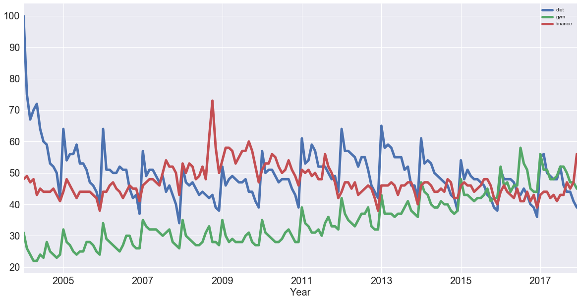
Then, compute the correlation coefficients of all of these time series with the help of .corr():
df.corr()
| diet | gym | finance | |
|---|---|---|---|
| diet | 1.000000 | -0.100764 | -0.034639 |
| gym | -0.100764 | 1.000000 | -0.284279 |
| finance | -0.034639 | -0.284279 | 1.000000 |
Now, what does the above tell you?
Let's focus on 'diet' and 'gym'; They are negatively correlated. That's very interesting! Remember that you have a seasonal and a trend component. From the correlation coefficient, 'diet' and 'gym' are negatively correlated. However, from looking at the times series, it looks as though their seasonal components would be positively correlated and their trends negatively correlated.
The actual correlation coefficient is actually capturing both of those.
What you want to do now is plot the first-order differences of these time series and then compute the correlation of those because that will be the correlation of the seasonal components, approximately. Remember that removing the trend may reveal correlation in seasonality.
Start off by plotting the first-order differences with the help of .diff() and .plot():
df.diff().plot(figsize=(20,10), linewidth=5, fontsize=20)
plt.xlabel('Year', fontsize=20);
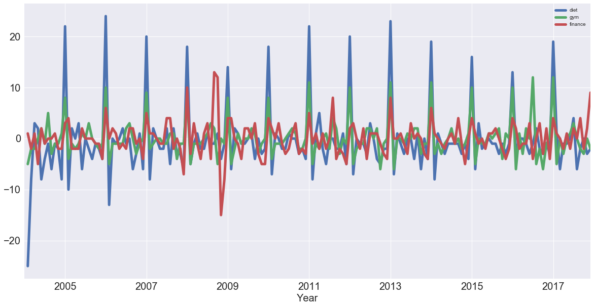
You see that 'diet' and 'gym' are incredibly correlated once you remove the trend. Now, you'll compute the correlation coefficients of the first-order differences of these time series:
df.diff().corr()
| diet | gym | finance | |
|---|---|---|---|
| diet | 1.000000 | 0.758707 | 0.373828 |
| gym | 0.758707 | 1.000000 | 0.301111 |
| finance | 0.373828 | 0.301111 | 1.000000 |
Note that once again, there was a slight negative correlation when you were thinking about the trend and the seasonal component. Now, you can see that with the seasonal component, 'diet' and 'gym' are highly correlated, with a coefficient of 0.76.
Autocorrelation
Now you've taken a dive into correlation of variables and correlation of time series, it's time to plot the autocorrelation of the 'diet' series: on the x-axis, you have the lag and on the y-axis, you have how correlated the time series is with itself at that lag.
So, this means that if the original time series repeats itself every two days, you would expect to see a spike in the autocorrelation function at 2 days.
Here, you'll look at the plot and what you should expect to see here is a spike in the autocorrelation function at 12 months: the time series is correlated with itself shifted by twelve months.
Use the plotting interface of pandas, which has the autocorrelation_plot() function. You can use this function to plot the time series 'diet':
pd.plotting.autocorrelation_plot(diet);
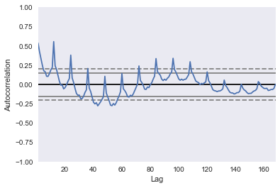
If you included more lags in your axes, you'd see that it is 12 months at which you have this huge peak in correlation. You have another peak at a 24 month interval, where it's also correlated with itself. You have another peak at 36, but as you move further away, there's less and less of a correlation.
Of course, you have a correlation of itself with itself at a lag of 0.
The dotted lines in the above plot actually tell you about the statistical significance of the correlation. In this case, you can say that the 'diet' series is genuinely autocorrelated with a lag of twelve months.
You have identified the seasonality of this 12 month repetition!
Conclusion
In this tutorial, you covered a lot of ground! You checked out Google trends data of keywords 'diet', 'gym' and looked cursorily at 'finance' to see how they vary over time. You covered concepts such as seasonality, trends, correlation, autocorrelation, ...
For those eager data scientists, there are two things you could do right away:
- You could look into the 'finance' column and report what you find;
- Use ARIMA modeling to make some time series forecasts as to what these search trends will look like over the coming years. Jason Brownlee at Machine Learning Mastery has a cool tutorial on ARIMA modeling in Python, DataCamp has a great ARIMA Modeling with R and Time Series with Python course.
