
Cursus
Fondamentaux d'Excel
16 h
Spreadsheets can be boring, especially if you have rows and rows of data and no way of highlighting what’s important.
Conditional formatting is a quick and easy technique that solves this problem in just a few clicks.
In this article, we explore conditional formatting in Excel, with examples and best practices for simple and advanced scenarios.
If you’re still fairly new to Excel, check out our Introduction to Excel course. Plus, our Excel basics cheat sheet is a great resource to keep on hand as you learn and navigate your way around Excel formulas.
DataCamp Excel Formulas Cheat Sheet
Conditional formatting in Excel is a feature that allows you to automatically apply formatting—like colors, icons, or data bars—to cells based on their values. This makes it easier to quickly identify trends, patterns, or outliers in your data.
You can highlight all the sales figures above a certain number, flag overdue tasks, or even color-code data trends.
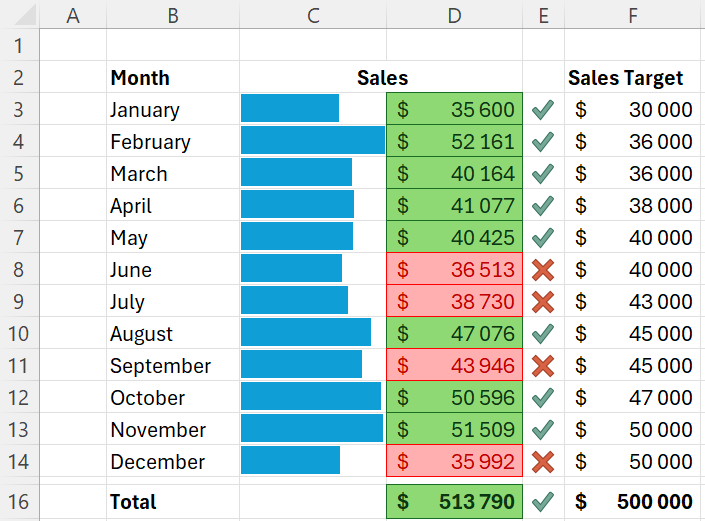
If you’re analyzing monthly sales data, for example, you can instantly see which months are performing well against your targets.
Example of conditional formatting in Excel
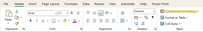
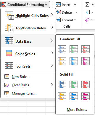
First, select the cells you want to format. Then, go to the Home tab of the ribbon and click on “Conditional Formatting”.
Location of conditional formatting on the ribbon
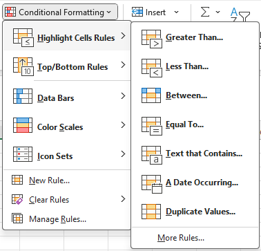
A drop-down menu will appear, where you can choose from various rule types (or styles of conditional formatting), such as highlighting cells that contain specific text, values above or below a certain threshold, duplicate values, etc.
Once you’ve selected a rule type, you can then define the specific criteria for your rule. When you’re done, click OK, and the formatting will be applied to the cells that meet your criteria.
To learn more about importing and preparing data in Excel to use features like conditional formatting, we have a course that covers all the foundational concepts, plus a few useful advanced formulas.
There are a range of conditional formatting styles that you can use to visually enhance your data in Excel.
We’ll be exploring each of the following styles in this section:
The highlight cells style is highly versatile, allowing you to apply formatting to a variety of different data types.
You can emphasize specific cells based on criteria you set, such as values greater than a certain number, text that contains specific keywords, or dates within a particular range.
Highlight cell rules
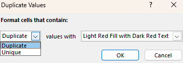
Another very useful option within this style is duplicate values. Selecting this style allows you to identify both duplicate and unique values.
This feature is essential for cleaning and investigating your data. For example, you could easily spot duplicate entries in a list of customer emails. For more information, check out our guide on data cleaning in Excel.
Duplicate values
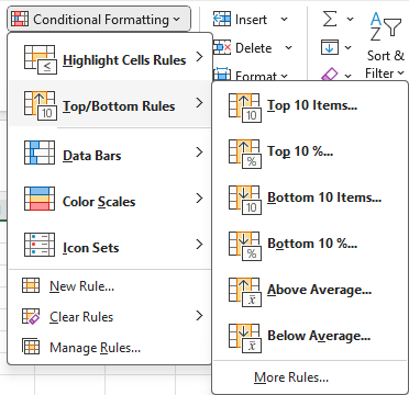
This style automatically identifies the top or bottom values in a range of data. While 10 is the default value, you can adjust this to show any number of the top or bottom data points.
Top/Bottom rules
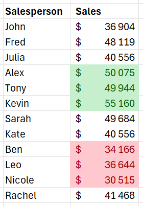
In the example below, we use the Top 10 and Bottom 10 styles to show just the top 3 and bottom 3 salespersons in our data.
Example of applying the top and bottom 10 style
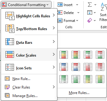
The color scales style allows you to format a table of data as a heatmap. You can highlight the range of data points from lowest to highest using the color gradient of your choice.
Color scales
This style is very useful for quickly making sense of a table that contains a lot of numbers.
In the example below, we show each salesperson's monthly sales. Without the color scales formatting applied, this would look like a confusing sea of numbers, and it would take more than a few minutes to figure out what’s important.
Instead, applying the color scale makes it much easier to identify the highest and lowest performing salesperson and month.
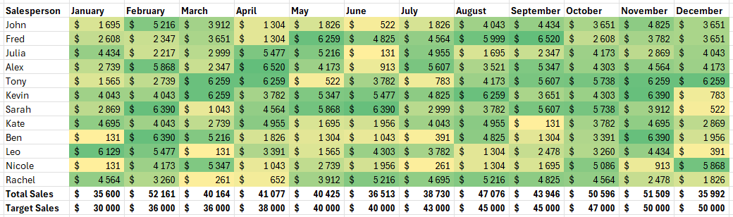
Example of applying color scales
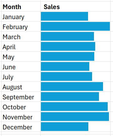
This style adds horizontal bars within cells to visually represent the relative value of each cell, making it easy to compare data at a glance.
This style has quite a few options for changing how it looks and behaves. You can customize colors and choose whether to display the bar only or include the cell's numerical value.
Data bars
In the example below, we add data bars instead of the sales values. These bars make it quick and easy to identify the highest and lowest performing months.
Example of applying data bars
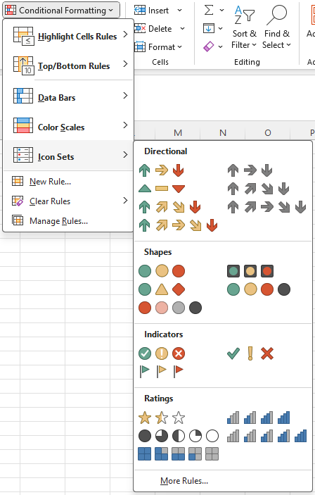
Lastly, there is the icon set style. These are similar to the data bars in that you have quite a few customization options, such as whether to display the icon only or both the icon and value.
You can even import your own icon sets to maintain consistent branding in your reports.
Icon sets
If your conditions are straightforward, like highlighting cells greater than a specific value or finding duplicates, predefined rules are quick and easy.
However, when your conditions depend on changing values or more complex logic, formulas provide a lot more flexibility. If you need to combine multiple conditions or custom rules, such as highlighting cells that are above average and also below a certain threshold, formulas can handle this complexity.
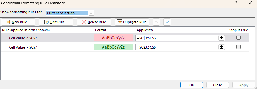
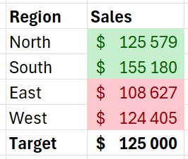
Let's say you have a list of regions in column B with their associated sales values in column C and a sales target in cell $C$7.
We want to highlight any sales figures above or below this target. To do this, we’ll need to apply two rules.
First, select the cells in column C to apply the rule.
In the conditional formatting drop-down menu, select “Greater than” and enter the cell that contains the target ($C$7). This formula checks if the value in each cell of column C is greater than the value in cell $C$7.
Simple example of formula-driven conditional formatting
Choose the green color format to apply to cells that meet the condition. Then, repeat this process with the “Less than” formatting option in the conditional formatting drop-down menu and apply the red color format.
This will give us a nicely formatted table where we can quickly see which regions hit their target and which did not.
Whenever you change the sales target in cell $C$7, the conditional formatting will automatically update to reflect the new target. This makes your formatting dynamic and responsive to changes in your data without the need to adjust the rule manually each time.
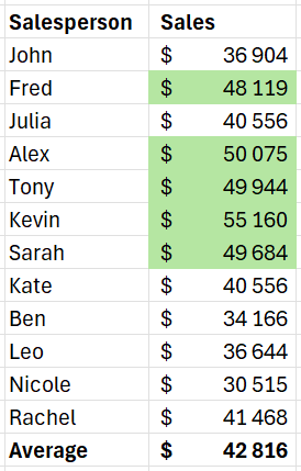
Suppose we have a table showing the total sales by salesperson, and we want to identify the top performers based on the average for the group.
Our data is structured as follows:
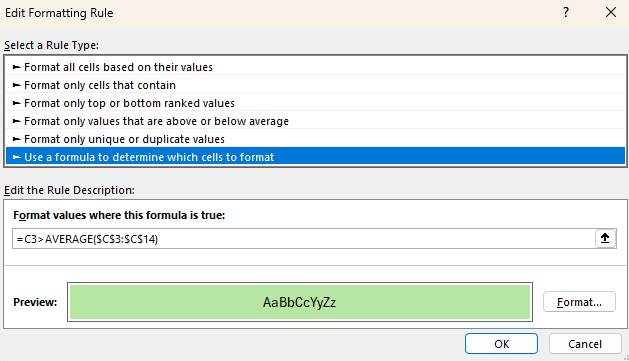
First, select the first cell in the range to which you want to apply the formatting. In this example, it is C3.
Select "New Rule" from the conditional formatting dropdown menu. Then, select the rule type “Use a formula to determine which cells to format”.
Here, we must enter a formula that compares each cell to the average of the sales data.
The formula should be =C3>AVERAGE($C$3:$C$14). If this formula is a bit confusing, don’t worry; we have an excellent tutorial on basic Excel formulas to get you started quickly.
Advanced example of formula-driven conditional formatting
Then, choose how you would like the cells that meet the criteria to be formatted, such as a fill color or font color. Click OK to apply the rule.
Lastly, copy the formatting from this first cell and paste it onto each subsequent cell in the range. This will automatically adjust the relative cell reference in our formula so that the correct cell is used for each calculation.
Below is the result. We can see that five out of the twelve salespeople performed above the average.
Using conditional formatting in Excel helps you quickly spot important information without needing advanced analysis skills, making it easier to understand and communicate your data insights.
This tool simplifies data interpretation, saving you time and effort in identifying critical areas that need attention.
|
Purpose |
Description |
|
Highlighting duplicates |
Identifies and addresses duplicates to ensure data is clean, reliable, and accurate. |
|
Visualizing trends and outliers |
Spot trends, patterns, and anomalies at a granular level without separate visual representations. |
|
Monitoring KPIs |
Quickly see which KPIs are on track, near target, or off-target without additional charts or reports. |
|
Creating dynamic heatmaps |
Visualize 2-dimensional tables, highlighting areas needing attention, such as low or high-performing sales periods. |
|
Tracking changes over time |
Highlight when values increase, decrease, or stay the same month over month to track trends. |
To learn more about data analysis in Excel, we have a course that takes you through Pivot Tables, logical functions, forecasting, and more.
When you're new to conditional formatting, start with basic rules before experimenting with more complex formulas and conditions.
Begin by applying simple highlight rules, such as formatting cells that are greater than a specific value or highlighting duplicates. This approach helps you understand the impact of conditional formatting on your data.
As you gain confidence, you can gradually introduce more advanced techniques to enhance your data analysis.
Using consistent colors across your conditional formatting rules keeps your spreadsheets clear and consistent.
For example, use green to indicate positive performance, red for negative, and yellow for warnings or alerts.
This consistency in color schemes makes it easier for you and others to interpret the data quickly, reducing confusion and ambiguity later on.
While conditional formatting is a powerful tool, overusing it can make your data harder to read and understand. Applying too many rules or overly complex formatting can make your spreadsheet look cluttered, which will only lead to confusion.
Focus on highlighting the most critical data points that need attention and try not to apply multiple conflicting rules to the same range of cells.
Dynamic named ranges are a great way to ensure your conditional formatting rules adapt to changes in your data. A dynamic named range automatically adjusts its size as data is added or removed, ensuring your formatting remains relevant as things change.
The easiest way to create a dynamic range is to format your data as a table. This way, your formulas and conditional formatting rules will use table and column names instead of referring to their column or row letters and numbers.
Conditional formatting is a great tool for creating rules that highlight the most important data in your spreadsheets.
It’s really easy to get started with conditional formatting in Excel, and there are many pre-built formatting styles to choose from, such as highlighting cells, using color scales, adding data bars, and more.
If you want to take it to the next level, you can even use formulas to create custom rules for your formatting.
We have an in-depth skill track dedicated to Excel fundamentals that is essential if you’re serious about leveling up your Excel knowledge and skills.
If you’re looking to start a career in data and want to add your Excel skills to your resume, consider pursuing a Microsoft Excel certification to validate your skills and prove to future employers that you’re the real deal.
Top Excel Courses
Cursus
Cours
Cours
cheat-sheet
Richie Cotton
Tutoriel
Aditya Sharma
Tutoriel
Francisco Javier Carrera Arias
Tutoriel
Joleen Bothma
Tutoriel
Laiba Siddiqui
Tutoriel
Laiba Siddiqui