Course
Time Series Analysis in Python
4 hr
69.7K
Signal processing is a fundamental discipline in data science that deals with the extraction, analysis, and manipulation of signals and time-series data. It is a broad field that can get complex. This guide will introduce you to the basic concepts and ideas necessary to help you navigate processing signals, whether they be pressure sensor data or stock market trends.
In the context of signal processing, a signal refers to any form of information that varies over time or space. Signals can take many forms, ranging from audio waveforms and temperature readings to financial market data and sensor measurements.
Time-series data is a subset of signals where measurements are recorded at successive points in time. Signals can be either analog (continuous) or digital (discrete).
Signal data can be classified into two main types: continuous and discrete.
Continuous signals are those that are measured and recorded over a continuous range, including analog signals, such as sound waves and temperature measurements (from analog thermometers).
Discrete signals are recorded at specific, distinct points. This type of data is more common in practical applications due to the discrete nature of today’s data acquisition and storage.
Digital sensor measurements and financial market data sampled at fixed intervals are examples of discrete-time signals.
Often, raw signal data is difficult to interpret.
Imagine seeing the soundwave data for a podcast, for example. Signal processing allows us to extract valuable insights from this raw data that might not be apparent at first glance. This information can then be used to make informed decisions, identify opportunities, or solve complex problems across various domains.
Signal processing is also useful during data preprocessing.
Real-world data is often noisy, and signal processing techniques allow data scientists to remove unwanted disturbances, outliers, and artifacts, resulting in cleaner and more reliable datasets. This clean data is essential for accurate modeling, predictions, and other advanced data analysis tasks. Additionally, signal processing is at the core of many advanced algorithms and models used in data science, such as time-series forecasting, anomaly detection, and image and speech recognition.

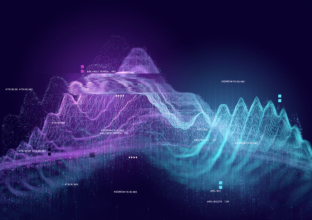
Figure 1: Artistic image depicting the audiogram (sound frequencies) of a podcaster. This sort of audiogram is an example of a signal. Photo credit: DALL-E.
Time-series data is a type of signal that is temporally ordered, where each data point is associated with a specific timestamp. This temporal structure allows the analysis of trends, seasonality, and cyclic patterns. There are a number of resources available for time-series data analysis in Python and time series with R.
Time-series forecasting is a subfield of signal processing that aims to predict future values based on historical data points. Forecasting plays a crucial role in various industries, enabling businesses to make informed decisions, optimize resource allocation, and anticipate market trends. It involves analyzing patterns and trends in time-series data to try to predict future time steps.
For a detailed view of time series forecasting, check out the Time Series Forecasting Tutorial.
Signals are often best understood through visuals. There are a few plots that are generally used for different types of signal data.
Line plots are a simple yet powerful way to visualize signal data, where the y-axis represents the signal value, and the x-axis corresponds to some sequential metric, such as time, meters, or sample number. These plots can provide an immediate understanding of trends and fluctuations.
An audio waveform is a common way of visualizing sound. You may have seen these types of plots when playing music or listening to a podcast, as several music apps display them in real-time.
Another common visualization is a spectrogram or an audiogram. And stock data is often displayed as a series of boxplots, called candlesticks, to display trends over time.
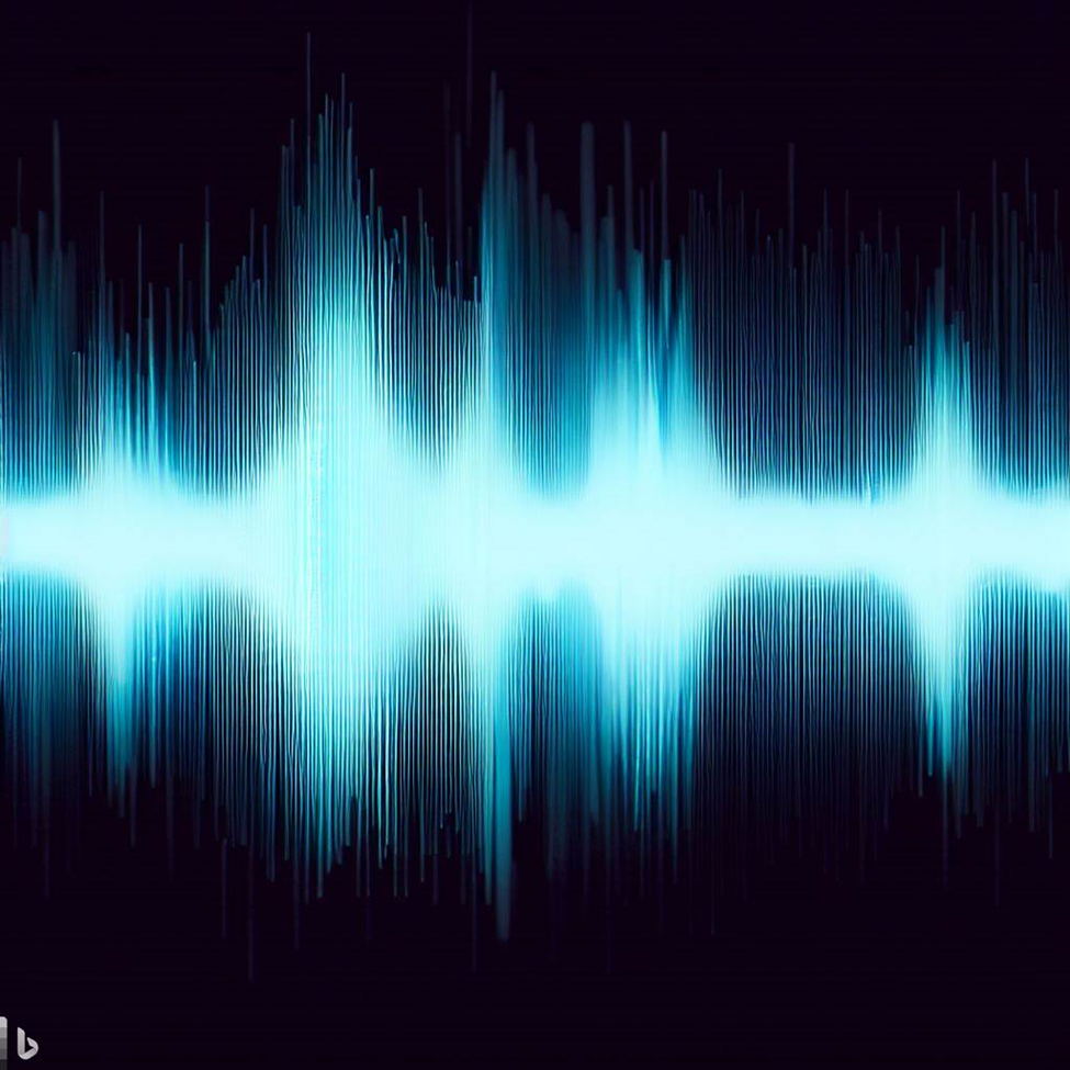
Figure 3: An example of an audio waveform depicting sound. Image credit: DALL-E.
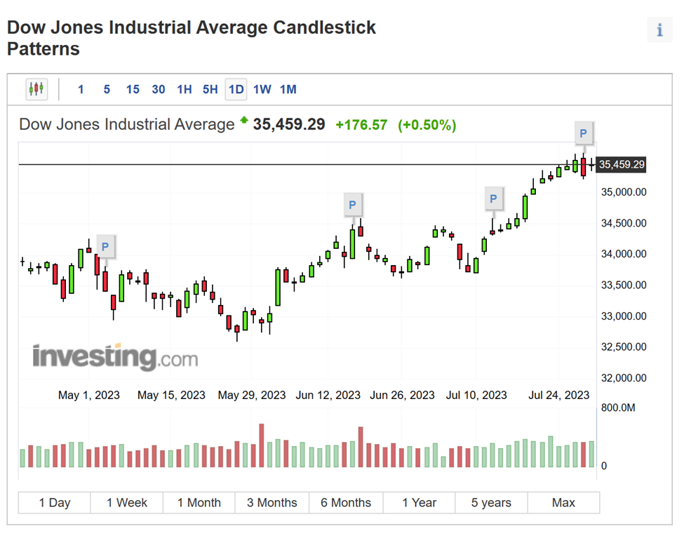
Figure 4: An example of a candlestick chart used for stock market analysis. Image source
In the realm of signal processing and time-series analysis, two commonly-used programming tools are MATLAB and Python.
MATLAB, developed by MathWorks, is a powerful and versatile tool widely used in engineering, mathematics, and scientific research. Its extensive documentation, built-in functions for signal processing, and user-friendly interface and visualization capabilities make it a great choice. The major drawback is the price of the tool.
If you are interested in using MATLAB for signal processing, check out the Signal Processing Toolbox and the Audio Toolbox, which both have extensive documentation with interactive examples.
Python is a free alternative that is used by many data scientists for signal processing tasks. If you are interested in switching from Matlab to Python, check out this Python for MATLAB users course from DataCamp!
Libraries such as NumPy, Pandas, and SciPy provide support for time-series data analysis. While there is an abundance of documentation for Python, its open-sourced nature can make it challenging to find the documentation necessary for your particular task.
For signal processing tasks, I’d recommend this Github repository.
Preprocessing data is a crucial step in signal processing that lays the foundation for accurate and meaningful analysis. Depending on your data and your analysis, this may mean dealing with irregular or missing data through resampling and interpolation methods or smoothing your data using various filters.
When working with signal data, you may encounter irregular sampling intervals or missing data points, which can frustrate your analysis and modeling efforts.
Resampling is a technique you can use to standardize the intervals of the data. It can involve upsampling (increasing the frequency of data points) or downsampling (decreasing the frequency of data points) to obtain a regular time-series.
Interpolation methods come into play when data points are missing or need to be estimated. Common interpolation techniques include linear interpolation, spline interpolation, and time-based interpolation.
These methods fill in the gaps in the data by estimating values based on surrounding data points, allowing for continuous and smooth signal data.
At their core, resampling and interpolation are essentially using the same concept to achieve different results. They are both interpreting a pattern in the data and “guessing” what the data would look like along this pattern, though they use different means to do so.
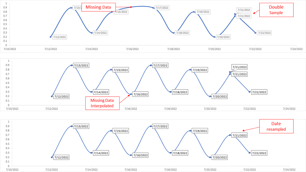
Figure 5: This figure shows a very simplified example of how interpolation and resampling can clean up messy data.
Noise and outliers are common occurrences in signal data, and they can make it challenging to obtain insights.
Outliers are data points that significantly deviate from the overall pattern, while noise refers to random fluctuations in the data that can obscure underlying patterns.
Outliers can be managed through techniques like data truncation or winsorization, which involve capping extreme values at a certain threshold.
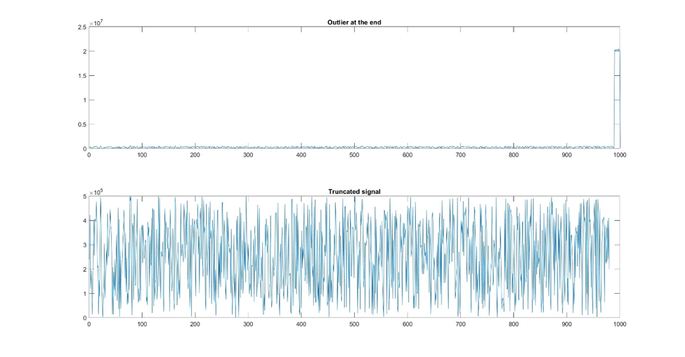
Figure 6: Sometimes there is noise or outliers at the front or end of the signal and you can resolve this by truncating the dataset.
Alternatively, outliers can be treated separately in the analysis, depending on their significance and impact on the overall results.
Ultimately, your approach to noise and outliers will depend on your specific dataset.
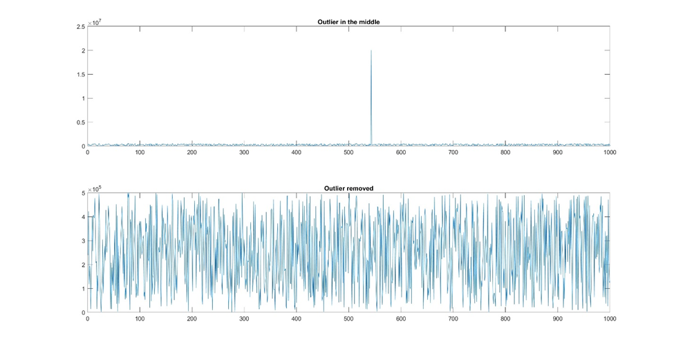
Figure 7: If there are only a few outliers, you can remove them manually. Alternatively, you could remove any value outside a certain amplitude range.
One approach to handling noise is smoothing to reduce the impact of random fluctuations.
This technique helps reveal long-term trends while suppressing short-term noise. Smoothing can often be more of an art, as it is important to smooth data enough to reduce the background noise without smoothing so much that you remove the signal as well. Since filtering is such a crucial step, we’ll discuss it more thoroughly later.
Moving averages and rolling windows are simple yet effective filtering techniques used to smooth time-series data and reduce the impact of noise. Rolling windows involve computing a specific statistic (e.g. mean or standard deviation) over a sliding window of data points. This approach helps capture localized patterns and variations in the data.
The moving average is one of the more common applications of rolling windows, where the statistic being calculated is the mean. This smooths out short-term fluctuations, making it easier to identify long-term trends and patterns. Moving averages are particularly useful in financial data analysis, where they are employed to study price trends over time.
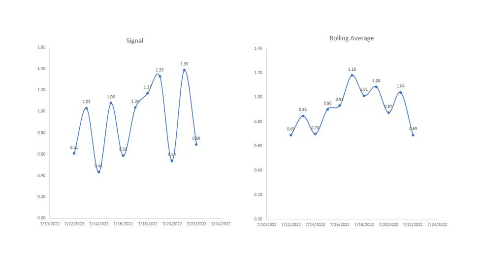
Figure 8: An example of how a rolling average can be used to smooth out a signal. This rolling average was taken with a window size of 3, meaning every data point in the right graph is an average of three corresponding data points in the left graph.
Low-pass, high-pass, and band-pass filters are frequency-based filtering techniques used to pass or block certain frequency components of a signal.
A low-pass filter allows low-frequency signals to pass while attenuating higher-frequency components, making it useful for removing noise and retaining slow-changing trends.
Conversely, a high-pass filter permits higher-frequency signals to pass, filtering out low-frequency components. High-pass filters are often employed to highlight short-duration events or sudden changes in the time-series.
A band-pass filter allows signals within a specific frequency band to pass while blocking others. This type of filter is useful in applications where specific frequency ranges contain relevant information. For example, in audio processing, a band-pass filter can be used to extract certain frequencies corresponding to human speech.
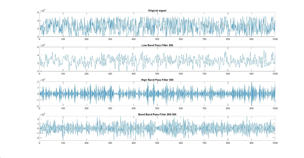
Figure 9: A demonstration of how different types of filters affect a signal.
Choosing the correct filter or smoothing technique for your particular dataset can be time-consuming.
A good method is to start with either a high band pass or a low band pass (depending on what you’re trying to isolate) and iterate from there.
Here is a list of several more complex filtering techniques you can try if a simpler technique doesn’t sufficiently isolate your desired pattern:
The two main ways of thinking about signals are in the time domain and in the frequency domain. Let’s start with the time domain.
Time-domain analysis involves examining the behavior of signals and data points with respect to time. In this section, we will explore three important aspects of time-domain analysis: auto-correlation and cross-correlation, time-domain features (mean, variance, skewness, kurtosis, etc.), and trend analysis with detrending methods.
Calculating various statistical features in the time domain provides valuable insights into the behavior of a time-series.
The mean gives the central tendency of the data, providing an overall idea of the data's level.
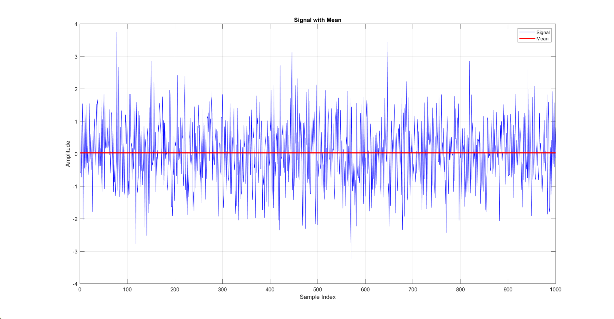
Figure 10: A demonstration of the mean of a signal. Here, the red line indicates the mean of the blue signal distribution.
Variance measures the spread or dispersion of the data points around the mean.
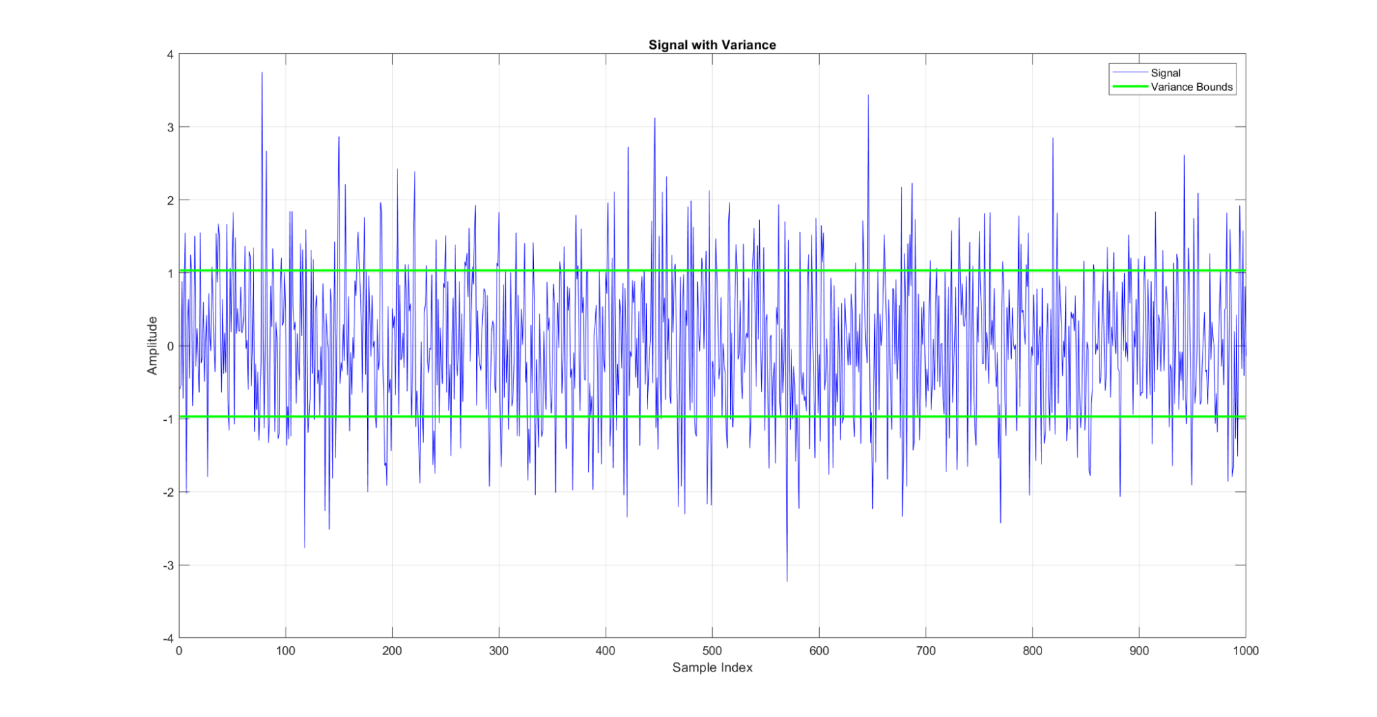
Figure 11: A demonstration of the variance metric for a signal. The green lines on this graph show the variance around the mean for the signal.
Skewness quantifies the asymmetry of the distribution, indicating whether the data is predominantly spread out on one side.
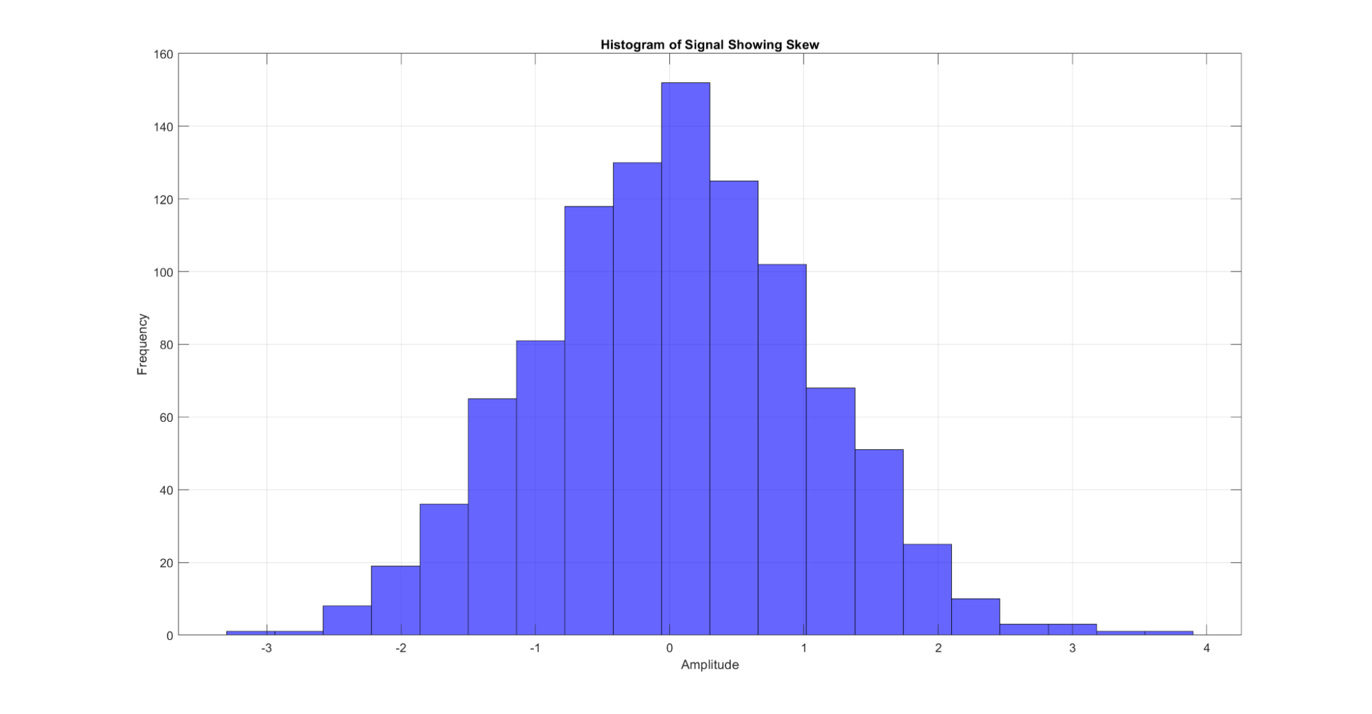
Figure 12: A demonstration of the skew metric for a signal. When the signal is plotted as a histogram of frequencies by amplitude, the skew can be visualized by the asymmetry in the tails of the histogram.
Kurtosis measures the thickness of the tails of the distribution, characterizing the presence of extreme values.
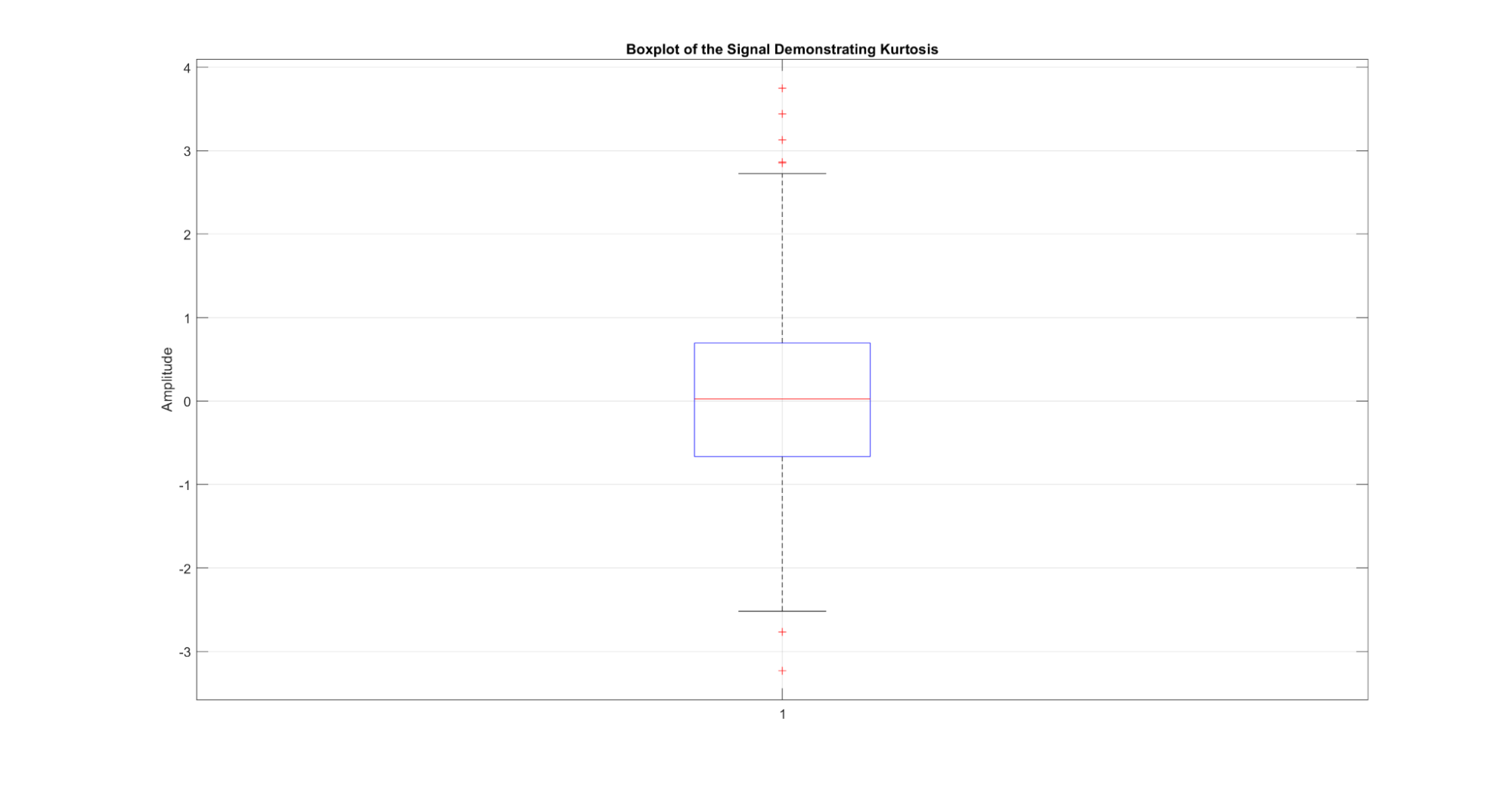
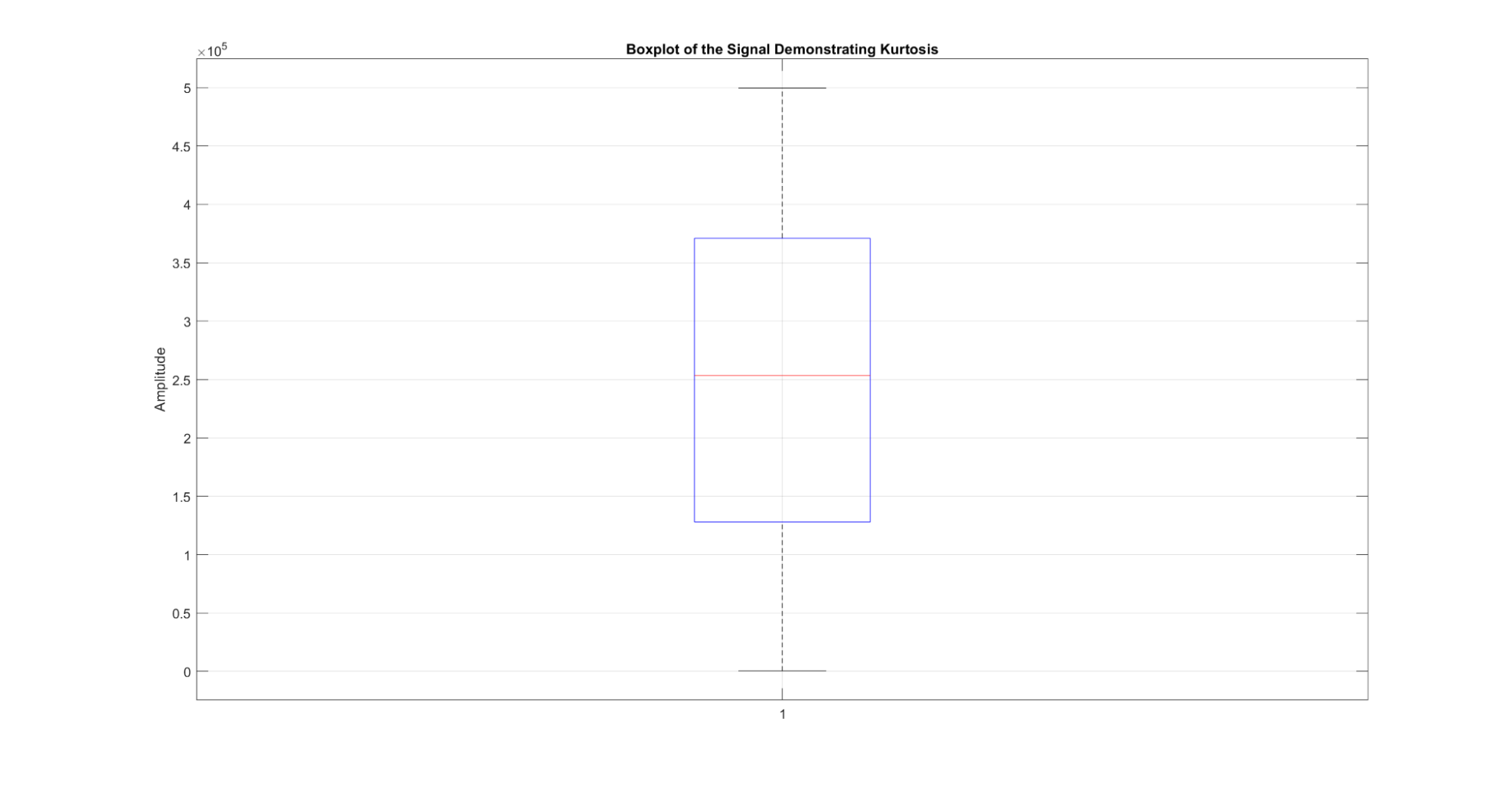
Figure 13: A demonstration of the kurtosis metric for a signal. When the signal is plotted as a boxplot of amplitudes, the kurtosis can be visualized by the height of the box.
These statistics may seem familiar if you have worked with data distributions. These metrics are the same for signal data as they are for distributions.
Auto-correlation measures the similarity between a time-series and a lagged version of itself. It helps identify repeating patterns or cyclic behavior within the data.
A strong auto-correlation at a specific lag indicates a repetitive pattern with that periodicity. For instance, in viral infection data, auto-correlation can reveal a seasonality associated with outbreaks.
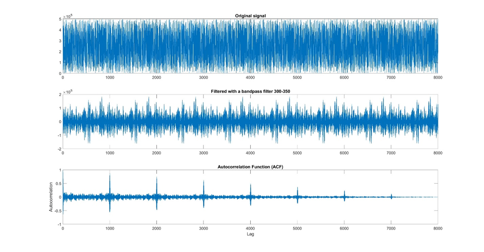
Figure 14: An example of using autocorrelation to identify periodicity in your signal. In this example, I took a very noisy signal, used a bandpass filter to reduce the noise, and then used an autocorrelation to evaluate how well the signal correlates with itself at different time lags. From this autocorrelation graph, you can see that the signal repeats with a period of about 1000.
Cross-correlation explores the relationship between two different signals. It is useful in finding correlations and lagged associations between two variables. For instance, cross-correlation could be used to study the relationship between temperature and energy consumption over time.
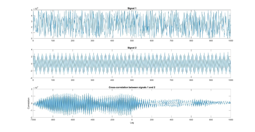
Figure 15: Here is an example of cross-correlation. In this example, we have two signals, one that may have some periodicity and another that has a stronger periodicity. Using a cross-correlation, we want to see whether these two signals correlate with each other at various time lags. We can see from the bottom graph that there is a stronger correlation at negative lags and almost no correlation at positive lags.
Trend analysis is useful for understanding the underlying long-term behavior of a signal. A trend represents the general direction in which the data is moving over an extended period. Trends can be ascending (increasing), descending (decreasing), or flat (stable).
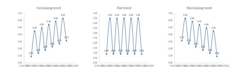
Figure 12: Example of three types of trends, an increasing trend, a flat or stable trend, and a decreasing trend.
Detrending methods are applied to separate the underlying trend from the signal, which can help focus the analysis on the remaining components like seasonality and irregular fluctuations.
One common detrending method is the moving average, where a rolling window's average is subtracted from the original signal. Other methods involve fitting a polynomial or using techniques like the Hodrick-Prescott filter.
On its surface, detrending sounds a lot like smoothing, but the techniques perform different tasks. Smoothing reduces noise, which allows long-term trends to be clearer. Detrending, on the other hand, removes long-term trends, allowing periodicity or seasonality to be more obvious. Depending on your analysis goals, you may use both.
Visualizing the original signal along with the detrended signal can help you better understand the data's behavior. Line plots or stem plots can effectively display trends and detrended data side by side.
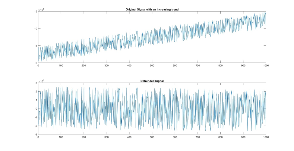
Figure 16: This example demonstrates the power of detrending. The original signal had a positively increasing trend to it. After detrending, the resulting pattern no longer retains this upward trajectory. Now that the trend is removed, a smoothing filter could be applied to better view the underlying pattern.
Frequency-domain analysis is a powerful technique that allows you to gain valuable insights into the frequency components of the data.
The Fourier Transform is a mathematical technique used to convert a time-domain signal into its corresponding frequency-domain representation. It decomposes the original signal into a sum of sinusoidal functions of different frequencies. The resulting frequency spectrum provides a clear picture of the frequency components present in the time-series data.
Visualizing the frequency spectrum is often done with a plot called the Power Spectral Density (PSD) plot. The PSD plot displays the power (or magnitude squared) of each frequency component. Peaks in the PSD plot indicate dominant frequencies in the data, which can reveal underlying patterns or periodic behavior.
The Power Spectral Density is a fundamental tool in frequency-domain analysis that shows the distribution of power with respect to frequency. It provides information about the strength of different frequency components present in the signal data.
High peaks in the PSD plot indicate strong frequency components, while low peaks represent weaker ones.
PSD plots are typically visualized using a logarithmic scale to enhance the visibility of weaker frequencies. These plots aid in identifying significant frequencies that may correspond to specific patterns or phenomena in the data.
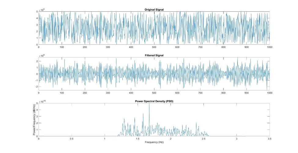
Figure 17: Here is an example of using a power spectral density plot (PSD) to examine the strength of different frequency components in the signal. The original signal was first filtered using a band pass filter, and then a power spectral density plot was created using a built-in function in Matlab.
The spectrogram is a valuable visualization technique used to examine how the frequency content of a signal changes over time. It provides a time-frequency representation of the data by dividing the signal into small segments and calculating the Fourier Transform for each segment.
By using a colormap to represent the power or magnitude of each frequency component, the spectrogram displays a three-dimensional view of the data. Warmer-colored regions in the spectrogram indicate stronger frequency components at specific time intervals, while cooler-colored regions suggest weaker or non-existent frequencies.
Time-frequency analysis helps detect transient events or changes in frequency characteristics that are not easily observable in the time or frequency domain alone. This is particularly useful in applications such as speech and audio processing, where different phonemes or sounds may have varying frequency components over time.
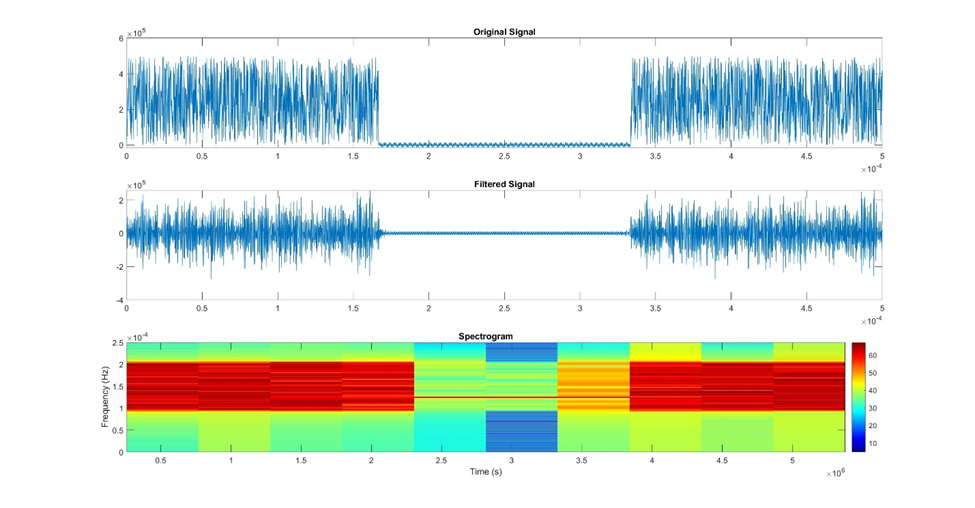
Figure 18: This is an example of how to visualize your signal as a spectrogram. The original signal was filtered using a band filter and then plotted as a spectrogram using a default Matlab function.
The applications of signal processing are diverse and encompass several fields. Let's explore some prominent applications of signal processing in data science:
Signal processing is highly influential in the finance industry, enabling in-depth analysis of financial time-series data.
By applying filtering techniques, trend analysis, and time-domain features, data scientists can identify patterns, trends, and anomalies in stock market data.
Forecasting models are utilized to predict market trends, stock prices, and risk assessments. These predictions are instrumental for investors, traders, and financial institutions in making well-informed decisions and managing portfolios effectively.
For a more in depth look at financial data analytics, check out DataCamp’s catalog of financial data courses or this Introduction to Financial Concepts in Python course.
The Internet of Things (IoT) generates vast volumes of time-series data from various sensors and devices.
Signal processing helps in extracting valuable information from this data, leading to actionable insights. By analyzing IoT sensor data, data scientists can monitor equipment health, detect anomalies, and optimize performance.
For instance, in smart manufacturing, signal processing techniques are employed to predict machinery failures and prevent downtime, ultimately enhancing productivity and reducing maintenance costs.
DataCamp has a great course on analyzing IoT data. Check it out!
Signal processing is used in healthcare and biomedical applications, where continuous monitoring of physiological signals is vital for patient care.
For example, in electrocardiograms (ECGs) and electroencephalograms (EEGs), signal processing techniques help detect abnormalities, assess patient conditions, and assist in diagnosis and treatment planning.
Additionally, time-domain and frequency-domain analysis aid in uncovering hidden patterns in medical signals, leading to advancements in disease detection and understanding of human physiology.
In addition to healthcare applications, signal processing finds extensive use in biomedical research. It’s useful in analyzing genomic data, and other biological signals, providing valuable insights into disease mechanisms, drug discovery, and personalized medicine.
Check out this DataCamp course on Biomedical Image Analysis in Python that uses some of these techniques.
In speech and audio processing, signal processing techniques are employed to analyze and interpret spoken language and audio signals.
Automatic speech recognition (ASR) systems, voice assistants, and speech emotion recognition rely on signal processing algorithms to extract relevant features and recognize speech patterns.
Audio processing applications, such as noise reduction, audio enhancement, and speech synthesis, also heavily leverage signal processing methods.
If you’re interested in learning more, DataCamp has an excellent course on Spoken Language Processing in Python.
Signal processing is even used in image and video analysis, enabling applications like image recognition, object detection, and video surveillance.
Techniques such as the Fourier Transform are used for image compression and feature extraction. Time-frequency analyses, like spectrograms, play a crucial role in video and audio signal synchronization, enabling lip-reading and gesture recognition technologies.
For more information on image processing, I recommend this image processing course on DataCamp.
Signal processing is at the core of sensor data analysis, which is used in fields like environmental monitoring, weather forecasting, and industrial automation. It helps identify patterns and trends in sensor data, allowing predictive maintenance, anomaly detection, and optimization of systems and processes.
Signal processing is used in many scientific studies to examine everything from pressure signals to seismic tremors to voltages. These techniques have even been used to identify the sounds made by the wings of hummingbirds!
Signal processing is a powerful methodology, but to yield accurate and meaningful results, it requires adherence to best practices and careful considerations. Here are some essential tips to ensure successful signal processing.
Before diving into signal processing techniques, thorough data preprocessing and cleaning is critical! This involves handling missing values, dealing with outliers, and normalizing the data to ensure consistency and reliability. Noise reduction techniques, like filtering, are useful to remove unwanted disturbances that can affect signal analysis.
Visualizations are a super powerful tool in signal processing. They provide a clear understanding of the data patterns and the effectiveness of the applied techniques.
It is highly recommended that you visualize your data at each step in the preprocessing and analysis.
Time-domain plots, frequency spectra, and spectrograms are all common visualizations for signals.
Choosing the Right Signal Processing Techniques for Specific Problems
Signal processing includes a wide range of techniques, each tailored to specific types of data and problems. Understanding the nature of the data and the objectives of the analysis is essential in selecting the appropriate techniques. For time-series data, techniques like Fourier Transform and auto-correlation are useful for frequency and pattern analysis. Image data requires image processing techniques like edge detection and feature extraction.
Signal processing is a fundamental component of data science, empowering professionals to extract valuable insights from complex data in various industries. From finance to healthcare, speech to image processing, signal analysis plays an important role in transforming raw data into actionable insights.
Recent advancements in machine learning and computational capabilities have driven the development of innovative signal processing techniques. Check out how to use machine learning with your signal data, in a separate article.
It can be daunting the first time you are tasked with processing signal data. Hopefully, this tutorial has given you the tools to isolate a voice pattern, detect an earthquake, or predict a stock price increase.
If this article has interested you, DataCamp has several code-alongs you may want to check out. Here’s one for Time Analysis in Python, and a case study Analyzing a Time Series of the Thames River in Python. There are also time series tutorials in Python and spreadsheets.
Start Learning Topics Mentioned in this Tutorial!
Course
Course
Course
blog
Shawn Plummer
9 min
blog
Matt Crabtree
15 min
blog
Kurtis Pykes
15 min
Tutorial
Joanne Xiong
Tutorial
Karlijn Willems
Tutorial
Amberle McKee