Course
Intermediate Python
4 hr
1.4M
A time series is a collection of data observations indexed by time in chronological order. These data observations are commonly (but not necessarily) recorded at regular time intervals. Time series are often used in banking, trading, marketing, science, and other industries. The most typical visual representation of time series data is a line plot where time is put on the x-axis and the measured value – on the y-axis.
In this tutorial, we'll explore how to create and customize time series line plots in matplotlib, a primary Python plotting library.
First, we'll import the necessary Python libraries and load the data – a Kaggle dataset Daily Exchange Rates per Euro 1999-2023. We'll also perform some basic data cleaning:
import matplotlib
import matplotlib.pyplot as plt
import pandas as pd
from datetime import datetime

df = pd.read_csv('euro-daily-hist_1999_2022.csv')
df = df.iloc[:, [0, 4, 28, -2]]
df.columns = ['Date', 'CAD', 'NZD', 'USD']

for col in ['CAD', 'NZD', 'USD']:
    df = df[df[col] != '-']
    df[col] = pd.to_numeric(df[col])

df = df[df['Date'] >= '2022-12-01'].reset_index(drop=True)
print(df.head(3))
print(f'\nThe date range: {df.Date.min()}/{ df.Date.max()}')
Output:
Date     CAD     NZD     USD
0  2023-01-27  1.4479  1.6759  1.0865
1  2023-01-26  1.4568  1.6799  1.0895
2  2023-01-25  1.4544  1.6792  1.0878

The date range: 2022-12-01/2023-01-27To efficiently work with time series, we need to convert date or time strings to datetime objects using the pandas.to_datetime function:
df['Date'] = pd.to_datetime(df['Date'])
print(df['Date'].dtypes)
Output:
datetime64[ns]If you need a refresher on how to work with time series in Python, you can find useful the Manipulating Time Series Data in Python course.
Now, let's set the Date column as a dataframe index using the set_index method:
df = df.set_index('Date')
print(df.head(3))
Output:
              CAD     NZD     USD
Date
2023-01-27  1.4479  1.6759  1.0865
2023-01-26  1.4568  1.6799  1.0895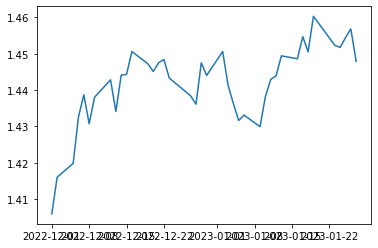
2023-01-25 1.4544 1.6792 1.0878To create a basic time series line plot, we use the standard matplotlib.pyplot.plot(x, y) method:
plt.plot(df.index, df['CAD'])Output:
To create a multiple-line time series plot, we just run the matplotlib.pyplot.plot(x, y) method the necessary number of times:
plt.plot(df.index, df['CAD'])
plt.plot(df.index, df['NZD'])
plt.plot(df.index, df['USD'])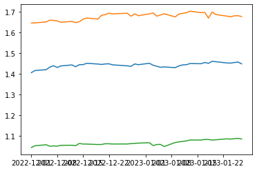
Using the for loop optimizes the above code:
for col in ['CAD', 'NZD', 'USD']:
    plt.plot(df.index, df[col])
Output:

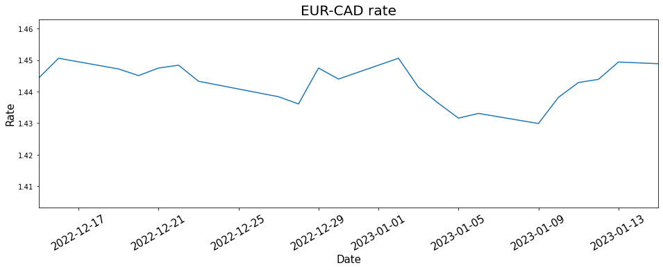
To make our time series line plot more readable and compelling, we need to customize it. We can apply to it some common matplotlib adjustments, such as customizing the figure size, adding and customizing a plot title and axis labels, modifying the line properties, adding and customizing markers, etc. Other adjustments are specific to time series line plots, such as customizing time axis ticks and their labels or highlighting certain time periods.
Using standard matplotlib methods, we can customize the figure and axes of a time series line plot in many ways, as described in the code comments below:
# Adjusting the figure size
fig = plt.subplots(figsize=(16, 5))

# Creating a plot
plt.plot(df.index, df['CAD'])

# Adding a plot title and customizing its font size
plt.title('EUR-CAD rate', fontsize=20)

# Adding axis labels and customizing their font size
plt.xlabel('Date', fontsize=15)
plt.ylabel('Rate', fontsize=15)

# Rotaing axis ticks and customizing their font size
plt.xticks(rotation=30, fontsize=15)

# Changing the plot resolution - zooming in the period from 15.12.2022 till 15.01.2023
plt.xlim(pd.Timestamp('2022-12-15'), pd.Timestamp('2023-01-15'))
Output:
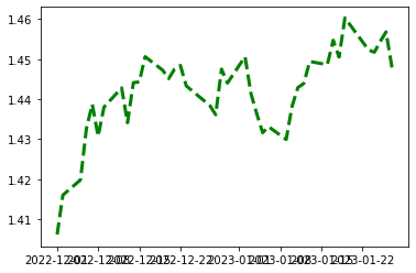
Like with common line plots, it's possible to change the line properties of a time series line plot, such as line color, style, or width:
plt.plot(df.index, df['CAD'], color='green', linestyle='dashed', linewidth=3)Output:
Like with any line plot, we can put markers on a time series line plot and customize their symbol, color, edge color, and size:
plt.plot(df.index, df['CAD'], marker='o', markerfacecolor='yellow', markeredgecolor='red', markersize=8)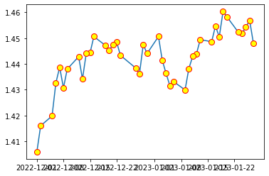
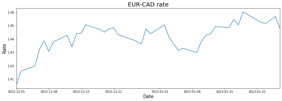
Let's first create a basic matplotlib time series line plot with some essential customization:
fig = plt.subplots(figsize=(16, 5))
plt.plot(df.index, df['CAD'])
plt.title('EUR-CAD rate', fontsize=20)
plt.xlabel('Date', fontsize=15)
plt.ylabel('Rate', fontsize=15)
plt.xlim(df.index.min(), df.index.max())
Output:
We see that by default matplotlib displays some random ticks, together with their labels. However, we may want to take control over what ticks are displayed on the time axis. In this case, we need to provide a list of the necessary dates (or times) as strings or pandas timestamps to the matplotlib.pyplot.xticks method:
fig = plt.subplots(figsize=(16, 5))
plt.plot(df.index, df['CAD'])
plt.title('EUR-CAD rate', fontsize=20)
plt.xlabel('Date', fontsize=15)
plt.ylabel('Rate', fontsize=15)
plt.xlim(df.index.min(), df.index.max())

# Defining and displaying time axis ticks
ticks = ['2022-12-05', '2023-01-02', '2023-01-20']
plt.xticks(ticks)
Output:
Above, matplotlib showed the selected ticks and automatically labelled them.
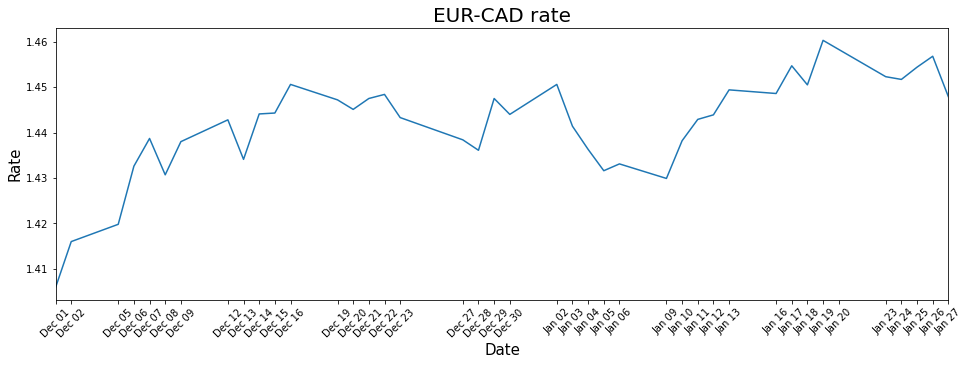
If we want to display all ticks, we should provide a list of the time series indices to the matplotlib.pyplot.xticks method:
fig = plt.subplots(figsize=(16, 5))
plt.plot(df.index, df['CAD'])
plt.title('EUR-CAD rate', fontsize=20)
plt.xlabel('Date', fontsize=15)
plt.ylabel('Rate', fontsize=15)
plt.xlim(df.index.min(), df.index.max())

# Defining and displaying all time axis ticks
ticks = list(df.index)
plt.xticks(ticks, rotation=45)
Output:
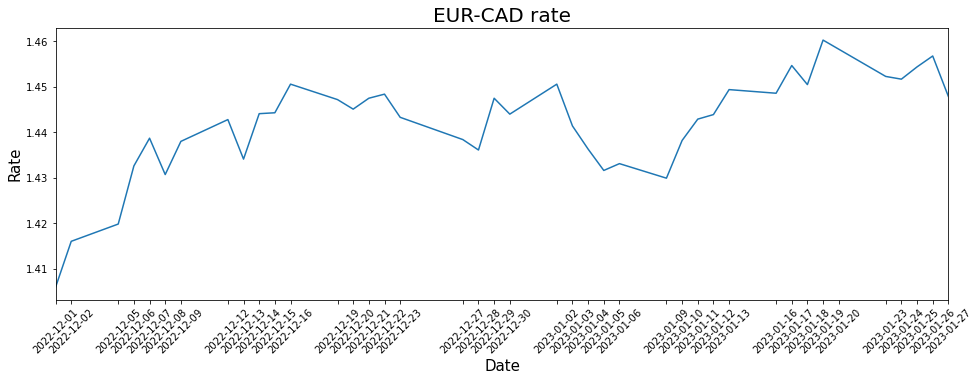
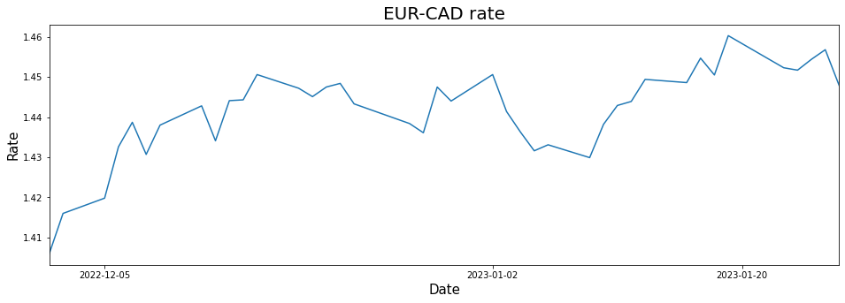
The time axis tick labels on the above line plot can look overwhelming. We may want to format them to make them more readable. For this purpose, we can use the matplotlib.dates.DateFormatter class passing to it a strftime format string reflecting how we would like to see the dates/times. Then, we provide this formatter to the matplotlib.axis.XAxis.set_major_formatter method:
fig, ax = plt.subplots(figsize=(16, 5))
plt.plot(df.index, df['CAD'])
plt.title('EUR-CAD rate', fontsize=20)
plt.xlabel('Date', fontsize=15)
plt.ylabel('Rate', fontsize=15)
plt.xlim(df.index.min(), df.index.max())
ticks = list(df.index)
plt.xticks(ticks, rotation=45)

# Formatting time axis tick labels
ax.xaxis.set_major_formatter(matplotlib.dates.DateFormatter('%b %d'))
Output:
This documentation page provides an exhaustive list of all possible strftime format codes.
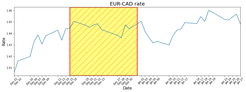
Sometimes, we may want to shade certain time periods on a time series line plot. For this purpose, we can use the matplotlib.pyplot.axvspan method. It takes two required arguments: the start and end time points of a period in interest in a datetime format. The method can also take some optional parameters to customize the appearance of a highlighted area, such as its color, edge color, transparency, line width, or filling pattern.
Let's apply this technique to the plot from the previous section:
fig, ax = plt.subplots(figsize=(16, 5))
plt.plot(df.index, df['CAD'])
plt.title('EUR-CAD rate', fontsize=20)
plt.xlabel('Date', fontsize=15)
plt.ylabel('Rate', fontsize=15)
plt.xlim(df.index.min(), df.index.max())
ticks = list(df.index)
plt.xticks(ticks, rotation=45)
ax.xaxis.set_major_formatter(matplotlib.dates.DateFormatter('%b %d'))

# Highlighting the time period from 15.12.2022 to 1.01.2023 and customizing the shaded area
plt.axvspan(datetime(2022, 12, 15), datetime(2023, 1, 1), facecolor='yellow', alpha=0.5, hatch='/', edgecolor='red', linewidth=5)
Output:
We can opt for saving a time series line plot to an image file rather than just displaying it. To do so, we use the matplotlib.pyplot.savefig method passing in the file name. For example, let’s return to our first basic plot:
plt.plot(df.index, df['CAD'])

# Saving the resulting plot to a file
plt.savefig('time series line plot.png')
Above, we saved the plot to a file called time series line plot.png and located in the same place as our current program.
To sum up, in this tutorial, we discussed how to create and customize time series line plots in matplotlib, using both common matplotlib methods and more advanced ones, specific only to time series visualizations.
After learning these fundamental techniques, you might want to dive deeper into working with time series data and visualizing them in Python. In this case, consider exploring the following comprehensive, beginner-friendly, and end-to-end resources:
Python Courses
Course
Course
cheat-sheet
Karlijn Willems
Tutorial
Kevin Babitz
Tutorial
Arunn Thevapalan
Tutorial
Elena Kosourova
Tutorial
Kurtis Pykes
Tutorial
Bekhruz Tuychiev