A line plot is a relational data visualization showing how one continuous variable changes when another does. It's one of the most common graphs widely used in finance, sales, marketing, healthcare, natural sciences, and more.
In this tutorial, we'll discuss how to use Seaborn, a popular Python data visualization library, to create and customize line plots in Python.
Introducing the Dataset
To have something to practice seaborn line plots on, we'll first download a Kaggle dataset called Daily Exchange Rates per Euro 1999-2024. Then, we'll import all the necessary packages and read in and clean the dataframe. Without getting into details of the cleaning process, the code below demonstrates the steps to perform:
import seaborn as sns
import matplotlib.pyplot as plt
import pandas as pd

daily_exchange_rate_df = pd.read_csv('euro-daily-hist_1999_2022.csv')
daily_exchange_rate_df = daily_exchange_rate_df.iloc[:, [0, 1, 4, -2]]
daily_exchange_rate_df.columns = ['Date', 'Australian dollar', 'Canadian dollar', 'US dollar']
daily_exchange_rate_df = pd.melt(daily_exchange_rate_df, id_vars='Date', value_vars=['Australian dollar', 'Canadian dollar', 'US dollar'], value_name='Euro rate', var_name='Currency')
daily_exchange_rate_df['Date'] = pd.to_datetime(daily_exchange_rate_df['Date'])
daily_exchange_rate_df = daily_exchange_rate_df[daily_exchange_rate_df['Date']>='2022-12-01'].reset_index(drop=True)
daily_exchange_rate_df['Euro rate'] = pd.to_numeric(daily_exchange_rate_df['Euro rate'])

print(f'Currencies: {daily_exchange_rate_df.Currency.unique()}\n')
print(df.head())
print(f'\n{daily_exchange_rate_df.Date.dt.date.min()}/{ daily_exchange_rate_df.Date.dt.date.max()}')Output:
Currencies: ['Australian dollar' 'Canadian dollar' 'US dollar']

        Date           Currency  Euro rate
0 2023-01-27  Australian dollar     1.5289
1 2023-01-26  Australian dollar     1.5308
2 2023-01-25  Australian dollar     1.5360
3 2023-01-24  Australian dollar     1.5470
4 2023-01-23  Australian dollar     1.5529

2022-12-01/2023-01-27
The resulting dataframe contains daily (business days) Euro rates for Australian, Canadian, and US dollars for the period from 01.12.2022 until 27.01.2023 inclusive.
Now, we're ready to dive into creating and customizing Python seaborn line plots.
Seaborn Line Plot Basics
To create a line plot in Seaborn, we can use one of the two functions: lineplot() or relplot(). Overall, they have a lot of functionality in common, together with identical parameter names. The main difference is that relplot() allows us to create line plots with multiple lines on different facets. Instead, lineplot() allows working with confidence intervals and data aggregation.
In this tutorial, we'll mostly use the lineplot() function.
The course Introduction to Data Visualization with Seaborn will help you learn and practice the main functions and methods of the seaborn library. You can also check out our Seaborn tutorial for beginners to get more familiar with the popular Python library.
Creating a single seaborn line plot
We can create a line plot showing the relationships between two continuous variables as follows:
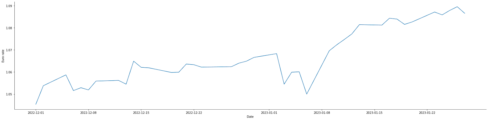
usd = daily_exchange_rate_df[daily_exchange_rate_df['Currency']=='US dollar'].reset_index(drop=True)
sns.lineplot(x='Date', y='Euro rate', data=usd)Output:
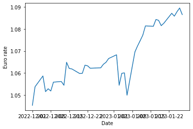
The above graph shows the EUR-USD rate dynamics. We defined the variables to plot on the x and y axes (the x and y parameters) and the dataframe (data) to take these variables from.
For comparison, to create the same plot using relplot(), we would write the following:
sns.relplot(x='Date', y='Euro rate', data=usd, kind='line')Output:
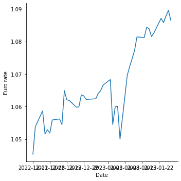
In this case, we passed in one more argument specific to the relplot() function: kind='line'. By default, this function creates a scatter plot.
Customizing a single seaborn line plot
We can customize the above chart in many ways to make it more readable and informative. For example, we can adjust the figure size, add title and axis labels, adjust the font size, customize the line, add and customize markers, etc. Let's see how to implement these improvements in seaborn.
Adjusting the figure size
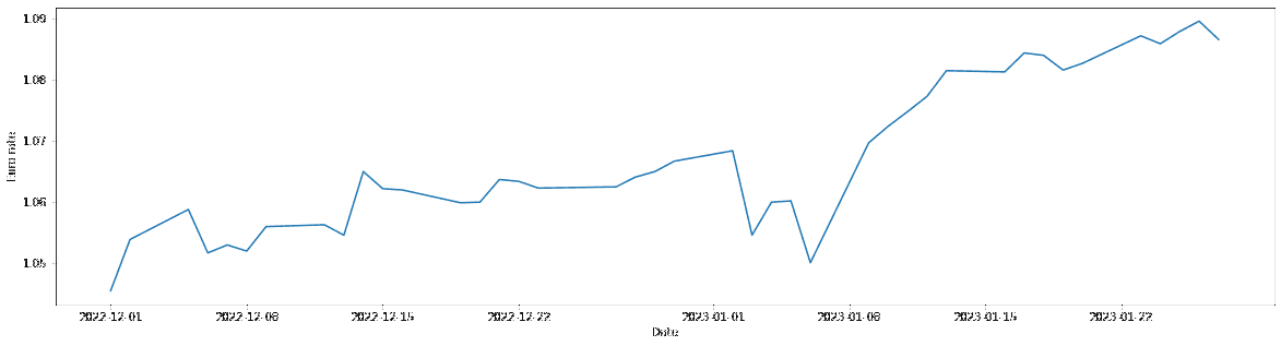
Since Seaborn is built on top of matplotlib, we can use matplotlib.pyplot to adjust the figure size:
fig = plt.subplots(figsize=(20, 5))
sns.lineplot(x='Date', y='Euro rate', data=usd)Output:
Instead, with relplot(), we can use the height and aspect (the width-to-height ratio) parameters for the same purpose:
sns.relplot(x='Date', y='Euro rate', data=usd, kind='line', height=6, aspect=4)Output:
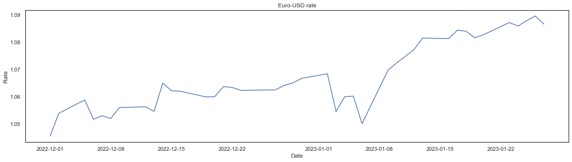
Adding a title and axis labels
To add a graph title and axis labels, we can use the set() function on the seaborn line plot object passing in the title, xlabel, and ylabel arguments:
fig = plt.subplots(figsize=(20, 5))
sns.lineplot(x='Date', y='Euro rate', data=usd).set(title='Euro-USD rate', xlabel='Date', ylabel='Rate')Output:
Adjusting the font size
A convenient way to adjust the font size is to use the set_theme() function and experiment with different values of the font_scale parameter:
fig = plt.subplots(figsize=(20, 5))
sns.lineplot(x='Date', y='Euro rate', data=usd).set(title='Euro-USD rate', xlabel='Date', ylabel='Rate')
sns.set_theme(style='white', font_scale=3)Output:
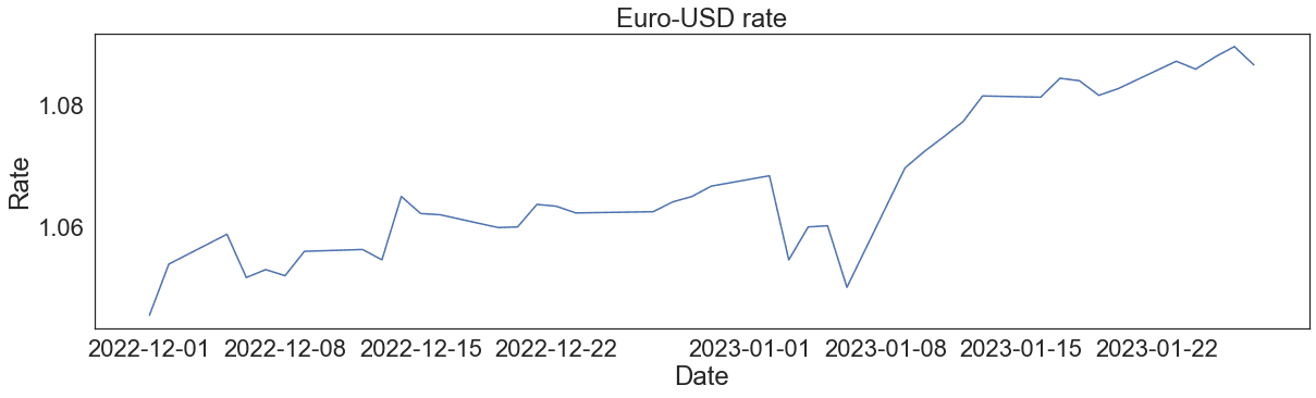
Note that we also added style='white' to avoid overriding the initial style.
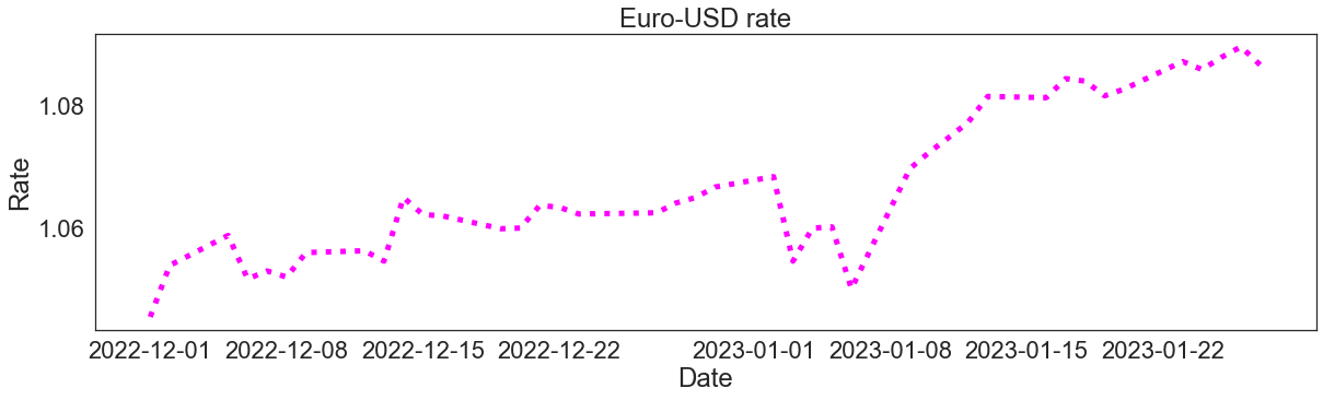
Changing the line color, style, and size
To customize the plot line, we can pass in some optional parameters in common with matplotlib.pyplot.plot, such as color, linestyle, or linewidth:
fig = plt.subplots(figsize=(20, 5))
sns.lineplot(x='Date', y='Euro rate', data=usd, linestyle='dotted', color='magenta', linewidth=5).set(title='Euro-USD rate', xlabel='Date', ylabel='Rate')
sns.set_theme(style='white', font_scale=3)Output:
Adding markers and customizing their color, style, and size
It's possible to add markers on the line and customize their appearance. Also, in this case, we can use some parameters from matplotlib, such as marker, markerfacecolor, or markersize:
fig = plt.subplots(figsize=(20, 5))
sns.lineplot(x='Date', y='Euro rate', data=usd, marker='*', markerfacecolor='limegreen', markersize=20).set(title='Euro-USD rate', xlabel='Date', ylabel='Rate')
sns.set_theme(style='white', font_scale=3)Output:
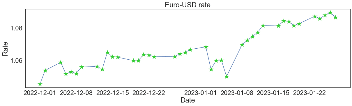
The documentation provides us with the ultimate list of the parameters to use for improving the aesthetics of a seaborn line plot. In particular, we can see all the possible choices of markers.
In our Seaborn cheat sheet, you'll find other ways to customize a line plot in Seaborn.
Seaborn Line Plots With Multiple Lines
Often, we need to explore how several continuous variables change depending on another continuous variable. For this purpose, we can build a seaborn line plot with multiple lines. The functions lineplot() and relplot() are also applicable to such cases.
Creating a seaborn line plot with multiple lines
Technically, it's possible to create a seaborn line plot with multiple lines just by building a separate axes object for each dependent variable, i.e., each line:
aud = daily_exchange_rate_df[daily_exchange_rate_df['Currency']=='Australian dollar'].reset_index(drop=True)
cad = daily_exchange_rate_df[daily_exchange_rate_df['Currency']=='Canadian dollar'].reset_index(drop=True)

sns.lineplot(x='Date', y='Euro rate', data=usd)
sns.lineplot(x='Date', y='Euro rate', data=aud)
sns.lineplot(x='Date', y='Euro rate', data=cad)Output:
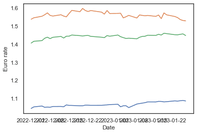
Above, we extracted two more subsets from our initial dataframe daily_exchange_rate_df – for Australian and Canadian dollars – and plotted each euro rate against time. However, there are more efficient solutions to it: using the hue, style, or size parameters, available in both lineplot() and relplot().
Using the hue parameter
This parameter works as follows: we assign to it the name of a dataframe column containing categorical values, and then seaborn generates a line plot for each category, giving a different color to each line:
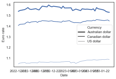
sns.lineplot(x='Date', y='Euro rate', data=daily_exchange_rate_df, hue='Currency')Output:
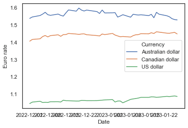
With just one line of simple code, we created a seaborn line plot for three categories. Note that we passed in the initial dataframe daily_exchange_rate_df instead of its subsets for different currencies.
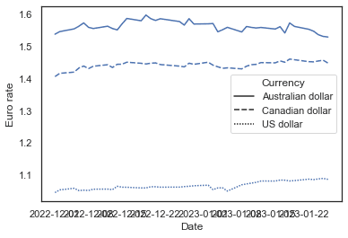
Using the style parameter
The style parameter works in the same way as hue, only that it distinguishes between the categories by using different line styles (solid, dashed, dotted, etc.), without affecting the color:
sns.lineplot(x='Date', y='Euro rate', data=daily_exchange_rate_df, style='Currency')Output:
Using the size parameter
Just like hue and style, the size parameter creates a separate line for each category. It doesn't affect the color and style of the lines but makes each of them of different width:
sns.lineplot(x='Date', y='Euro rate', data=daily_exchange_rate_df, size='Currency')Output:
Customizing a seaborn line plot with multiple lines
Let's now experiment with the aesthetics of our graph. Some techniques here are identical to those we applied to a single Seaborn line plot. The others are specific only to line plots with multiple lines.
Overall adjustments
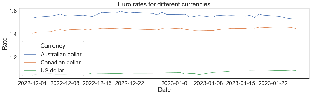
We can adjust the figure size, add a title and axis labels, and change the font size of the above graph in the same way as we did for a single line plot:
fig = plt.subplots(figsize=(20, 5))
sns.lineplot(x='Date', y='Euro rate', data=daily_exchange_rate_df, hue='Currency').set(title='Euro rates for different currencies', xlabel='Date', ylabel='Rate')
sns.set_theme(style='white', font_scale=3)Output:
Changing the color, style, and size of each line
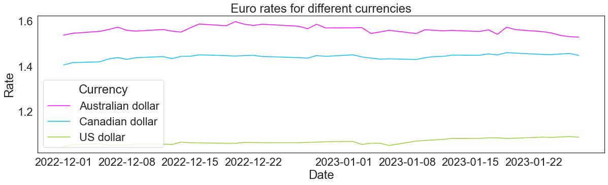
Earlier, we saw that when the hue, style, or size parameters are used, seaborn provides a default set of colors/styles/sizes for a line plot with multiple lines. If necessary, we can override these defaults and select colors/styles/sizes by ourselves.
When we use the hue parameter, we can also pass in the palette argument as a list or tuple of matplotlib color names. I would read our tutorial, Seaborn Color Palette: Quick Guide to Picking Colors, to understand more about color theory and to get lots of good ideas to make your visuals look nice.
fig = plt.subplots(figsize=(20, 5))
sns.lineplot(x='Date', y='Euro rate', data=daily_exchange_rate_df, hue='Currency', palette=['magenta', 'deepskyblue', 'yellowgreen']).set(title='Euro rates for different currencies', xlabel='Date', ylabel='Rate')
sns.set_theme(style='white', font_scale=3)Output:
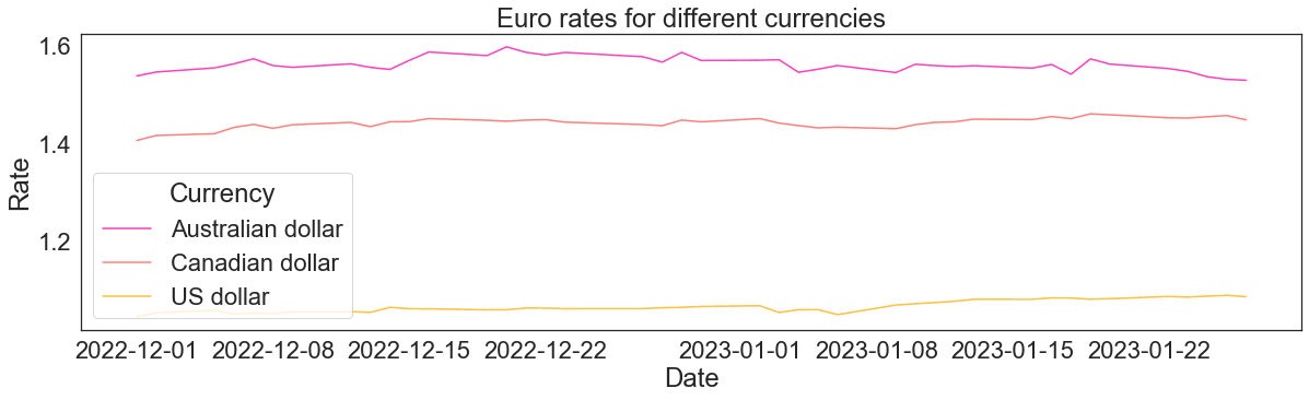
It's also possible to apply directly an existing matplotlib palette:
fig = plt.subplots(figsize=(20, 5))
sns.lineplot(x='Date', y='Euro rate', data=daily_exchange_rate_df, hue='Currency', palette='spring').set(title='Euro rates for different currencies', xlabel='Date', ylabel='Rate')
sns.set_theme(style='white', font_scale=3)Output:
At the same time, when using hue, we can still adjust the line style and width of all the lines passing in the arguments linestyle and linewidth:
fig = plt.subplots(figsize=(20, 5))
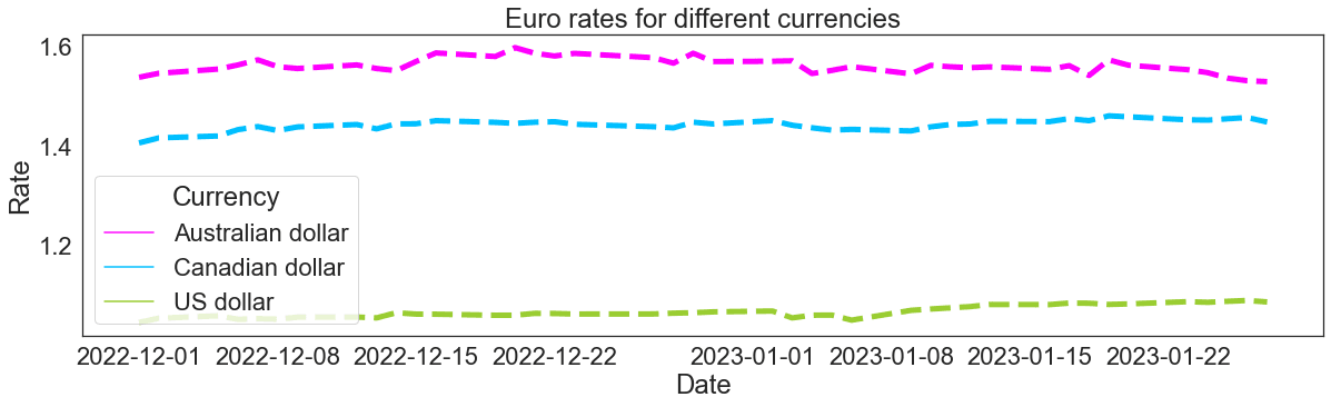
sns.lineplot(x='Date', y='Euro rate', data=daily_exchange_rate_df, hue='Currency', palette=['magenta', 'deepskyblue', 'yellowgreen'], linestyle='dashed', linewidth=5).set(title='Euro rates for different currencies', xlabel='Date', ylabel='Rate')
sns.set_theme(style='white', font_scale=3)Output:
Instead, when we create a seaborn line plot with multiple lines using the style parameter, we can assign a list (or a tuple) of lists (or tuples) to a parameter called dashes:
fig = plt.subplots(figsize=(20, 5))
sns.lineplot(x='Date', y='Euro rate', data=daily_exchange_rate_df, style='Currency', dashes=[[4, 4], [6, 1], [3, 9]]).set(title='Euro rates for different currencies', xlabel='Date', ylabel='Rate')
sns.set_theme(style='white', font_scale=3)Output:
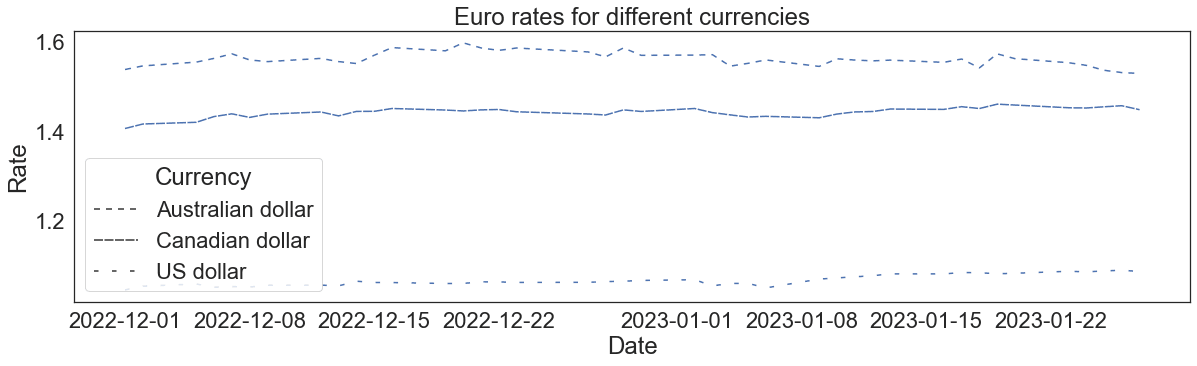
In the above list of lists assigned to dashes, the first item of each sublist represents the length of a segment of the corresponding line, while the second item – the length of a gap.
Note: to represent a solid line, we need to set the length of a gap to zero, e.g.: [1, 0].
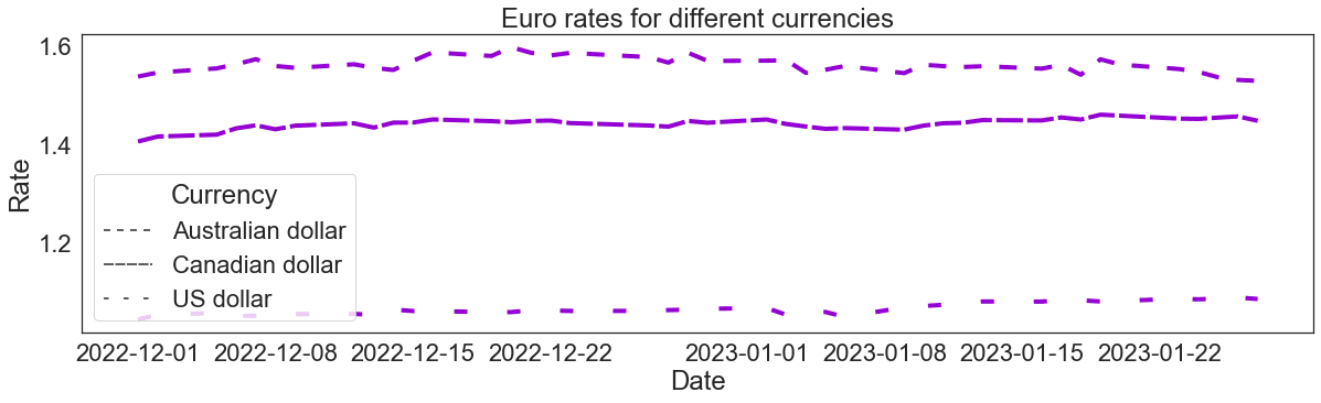
To adjust the color and width of all the lines of this graph, we provide the arguments color and linewidth, just like we did when customizing a single seaborn line plot:
fig = plt.subplots(figsize=(20, 5))
sns.lineplot(x='Date', y='Euro rate', data=daily_exchange_rate_df, style='Currency', dashes=[[4, 4], [6, 1], [3, 9]], color='darkviolet', linewidth=4).set(title='Euro rates for different currencies', xlabel='Date', ylabel='Rate')
sns.set_theme(style='white', font_scale=3)Output:
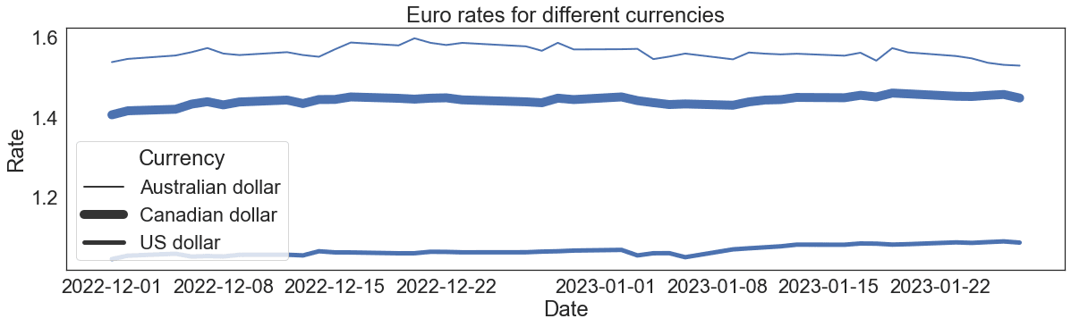
Finally, when we use the size parameter to create a seaborn multiple line plot, we can regulate the width of each line through the sizes parameter. It takes in a list (or a tuple) of integers:
fig = plt.subplots(figsize=(20, 5))
sns.lineplot(x='Date', y='Euro rate', data=daily_exchange_rate_df, size='Currency', sizes=[2, 10, 5]).set(title='Euro rates for different currencies', xlabel='Date', ylabel='Rate')
sns.set_theme(style='white', font_scale=3)Output:
To customize the color and style of all the lines of this plot, we need to provide the arguments linestyle and color:
fig = plt.subplots(figsize=(20, 5))
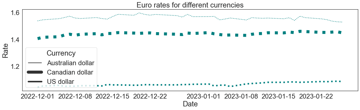
sns.lineplot(x='Date', y='Euro rate', data=daily_exchange_rate_df, size='Currency', sizes=[2, 10, 5], linestyle='dotted', color='teal').set(title='Euro rates for different currencies', xlabel='Date', ylabel='Rate')
sns.set_theme(style='white', font_scale=3)Output:
Adding markers and customizing their color, style, and size
We may want to add markers on our seaborn multiple line plot.
To add markers of the same color, style, and size on all the lines, we need to use the parameters from matplotlib, such as marker, markerfacecolor, markersize, etc., just as we did for a single line plot:
fig = plt.subplots(figsize=(20, 5))
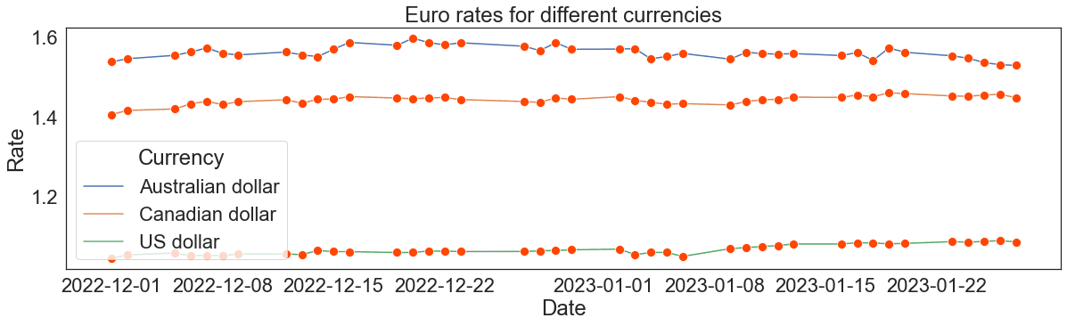
sns.lineplot(x='Date', y='Euro rate', data=daily_exchange_rate_df, hue='Currency', marker='o', markerfacecolor='orangered', markersize=10).set(title='Euro rates for different currencies', xlabel='Date', ylabel='Rate')
sns.set_theme(style='white', font_scale=3)Output:
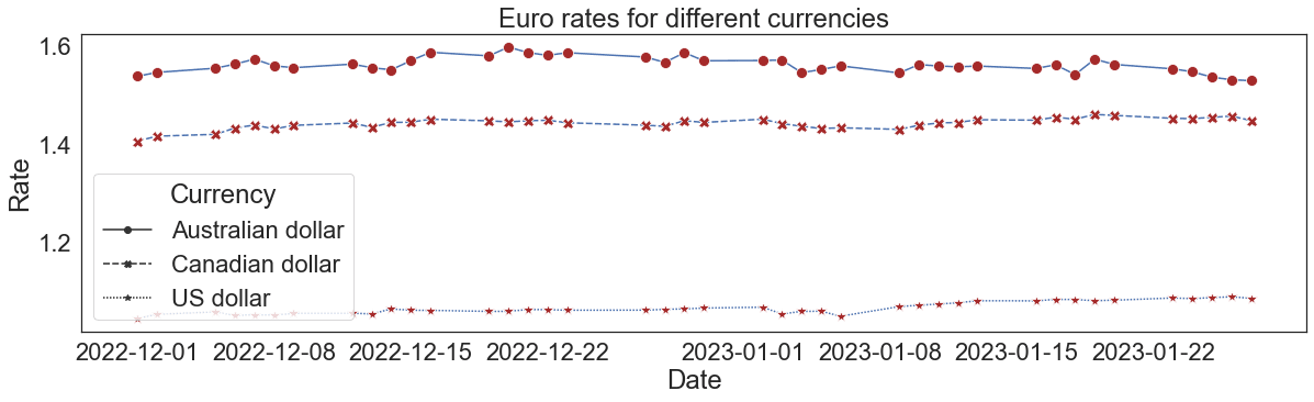
Things are different, though, when we want different markers for each line. In this case, we need to use the markers parameter, which, however, according to seaborn functionalities, works only when the style parameter is specified:
fig = plt.subplots(figsize=(20, 5))
sns.lineplot(x='Date', y='Euro rate', data=daily_exchange_rate_df, style='Currency', markers=['o', 'X', '*'], markerfacecolor='brown', markersize=10).set(title='Euro rates for different currencies', xlabel='Date', ylabel='Rate')
sns.set_theme(style='white', font_scale=3)Output:
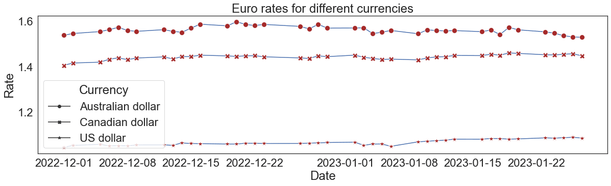
On the above plot, we can make all the lines solid by providing the dashes argument and setting the [1, 0] style pattern to each line:
fig = plt.subplots(figsize=(20, 5))
sns.lineplot(x='Date', y='Euro rate', data=daily_exchange_rate_df, style='Currency', markers=['o', 'X', '*'], dashes=[[1, 0], [1, 0], [1, 0]], markerfacecolor='brown', markersize=10).set(title='Euro rates for different currencies', xlabel='Date', ylabel='Rate')
sns.set_theme(style='white', font_scale=3)Output:
Conclusion
To recap, in this tutorial, we learned a range of ways to create and customize a Seaborn line plot with either a single or multiple lines.
As a way forward, with seaborn, we can do much more to further adjust a line plot. For example, we can:
- Group lines by more than one categorical variable
- Customize the legend
- Create line plots with multiple lines on different facets
- Display and customize the confidence interval
- Customize time axis ticks and their labels for a time series line plot
To dig deeper into what and how can be done with seaborn, consider taking our course Intermediate Data Visualization with Seaborn.