In our previous Bokeh tutorials, we discussed how to take your first steps with Bokeh and create some basic scatter and line plots. In addition to its vast data visualization possibilities, Bokeh also offers users a way to host apps on their servers by enabling a connection between Python and the browser.
We will begin by creating the app and running it on Bokeh servers to share with colleagues. To get more information on how the Bokeh server works, check out Bokeh documentation.
Basics of the Bokeh Server
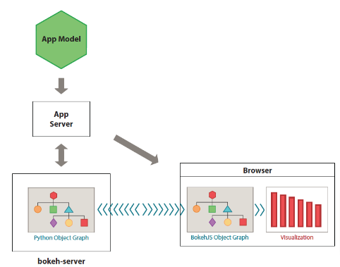
Bokeh converts objects (such as plots, widgets, axes, and almost everything you create) into JSON format.
The Bokeh server converts the Python Code you write to a JSON document. The JSON document is rendered in JavaScript using Bokeh's client library (BokehJS) for users to view the application in the browser.
The advantage of Bokeh is that it handles the JavaScript part. Hence, you don't need to have prior knowledge of JavaScript to create an app! The following image provides a summary of how the Bokeh server works.

Source: The Bokeh Server
How to Build and Run a Bokeh Application
The general structure of a bokeh application is:
- Create plots and widgets: This is the first step in creating a Bokeh application. You should have a predetermined plot that you want to showcase.
- Define callback function: A callback function instructs the application on how to respond to user interaction. For example, when you select a different ticker in a time series plot, the plot should update with the new data.
- Create layouts: Layouts help us present plots effectively and aesthetically.
Creating a Stock Market Analysis Bokeh Web App
Project Description
In this section, we will show you how to create a simple web app and deploy it for financial analysts to use.
Imagine you are working for Big Money Inc — a leading asset management company. Your manager has heard your colleagues praise your Python skills. Now she wants you to create a stock market app that the company's financial analysts will use to compare two stocks. Your manager believes that the company's financial analysts can save time by quickly comparing any stock they want to a similar stock in the same industry. For example, they can compare Apple's stock to Microsoft's and pick the best stock for creating clients' portfolios. The comparison should include basic measures, such as:
- Close price trend charts
- Correlation
- Mean (expected return)
- Standard deviation (expected risk)
There should be a way to customize the period of analysis interactively. For example, a user should be able to compare the performance of two stocks in the last week, month, year, or any period that they like. You should ensure that the app is readily available for all company users. This means that you need to deploy it using a cloud service.
Prerequisites
- Basic understanding of Bokeh.
- Some knowledge of Python.
- An installation of the packages outlined in our Getting Started with Bokeh Tutorial.
Overview of the Stock Market Web App
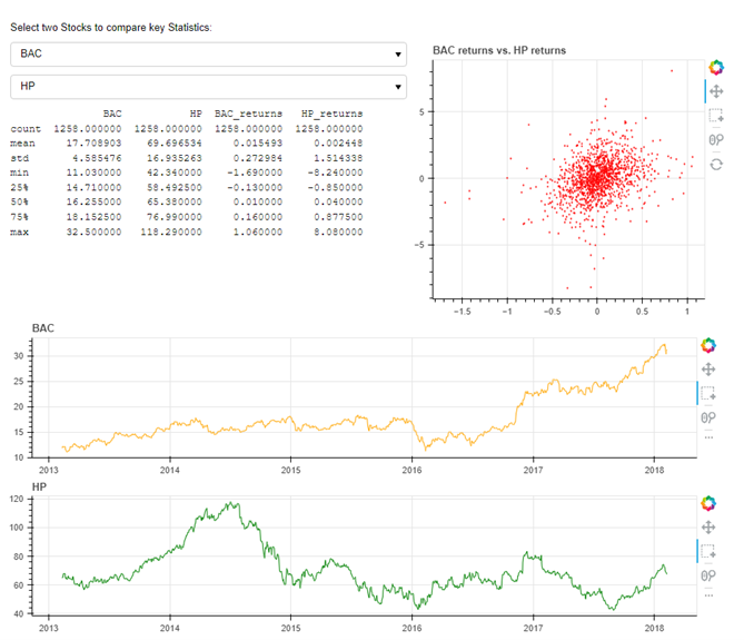
The web app will provide a solution to the case study in finance detailed above. This web app allows users to select two stock tickers and visualize their descriptive statistics (such as mean and standard deviation) of both prices and returns, correlation plots, and price trend charts for the selected stocks. Interactivity is created by enabling the selection of a combination of different tickers and different time periods (on the price trend charts). The web app will look like this:

Creating the Stock Market Web App Bokeh Project
1. You will need to create a project folder and name it SelectStock.
2. Open the project folder and create a file named main.py.
3. Save a copy of the stock market data in the project folder as “all_stocks_5yr.csv”.
Save a copy of the stock tickers. The file ticker.py contains the list of tickers. There are only 505 stock tickers, as including the entire list in the main.py code script can make the code cumbersome. It is appropriate to save the list of tickers in a separate file and call from it when needed.
Open the main.py file in your favorite code editors like Spyder, atom, or Sublime Text.
Import Packages
Type the following code in the main.py file. This code imports the packages and tickers that are necessary for creating the web app:
# Import the required packages
import pandas as pd
from functools import lru_cache
from bokeh.io import curdoc
from bokeh.layouts import column, row
from bokeh.models import ColumnDataSource, PreText, Select, Div
from bokeh.plotting import figure

# load the list of tickers
import tickers
tickers = tickers.tickers
Read and Load Data
Write a function to prevent a ticker from comparing to itself:
# Create a function to ensure that a ticker is not compared to itself
def foo(val, lst):
return [x for x in lst if x != val]
Add the following code to read and load data for the webapp:
# A function to read and load data
# Note the use of @lru_cache() decorator is to cache the data and speed up reloads
@lru_cache()
def load_ticker(ticker):
data = pd.read_csv('all_stocks_5yr.csv', parse_dates=['date'])
data = data.set_index('date')
data = data[data['Name'] == ticker]
return pd.DataFrame({ticker: data.close, ticker+'_returns': data.close.diff()})

# A function to create a dataframe for the selected tickers
@lru_cache()
def get_data(t1, t2):
df1 = load_ticker(t1)
df2 = load_ticker(t2)
data = pd.concat([df1, df2], axis=1)
data = data.dropna()
data['t1'] = data[t1]
data['t2'] = data[t2]
data['t1_returns'] = data[t1+'_returns']
data['t2_returns'] = data[t2+'_returns']
return data

# Put data into a ColumnDataSource
source = ColumnDataSource(
data=dict(date=[], t1=[], t2=[], t1_returns=[], t2_returns=[]))
Create Widgets
# set up widgets
stats = PreText(text='', width=500)
ticker1 = Select(value='AAPL', options=foo('GOOG', tickers))
ticker2 = Select(value='GOOG', options=foo('AAPL', tickers))
The widgets allow the user to select the first ticker and second ticker for comparison. Once you select the tickers, Bokeh can create plots.
Create Plots
# set up plots
tools = 'pan,wheel_zoom,xbox_select,reset'

corr = figure(width=400, height=350,
              tools='pan,wheel_zoom,box_select,reset', output_backend='webgl')
corr.diamond('t1_returns', 't2_returns', size=2, source=source, color="red",
            selection_color="orange", alpha=0.6, nonselection_alpha=0.1, selection_alpha=0.4)


time_series1 = figure(width=900, height=200, tools=tools,
                      x_axis_type='datetime', active_drag="xbox_select", output_backend='webgl')
time_series1.line('date', 't1', source=source, color='orange')
time_series2 = figure(width=900, height=200, tools=tools,
                      x_axis_type='datetime', active_drag="xbox_select", output_backend='webgl')
time_series2.x_range = time_series1.x_range
time_series2.line('date', 't2', source=source, color='green')
In this code, we first define the tools that will accompany the plots. The correlation plot is the first plot, with the figure() function specifying width = 400 and height = 350. The correlation plot uses diamond markers.
We use the line glyph to create the time series plots for the tickers. The range of the time series is equal to allow for proper comparison.
# Define callbacks
def change_ticker1(attrname, old, new):
ticker2.options = foo(new, tickers)
update()

def change_ticker2(attrname, old, new):
ticker1.options = foo(new, tickers)
update()

def update(selected=None):
t1, t2 = ticker1.value, ticker2.value

df = get_data(t1, t2)
data = df[['t1', 't2', 't1_returns', 't2_returns']]
source.data = data

update_stats(df, t1, t2)

corr.title.text = '%s returns vs. %s returns' % (t1, t2)
    time_series1.title.text, time_series2.title.text = t1, t2

def update_stats(data, t1, t2):
stats.text = str(data[[t1, t2, t1+'_returns', t2+'_returns']].describe())

ticker1.on_change('value', change_ticker1)
ticker2.on_change('value', change_ticker2)

def selection_change(attrname, old, new):
t1, t2 = ticker1.value, ticker2.value
data = get_data(t1, t2)
selected = source.selected.indices
if selected:
    data = data.iloc[selected, :]
update_stats(data, t1, t2)

source.selected.on_change('indices', selection_change)
In the callback section, the first and second functions define the callback for ticker 1 and ticker 2, respectively.
The update() function updates the plots whenever the user selects a different combination of tickers; the update_stats() function updates the statistics when the user selects a new set of tickers; and, the selection_change() function updates the entire app when the user updates tickers.
Set Up the Layout
The first step is to give the app a title that provides instructions to the user on how to interact with the web app. The Div function allows you to provide the text and define the height and width, along with other customizations.
# set up layout
# Add a title message to the app
div = Div(
    text="""
        <p>Select two Stocks to compare key Statistics:</p>
        """,
width=900,
height=30,
)
# Create layouts
app_title = div
widgets = column(ticker1, ticker2, stats)
main_row = row(widgets, corr)
series = column(time_series1, time_series2)
layout = column(app_title, main_row, series)
The app layout combines both the column and row functions.
First, a title is placed at the top. The main row is stacked underneath (the main row contains the descriptive statistics and the correlation plot). The next row contains the first time series plot (for ticker 1), and the last row contains the time series plot for the second ticker.
Initialize the app
This step initializes the web app when called on the server.
# initialize the app
update()
curdoc().add_root(layout)
curdoc().title = "Compare Stocks"
Deploying the Web App
To test your web app, you can deploy it using your local machine. To do this, you simply open Anaconda Prompt or the terminal of your choice. Move into the directory containing the project folder name 'SelectStock'. You can do this by typing the following code:
cd "System path to where the SelectStock folder is contained"e.g cd "C:\Users\... \SelectStock"
Type the following code to run the web app:
bokeh serve --show SelectStockAlternatively, you can navigate into the SelectStock folder and run the main.py file:
Bokeh serve --show main.py
This launches the web app in the default web browser as;
http://localhost:5006/SelectStock or
You are using the Bokeh Server to run and deploy your web app.
You can also deploy the web app using services such as Heroku.
Conclusion
In this tutorial, you have learned the fundamentals of building and deploying your very own Bokeh applications on your local machine. The tutorial shows you how to put together all that you have learned to build a practical, fun, and interactive app that will excite users.
The best way to build your coding skills fast is by building projects like this after learning a concept or tool. This practical approach will ensure that you have a good understanding of a tool or skill and can show prospective employers what you've been doing.
If you want to learn more about Bokeh, you can read this book. Or, better yet, try DataCamp’s Interactive Visualization with Bokeh course. It provides details on Bokeh and how to create more advanced plots. You can go further and learn how to build your own Bokeh web apps using real-time data.
