In this tutorial you will learn how to install Bokeh (and its dependencies) and the basic building blocks for visualization using Bokeh. You will also learn how to create basic plots and customize them. This will lay the groundwork for learning more advanced features in the later sections.
What is Bokeh?
Bokeh is an interactive, data visualization package for creating dynamic visualizations with Python. Bokeh is open-source and you can use it to create plots that tell an interesting story.
What sets bokeh apart from other tools?
In the world of visualizations, there are many Python libraries for creating dashboards and visualizations, these include:
- Bokeh
- Matplotlib
- Streamlit
- dash
- Seaborn
- Plotly
- Geoplotlib
- Gleam
- ggplot
- Missingo
Bokeh is good for the following:
- Building interactive visualizations for modern browsers
- Making stand-alone documents or server-backed applications
- Creating expressive and dynamic graphics
- Creating dashboards for big, dynamic, or streaming data
This Bokeh Tutorial Is For You...
If you are a data scientist, data analyst, or machine learning engineer. This tutorial requires that you have some basic knowledge of Python and know how to install and import packages. You will learn how to create interactive visualizations and deploy them on the web using the Bokeh library. Bokeh can help you to create interactive plots, dashboards, and data applications.
How To Install Bokeh
Install using Anaconda
If Anaconda is your Python package manager, then you can install Bokeh from Anaconda Prompt, Windows Command Prompt, or Bash Terminal, as follows:
conda install bokeh
conda install jinja2
conda install six
conda install requests
conda install tornado
conda install pyYaml
Install using pip
You can also install it using pip python package manager, as follows:
pip install bokeh
pip install jinja2
pip install six
pip install requests
pip install tornado
pip install pyYaml
Install within Jupyter Notebook
!pip install bokeh
!pip install Jinja2
!pip install Six
!pip install Requests
!pip install Tornado
!pip install PyYaml
Verify your installation
from bokeh.io import output_notebook, show

output_notebook()

Problem Solving
If you are having problems with installing Bokeh, you can check out Discourse for help. You can also check out Github for solving Bokeh issues.
Welcome to Glyphs
What are glyphs anyway?
Glyphs are Bokeh's key building blocks that create plots. Every plot you build in Bokeh has a glyph mechanism in it. For example, when you want to create a scatter plot, you may use a circle as a marker to represent information. A line will represent information on a line plot.
These geometric shapes (lines or circles) are what we call glyphs in Bokeh. They convey visual information about data. This tutorial will help you understand glyphs by showing you how to use glyphs to create various types of plots. In summary, we are going to plot the following plots using glyphs:
- Line plots: Line plots present movement of data points along the x and y-axes as a line. Line plots are appropriate for plotting time series data.
- Bar plots: Bar plots represent the count of each category as a column or field. Bar plots are appropriate for categorizing data.
- Patch plots: Patch plots show a region of points using a particular color. They are appropriate for distinguishing groups within the same dataset.
- Scatter plots: Scatter plots represent the relationship between two variables and the strength of correlation between them.
How To Use Glyphs For Plotting
The general steps for creating a plot in Bokeh are;
- Create a plot using the figure() function to instruct Bokeh to create a diagram.
- Define title, x-axis, and y-axis labels.
- Then add line() glyph to the figure to create a line plot and
- cross() glyph to mark intersections between the x and y points.
Creating Line Plots
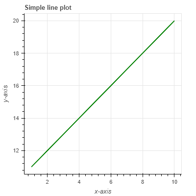
The code shows you how to create a simple line plot in bokeh.
#Import the required packages
from bokeh.io import output_notebook, output_file, show
from bokeh.plotting import figure
#Create two data arrays
x = [1, 2, 3, 4, 5, 6, 7, 8, 9, 10]
y = [11, 12, 13, 14, 15, 16, 17, 18, 19, 20]

# Create plot
plot = figure(width=400, height=400, title="Simple line plot", x_axis_label="x-axis", y_axis_label = 'y-axis')
plot.line(x,y, line_width=2, color='green')


#Show plot
output_file(“line_plot1.html”)
show(plot)
This example shows you how to create a single line glyph using a one-dimensional sequence of x and y data points using the line() glyph. You can specify the width and length of the plot, title, and axes labels in the figure() function. In the line() glyph, you can specify the line_width (thickness) using the line_width argument, and the color using the color argument.
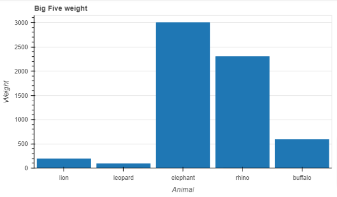
Creating bar plots
#Import the
from bokeh.plotting import figure, show

animals = ['lion', 'leopard', 'elephant', 'rhino', 'buffalo']
weight_tonnes = [190, 90, 3000, 2300, 590]

p = figure(x_range=animals, height=350, title="Big Five weight", x_axis_label = "Animal", y_axis_label = "Weight",
           toolbar_location=None, tools="")

p.vbar(x=animals, top=weight_tonnes, width=0.9)

p.xgrid.grid_line_color = None
p.y_range.start = 0

show(p)
Creating patch plots
A patch plot shades regions with color to show a group or region has similar characteristics. You can create a simple patch plot, as follows:
# Import required packages
from bokeh.io import output_file, show
from bokeh.plotting import figure
# Create the regions to chart
x_region = [[1,1,2], [2,3,3], [2,3,5,4]]
y_region = [[2,5,6], [3,6,7], [2,4,7,8]]
# Create plot
plot = figure()
plot.patches(x_region, y_region, fill_color = ['blue', 'yellow', 'green'], line_color = 'black')
show(plot)
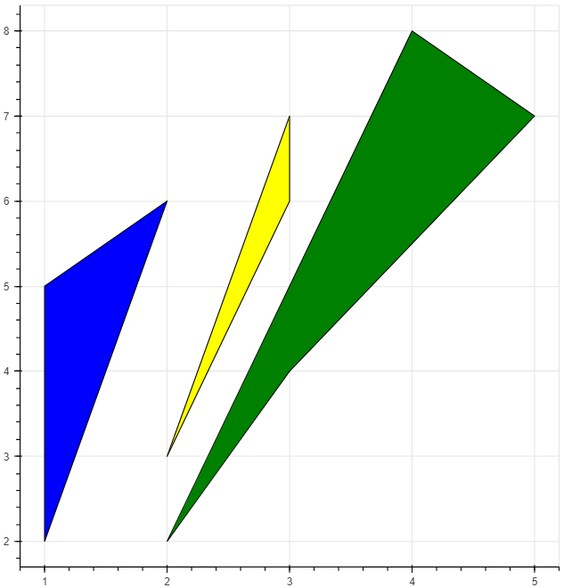
There are three distinct regions: First is the [1,1,2] mapped to [2,5,6] on the y-axis. Second is the region of [2,2,3] on the x-axis mapped to [3,6,7] on the y-axis, and third region [2,3,5,4] on the x-axis mapped to [2,4,7,8] on the y-axis. The patches glyph use different colors to build the patches for each region. The _linecolor argument specifies the border color for each patch.
Creating scatter plots
Data scientists often use scatter plots to determine the relationship between two variables. You can create a simple scatter plot in Bokeh as follows:
# Import required packages
from bokeh.io import output_file, show
from bokeh.plotting import figure
# Create x and y data points
x = [1,2,3,4,5]
y = [5,7,2,2,4]
# Create plot
plot = figure(title = "Scatter plot", x_axis_label = "Label name of x axis", y_axis_label ="Label name of y axis")
plot.circle(x,y, size = 30, alpha = 0.5)
# Add labels

# Output the plot
show(plot)
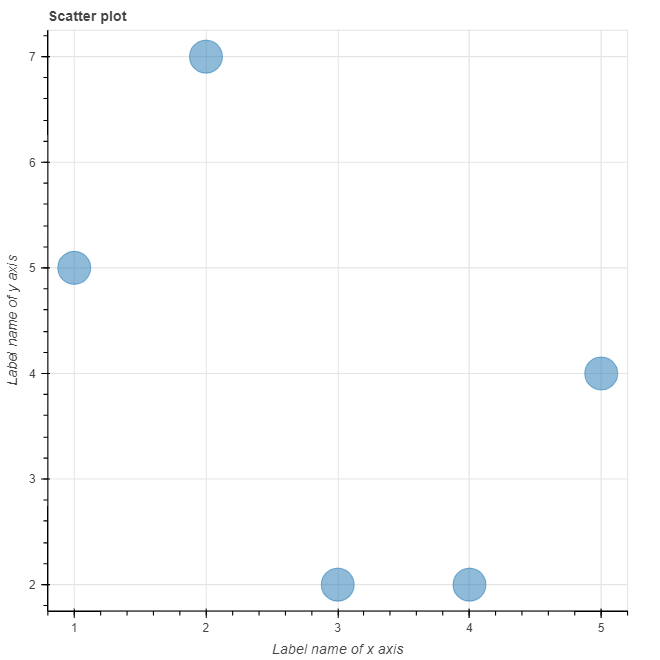
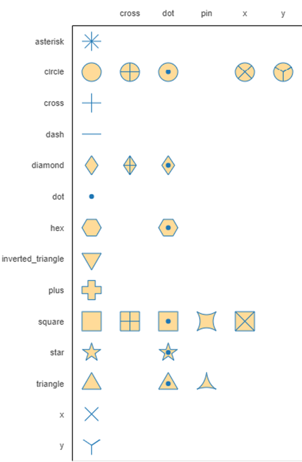
The code uses circle markers to create the intersection points of the x and y lists on the scatter plot. Instead of circles you can use other markers such as:
- cross()
- x()
- diamond()
- diamond_cross()
- circle_x()
- circle_cross()
- triangle()
- inverted_triangle()
- square_x()
- square_cross()
- asterisk()
The size = 30 argument specifies the size of each circles. The figure summarizes all markers available in bokeh.
The alpha argument specifies the transparency of the circles. It takes the value between 0 and 1, with 0 being completely transparent and 1 being opaque.
Conclusion
This tutorial introduces Bokeh as an interactive and high level visualization tool. The tutorial lays the groundwork on what you can expect when using Bokeh. You have seen how to create line plots, bar pots, patch plots, and scatter plots in Bokeh using the concept of glyphs. Check out the following Bokeh documentation for more details on the various charts that you can create in Bokeh.