In our first Data Visualization with Bokeh tutorial, you learned how to build visualizations from scratch using glyphs. Now, you can extend this concept and build plots from different data structures such as arrays and dataframes. In this tutorial, you will learn how to plot data with NumPy arrays, dataframes in Pandas, and ColumnDataSource using Bokeh. The ColumnDataSource is the essence of Bokeh, making it possible to share data over multiple plots and widgets.
Bokeh Plots from NumPy Arrays
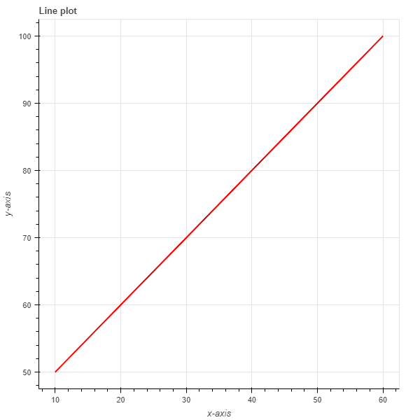
Creating line plots from NumPy arrays
# Import packages
import numpy as np
import random
from bokeh.io import output_file, show
from bokeh.plotting import figure

# Create an array
x_array = np.array([10,20,30,40,50,60])
y_array = np.array([50,60,70,80,90,100])

# Create a line plot
plot = figure()
plot.line(x_array, y_array)

# Output plot
show(plot)
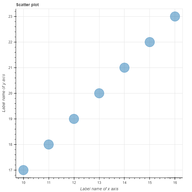
Creating scatter plots from NumPy arrays
# Import packages
import numpy as np
import random
from bokeh.io import output_file, show
from bokeh.plotting import figure

# Create arrays
x_arr = np.array([10,11,12,13,14,15,16])
y_arr = np.array([17,18,19,20,21,22,23])

# Create plot
plot = figure(title = "Scatter plot", x_axis_label = "Label name of x axis", y_axis_label ="Label name of y axis")
plot.circle(x_arr,y_arr, size = 30, alpha = 0.5)

# show plot
show(plot)
This yields the following graph:
Creating Plots Using Pandas Dataframes
Plotting lines with Pandas dataframes
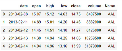
The data in this example is obtained from Kaggle. The dataset contains all the stocks contained in the S&P 500 index for five years up to December 2018. The file contains seven columns:
- Date - day of the week date in format yy-mm-dd
- Open - stock’s opening price
- High - stock’s highest price in the day
- Low - stock’s lowest price of the day
- Close - stock’s closing price for the day
- Volume - volume of stocks traded in the day
- Name - stock ticker name
We want to see the trend for Google’s stock over the five-year period. First, we load the data using Pandas and then check the first five rows of the Pandas dataframe.
# Import packages
import pandas as pd
# Load data
df = pd.read_csv('all_stocks_5yr.csv')
df.head()
# Focus on Google's stock
df_goog = df[df['Name'] == 'GOOG']
# Convert date column to a time series
df_goog['date'] = pd.to_datetime(df_goog['date'])

plot = figure(title= "Pandas Line Plot", x_axis_type = 'datetime', x_axis_label = 'date', y_axis_label= 'Prices')
plot.line(x = df_goog['date'], y = df_goog['high'])

# Output plot
show(plot)
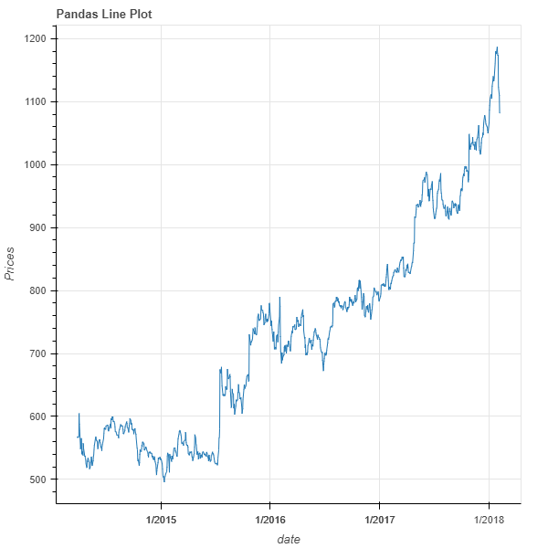
In the chart, it was necessary to convert the date column to datetime to render dates along the x-axis. Additionally, the line function (glyph in Bokeh) is used to generate a time series plot for Google's high prices.
Creating a scatter plot from Pandas dataframe
In this section, we use the open-source S&P 500 stock data available on Kaggle. In this example, we want to see the correlation between Google's stock prices and Apple's stock prices. You can learn more about correlation here.
# Import required packages
# Import packages
import pandas as pd
from bokeh.io import output_file, show
from bokeh.plotting import figure

# Load data
df = pd.read_csv('all_stocks_5yr.csv')

# Select Google and Apple stock
df_goog = df[df['Name'] == 'GOOG']
df_apple = df[df['Name'] == 'AAPL']

# Select only 'date' and 'high' columns for Google and Apple
df_goog = df_goog[['date','high']]
df_apple = df_apple[['date','high']]
# Rename 'high' column to 'high_goog' and 'high_apple'
df_goog.rename(columns={'high': 'high_goog'}, inplace=True)
df_apple.rename(columns={'high': 'high_apple'}, inplace=True)

df_merged = pd.merge(df_goog, df_apple, how='inner', on='date')
# See the first five rows
df_merged.head(5)
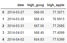
Merging ensures that the daily prices correspond to each other based on date. This mitigates the problem of correlating prices that are from different dates, as this will yield false statistical inference.
# Create scatter plot
plot = figure(title= "Pandas Scatter Plot", x_axis_label = "Apple high prices", y_axis_label= "Google high prices")
plot.circle(x = df_merged['high_apple'], y = df_merged['high_goog'],color = 'red', size = 10, alpha = 0.8)

# Output the plot
show(plot)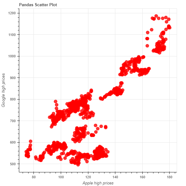
The circles represent the link between Apple and Google's high prices. There is a general positive correlation between Google and Apple’s stock prices.
Creating Bokeh Plots from Columndatasource
The purpose of ColumnDataSource is to allow you to create different plots using the same data. In short, it allows you to build a foundation of data for calling in multiple plots and analyses. This will save you time, as you won't have to load data multiple times in Jupyter Notebook.
The ColumnDataSource is akin to a python dictionary, where the value of the data in a column has a key string name for that very column.
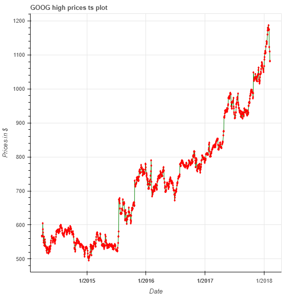
Creating line plots using ColumnDataSource
# Import packages
from bokeh.io import output_file, show
from bokeh.plotting import figure, ColumnDataSource

# Create the ColumnDataSource object
df_goog['date'] = pd.to_datetime(df_goog['date'])
data = ColumnDataSource(df_goog)

# Create time series plot
plot = figure(x_axis_type='datetime',
              title='GOOG high prices ts plot',
             x_axis_label = "Date",
              y_axis_label = "Prices in $")
plot.line(x='date', y = 'high_goog', source = data, color = 'green')
show(plot)
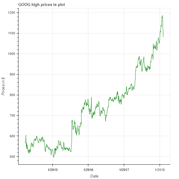
The plot shows us how Google’s high prices evolved over a 5-year period with the line indicating each price point of the stock.
To create this plot, we passed the entire Google stock dataframe into the ColumnDataSource function and saved it as a variable named data.
Then, we used the source argument to pass this data into the plot function. This makes it possible to use the column names directly when creating the plot instead of repeatedly calling the dataframe.
Finally, we used the line function to generate the green line to represent the data points.
Creating scatter plots using ColumnDataSource
In this code, we passed the entire Google stock dataframe into the ColumnDataSource (as in the line plot example). The dataframe is saved into the ColumnDataSource as a variable named data. We first create the line plot by directly calling the column names. Finally, we used the diamond function to generate the red diamonds to represent the individual data points.
# Import packages
from bokeh.io import output_file, show
from bokeh.plotting import figure, ColumnDataSource

# Create the ColumnDataSource object
df_goog['date'] = pd.to_datetime(df_goog['date'])
data = ColumnDataSource(df_goog)

# Create time series plot
plot = figure(x_axis_type='datetime',
              title='GOOG high prices ts plot',
             x_axis_label = "Date",
              y_axis_label = "Prices in $")
plot.line(x='date', y = 'high_goog', source = data, color = 'green')
plot.diamond(x='date', y = 'high_goog', source = data, color = 'red')
show(plot)
The plot shows the evolution of Google's stock over a 5-year period with the red diamonds indicating each price point of the stock.
Conclusion
This tutorial introduced the most common data structures that you are likely to encounter in Python and how you can use them to bring your data to life. While Bokeh is not your only option for Python visualization, it distinguishes itself from Matplotlib or Seaborn by its ease of use and interactive capabilities. In our next tutorial, you will gain hands-on experience in using layouts for creating effective and interactive visualizations. If you’d like to do a deep dive into all the data visualization possibilities offered by Bokeh, check out DataCamp’s Interactive Data Visualization with Bokeh course.