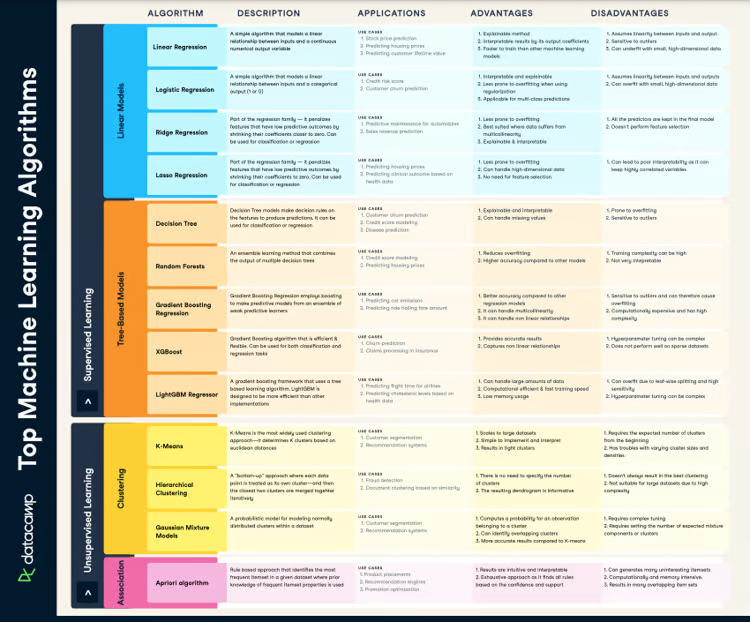
Descriptive analytics is one of most commonly used methods in data science. It helps you explore, and understand your data, and make decisions as a consequence. Descriptive statistics techniques are one of the most widely used-tools in descriptive analytics. In this cheat sheet, you’ll have a handy guide for all the relevant descriptive statistics to guide your analysis.
Have this cheat sheet at your fingertips
Download PDFKey Definitions
Throughout this cheat sheet, you’ll find terms and specific statistical jargon being used. Here’s a rundown of all the terms you may encounter.
- Variable: In statistics, a variable is a quantity that can be measured or counted. In data analysis, a variable is typically a column in a data frame
- Descriptive statistics: Numbers that summarize variables. They are also called summary statistics or aggregations.
- Categorical data: Data that consists of discrete groups. The categories are called ordered (e.g., educational levels) if you can sort them from lowest to highest, and unordered otherwise (e.g., country of origin)
- Numerical data: Data that consists of numbers (e.g., age).
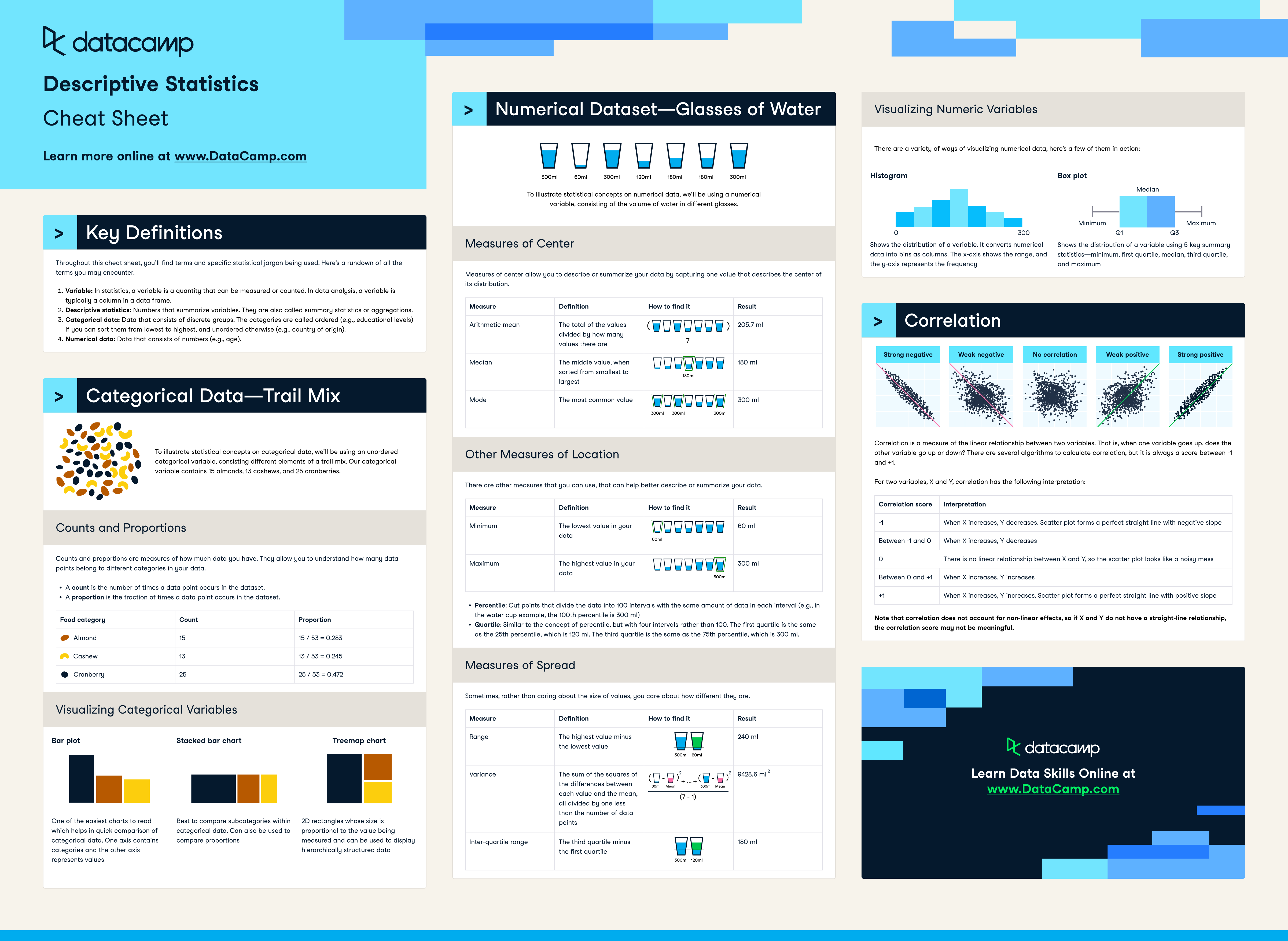
Categorical Data—Trail Mix
To illustrate statistical concepts on categorical data, we’ll be using an unordered categorical variable, consisting different elements of a trail mix. Our categorical variable contains 15 almonds, 13 cashews, and 25 cranberries.
Counts and Proportions
Counts and proportions are measures of how much data you have. They allow you to understand how many data points belong to different categories in your data.
- A count is the number of times a data point occurs in the dataset
- A proportion is the fraction of times a data point occurs in the dataset.
| Food category | Count | Proportion |
| Almond | 15 | 15 / 53 = 0.283 |
| Cashew | 13 | 13 / 53 = 0.245 |
| Cranberry | 25 | 25 / 53 = 0.472 |
Visualizing Categorical Variables
Bar plot
One of the easiest charts to read which helps in quick comparison of categorical data. One axis contains categories and the other axis represents values
Stacked bar chart
Best to compare subcategories within categorical data. Can also be used to compare proportions
Treemap chart
2D rectangles whose size is proportional to the value being measured and can be used to display hierarchically structured data
Numerical Dataset - Glasses of Water
To illustrate statistical concepts on numerical data, we’ll be using a numerical variable, consisting of the volume of water in different glasses.
Measures of Center
Measures of center allow you to describe or summarize your data by capturing one value that describes the center of its distribution.
| Measure | Definition | Result |
| Arithmetic mean | The total of the values divided by how many values there are | 205.7 ml |
| Median | The middle value, when sorted from smallest to largest | 180 ml |
| Mode | The most common value | 300 ml |
Other Measures of Location
There are other measures that you can use, that can help better describe or summarize your data.
| Measure | Defintion | Result |
| Minimum | The lowest value in your data | 60 ml |
| Maximum | The highest value in your data | 300 ml |
- Percentile: Cut points that divide the data into 100 intervals with the same amount of data in each interval (e.g., in the water cup example, the 100th percentile is 300 ml)
- Quartile: Similar to the concept of percentile, but with four intervals rather than 100. The first quartile is the same as the 25th percentile, which is 120 ml. The third quartile is the same as the 75th percentile, which is 300 ml.
Measures of Spread
Sometimes, rather than caring about the size of values, you care about how different they are.
| Measure | Defintion | Result |
| Range | The highest value minus the lowest value | 240 ml |
| Variance | The sum of the squares of the differences between each value and the mean, all divided by one less than the number of data points | 9428.6 ml2 |
| Inter-quartile range | The third quartile minus the first quartile | 180 ml |
Visualizing Numeric Variables
There are a variety of ways of visualizing numerical data, here’s a few of them in action:
- Histogram: Shows the distribution of a variable. It converts numerical data into bins as columns. The x axis shows the range, and the y axis represents the frequency
- Box plot: Shows the distribution of a variable using 5 key summary statistics minimum, first quartile median, third quartile, and maximum
Correlation
Correlation is a measure of the linear relationship between two variables. That is, when one variable goes up, does the other variable go up or down? There are several algorithms to calculate correlation, but it is always a score between 1 and +1.
For two variables, X and Y, correlation has the following interpretation:
| Correlation score | Interpretation |
| -1 | When X increases, Y decreases. Scatter plot forms a perfect straight line with negative slope |
| Between -1 and 0 | When X increases, Y decreases |
| 0 | There is no linear relationship between X and Y, so the scatter plot looks like a noisy mess |
| Between 0 and +1 | When X increases, Y increases |
| +1 | When X increases, Y increases. Scatter plot forms a perfect straight line with positive slope |
Note that correlation does not account for non linear effects, so if X and Y do not have a straight line relationship, the correlation score may not be meaningful.