Course
Introduction to Power BI
4 hr
793.3K
In this tutorial, I'll walk through how to visualize key business metrics (KPIs) in Power BI using three different visual types: the KPI visual, the gauge, and the card visual.
We'll use a sample dataset you can access from within Power BI. This sample dataset contains financial data showing sales per product per month. If you’re unfamiliar with analyzing financial data, check out our skill track on Financial Reporting in Power BI.
To get started with Power BI, check out our Power BI Fundamentals skill track and keep our Power BI cheat sheet on hand for quick reference.
The DataCamp Power BI Cheat Sheet
KPIs (Key Performance Indicators) are quantifiable metrics that track how well your organization meets its business objectives. In Power BI, you can visualize them using dedicated visuals that show actual values, targets, and trends.
Power BI offers a dedicated KPI visual that combines the actual value, a target comparison, and a trend line in a single chart. You can also use gauge and card visuals for different KPI display needs.
Alternatively, you can present your KPIs using the card or gauge visuals. You can also get creative with measures and formatting to incorporate KPIs into your Power BI reports. Here, we'll review both the traditional KPI visual and some alternative methods.
You can learn more about customizing and optimizing your KPIs with our webinar on calculating KPIs with DAX.
KPIs in Power BI are not just about visual appeal. They enable businesses to:
New to Power BI? Start with our Power BI for Beginners tutorial, then move on to our Introduction to Power BI course for structured learning.
Before adding KPI visuals to your dashboards, define clear, measurable goals. Each KPI should map directly to a specific business objective rather than a vague category like "improve performance."
Less is more when it comes to KPIs. Avoid adding too many KPI visuals to your dashboards.
We'll consider a common KPI for many businesses: profit margin. We also set an arbitrary target of 15% for our profit margin.
We'll visualize our profit margin KPI in three ways:
| Visual | Best For | Requires Date Field | Target Comparison | Customization |
|---|---|---|---|---|
| KPI visual | Metrics with a trend over time | Yes | Built-in (auto red/green) | Limited |
| Gauge | Single metric against a target band | No | Built-in (min/max/target) | Moderate |
| Card visual | Flexible, custom KPI displays | No | Via DAX measures | High |
| New Card (2025+) | Enterprise KPI rows with sparklines | Optional (for sparkline) | Via reference labels | Very high |
We'll start with the first three, which work in all Power BI Desktop versions.
Your data needs to be clean, properly typed, and structured with relationships before Power BI can produce accurate KPI calculations. See our data modeling in Power BI tutorial for a deep dive on this step.
Getting your data ready often involves some data prep work, such as:
Luckily, this sample data is cleaned and ready to use, so we'll import it into Power BI and start visualizing our KPI.
We need to create measures for the base and target values of the KPI and gauge visuals (and two other measures for our card visual). Measures are formulas written in DAX (Data Analysis Expressions), Power BI's formula language for calculations and aggregations. For a full introduction, see our Power BI DAX tutorial.
To get started with DAX, check out our Introduction to DAX course and keep our DAX cheat sheet on hand for a quick reference on many of the most useful DAX functions you will encounter (including the ones we’ll use in this tutorial).
The DataCamp DAX Cheat Sheet
Profit margin is calculated as profit divided by total sales. Here is the formula we use:
Profit Margin = SUM ( Profit ) / SUM ( Sales )
Our target measure is a simple scalar:
Profit Margin Target = 0.15
For the card visual, we must create two additional measures.
The first measure calculates the difference between the actual profit margin and the target. Then, it uses the FORMAT function to effectively convert the numbers to text so that we can concatenate a few other strings to make our “Goal” line, as seen in the KPI visual.
KPI Profit Margin vs Target =
  VAR Diff = [Profit Margin] - [Profit Margin Target]
  VAR Sign = IF(Diff > 0, "+", "")
  RETURN
  "Goal: " & FORMAT([Profit Margin Target], "#0%") & " (" & Sign & FORMAT(Diff, "#0.0%") & ")"
The second measure controls the color of our card. You’ll see that we use the SWITCH function in this expression. If you’re new to SWITCH and want to learn more about how it works and how you can use it, check out our guide to the Power BI SWITCH function.
KPI Color =
  VAR Diff = [Profit Margin] - [Profit Margin Target]
  RETURN
  SWITCH (
    TRUE(),
    Diff > 0, "Green",
    Diff < 0, "Red",
    "Black"
)In Power BI Desktop, go to the "Report" view. From the "Visualizations" pane, select the KPI visual.
The Power BI KPI visual contains these three fields:
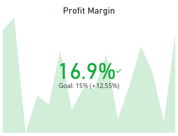
Image by author
From the "Visualizations" pane, select the gauge visual.
The gauge visual is much more flexible than the KPI simply because it offers more fields for adding measures that control the minimum and maximum values on the gauge. You are also not obligated to add a date column for showing a trend, which makes the gauge visual more suited to KPIs that may not need to be tracked over time.
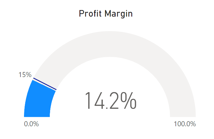
Image by author
Back in the "Visualizations" pane, we are now going to select the card visual.
Typically, this visual shows a single summarized metric. However, with the formatting and customization options, you can get creative with the type of information you can show with a card visual.
We will recreate the KPI visual using a few measures (that we already created in step 2 above) and some customization options in a card visual.
Here is the final product:
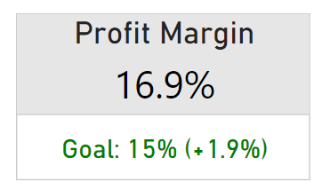
Image by author
The card visual is my first choice when visualizing KPIs in scenarios where I need more flexibility. What if I don’t need to track my KPI over time and don’t have a date column in my data? What if I want to add a custom calculation showing the difference between the actual value and the target?
One key difference between our card here and the KPI visual that we created earlier is that the KPI visual always calculates the percentage change between the actual value and its target. This is unintuitive for percentage-based KPIs since it makes more sense to calculate a simple difference between the actual value and the target.
With the card visual, we can choose how we want the KPI to be calculated, displayed, and compared against our target.
If you're interested in exploring advanced analytical features in Power BI, we have a tutorial to guide you through the process.
Starting with Power BI Desktop releases in 2025, the new Card visual supports embedded sparklines, reference labels, and multiple sub-values within a single visual. This makes it the current recommended approach for KPI rows on dashboards.
To use it for KPIs:
Profit Margin) to the callout value.The advantage over the legacy KPI visual: you get trend context without being forced to add a date dimension to a dedicated trend axis, and you have full control over formatting, colors, and layout. For organizations migrating legacy dashboards, the new Card visual replaces both the old Card and the Multi-row Card (which Microsoft is deprecating).
These practices come from building KPI dashboards across finance, operations, and sales domains. They apply regardless of which visual type you choose.
Focus on 4–6 KPIs per dashboard that map directly to current business priorities. If you need to show more detail, use drill-through features rather than cramming extra visuals onto the main view.
Our course on data visualization in Power BI covers layout and visual hierarchy in more depth.
The traffic light pattern (red/amber/green) is the most universally understood status indicator in enterprise reporting. Red means off-track, amber means at risk, green means on target. About 8% of males have color vision deficiency, so pair colors with icons or text labels for accessibility.
For implementation details, see our guide to Power BI conditional formatting.
Arrange KPIs in reading order: place the single most important metric top-left, group related metrics together, and guide the viewer’s eye through a logical sequence. Check out these 9 dashboard examples for inspiration, or see our dashboard design tutorial for layout principles.
Include both leading indicators (which predict future performance, such as pipeline value) and lagging indicators (which reflect outcomes, such as quarterly revenue). This combination gives decision-makers both a rearview mirror and a windshield.
Business priorities shift. Review your KPI set at least quarterly to retire metrics that no longer reflect current strategy and add ones that do.
Master the world's most popular business intelligence tool.
Learn More Power BI Skills
Course
Course
Course
Tutorial
Kafaru Simileoluwa
Tutorial
DataCamp Team
Tutorial
Austin Chia
Tutorial
Parul Pandey
Tutorial
Joleen Bothma
code-along
Iason Prassides