Cursus
Gegevensmodellering in Power BI
3 Hr
94.4K

In deze tutorial neem ik je stap voor stap mee door de basis van Power BI. Ik demonstreer de kernconcepten met een voorbeeld van een financieel dataset en aan het einde heb je een compleet Power BI-rapport vanaf nul gebouwd. Je kunt me volgen door de voorbeeld-financiële dataset te downloaden via Microsoft Learn.
Power BI is een business intelligence-tool waarmee je verbinding kunt maken met verschillende databronnen, de data kunt visualiseren in rapporten en dashboards, en deze vervolgens kunt delen met wie je maar wilt.
Power BI bestaat uit 3 hoofdelementen:
Het doel van BI is om Key Performance Indicators (KPI's) te volgen en inzichten in bedrijfsdata te ontdekken om besluitvorming in de hele organisatie beter te onderbouwen. Power BI wordt op verschillende manieren gebruikt, afhankelijk van de rol van de persoon, van developers, analisten, managers en directors tot iedereen daar tussenin.
Power BI is een van de meest gevraagde business intelligence-tools wereldwijd. Dit is waarom het de moeite waard is om aan je skillset toe te voegen:
Power BI en Tableau zijn beide business intelligence-tools en overlappen sterk qua mogelijkheden. Er zijn 2 belangrijke verschillen tussen Power BI en Tableau:
Zie het artikel Power BI vs. Tableau voor een uitgebreide vergelijking.
| Functie | Power BI | Tableau | Excel |
|---|---|---|---|
| Primair gebruik | Interactieve dashboards & BI-rapporten | Geavanceerde datavisualisatie | Spreadsheetanalyse |
| Platform | Windows (Desktop); browser (Service) | Windows & macOS | Windows & macOS |
| Gratis versie | Ja (Power BI Desktop) | Ja (Tableau Public) | Nee (vereist Microsoft 365) |
| Formuletaal | DAX | LOD-expressies | Excel-formules |
| Best voor | Microsoft-ecosysteem, grote datasets | Complexe, aangepaste visualisaties | Kleine datasets, snelle analyses |
| Delen & samenwerken | Power BI Service (online) | Tableau Server / Tableau Cloud | SharePoint / e-mail |
Excel is spreadsheetsoftware. Hoewel het veel van dezelfde kernfunctionaliteit als Power BI bevat, zijn de visualisatieopties beperkt en ontbreekt de mogelijkheid om rapporten en dashboards online te vernieuwen, te delen en te bekijken. Zie ons artikel Power BI vs Excel voor een volledige vergelijking naast elkaar.
Voordat je met deze tutorial begint, zorg dat je het volgende hebt:
Power BI Desktop is een van de kernelementen van Power BI en de belangrijkste applicatie voor het ontwerpen en bouwen van rapporten.
Het wordt aanbevolen om Power BI Desktop uit de Microsoft Store te downloaden, omdat dit een paar voordelen heeft:
Als je de Power BI Desktop-applicatie direct moet downloaden, ga dan naar de productpagina en selecteer 'See download or language options'. Dit brengt je naar het Microsoft Download Center, waar je de nieuwste versie van de applicatie kunt downloaden.
Houd er rekening mee dat je de Microsoft Store-versie en de versie uit het downloadcentrum niet tegelijkertijd op je computer kunt installeren. Als je toch wilt wisselen, zorg er dan voor dat je je huidige versie van de applicatie verwijdert voordat je de volgende installeert.
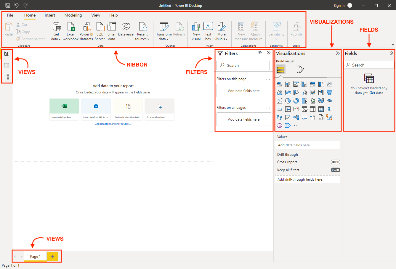
Power BI start met een leeg rapport wanneer je de applicatie opent. Laten we de onderdelen van Power BI Desktop doornemen:
Laten we nu de handen uit de mouwen steken en met onze data aan de slag gaan in Power BI.
Power BI biedt een breed scala aan ondersteunde databronnen en verbindingen, waardoor het ontzettend makkelijk is om te koppelen met de databron van jouw keuze. In deze tutorial importeren we een voorbeeld van financiële data die door Microsoft is geleverd.
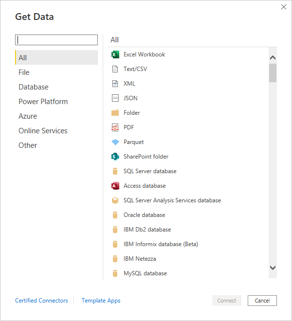
Zoals aan het begin van de tutorial vermeld, kun je de voorbeelddata downloaden en importeren door de Excel-databron te selecteren.
Er verschijnt een voorbeeldvenster waarin je de tabel of sheet kunt selecteren die je uit het Excel-bestand wilt importeren. Tabellen en sheets worden aangeduid met hun respectieve iconen. Het is over het algemeen beter om tabellen te importeren, omdat deze in Excel netjes zijn gedefinieerd met strikte kopteksten en rijscheidslijnen.
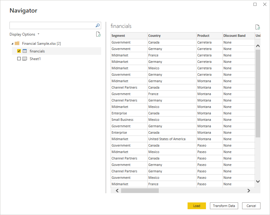
Hier kun je ook kiezen of je de data direct wilt laden of meteen naar de Power Query Editor wilt gaan via de optie Gegevens transformeren. Je data transformeren vóór het laden kan voordelig zijn, omdat er vaak kleine foutjes en issues zijn die je eerst wilt gladstrijken. Selecteer Gegevens transformeren, en er opent een apart venster voor de Power Query Editor.
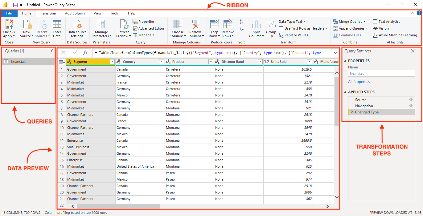
De Power Query Editor is op te delen in 4 hoofdonderdelen:
Hier is de financiële voorbeelddata al erg schoon, dus we hoeven geen transformaties toe te passen. Dit zijn echter enkele van de meest voorkomende transformaties:
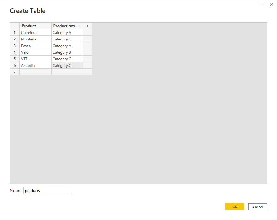
In het onderstaande voorbeeld hebben we een extra tabel met de naam Products toegevoegd met enkele fictieve productcategorieën om later in deze tutorial datamodellering te demonstreren. Je kunt deze tabel toevoegen door Gegevens invoeren in het lint te selecteren.
Selecteer tot slot Sluiten & toepassen in het lint om te beginnen met het bouwen en ontwerpen van het rapport.
We zijn klaar om ons eerste rapport te bouwen.
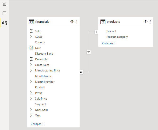
Nu we twee datatabellen hebben geïmporteerd, kunnen we relaties tussen hen creëren met behulp van de datamodelweergave.
Er zijn twee manieren om een relatie in Power BI te maken:
Standaard probeert Power BI een relatie tussen tabellen af te leiden. Dat gaat niet altijd goed, dus je kunt deze functie in de instellingen uitschakelen. Om de relatie te bewerken, klik je met de rechtermuisknop op de verbindingslijn en kies je Eigenschappen.
Dit venster biedt twee interessante opties voor het definiëren van een relatie: cardinaliteit en kruisfilterrichting. De keuzes voor elke optie kunnen grote invloed hebben op het uiteindelijke rapport, dus kies zorgvuldig. Laten we deze opties doornemen:
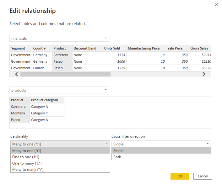
Cardinaliteit heeft vier opties: veel op één, één op één, één op veel of veel op veel. Bij het maken van relaties is het aan te raden dat het koppelingsveld in ten minste één van de tabellen unieke waarden bevat. Onze data toont een relatie tussen de tabel Financials en de tabel Products via het veld Product. De tabel Products heeft unieke waarden voor het veld Product (elk product komt slechts één keer voor). In de tabel Financials kan elk product echter meerdere keren voorkomen per datum, land, segment, enz.
Kruisfilterrichting geeft de keuze tussen enkelvoudig en beide richtingen. Relaties lopen van de tabel met unieke waarden naar de tabel met veel waarden. In ons geval loopt de relatie van de tabel Products naar de tabel Financials. Dit betekent dat als de kruisfilterrichting op enkelvoudig staat, de tabel Financials kan worden gefilterd door de velden Product en product-Categorie in de tabel Products, maar dat de tabel Products niet kan worden gefilterd via het productveld in de tabel Financials.
Berekeningen in Power BI worden aangestuurd door formules genaamd DAX (Data Analysis Expressions). Met DAX kun je nieuwe velden en zelfs nieuwe tabellen in je model maken. Je kunt drie soorten berekeningen in Power BI uitvoeren die DAX-formules gebruiken:
In dit rapport maken we één maat genaamd Profit margin met de volgende formule:
Profit margin = SUM(financials[Profit]) / SUM(financials[Sales])
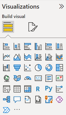
Er zijn allerlei visualisaties beschikbaar in Power BI—staafdiagrammen, lijndiagrammen, cirkeldiagrammen, tabellen, matrices, eenvoudige kaarten, KPI's, meters, interactieve kaarten en nog veel meer. Bovendien zijn er veel opmaakopties waar je mee kunt spelen.
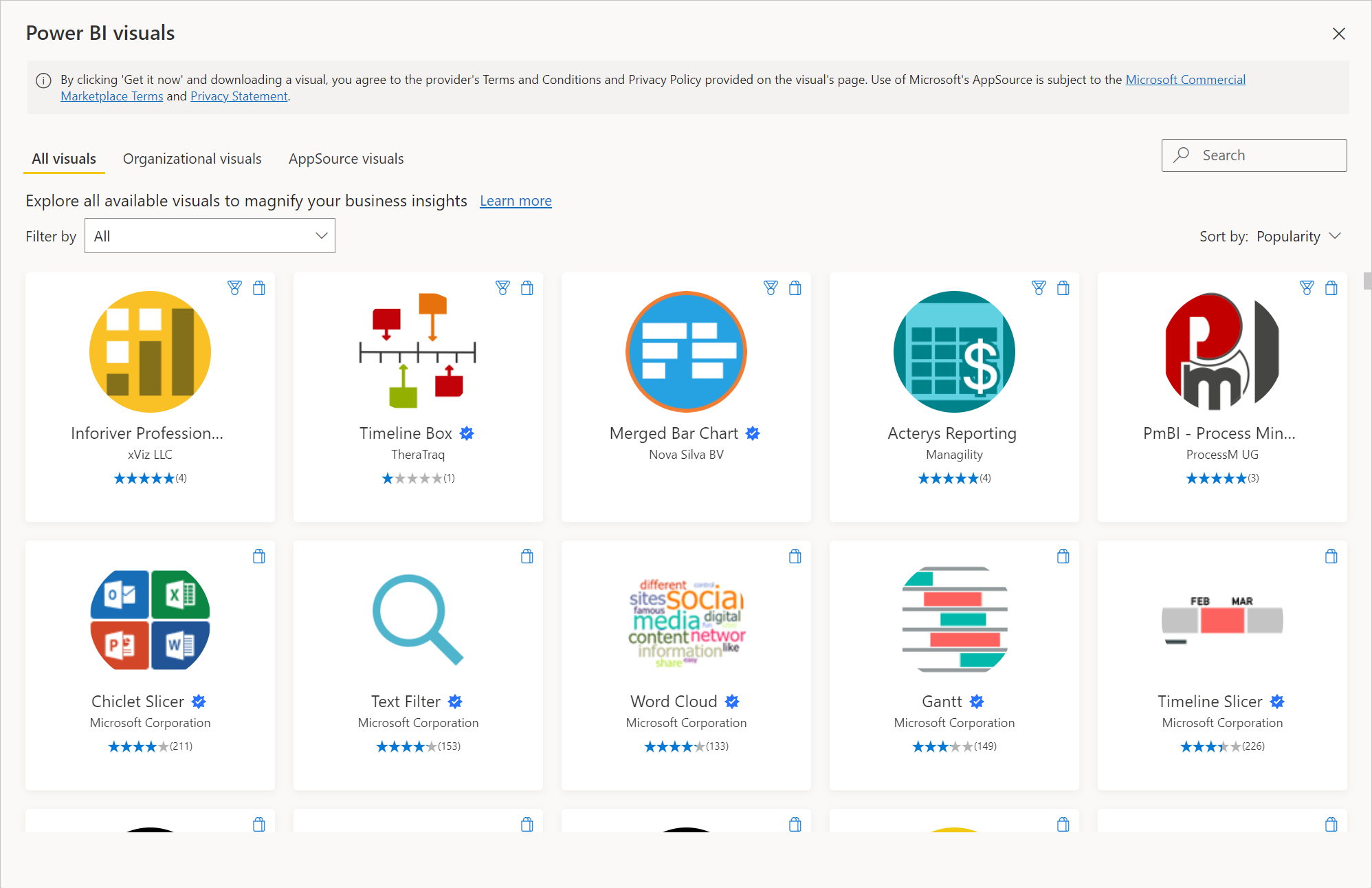
Je kunt ook aangepaste visualisaties importeren als jouw gewenste visual niet in de lijst staat. Klik simpelweg op het beletselteken, en er verschijnt een venster waarin je alle beschikbare visuals kunt doorzoeken—dit staat bekend als Microsoft AppSource. Je kunt zelfs je eigen visuals ontwerpen als je programmeervaardigheden hebt.
Het is aan te raden om alleen aangepaste visuals te downloaden via Microsoft AppSource, omdat ze daar zijn getest en goedgekeurd door Microsoft. Elders op internet downloaden kan onbedoelde effecten hebben of zelfs schadelijk zijn.
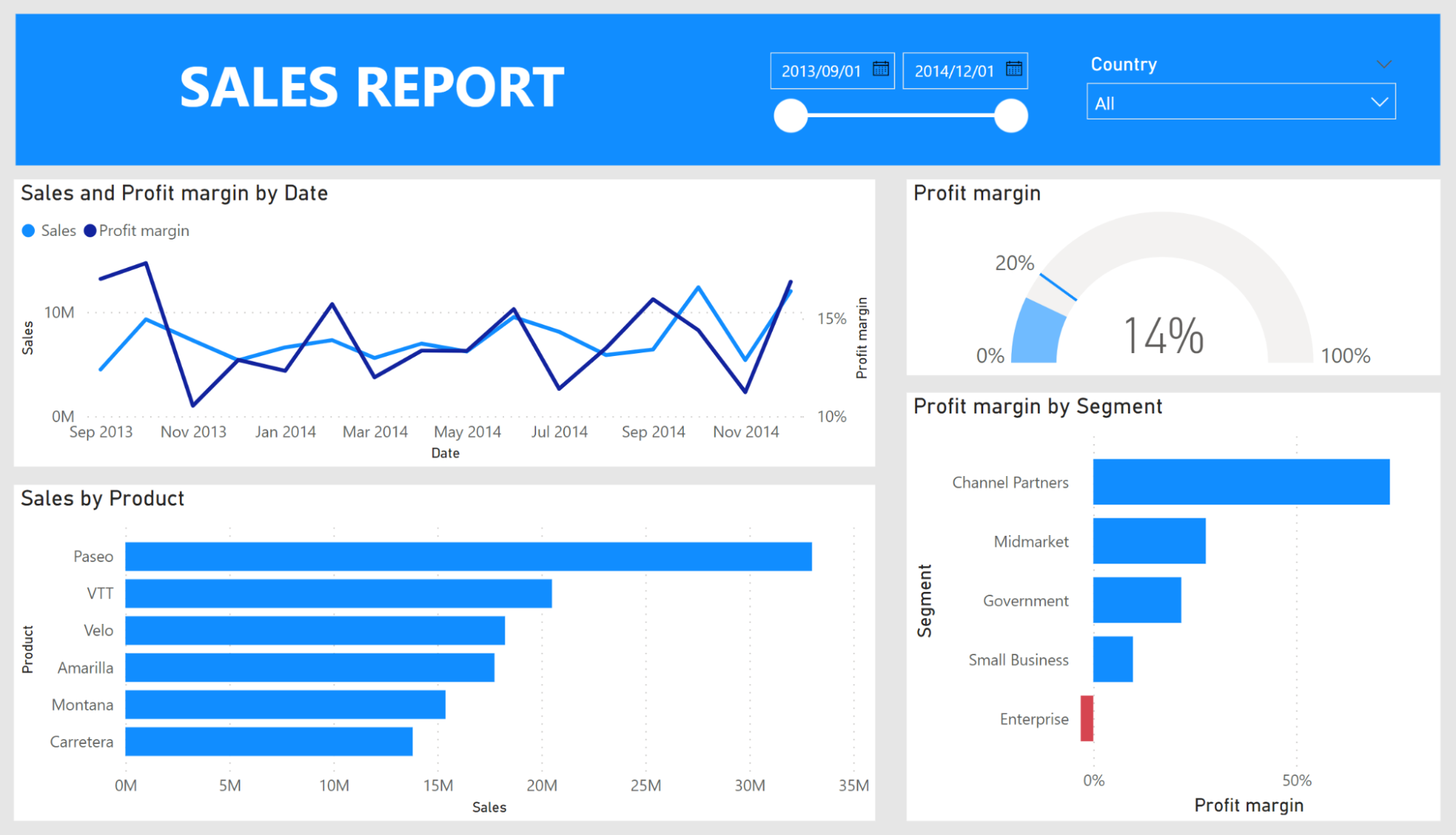
In deze tutorial bouwen we een eenvoudig rapport met deze visuals: slicers, gegroepeerde staafdiagrammen, een lijndiagram en een KPI. We bekijken hoe de gegroepeerde staafdiagram en de KPI worden gemaakt. De andere kun je gemakkelijk zelf namaken.
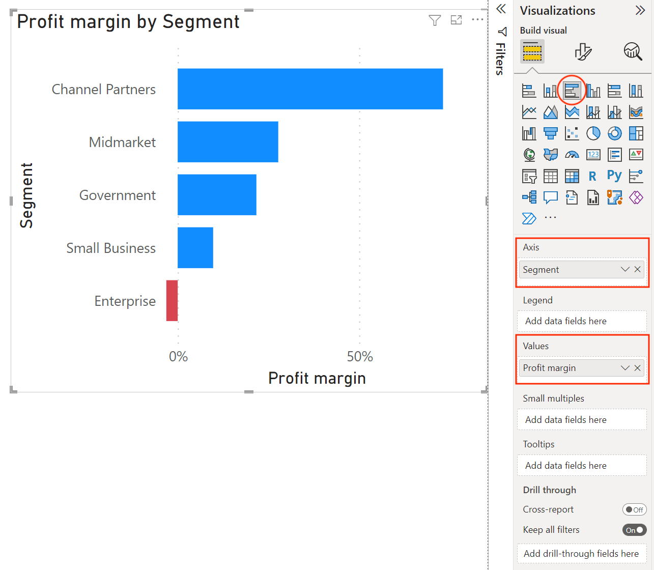
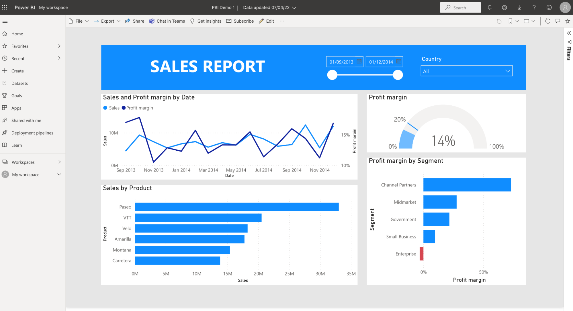
Om een gegroepeerde staafdiagram in te voegen, selecteer je het pictogram in het visualisatiepaneel; er verschijnt een lege staafdiagram op het canvas. Sleep het veld Segment naar de As en sleep onze nieuwe maat Profit margin naar de Waarden. Een titel en alle askoppen worden automatisch voor ons ingevuld op basis van de velden die we aan de visual hebben toegevoegd.
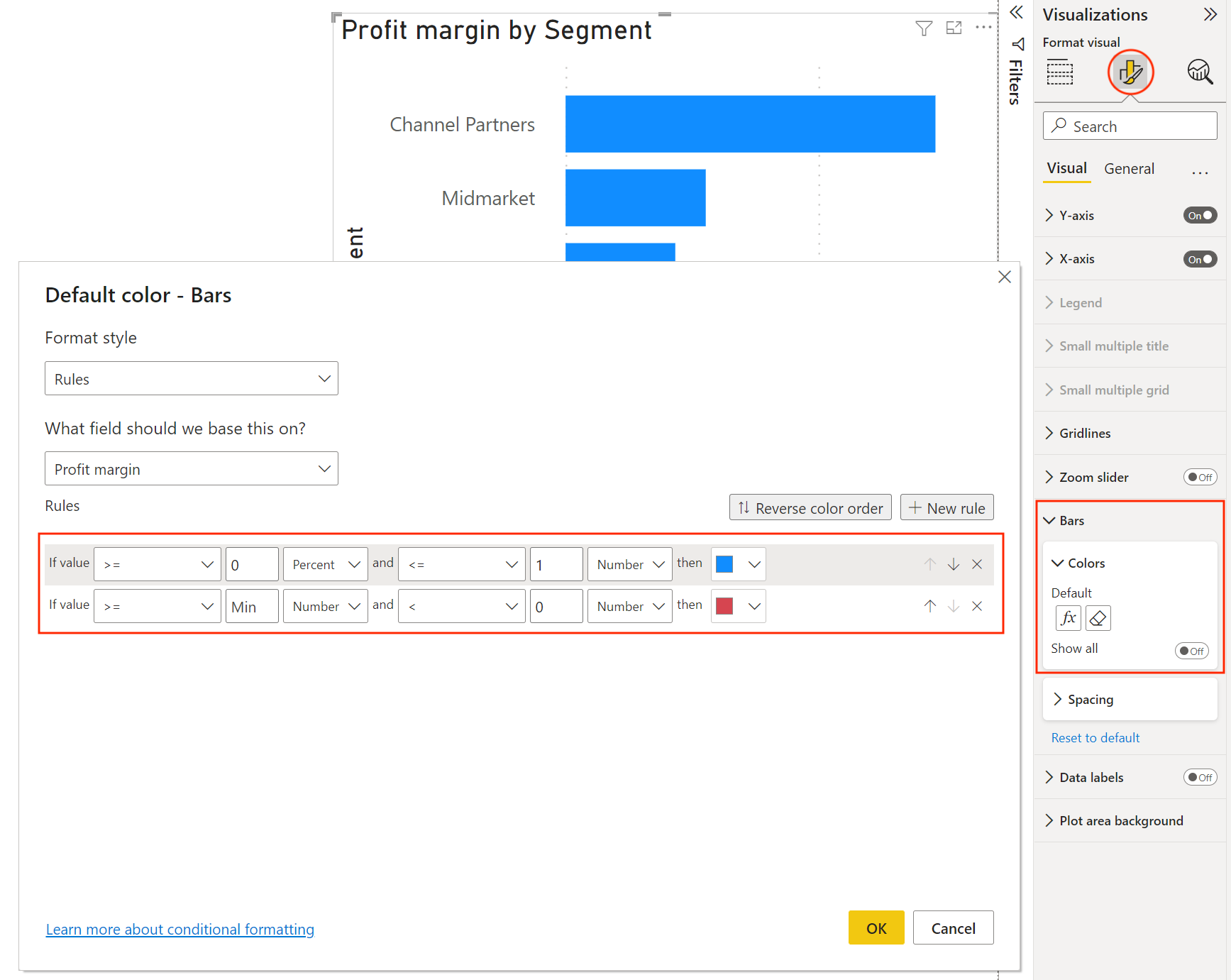
Aangezien de winstmarge voor een van de segmenten negatief is, voegen we wat voorwaardelijke opmaak toe om die negatieve waarde te laten opvallen.
Selecteer het opmaakpictogram bovenaan het visualisatiepaneel en ga vervolgens naar de opties voor Balken. Hier kunnen we de kleuren van de balken wijzigen. Om voorwaardelijke opmaak toe te passen, selecteer je het fx-symbool; er verschijnt een venster waarin je regels kunt toepassen op basis van de waarde van elk veld. Hier selecteren we het veld Profit margin en geven we aan dat de kleur "rood" moet zijn als het getal kleiner is dan 0.
Om een KPI-visual in te voegen, selecteer je het pictogram in het visualisatiepaneel. Er verschijnt een lege KPI-visual op het canvas. Deze KPI is gebaseerd op de maat Profit margin die we eerder hebben gemaakt. Sleep het veld Profit margin naar Waarde.
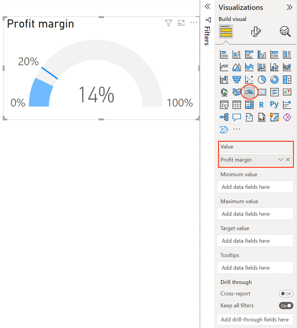
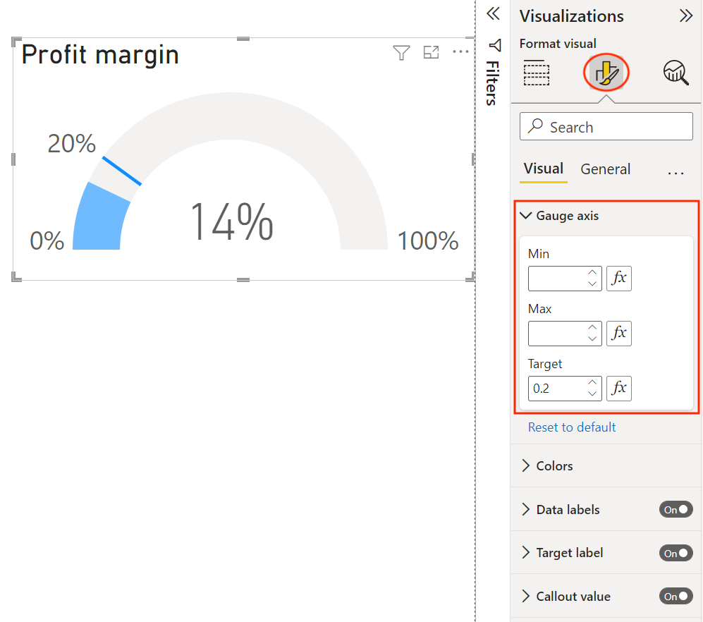
Vervolgens voegen we een target van 20% toe voor de KPI. We zouden het target kunnen toevoegen door een maatveld onder Doelwaarde te slepen (handig als de winstmargedoelstelling in andere visuals wordt gebruikt), maar we selecteren in plaats daarvan het opmaakpictogram en voeren de doelwaarde in onder de sectie Meterschaal.
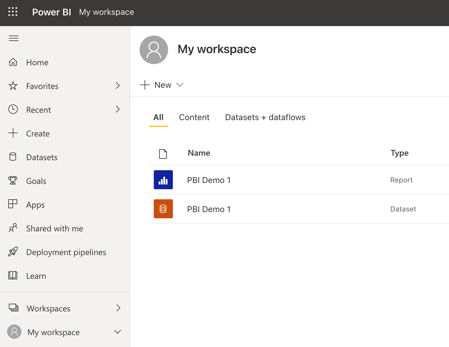
Als je tevreden bent met je rapport, kun je het publiceren naar je Power BI-werkruimte. Om dit te doen, moet je inloggen bij Power BI en vervolgens Publiceren selecteren in het lint. Kies een werkruimte en het rapport wordt gepubliceerd naar Power BI Service. Log in op je Power BI-account en ga naar de werkruimte waar je je rapport hebt gepubliceerd.
Het publiceren van een rapport publiceert ook de data, die je apart in je werkruimte ziet. Je kunt deze data gebruiken om nieuwe rapporten te maken vanuit de Power BI Service. Telkens wanneer je een rapport opnieuw publiceert, wordt de data overschreven, dus let op wijzigingen in de data die rapporten kunnen breken die in de Power BI Service op deze data zijn gebaseerd.
Selecteer de data en je komt op een scherm waar je een overzicht ziet van alle rapporten die met deze dataset zijn gebouwd. Vanaf dit scherm kun je ook een rapport maken met deze data of deze data met anderen delen. Als je een Power BI Gateway hebt ingesteld, kun je de data ook handmatig of volgens een schema vernieuwen.
Ga terug naar je werkruimte en selecteer nu het rapport. Vanaf hier kun je het rapport bekijken en ermee interageren, of onze Power BI Reports-tutorial verkennen om geavanceerdere ontwerptechnieken te leren. Andere nuttige opties zijn:
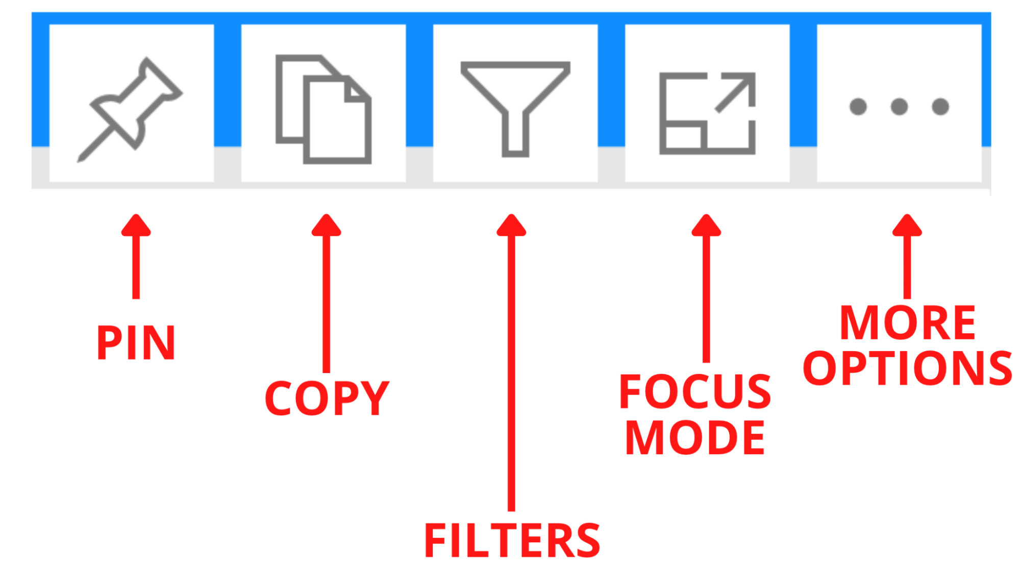
Elke visual heeft ook een aantal opties:
Je kunt volledige rapporten of individuele visuals vastzetten op dashboards. Het grootste voordeel van dashboards is dat je visuals uit verschillende rapporten in je werkruimte kunt vastzetten. Zo kun je belangrijke metrics gemakkelijk op één plek bijhouden in plaats van elk rapport afzonderlijk te openen. Voor een diepere duik, zie onze Power BI Dashboard-tutorial.
Nu je je eerste Power BI-rapport hebt gebouwd, zijn dit de beste manieren om je vaardigheden verder uit te bouwen:
Power BI is een krachtig hulpmiddel om data om te zetten in bruikbare inzichten via interactieve dashboards en rapporten. Of je nu net begint of je expertise wilt verdiepen, Power BI leren is een waardevolle stap voor iedereen in data-analyse of business intelligence. Voor een gestructureerde aanpak, bekijk Power BI Fundamentals of duik in specifieke cursussen zoals Introduction to Power BI, Introduction to DAX en Data Visualization in Power BI. Veel leerplezier!
Leer meer over Power BI met deze cursussen!
Cursus
Cursus
Cursus
blog
Adel Nehme
15 min