Course
Data Modeling in Power BI
3 hr
94.7K

In this tutorial, I'll walk you through the basics of Power BI step-by-step. I'll demonstrate key concepts using a sample financial dataset, and by the end, you'll have built a complete Power BI report from scratch. You can follow along by downloading the sample financial dataset from Microsoft Learn.
Power BI is a business intelligence tool that allows you to connect to various data sources, visualize the data in reports and dashboards, and then share them with anyone you want.
Power BI is made up of 3 main elements:
The purpose of BI is to track Key Performance Indicators (KPIs) and uncover insights in business data to better inform decision-making across the organization. Power BI is used in different ways depending on the role of the individual, from developers, analysts, managers, and directors to everyone in between.
Power BI is one of the most in-demand business intelligence tools globally. Here's why it's worth adding to your skill set:
Power BI and Tableau are both business intelligence tools and have a lot of overlap in terms of their capabilities. There are 2 key differences between Power BI and Tableau:
See the Power BI vs. Tableau article for an in-depth comparison.
| Feature | Power BI | Tableau | Excel |
|---|---|---|---|
| Primary use | Interactive dashboards & BI reports | Advanced data visualization | Spreadsheet analysis |
| Platform | Windows (Desktop); browser (Service) | Windows & macOS | Windows & macOS |
| Free version | Yes (Power BI Desktop) | Yes (Tableau Public) | No (requires Microsoft 365) |
| Formula language | DAX | LOD expressions | Excel formulas |
| Best for | Microsoft ecosystem, large datasets | Complex custom visualizations | Small datasets, quick analysis |
| Sharing & collaboration | Power BI Service (online) | Tableau Server / Tableau Cloud | SharePoint / email |
Excel is spreadsheet software. While it contains much of the same core functionality as Power BI, it has limited visualization options and lacks the ability to refresh, share, and view reports and dashboards online. See our Power BI vs Excel article for a full side-by-side comparison.
Before starting this tutorial, make sure you have the following:
Power BI Desktop is one of the core elements of Power BI and it is the main application for designing and building reports.
It is recommended to download Power BI Desktop from the Microsoft Store as there are a few advantages:
If you need to download the Power BI Desktop application directly, go to the product page and select 'See download or language options'. This will take you to the Microsoft Download Center, where you can download the latest version of the application.
Keep in mind that you cannot install both the Microsoft Store version and the version from the download center on your computer at the same time. If you do need to switch, be sure to uninstall your current version of the application before installing the next.
Power BI will start with a blank report when you launch the application. Let's go over the components of the Power BI Desktop:
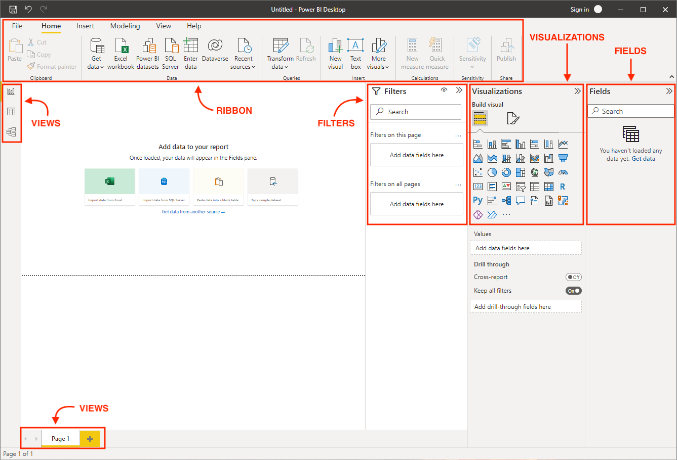
Now, let's get our hands dirty and work with our data in Power BI.
Power BI offers a wide variety of supported data sources and connections, making it incredibly easy to connect to the data source of your choosing. For this tutorial, we will import some sample financial data provided by Microsoft.
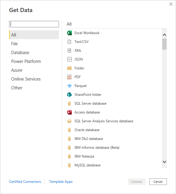
As stated at the beginning of the tutorial, you can download the sample data and import it by selecting the Excel data source.
A preview window will pop up where you can select the table or sheet you want to import from the Excel file. Tables and sheets are designated by their respective icons. It is generally better to import tables as they are neatly defined in Excel with strict headers and row boundaries.
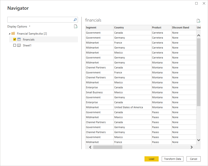
Here, you can also choose whether to load the data directly or go straight to the Power Query Editor using the Transform Data option. Transforming your data before loading it in can be advantageous, as there are often small errors and issues that you may want to iron out first. Select Transform Data, and a separate window will open up for the Power Query Editor.
The Power Query Editor can be broken up into 4 main parts:
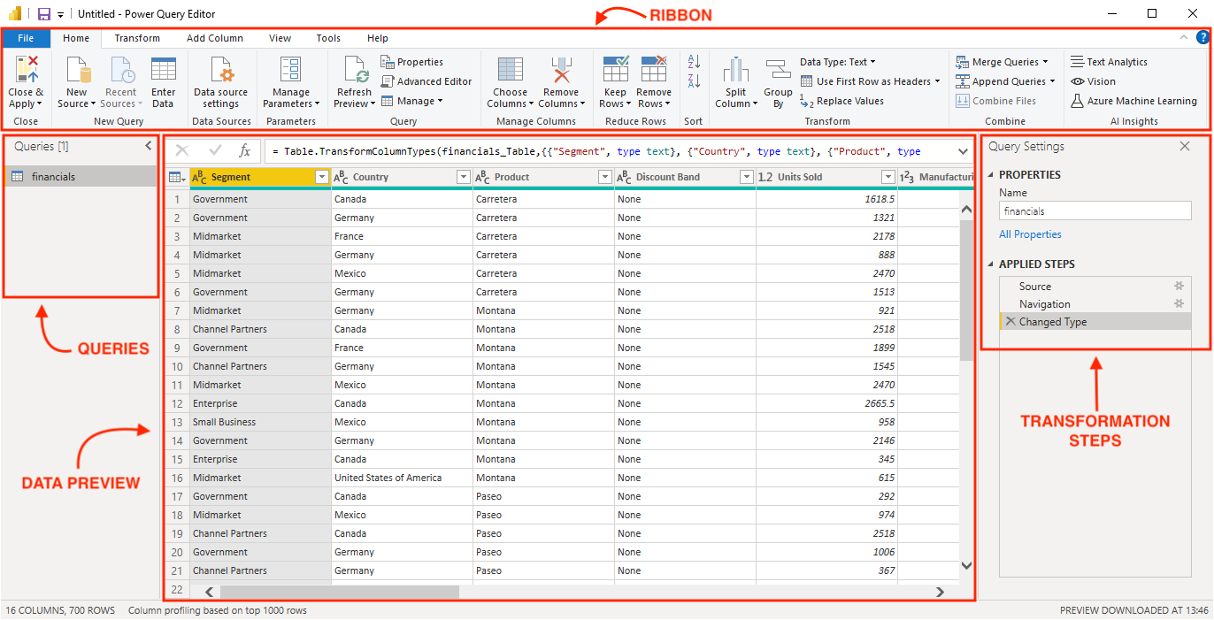
Here, the financial sample data is already very clean, so we have no transformation steps to apply. However, these are some of the most common transformation steps:
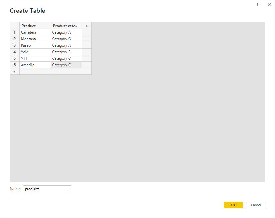
In the example below, we have included an additional table called Products containing some fictitious product categories to demonstrate data modeling later in this tutorial. You can add this table by selecting Enter Data in the ribbon.
Lastly, select Close & Apply from the ribbon to start building and designing the report.
We are ready to build our first report.
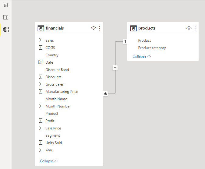
Now that we have imported two data tables, we can create relationships between them using the data model view.
There are two ways you can create a relationship in Power BI:
By default, Power BI will try to infer a relationship between tables. It doesn't always get this right, so you may wish to turn this feature off in the settings. To edit the relationship, right-click the connecting line between them and select Properties.
This window offers two interesting options for defining a relationship: cardinality and cross-filter direction. The choices for each option can have a big impact on the resulting report, so choose carefully. Let's break down each of these options:
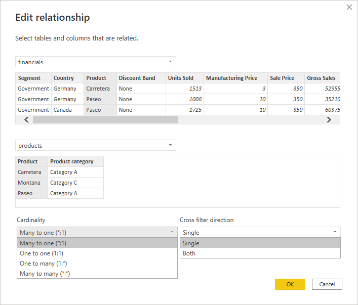
Cardinality has four choices: many to one, one to one, one to many, or many to many. When creating relationships, it is recommended that the joining field contains unique values in at least one of the tables. Our data shows a relationship between the Financials table and the Products table using the Product field. The Products table has unique values for the Product field (each product only appears once in the table). However, the Financials table can have each product showing up several times by date, country, segment, etc.
Cross-filter direction gives a choice between single and both directions. Relationships flow from the table with unique values to the table with many values. In our case, the relationship flows from the Products table to the Financials table. This means that if the cross-filter direction is set to single, then the Financials table can be filtered by the Product and product Category fields in the Products table, but the Products table cannot be filtered by using the product field in the Financials table.
Calculations in Power BI are powered by formulas called DAX (Data Analysis Expressions). DAX allows you to create new fields and even new tables in your model. You can perform three types of calculations in Power BI that use DAX formulas:
In this report, we will create a single measure called Profit margin with the following formula:
Profit margin = SUM(financials[Profit]) / SUM(financials[Sales])
There are a variety of visualizations available in Power BI—bar charts, line charts, pie charts, tables, matrices, simple cards, KPIs, gauges, interactive maps, and much more. On top of that, there are many formatting options that you can play around with, too.
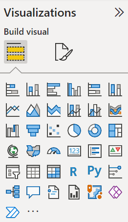
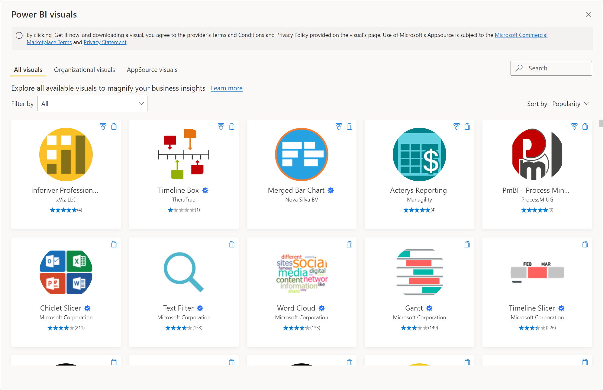
You can also import custom visualizations if your desired visual is not on the list. Simply click the ellipsis, and a window will pop up where you can browse all the available visuals—this is known as Microsoft AppSource. You can even design your own visuals if you have programming experience.
It is recommended that you only download custom visuals from Microsoft AppSource, as they have been tested and approved by Microsoft. Downloading them from anywhere else on the internet can have unintended effects or even be harmful.
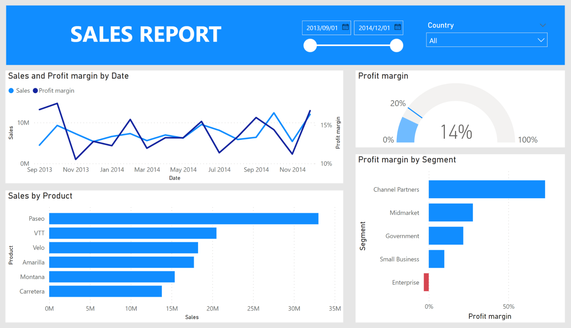
In this tutorial, we build a simple report that contains these visuals: slicers, clustered bar charts, a line chart, and a KPI. We will review how the clustered bar chart and the KPI are created. The others should be easy to replicate on your own.
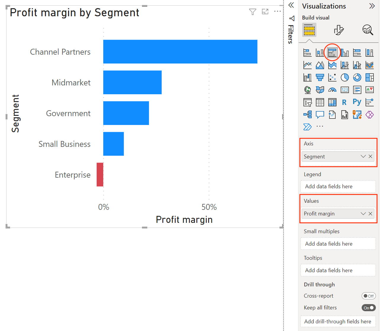
To insert a clustered bar chart, select the icon in the visualization pane, and a blank bar chart visual will appear on the canvas. Drag the Segment field to the Axis, and drag our new measure Profit margin to the Values. A title and all the axis headers are automatically populated for us based on the fields we added to the visual.
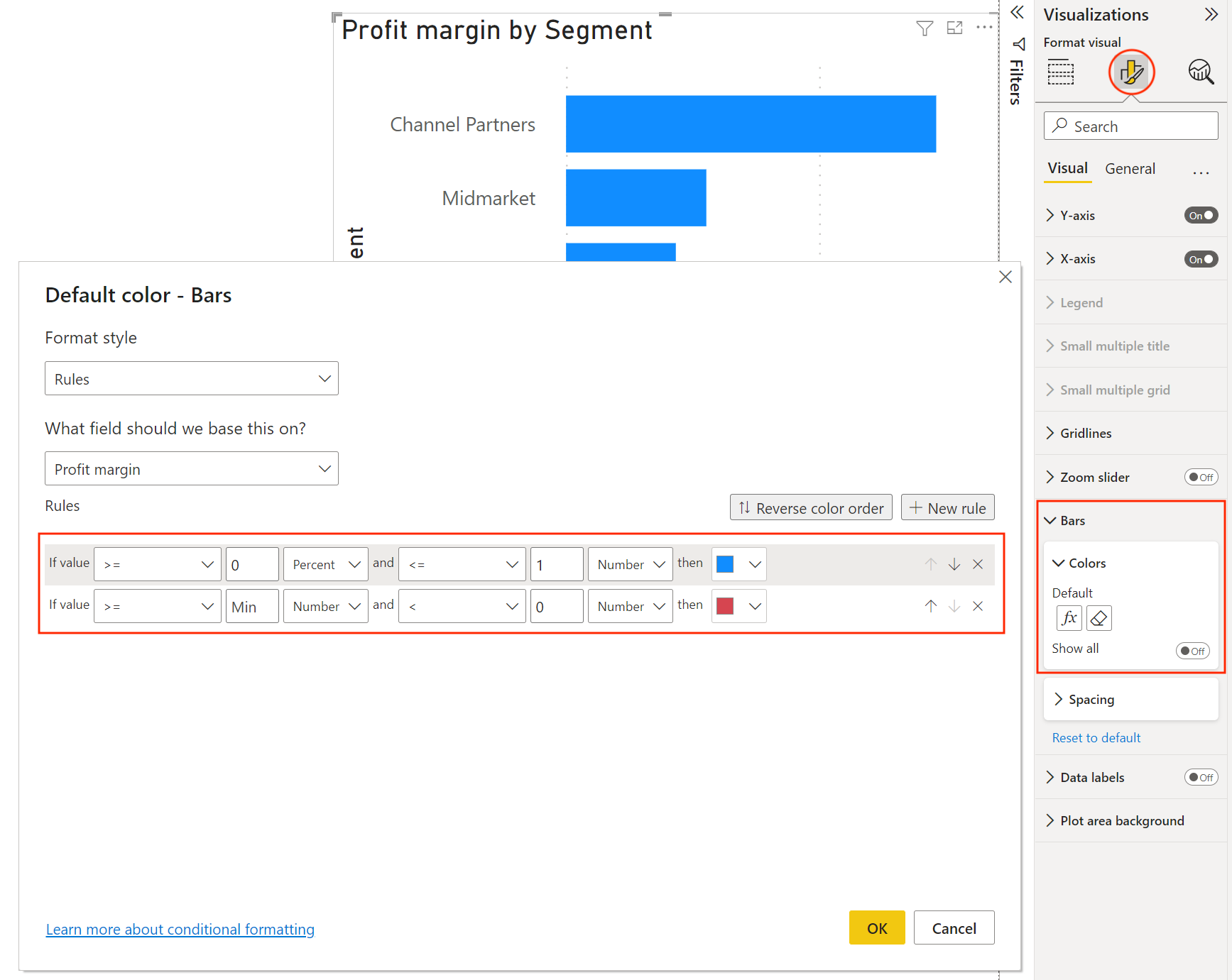
Since the profit margin is negative for one of the segments, we will add some conditional formatting to make that negative value stand out.
Select the formatting icon at the top of the visualization pane and then go down to the Bars options. Here, we can change the colors of the bars. To apply conditional formatting, select the fx symbol, and a window will pop up where you can apply rules based on the value of any field. Here, we select the Profit margin field and specify that the color should be "red" if the number is less than 0.
To insert a KPI visual, select the icon in the visualization pane. A blank KPI visual will appear on the canvas. This KPI will be based on the Profit margin measure that we created earlier. Drag the Profit margin field to Value.
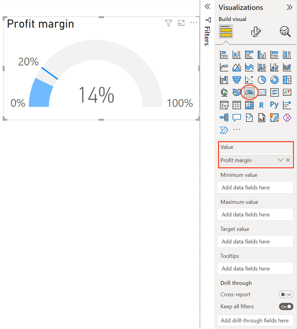
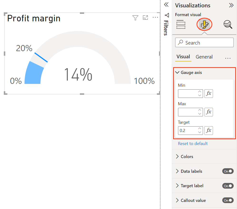
Next, we will add a target of 20% for the KPI. We could add the target by dragging a measure field under the Target value (this is useful if the profit margin target is used in other visuals), but we will instead select the formatting icon and enter the target value under the Gauge axis section.
Once you are happy with your report, you can publish it to your Power BI Workspace. To do this, you must sign in to Power BI and then select Publish from the ribbon. Select a workspace, and the report will be published to Power BI Service. Log in to your Power BI account and navigate to the workspace where you published your report.
Publishing a report also publishes the data, which you will see separately in your workspace. You can use this data to create new reports from the Power BI Service. Whenever you republish a report, the data will be overwritten, so watch out for any changes to the data that could break the reports created from this data in the Power BI Service.
Select the data, and you will be brought to a screen where you can see an overview of all the reports that were built using this dataset. From this screen, you can also create a report using this data or share this data with others. If you have a Power BI Gateway set up, you can also refresh the data either manually or on a schedule.
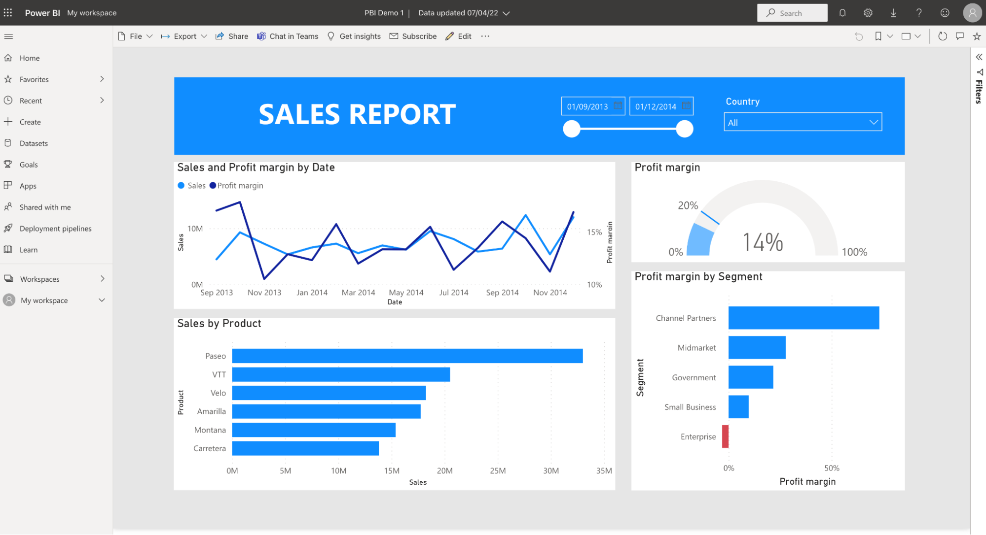
Go back to your workspace and now select the report. From here, you can view and interact with the report, or explore our Power BI Reports tutorial to learn more advanced design techniques. Other useful options include:
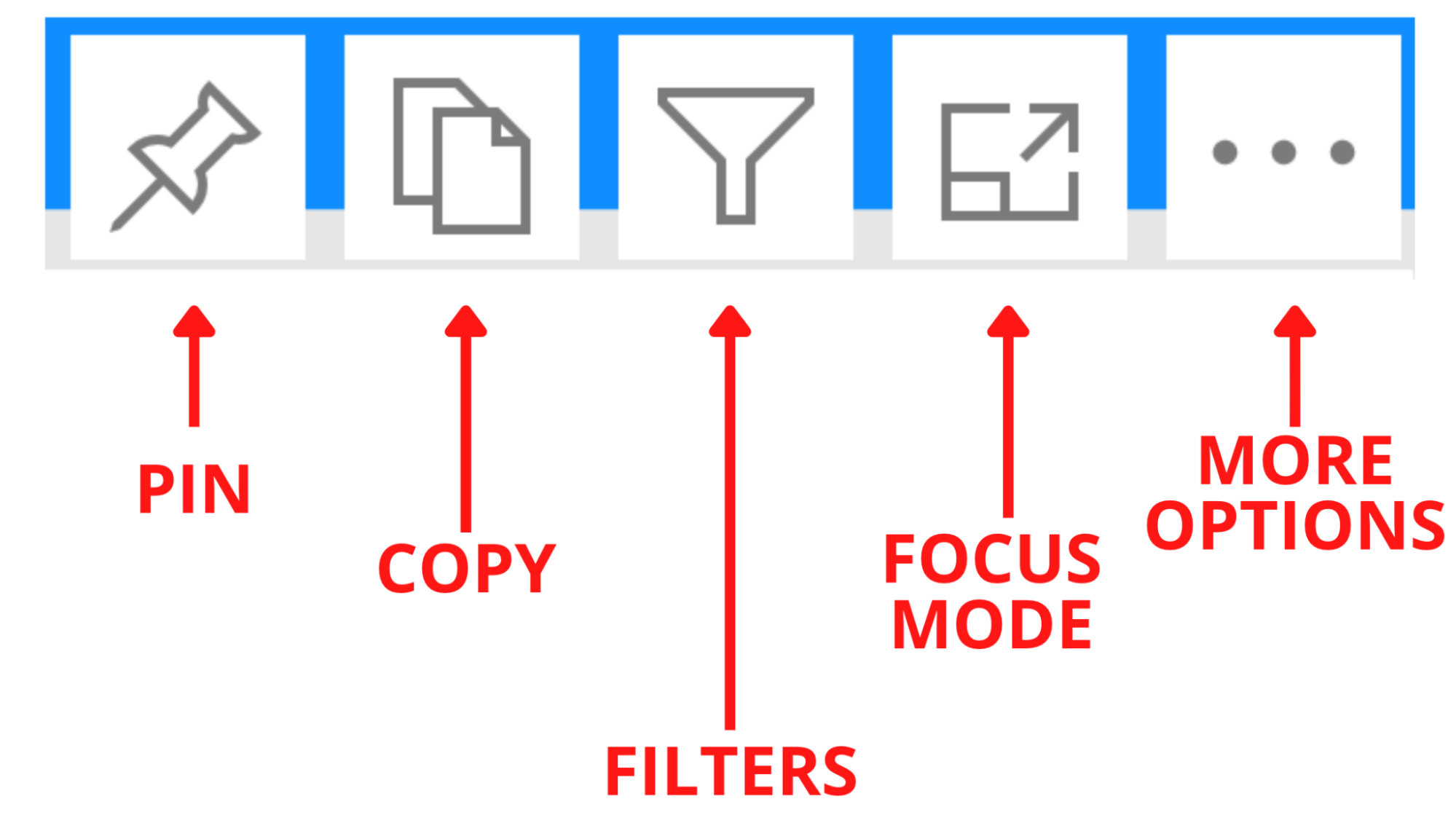
Each visual also has a number of options:
You can pin entire reports or individual visuals to dashboards. The biggest benefit of using dashboards is that they allow you to pin visuals from different reports in your workspace. This way, you can easily keep track of important metrics in one place rather than clicking on each report. For a deeper dive, see our Power BI Dashboard Tutorial.
Now that you've built your first Power BI report, here are the best ways to continue building your skills:
Power BI is a powerful tool for transforming data into actionable insights through interactive dashboards and reports. Whether you're just getting started or looking to deepen your expertise, learning Power BI is a valuable step for anyone in data analytics or business intelligence. For a structured approach, explore Power BI Fundamentals or dive into specific courses like Introduction to Power BI, Introduction to DAX, and Data Visualization in Power BI. Happy learning!
Master the world's most popular business intelligence tool.
Learn more about Power BI with these courses!
Course
Course
Course
blog
Wendy Gittleson
12 min
Tutorial
Kafaru Simileoluwa
Tutorial
Austin Chia
Tutorial
Joleen Bothma
Tutorial
Austin Chia
code-along
Nick Switzer