Course
Introduction to Data Visualization with Matplotlib
4 hr
230.9K
In this step-by-step guide, we will discuss what a Gantt chart is, why and when such visualizations are useful, how to make a Gantt chart in Python with matplotlib, and how to further customize it. Along the way, we'll build some Gantt chart examples in matplotlib.
A Gantt chart is a type of bar plot used for illustrating a full-fledged project planning and management schedule. It commonly displays such features as project task names, their start and end dates, teams to which those tasks are assigned, the task completion status in percentage or fraction, performance by team, and important milestones of the project.
The task names are arranged along the y-axis of the Gantt chart, usually sorted by their start dates in chronological order from top to bottom. Instead, the x-axis serves for showing time periods, with the width of each bar corresponding to the duration of implementation of each task.
Since a Gantt chart is essentially a specific form of a horizontal bar plot, we can create it in many data visualization libraries of Python, including matplotlib, Plotly, Bokeh, and Altair. In this tutorial, we'll focus on making Gantt charts in the most popular of them – matplotlib.
If you want to explore the alternative ways of creating a Gantt chart and other kinds of plots in Python, feel free to explore the course Introduction to Data Visualization with Plotly in Python. If you need to refresh or develop your matplotlib skills, you will find these courses useful: Introduction to Data Visualization with Matplotlib and Python for MATLAB Users.
Let's start with building a basic matplotlib Gantt chart using the barh() method of matplotlib.pyplot.
First, we need to download the necessary libraries:
import pandas as pd
import numpy as np
import matplotlib
import matplotlib.pyplot as plt
import datetime as dt
The next step is to create dummy data to work with:
df = pd.DataFrame({'task': ['A', 'B', 'C', 'D', 'E', 'F', 'G', 'H', 'I', 'J', 'K', 'L'],
                  'team': ['R&D', 'Accounting', 'Sales', 'Sales', 'IT', 'R&D', 'IT', 'Sales', 'Accounting', 'Accounting', 'Sales', 'IT'],
                  'start': pd.to_datetime(['20 Oct 2022', '24 Oct 2022', '26 Oct 2022', '31 Oct 2022', '3 Nov 2022', '7 Nov 2022', '10 Nov 2022', '14 Nov 2022', '18 Nov 2022', '23 Nov 2022', '28 Nov 2022', '30 Nov 2022']),
                  'end': pd.to_datetime(['31 Oct 2022', '28 Oct 2022', '31 Oct 2022', '8 Nov 2022', '9 Nov 2022', '18 Nov 2022', '17 Nov 2022', '22 Nov 2022', '23 Nov 2022', '1 Dec 2022', '5 Dec 2022', '5 Dec 2022']),
                  'completion_frac': [1, 1, 1, 1, 1, 0.95, 0.7, 0.35, 0.1, 0, 0, 0]})
print(df)
Output:
  task        team      start        end  completion_frac
0     A         R&D 2022-10-20 2022-10-31             1.00
1     B  Accounting 2022-10-24 2022-10-28             1.00
2     C       Sales 2022-10-26 2022-10-31             1.00
3     D       Sales 2022-10-31 2022-11-08             1.00
4     E          IT 2022-11-03 2022-11-09             1.00
5     F         R&D 2022-11-07 2022-11-18             0.95
6     G          IT 2022-11-10 2022-11-17             0.70
7     H       Sales 2022-11-14 2022-11-22             0.35
8     I  Accounting 2022-11-18 2022-11-23             0.10
9     J  Accounting 2022-11-23 2022-12-01             0.00
10    K       Sales 2022-11-28 2022-12-05             0.00
11    L          IT 2022-11-30 2022-12-05             0.00
To facilitate building a Gantt chart for this data, we have to calculate four more columns that will represent the following information:
df['days_to_start'] = (df['start'] - df['start'].min()).dt.daysdf['days_to_end'] = (df['end'] - df['start'].min()).dt.daysdf['task_duration'] = df['days_to_end'] - df['days_to_start'] + 1 # to include also the end datedf['completion_days'] = df['completion_frac'] * df['task_duration']Let's check what we obtained:
print(df)Output:
  task        team      start        end  completion_frac  days_to_start  \
0     A         R&D 2022-10-20 2022-10-31             1.00              0
1     B  Accounting 2022-10-24 2022-10-28             1.00              4
2     C       Sales 2022-10-26 2022-10-31             1.00              6
3     D       Sales 2022-10-31 2022-11-08             1.00             11
4     E          IT 2022-11-03 2022-11-09             1.00             14
5     F         R&D 2022-11-07 2022-11-18             0.95             18
6     G          IT 2022-11-10 2022-11-17             0.70             21
7     H       Sales 2022-11-14 2022-11-22             0.35             25
8     I  Accounting 2022-11-18 2022-11-23             0.10             29
9     J  Accounting 2022-11-23 2022-12-01             0.00             34
10    K       Sales 2022-11-28 2022-12-05             0.00             39
11    L          IT 2022-11-30 2022-12-05             0.00             41

    days_to_end  task_duration  completion_days
0            11             12            12.00
1             8              5             5.00
2            11              6             6.00
3            19              9             9.00
4            20              7             7.00
5            29             12            11.40
6            28              8             5.60
7            33              9             3.15
8            34              6             0.60
9            42              9             0.00
10           46              8             0.00
11           46              6             0.00
Now, we're ready to generate a basic Gantt chart in matplotlib:
plt.barh(y=df['task'], width=df['task_duration'], left=df['days_to_start'])
plt.show()
Output:
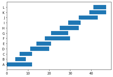
The above plot needs quite a few adjustments for us to be able to get the maximum information from it:
We're going to implement all those refinements soon. However, before doing so, let's consider how to deal with making a basic Gantt chart.
broken_barh()When some tasks contain two or more subtasks spread out over a period of time, we should use another matplotlib method – broken_barh().
To have some dummy data to try this approach on, let's do the following:
completion_frac column).start and end to start_1 and end_1 correspondingly (for convenience).# 1
df2 = df[df['team']=='Sales'][['task', 'team', 'start', 'end']]
# 2
df2.rename(columns={'start': 'start_1', 'end': 'end_1'}, inplace=True)
df2.reset_index(drop=True, inplace=True)
# 3
df2['start_2'] = pd.to_datetime([None, '10 Nov 2022', '25 Nov 2022', None])
df2['end_2'] = pd.to_datetime([None, '14 Nov 2022', '28 Nov 2022', None])
df2['start_3'] = pd.to_datetime([None, None, '1 Dec 2022', None])
df2['end_3'] = pd.to_datetime([None, None, '5 Dec 2022', None])
# 4
for i in [1, 2, 3]:
suffix = '_' + str(i)
df2['days_to_start' + suffix] = (df2['start' + suffix] - df2['start_1'].min()).dt.days
df2['days_to_end' + suffix] = (df2['end' + suffix] - df2['start_1'].min()).dt.days
df2['task_duration' + suffix] = df2['days_to_end' + suffix] - df2['days_to_start' + suffix] + 1
print(df2)Output:
task   team    start_1      end_1    start_2      end_2    start_3  \
0    C  Sales 2022-10-26 2022-10-31        NaT        NaT        NaT
1    D  Sales 2022-10-31 2022-11-08 2022-11-10 2022-11-14        NaT
2    H  Sales 2022-11-14 2022-11-22 2022-11-25 2022-11-28 2022-12-01
3    K  Sales 2022-11-28 2022-12-05        NaT        NaT        NaT

      end_3  days_to_start_1  days_to_end_1  task_duration_1  \
0        NaT                0              5                6
1        NaT                5             13                9
2 2022-12-05               19             27                9
3        NaT               33             40                8

  days_to_start_2  days_to_end_2  task_duration_2  days_to_start_3  \
0              NaN            NaN              NaN              NaN
1             15.0           19.0              5.0              NaN
2             30.0           33.0              4.0             36.0
3              NaN            NaN              NaN              NaN

  days_to_end_3  task_duration_3
0            NaN              NaN
1            NaN              NaN
2           40.0              5.0
3            NaN              NaN
Note that now task D has two subtasks, task H has three subtasks, and tasks C and K have one subtask each. Hence, tasks D and H are those tasks for which we're going to apply the broken_barh() method. Since the syntax of this method is a bit less intuitive than that of barh(), let's take a look at its main parameters and their format. The mandatory parameters of the broken_barh() method are:
xranges – a sequence of tuples of the format (xmin, xwidth) to denote the start and extension of each bar. Here, each bar represents a subtask. So, this parameter displays the start date and duration of each subtask.yrange – a tuple of the format (ymin, yheight) to denote the y-position and height for each bar.Now, let's plot our "broken" Gantt chart. The algorithm is as follows:
barh() method as we did earlier.broken_barh() method.broken_barh() method.# 1
fig, ax = plt.subplots()
# 2
for index, row in df2.iterrows():
if row['start_2'] is None:
ax.barh(y=df2['task'], width=df2['task_duration_1'], left=df2['days_to_start_1'])
elif row['start_2'] is not None and row['start_3'] is None:
ax.broken_barh(xranges=[(row['days_to_start_1'], row['task_duration_1']), (row['days_to_start_2'], row['task_duration_2'])], yrange=(index + 1, 0.5))
else:
ax.broken_barh(xranges=[(row['days_to_start_1'], row['task_duration_1']), (row['days_to_start_2'], row['task_duration_2']), (row['days_to_start_3'], row['task_duration_3'])], yrange=(index + 1, 0.5))
# 3
ax.set_yticks([1.25, 2.25, 3.25, 4.25])
ax.set_yticklabels(df2['task'])
plt.show()Output:
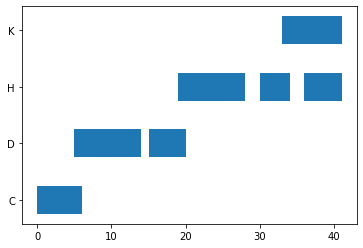
In the above code, we can actually use the broken_barh() method to plot the bars also for the tasks with only one subtask. In this case, we need to substitute this line of code:
ax.barh(y=df2['task'], width=df2['task_duration_1'], left=df2['days_to_start_1'])with this one:
ax.broken_barh(xranges=[(row['days_to_start_1'], row['task_duration_1'])], yrange=(index + 1, 0.5))This approach would also make our code more uniform and readable.
Let's return to our initial dataframe:
print(df)Output:
  task        team      start        end  completion_frac  days_to_start  \
0     A         R&D 2022-10-20 2022-10-31             1.00              0
1     B  Accounting 2022-10-24 2022-10-28             1.00              4
2     C       Sales 2022-10-26 2022-10-31             1.00              6
3     D       Sales 2022-10-31 2022-11-08             1.00             11
4     E          IT 2022-11-03 2022-11-09             1.00             14
5     F         R&D 2022-11-07 2022-11-18             0.95             18
6     G          IT 2022-11-10 2022-11-17             0.70             21
7     H       Sales 2022-11-14 2022-11-22             0.35             25
8     I  Accounting 2022-11-18 2022-11-23             0.10             29
9     J  Accounting 2022-11-23 2022-12-01             0.00             34
10    K       Sales 2022-11-28 2022-12-05             0.00             39
11    L          IT 2022-11-30 2022-12-05             0.00             41

    days_to_end  task_duration  completion_days
0            11             12            12.00
1             8              5             5.00
2            11              6             6.00
3            19              9             9.00
4            20              7             7.00
5            29             12            11.40
6            28              8             5.60
7            33              9             3.15
8            34              6             0.60
9            42              9             0.00
10           46              8             0.00
11           46              6             0.00
and our first Gantt chart:
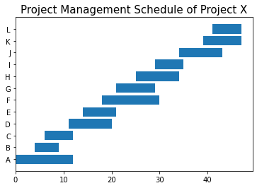
plt.barh(y=df['task'], width=df['task_duration'], left=df['days_to_start'])
plt.show()
Output:
In particular, we want to add some customization to this chart to make it more insightful.
To dig deeper into plot customizing with matplotlib, consider the following resources: Matplotlib Tutorial: Python Plotting and Matplotlib Cheat Sheet: Plotting in Python.
These include:
Having a meaningful title is a must for any plot, including a Gantt chart. Let's assume that our project is called Project X:
plt.barh(y=df['task'], width=df['task_duration'], left=df['days_to_start'])
plt.title('Project Management Schedule of Project X', fontsize=15)
plt.show()
Output:
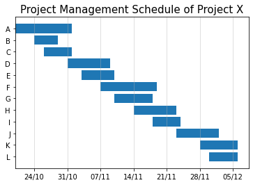
At this step, we're going to build upon the previous code and perform the following actions:
ax object.# 1
fig, ax = plt.subplots()
plt.barh(y=df['task'], width=df['task_duration'], left=df['days_to_start'] + 1)
plt.title('Project Management Schedule of Project X', fontsize=15)
# 2
plt.gca().invert_yaxis()
# 3
xticks = np.arange(5, df['days_to_end'].max() + 2, 7)
# 4
xticklabels = pd.date_range(start=df['start'].min() + dt.timedelta(days=4), end=df['end'].max()).strftime("%d/%m")
# 5
ax.set_xticks(xticks)
ax.set_xticklabels(xticklabels[::7])
# 6
ax.xaxis.grid(True, alpha=0.5)
plt.show()Output:
If you need more practice in Python to write and read any Python code easily, our Intermediate Python course is a good reference point.
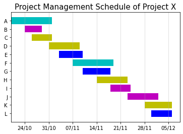
Now, let's color-code each bar (representing a specific task) in accordance with the team to which this task was assigned. For this purpose, we're going to do the following:
# 1
team_colors = {'R&D': 'c', 'Accounting': 'm', 'Sales': 'y', 'IT': 'b'}

# 2
fig, ax = plt.subplots()

# 3
for index, row in df.iterrows():
    plt.barh(y=row['task'], width=row['task_duration'], left=row['days_to_start'] + 1, color=team_colors[row['team']])

# 4
plt.title('Project Management Schedule of Project X', fontsize=15)
plt.gca().invert_yaxis()
ax.set_xticks(xticks)
ax.set_xticklabels(xticklabels[::7])
ax.xaxis.grid(True, alpha=0.5)
plt.show()
Output:
One thing that is missing in the above Gantt chart example is a legend illustrating which color is related to which team. To fix it, let's create patches – matplotlib 2D artist objects filled with a predefined color. We'll use the matplotlib.patches.Patch class to generate a list of patches, one for each team, colored accordingly:
patches = []
for team in team_colors:
    patches.append(matplotlib.patches.Patch(color=team_colors[team]))
Now, we're ready to add a legend to our chart:
fig, ax = plt.subplots()
for index, row in df.iterrows():
    plt.barh(y=row['task'], width=row['task_duration'], left=row['days_to_start'] + 1, color=team_colors[row['team']])
plt.title('Project Management Schedule of Project X', fontsize=15)
plt.gca().invert_yaxis()
ax.set_xticks(xticks)
ax.set_xticklabels(xticklabels[::7])
ax.xaxis.grid(True, alpha=0.5)

# Adding a legend
ax.legend(handles=patches, labels=team_colors.keys(), fontsize=11)

plt.show()
Output:
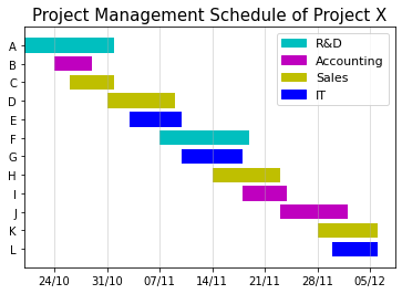
The above Gantt chart example looks much more informative.
You'll find more techniques for enhancing plot aesthetics and readability in the course on Improving Your Data Visualizations in Python.
So far, we haven't used the completion_days column that we calculated at the beginning of this tutorial. We're going to use it now to make our Gantt chart more insightful by displaying at what stage of completion each task is.
What we'll do technically is add another bar on top of each bar that we've already built. The lower bar will represent the overall duration of each task in allocated days, while the upper one will correspond to the status of completion of that task in allocated days.
For each task, both bars will be of the same color related to the corresponding team, but the lower bar will be lighter than the upper one to be able to see the difference between them.
In other words, if a team is overperforming on a task, a combination of these two bars will show as if the team was already working more days on that task than it was expected (meaning that the task is probably going to be completed before the deadline).
In the opposite case, if a team is underperforming on a task, a combination of the corresponding bars will show as if the team was working fewer days on that task than it was expected (meaning that the task is probably going to be completed after the deadline).
fig, ax = plt.subplots()

for index, row in df.iterrows():

    # Adding a lower bar - for the overall task duration
    plt.barh(y=row['task'], width=row['task_duration'], left=row['days_to_start'] + 1, color=team_colors[row['team']], alpha=0.4)

    # Adding an upper bar - for the status of completion
    plt.barh(y=row['task'], width=row['completion_days'], left=row['days_to_start'] + 1, color=team_colors[row['team']])

plt.title('Project Management Schedule of Project X', fontsize=15)
plt.gca().invert_yaxis()
ax.set_xticks(xticks)
ax.set_xticklabels(xticklabels[::7])
ax.xaxis.grid(True, alpha=0.5)
ax.legend(handles=patches, labels=team_colors.keys(), fontsize=11)
plt.show()
Output:
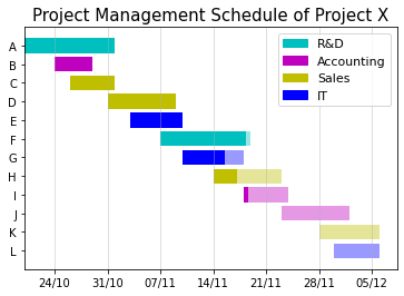
From the above plot, we can see that the teams aren't going at the same pace with completing their tasks, which is a common situation with many real-world projects. To get more information from this plot, let's assume that the current date is the 17 of November 2022 and mark this date on our chart:
fig, ax = plt.subplots()
for index, row in df.iterrows():
    plt.barh(y=row['task'], width=row['task_duration'], left=row['days_to_start'] + 1, color=team_colors[row['team']], alpha=0.4)
    plt.barh(y=row['task'], width=row['completion_days'], left=row['days_to_start'] + 1, color=team_colors[row['team']])

plt.title('Project Management Schedule of Project X', fontsize=15)
plt.gca().invert_yaxis()
ax.set_xticks(xticks)
ax.set_xticklabels(xticklabels[::7])
ax.xaxis.grid(True, alpha=0.5)
ax.legend(handles=patches, labels=team_colors.keys(), fontsize=11)

# Marking the current date on the chart
ax.axvline(x=29, color='r', linestyle='dashed')
ax.text(x=29.5, y=11.5, s='17/11', color='r')

plt.show()
Output:

We can make the following observations about the current status of Project X:
Such observations can help team leaders and the project manager to adjust the project schedule accordingly and allocate necessary resources timely to avoid delays in project deliverables.
We can add more details to our matplotlib Gantt chart. For example:
It's important, however, to keep our Gantt chart clean and avoid cluttering it with too many details. As with any other kind of data visualization, we need to maintain the necessary balance between the information capacity of the plot and its readability, as well as the readability of the code used for building that plot.
To summarize, in this tutorial, we explored:
In addition, we looked at various Gantt chart examples and the step-by-step process of building them.
For a more integrated approach to learning how to create compelling and informative charts in Python, take a look at our Data Visualization with Python skill track.
Data Visualization Courses
Course
Course
Course
cheat-sheet
Karlijn Willems
Tutorial
Kevin Babitz
Tutorial
Aditya Sharma
Tutorial
Elena Kosourova
Tutorial
Kurtis Pykes
Tutorial
Arunn Thevapalan