In this tutorial, I cover how to create line plots, bar plots, and scatter plots in Matplotlib using stock market data. The tutorial assumes some familiarity with NumPy arrays and pandas DataFrames. I'll explain what each library call does when it appears, but the main focus here is Matplotlib.
TL;DR
-
Matplotlib is Python's foundational plotting library — install with
pip install matplotliband import asimport matplotlib.pyplot as plt -
Create line plots with
plt.plot(x, y), bar plots withplt.bar(x, height), and scatter plots withplt.scatter(x, y) -
Always call
plt.show()to display the plot, orplt.savefig('filename.png')to save it -
Customize with
plt.title(),plt.xlabel(),plt.ylabel(), and thecolorparameter -
Use colormaps (
cmap) for continuous data andplt.legend()for multi-series plots
What Is Matplotlib?
Matplotlib is the most widely used data visualization library in Python, with over 50 million monthly downloads as of 2026. It creates static, interactive, and animated plots including line charts, bar charts, scatter plots, histograms, and more. Most other Python visualization libraries (Seaborn, pandas plotting, and even parts of Plotly) are built on top of Matplotlib.
Matplotlib offers fine-grained control over every visual element, which does mean more code for even basic plots. If quick exploratory charts are your priority, Seaborn provides higher-level defaults that look good out of the box. For interactive web-based charts, Plotly Express is another option worth considering.
By the end of this tutorial, you will know how to create line plots, bar plots, and scatter plots like the one below, along with customization basics: choosing colors, adding labels and titles, setting axis limits, and saving finished figures to file.
Getting Started with Matplotlib
Without further ado, let's load Matplotlib and quickly inspect the dataset used for this tutorial.
Loading Matplotlib
Before creating any plots, you need to import the library. The pyplot submodule provides all the plotting functions used in this tutorial.
The convention is to alias pyplot as plt. I also import pandas, NumPy, and datetime here since later sections use them.
import matplotlib.pyplot as plt
import pandas as pd
import numpy as np
from datetime import datetime
Loading the DJIA index dataset
Matplotlib is designed to work with NumPy arrays and pandas dataframes. The library makes it straightforward to build graphs from tabular data. For this tutorial, we will use the Dow Jones Industrial Average (DJIA) index’s historical prices from 2022-01-01 to 2022-12-31 (found here). You can set the date range on the page and then click the “download a spreadsheet” button.
We will load in the CSV file, named HistoricalPrices.csv, using the pandas library and view the first rows using the .head() method.
import pandas as pd

djia_data = pd.read_csv('HistoricalPrices.csv')
djia_data.head()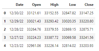
We see the data include 4 columns: Date, Open, High, Low, and Close. The latter 4 are related to the price of the index during the trading day. Below is a brief explanation of each variable.
- Date: The day that the stock price information represents.
- Open: The price of the DJIA at 9:30 AM ET when the stock market opens.
- High: The highest price the DJIA reached during the day.
- Low: The lowest price the DJIA reached during the day.
- Close: The price of the DJIA when the market stopped trading at 4:00 PM ET.
As a quick cleanup step, we will also need to use the rename() method in pandas, as the dataset we downloaded has an extra space in the column names.
djia_data = djia_data.rename(columns = {' Open': 'Open', ' High': 'High', ' Low': 'Low', ' Close': 'Close'})We also convert the Date column to a datetime type and sort in ascending order by date. For more on data type conversion, see the Python Data Type Conversion tutorial.
djia_data['Date'] = pd.to_datetime(djia_data['Date'])
djia_data = djia_data.sort_values(by = 'Date')
Drawing Line Plots with Matplotlib
Line plots show how values change over a continuous dimension, most often over time. They are the go-to charts for time series data because the connected points reveal trends, seasonality, and anomalies at a glance.
Line plots with a single line
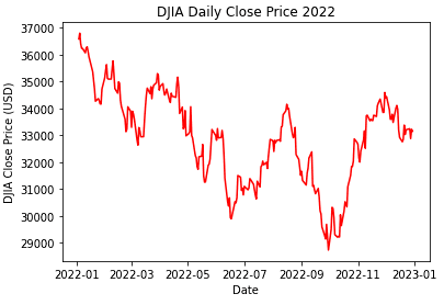
We can create a line plot in matplotlib using the plt.plot() method, where the first argument is the x variable and the second argument is the y variable in our line plot. Whenever we create a plot, we need to make sure to call plt.show() to ensure we see the graph we have created. We will visualize the closing price over time of the DJIA.
plt.plot(djia_data['Date'], djia_data['Close'])
plt.show()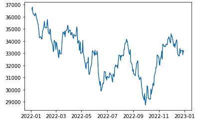
We can see that over the course of the year, the index price started at its highest value, followed by some fluctuations up and down throughout the year. We see the price was lowest around October, followed by a strong end-of-the-year increase in price.
Line plots with multiple lines
We can visualize multiple lines on the same plot by adding another plt.plot() call before the plt.show() function.
plt.plot(djia_data['Date'], djia_data['Open'])
plt.plot(djia_data['Date'], djia_data['Close'])


plt.show()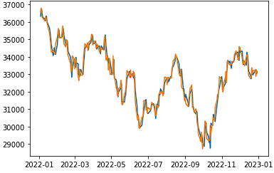
Over the course of the year, we see that the open and close prices of the DJIA were relatively close to each other for each given day, with no clear pattern of one always being above or below the other.
Adding a legend
If we want to distinguish which line represents which column, we can add a legend. This will create a color-coded label in the corner of the graph. We can do this using plt.legend() and adding label parameters to each plt.plot() call.
plt.plot(djia_data['Date'], djia_data['Open'], label = 'Open')
plt.plot(djia_data['Date'], djia_data['Close'], label = 'Close')
plt.legend()
plt.show()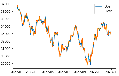
We now see a legend with the specified labels appear in the default location in the top right (location can be specified using the loc argument in plt.legend()).
Drawing Bar Plots with Matplotlib
Bar plots are very useful for comparing numerical values across categories. They are particularly helpful for finding the largest and smallest categories.
For this section, we aggregate the data into monthly averages using pandas .groupby() so we can compare the monthly performance of the DJIA. For a deeper look at grouping operations, see the Pandas GroupBy tutorial.
# Import the calendar package
from calendar import month_name

# Order by months by chronological order
djia_data['Month'] = pd.Categorical(djia_data['Date'].dt.month_name(), month_name[1:])

# Group metrics by monthly averages
djia_monthly_mean = djia_data \
    .groupby('Month') \
    .mean(numeric_only=True) \
    .reset_index()

djia_monthly_mean.head(6)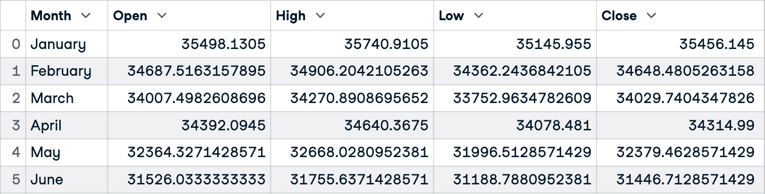
Vertical bar plots
We will start by creating a bar chart with vertical bars. This can be done using the plt.bar() method with the first argument being the x-axis variable (Month) and the height parameter being the y-axis (Close). We then want to make sure to call plt.show() to show our plot.
plt.bar(djia_monthly_mean['Month'], height = djia_monthly_mean['Close'])
plt.show()
We see that most of the closing prices of the DJIA were close to each other, with the lowest average closing value being in June and the highest average closing value being in January.
Reordering bars in bar plots
If we want to show these bars in order of highest to lowest, monthly average close price, we can sort the bars using the sort_values() method in pandas, and then use the same plt.bar() method.
djia_monthly_mean_srtd = djia_monthly_mean.sort_values(by = 'Close', ascending = False)

plt.bar(djia_monthly_mean_srtd['Month'], height = djia_monthly_mean_srtd['Close'])
plt.show()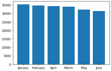
As you can see, it is significantly easier to see which months had the highest average DJIA closing price and which months had the lowest averages. It is also easier to compare across months and rank the months.
Horizontal bar plots
It is sometimes easier to interpret bar charts and read the labels when we make the bar plot with horizontal bars. We can do this using the plt.barh() method.
plt.barh(djia_monthly_mean_srtd['Month'], width = djia_monthly_mean_srtd['Close'])
plt.show()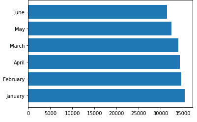
As you can see, the labels of each category (month) are easier to read than when the bars were vertical. We can still easily compare across groups. This horizontal bar chart is especially useful when there are a lot of categories.
Drawing Scatter Plots with Matplotlib
Scatter plots show the relationship between two numeric variables. Each point represents one observation, and the overall pattern reveals whether a linear, non-linear, or no relationship exists, which directly informs your choice of modeling technique.
Creating a basic scatter plot
Similar to the other plots, a scatter plot can be created using pyplot.scatter(), where the first argument is the x-axis variable and the second argument is the y-axis variable. In this example, we will look at the relationship between the open and close prices of the DJIA.
plt.scatter(djia_data['Open'], djia_data['Close'])
plt.show()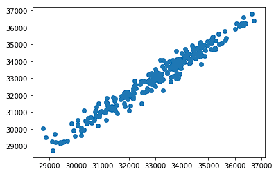
On the x-axis, we have the open price of the DJIA, and on the y-axis, we have the close price. As we would expect, as the open price increases, we see a strong relationship in the close price increasing as well.
Adding a trend line
Next, we will add a trend line to the graph to show the linear relationship between the open and close variables more explicitly. To do this, we will use the numpy polyfit() method and poly1d(). The first method will give us a least squares polynomial fit where the first argument is the x variable, the second variable is the y variable, and the third variable is the degrees of the fit (1 for linear). The second method will give us a one-dimensional polynomial class that we can use to create a trend line using plt.plot().
z = np.polyfit(djia_data['Open'], djia_data['Close'], 1)
p = np.poly1d(z)


plt.scatter(djia_data['Open'], djia_data['Close'])
plt.plot(djia_data['Open'], p(djia_data['Open']))
plt.show()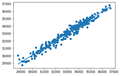
As we can see, the line in the background of the graph follows the trend of the scatterplot closely as the relationship between open and close price is strongly linear. We see that as the open price increases, the close price generally increases at a similar and linear rate.
Setting the Plot Title and Axis Labels
Plot titles and axis labels help the viewer understand what data they are looking at. Matplotlib provides plt.title(), plt.xlabel(), and plt.ylabel() to annotate a plot. Here is the previous scatterplot with all three added:
plt.scatter(djia_data['Open'], djia_data['Close'])
plt.title('DJIA 2022: Open vs. Close Price')
plt.xlabel('Open Price ($)')
plt.ylabel('Close Price ($)')
plt.show()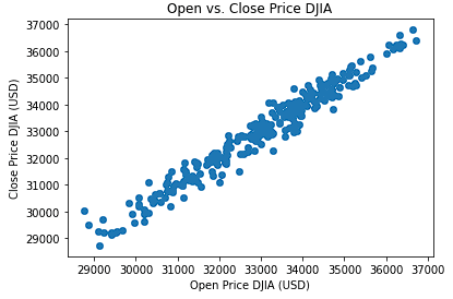
Changing Colors
Color choices affect both readability and emphasis. In Matplotlib, colors can be specified in three ways:
-
Named colors:
"red","blue","steelblue" -
Hex codes:
"#f4db9a","#383c4a" -
RGB tuples:
(0.49, 0.39, 0.15),(0.12, 0.21, 0.47)
Changing line color
For a line plot, we can change the color using the color attribute in plt.plot(). Below, we change the color of our open price line to “black” and our close price line to “red.”
plt.plot(djia_data['Date'], djia_data['Open'], color = 'black')
plt.plot(djia_data['Date'], djia_data['Close'], color = 'red')
plt.show()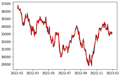
Changing bar color
For bars, we can pass a list into the color attribute to specify the color of each line. Let’s say we want to highlight the average price in January for a point we are trying to make about how strong the average close price was. We can do this by giving that bar a unique color to draw attention to it.
plt.bar(djia_monthly_mean_srtd['Month'], height = djia_monthly_mean_srtd['Close'], color = ['blue', 'gray', 'gray', 'gray', 'gray', 'gray'])
plt.show()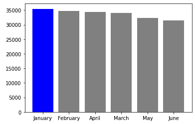
Changing point color
Finally, for scatter plots, we can change the color using the color attribute of plt.scatter(). We will color all points in January as blue and all other points as gray to show a similar story as in the above visualization.
plt.scatter(djia_data[djia_data['Month'] == 'January']['Open'], djia_data[djia_data['Month'] == 'January']['Close'], color = 'blue')

plt.scatter(djia_data[djia_data['Month'] != 'January']['Open'], djia_data[djia_data['Month'] != 'January']['Close'], color = 'gray')

plt.show()
Using Colormaps
Colormaps are built-in Matplotlib color scales that map numeric values to a color gradient (official documentation). For a deeper look, see our Matplotlib Colormaps tutorial. The colormaps generally aesthetically look good together and help tell a story in the increasing values.
We see in the below example, we use a colormap by passing the close price (y-variable) to the c attribute, and the plasma colormap through cmap. We see that as the values increase, the associated color gets brighter and more yellow while the lower end of the values is purple and darker.
plt.scatter(djia_data['Open'], djia_data['Close'], c=djia_data['Close'], cmap = plt.cm.plasma)

plt.show()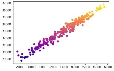
Setting Axis Limits
Sometimes, it is helpful to look at a specific range of values in a plot. For example, if the DJIA is currently trading around $30,000, we may only care about behavior around that price. We can pass a tuple into the plt.xlim() and plt.ylim() to set x and y limits respectively. The first value in the tuple is the lower limit, and the second value in the tuple is the upper limit.
plt.scatter(djia_data['Open'], djia_data['Close'])
plt.xlim((29000, 34000))
plt.ylim((29000, 34000))
plt.title('DJIA Open vs Close (Zoomed In)')
plt.xlabel('Open Price ($)')
plt.ylabel('Close Price ($)')
plt.show()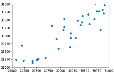
Saving Plots
Once you have a plot you are happy with, you can save it to a file. Matplotlib supports PNG, PDF, SVG, and other formats through plt.savefig(). The format is inferred from the file extension.
Finally, we can save plots that we create in matplotlib using the plt.savefig() method. We can save the file in many different file formats including ‘png,’ ‘pdf,’ and ‘svg’. The first argument is the filename. The format is inferred from the file extension (or you can override this with the format argument).
plt.scatter(djia_data['Open'], djia_data['Close'])
plt.savefig('DJIA 2022 Scatterplot Open vs. Close.png')
Final Thoughts
This tutorial covered line plots, bar plots, and scatter plots, the three chart types you will reach for most often. Matplotlib requires more code than higher-level libraries like Seaborn or Plotly, but that verbosity buys you pixel-level control over every element in the figure.
From here, I recommend exploring histograms, pie charts, and colormaps as your next steps. If you want a structured deep dive, the Introduction to Data Visualization with Matplotlib course walks through subplots, styling, and sharing figures in four hours.