There are two major causes for errors in machine learning models:
- Bias describes a model which makes simplified assumptions so the target function is easier to approximate; a model may learn that every 5'9 male in the world wears a size medium top - this is clearly biased.
- Variance describes the variability in the model prediction; how much the prediction of the model changes when we change the data used to train it.
To attain a more accurate solution, we seek to reduce the amount of bias and variance present in our model. This is not a straightforward task. Bias and variance are at odds with each other - reducing one will increase the other because of a concept known as the bias-variance tradeoff.
In this article you'll learn:
- How to detect whether a model suffers from high bias or high variance
- How to diagnose a model suffering from either symptom
- How to build a good-fit model
Before we get into detecting the error symptoms, let's first go into more depth with the bias-variance tradeoff.
A look at the bias-variance tradeoff
All supervised learning algorithms strive to achieve the same objective: estimating the mapping function (f_hat) for a target variable (y) given some input data (X). We refer to the function that a machine learning model aims to approximate as the target function.
Changing the input data used to approximate the target variable will likely result in a different target function, which may impact the outputs predicted by the model. How much our target function varies as the training data is changed is known as the variance. We don't want our model to have high variance because while our algorithm may perform flawlessly during training, it fails to generalize to unseen instances.
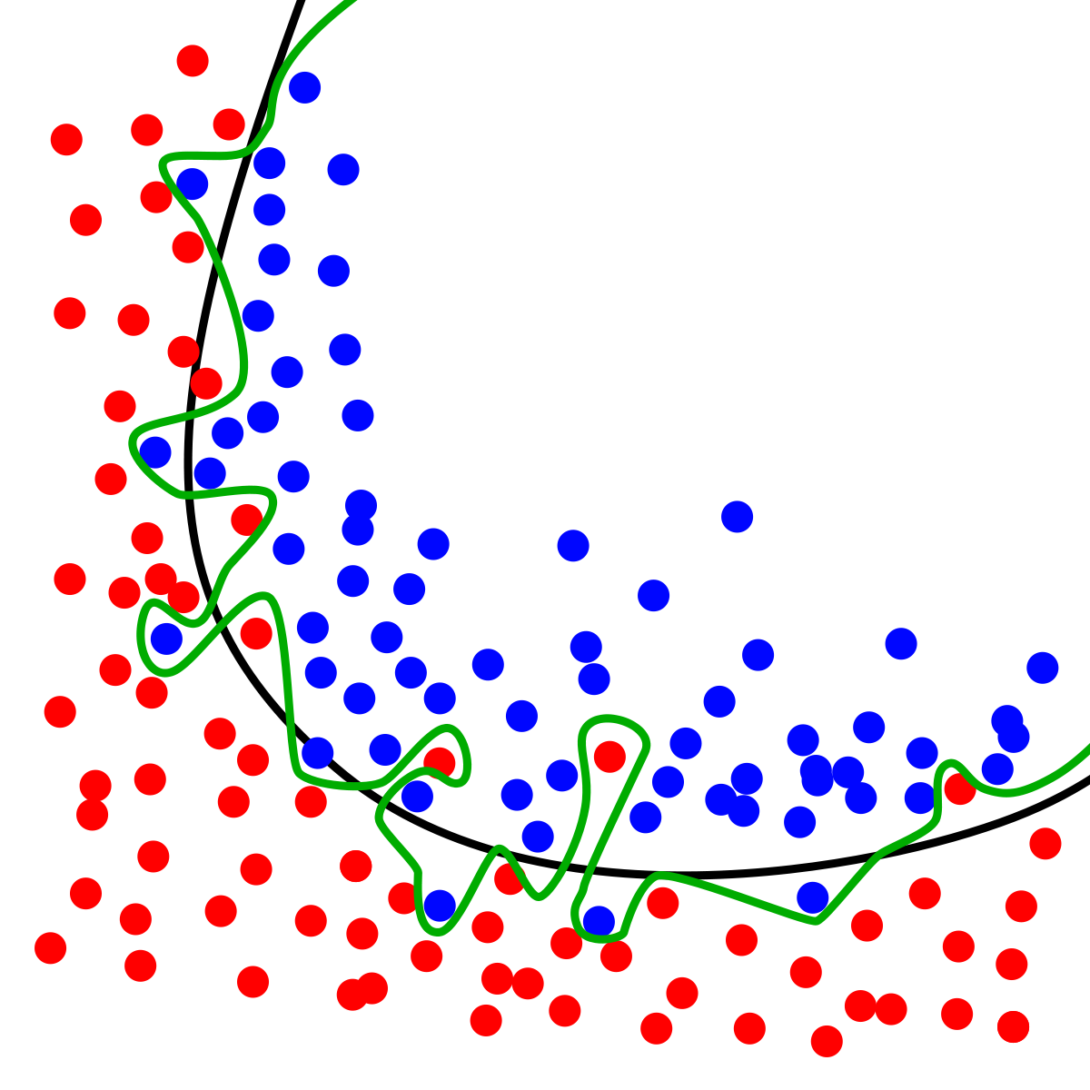
In the above image, the approximated target function is the green line and the line of best fit is in black. Notice how well the model learns the training data with the green line. It does its best to ensure all red and blue observations are separated. If we trained this model on new observations, it would learn an entirely new target function and attempt to enact the same behavior.
Consider a scenario in which we use a linear method like linear regression to approximate the target function. The first thing to note about linear regression is that it assumes a linear relationship between the input data and the target we are trying to predict. Events in the real world are a lot more complex. At the cost of some flexibility, this simple assumption makes the target function much quicker to learn and easier to understand. We refer to this paradigm as Bias.
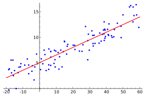
In the image above, the red line represents the learned target function. Many of the observations fall far away from the values predicted by the model.
We can reduce the bias in a model by making it more flexible, but this introduces variance. On the flip side, we can reduce the variance of a model by simplifying it, but this is introducing bias. There's no way to escape this relationship. The best alternative is to choose a model and configure it such that it strikes a balance in the tradeoff between bias and variance.
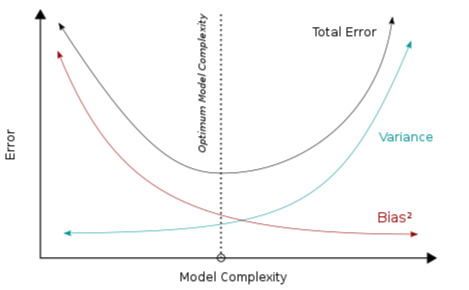
Due to unknown factors influencing the target function, there will always be some error present in the model, known as the irreducible error. This may be observed in the image above by noting the amount of error that occurs under the lowest point of the Total Error plot. To build the ideal model, we must find a balance between bias and variance such that the total error is minimized. This is illustrated with the dotted line called Optimum Model Complexity.
Let's expand on bias and variance using learning curves.
The anatomy of a learning curve
Learning curves are plots used to show a model's performance as the training set size increases. Another way it can be used is to show the model's performance over a defined period of time. We typically used them to diagnose algorithms that learn incrementally from data. It works by evaluating a model on the training and validation datasets, then plotting the measured performance.
For example, imagine we've modeled the relationship between some inputs and outputs using a machine learning algorithm. We start off by training the model on one instance and validating against one-hundred instances. What do you think will happen? If you said the model will learn the training data perfectly then you're correct - there would be no errors.
It's not hard to model the relationship of one input to output; all you have to do is remember that relationship. The difficult part would be trying to make accurate predictions when presented with new, unseen instances. Since our model learned the training data so well, it would have a terrible time trying to generalize to data it's not seen before. The model will perform poorly on our validation data as a result. This would mean there would be a large difference between the performance of our model on the training data and validation data. We call this difference the generalization error.
If our algorithm is going to stand a chance of making better predictions on the validation dataset, we need to add more data. Introducing new instances to the training data will inevitably change the target function of our model. How the model performs as we grow the training dataset could be monitored and plotted to reveal the evolution of the training and validation error scores.
This means the graph will display two different results:
- Training curve: The curve calculated from the training data; used to inform how well a model is learning.
- Validation curve: The curve calculated from the validation data; used to inform of how well the model is generalizing to unseen instances.
These curves show us how well the model is performing as the data grows, hence the name learning curves.
Note: The same process may be used to inform us of how our model learns over time. Instead of monitoring how the model is doing as the data gets larger, we monitor how well the model learns over time. For example, you may decide to learn a new language. Your grasp of that language could be evaluated and assigned a numerical score to show how you've faired over the course of 52 weeks.
You've now learned the anatomy of a learning curve; let's put it into practice with a real-world dataset to give you a visual understanding.
Use case: Predicting real estate valuations
We will be using the dataset: the market historical data set of real estate valuation. This data was collected from Sindian Dist., New Taipei, Taiwan and consists of market historical data.
Our task is to predict the real estate valuation given the following features:
- X1=the transaction date (for example, 2013.250=2013 March, 2013.500=2013 June, etc.)
- X2=the house age (unit: year)
- X3=the distance to the nearest MRT station (unit: meter)
- X4=the number of convenience stores in the living circle on foot (integer)
- X5=the geographic coordinate, latitude. (unit: degree)
- X6=the geographic coordinate, longitude. (unit: degree)
The target variable is defined as:
- Y= house price of unit area (10000 New Taiwan Dollar/Ping, where Ping is a local unit, 1 Ping = 3.3 meters squared)
The target we are predicting is continuous, thus the problem is going to require regression techniques.
Let's start by peeking at the data:
import pandas as pd

data = pd.read_excel("/content/gdrive/MyDrive/real_estate_valuation_data.xlsx")
print(data.info())
data.head()

>>>>
<class 'pandas.core.frame.DataFrame'>
RangeIndex: 414 entries, 0 to 413
Data columns (total 8 columns):
 #   Column                                  Non-Null Count  Dtype
---  ------                                  --------------  -----
 0   No                                      414 non-null    int64
 1   X1 transaction date                     414 non-null    float64
 2   X2 house age                            414 non-null    float64
 3   X3 distance to the nearest MRT station  414 non-null    float64
 4   X4 number of convenience stores         414 non-null    int64
 5   X5 latitude                             414 non-null    float64
 6   X6 longitude                            414 non-null    float64
 7   Y house price of unit area              414 non-null    float64
dtypes: float64(6), int64(2)
memory usage: 26.0 KB
None

No    X1 transaction date    X2 house age    X3 distance to the nearest MRT station    X4 number of convenience stores    X5 latitude    X6 longitude    Y house price of unit area
0    1    2012.916667    32.0    84.87882    10    24.98298    121.54024    37.9
1    2    2012.916667    19.5    306.59470    9    24.98034    121.53951    42.2
2    3    2013.583333    13.3    561.98450    5    24.98746    121.54391    47.3
3    4    2013.500000    13.3    561.98450    5    24.98746    121.54391    54.8
4    5    2012.833333    5.0    390.56840    5    24.97937    121.54245    43.1
There's an extra featured called No which was not referenced in the documentation of the data. It's possible it refers to an index, but for simplicity's sake we are going to remove it. Also, the feature names do not reflect what was given in the documentation so we are going to clean this up.
# rename the columns
renamed_columns = [col.split()[0] for col in data.columns]
renamed_columns_map = {data.columns[i]:renamed_columns[i] for i in range(len(data.columns))}

data.rename(renamed_columns_map, axis=1, inplace=True)

# remove No column
data.drop("No", axis=1, inplace=True)

print(data.head())

# separate features and target data
features, target = data.columns[:-1], data.columns[-1]

X = data[features]
y = data[target]
This is how the final dataset looks before we split the features and target labels:
        X1          X2          X3      X4      X5          X6        Y
0   2012.916667     32.0    84.87882    10  24.98298    121.54024   37.9
1   2012.916667     19.5    306.59470   9   24.98034    121.53951   42.2
2   2013.583333     13.3    561.98450   5   24.98746    121.54391   47.3
3   2013.500000     13.3    561.98450   5   24.98746    121.54391   54.8
4   2012.833333     5.0     390.56840   5   24.97937    121.54245   43.1
To demonstrate bias, variance, and good fit solutions, we are going to build three models: a decision tree regressor, a support vector machine for regression, and a random forest regressor. After building the model, we will plot learning curves for each one and share some diagnostic techniques.
Diagnosing learning curves
Learning curves are interpreted by assessing their shape. Once the shape and dynamics have been interpreted, we can use them to diagnose any problems in a machine learning model's behavior.
The learning_curve() function in Scikit-learn makes it easy for us to monitor training and validation scores, which is what is required to plot a learning curve.
The parameters we pass to the learning_curve() function are as follows:
- estimator: the model used to approximate the target function
- X: the input data
- y: the target
- cv: the cross-validation split strategy
- scoring: the metric used to evaluate the performance of the model
- train_sizes: the absolute numbers of training examples that will be used to generate the learning curve; the values we are using are completely random.
Model 1: Decision tree regressor
A model with high variance is said to be overfit. It learns the training data and the random noise extremely well, thus resulting in a model that performs well on the training data, but fails to generalize to unseen instances. We observe such behavior when the algorithm being used is too flexible for the problem being solved, or when the model is trained for too long.
For example, the decision tree regressor is a non-linear machine learning algorithm. Non-linear algorithms typically have low bias and high variance. This suggests that changes to the dataset will cause large variations to the target function.
Let's demonstrate high variance with our decision tree regressor:
from sklearn.model_selection import learning_curve
from sklearn.tree import DecisionTreeRegressor
import matplotlib.pyplot as plt

# overfitting
decision_tree = DecisionTreeRegressor()

train_sizes, train_scores, test_scores = learning_curve(
    estimator=decision_tree,
    X=X,
    y=y,
    cv=5,
    scoring="neg_root_mean_squared_error",
    train_sizes = [1, 75, 165, 270, 331]
)

train_mean = -train_scores.mean(axis=1)
test_mean = -test_scores.mean(axis=1)

plt.subplots(figsize=(10,8))
plt.plot(train_sizes, train_mean, label="train")
plt.plot(train_sizes, test_mean, label="validation")

plt.title("Learning Curve")
plt.xlabel("Training Set Size")
plt.ylabel("RMSE")
plt.legend(loc="best")

plt.show()
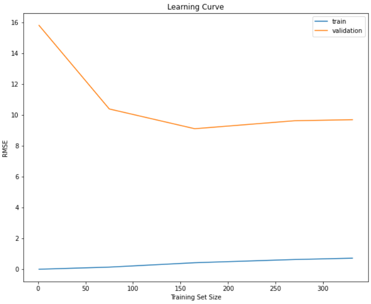
The model makes very few mistakes when it's required to predict instances it's seen during training, but performs terribly on new instances it hasn't been exposed to. You can observe this behavior by noticing how large the generalization error is between the training curve and the validation curve. A solution to improve this behavior may be to add more instances to our training dataset which introduces bias. Another solution may be to add regularization to the model (i.e. restricting the tree from growing to its full depth).
Model 2: Support Vector Machine
A model with high bias is said to be underfit. It makes simplistic assumptions about the training data, which makes it difficult to learn the underlying patterns. This results in a model that has high error on the training and validation datasets. We can observe such behavior when the model being used is too simple for the problem being solved, or when the model is not being trained for long enough.
For example, the support vector machine is a linear machine learning algorithm. Linear algorithms typically have high bias and low variance. This suggests that more assumptions are made about the form of the target function. To introduce more bias into our model, we've added regularization by setting the C parameter in our model.
Let's demonstrate high bias with our support vector machine:
from sklearn.svm import SVR
from sklearn.preprocessing import StandardScaler

# Underfitting
scaler = StandardScaler()
X_scaled = scaler.fit_transform(X)

svm = SVR(C=0.25)

train_sizes, train_scores, test_scores = learning_curve(
    estimator=svm,
    X=X_scaled,
    y=y,
    cv=5,
    scoring="neg_root_mean_squared_error",
    train_sizes = [1, 75, 150, 270, 331]
)

train_mean = -train_scores.mean(axis=1)
test_mean = -test_scores.mean(axis=1)

plt.subplots(figsize=(10,8))
plt.plot(train_sizes, train_mean, label="train")
plt.plot(train_sizes, test_mean, label="validation")

plt.title("Learning Curve")
plt.xlabel("Training Set Size")
plt.ylabel("RMSE")
plt.legend(loc="best")

plt.show()
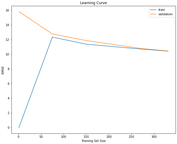
The generalization gap for the training and validation curve becomes extremely small as the training dataset size increases. This indicates that adding more examples to our model is not going to improve its performance. A solution to this problem may be to create more features or to make the model more flexible to reduce the number of assumptions being made.
Model 3: Random Forest Regressor
A good fit model exists in the gray area between an underfit and overfit model. The model may not be as good on the training data as it is in the overfit instance, but it will make far fewer errors when faced with unseen instances. This behaviour can be observed when the training error rises, but only to the point of stability, as the validation error decreases to the point of stability
To demonstrate this we are going to use a random forest which is an ensemble of decision trees. This means the model is also non-linear, but bias is added to the model by creating several diverse models and combining their predictions.
We've also added more regularization by setting the max_depth, which controls the maximum depth of each tree, to a value of three.
Let's see how this looks in code:
from sklearn.ensemble import RandomForestRegressor

# better
random_forest = RandomForestRegressor(max_depth=3)

train_sizes, train_scores, test_scores = learning_curve(
    estimator=random_forest,
    X=X,
    y=y,
    cv=5,
    scoring="neg_root_mean_squared_error",
    train_sizes = [1, 75, 150, 270, 331]
)

train_mean = -train_scores.mean(axis=1)
test_mean = -test_scores.mean(axis=1)

plt.subplots(figsize=(10,8))
plt.plot(train_sizes, train_mean, label="train")
plt.plot(train_sizes, test_mean, label="validation")

plt.title("Learning Curve")
plt.xlabel("Training Set Size")
plt.ylabel("RMSE")
plt.legend(loc="best")

plt.show()
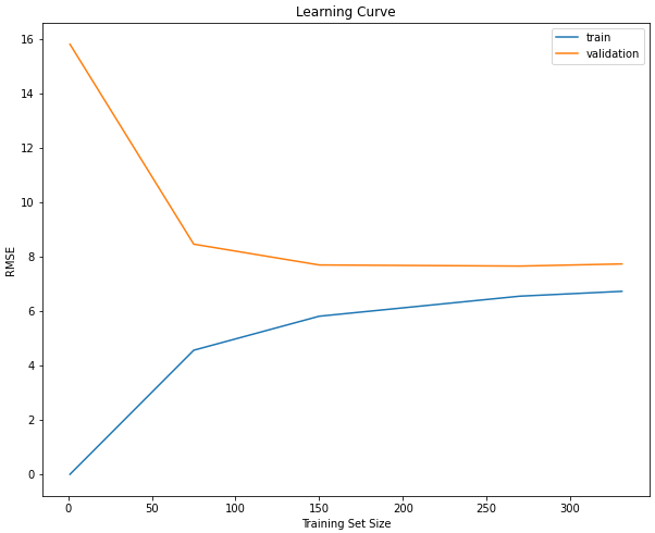
Now you can see we've reduced the error in the validation data. It came at the cost of weakened performance on the training data, but overall it's a better model.
The generalization error is much smaller, with a low number of errors being made. Also, both curves are stable beyond a 250 training set size, which implies that adding more instances may not improve this model much further.
In summary, a model's behavior can be observed using learning curves. The ideal scenario when building machine learning models is to keep the error as low as possible. Two factors that result in high error are bias and variance, and being able to strike a balance of both will result in a better-performing model.

