This tutorial is a valued contribution from our community and has been edited for clarity and accuracy by DataCamp.
Interested in sharing your own expertise? We’d love to hear from you! Feel free to submit your articles or ideas through our Community Contribution Form.
"Global warming isn’t a prediction. It is happening" - James Hansen
Climate change is an urgent issue that affects us all, and data visualization can be a powerful tool to raise awareness. In this step-by-step tutorial, you'll learn how to use ggplot2 in R to create impactful visualizations of historical climate data. By the end of this guide, you'll know how to find curated datasets, plot historical weather data, and customize your graphs to tell a compelling story.
Climate change is an urgent issue that affects us all, and data visualization can be a powerful tool to raise awareness. In this step-by-step tutorial, you'll learn how to use ggplot2 in R to create impactful visualizations of historical climate data. By the end of this guide, you'll know how to find curated datasets, plot historical weather data, and customize your graphs to tell a compelling story.
In this tutorial, you will learn where to find reliable and curated historical temperature data and visualize it with ggplot2.
- Know where to find curated datasets with historical weather data;
- Feel comfortable plotting historical weather data with ggplot2;
- Be able to customize your ggplot2 graphs to better tell your story.
Step 1: Finding and Loading the Data
Data for this tutorial is available on National Centers for Environmental Information (NCEI). The NCEI is the leading authority for environmental data in the USA and provides high quality data about climate, ecosystems and water resources. The Global Summary of the Year (GSOY) dataset offers historical weather data by city and station. For this tutorial, we will use data from Berkeley, CA. You can choose your preferred city if you wish.
Data will be loaded with read_csv. The first argument is the file path, while the second, col_select, tells R which columns you would like to load. Note that this dataset contains several variables, but we are only interested in the "DATE" and "TAVG". "DATE" contains the year the temperature was observed and "TAVG" is the average annual temperature given in Celcius. To know more about the available variables, please consult the dataset codebook.
library(readr)23df <- read_csv('USC00040693.csv',4 col_select = c("DATE", "TAVG"))5Rows: 118 Columns: 2── Column specification ────────────────────────────────────────────────────────Delimiter: ","dbl (2): DATE, TAVGBelow, you will print your dataset and its summary statistics to have an initial idea of your data. The R summary() function tells us that the data ranges from 1893 to 2019 and that the minimal average annual temperature observed was 12.9 ºC in Berkeley, CA, in this period. The maximum average temperature was 15.93 ºC.
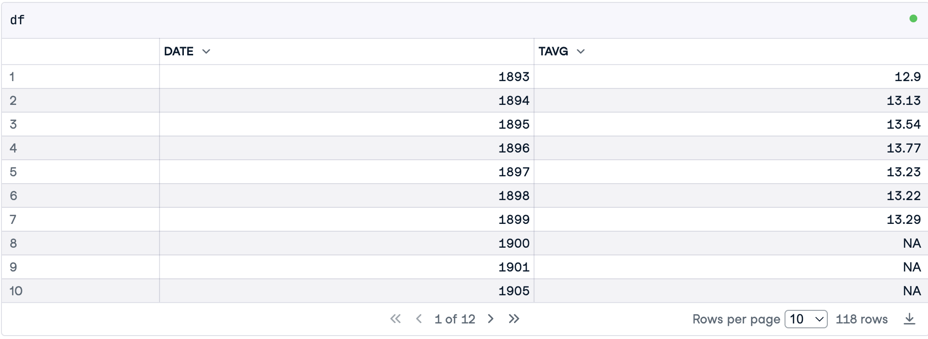
summary(df) DATE TAVG Min. :1893 Min. :12.90 1st Qu.:1926 1st Qu.:13.50 Median :1956 Median :13.91 Mean :1956 Mean :13.97 3rd Qu.:1985 3rd Qu.:14.33 Max. :2019 Max. :15.93 NA's :33 Step 2: Treating Missing Values
The summary() function revealed that there are 33 missing temperatures. You can also verify NAs of a specific variable using the function is.na(), which returns TRUE if the observation is an NA. Then, you can sum all missing values. The sum() function converts TRUE into 1.
print(paste("There are", sum(is.na(df$TAVG)), "missing values in this dataset."))[1] "There are 33 missing values in this dataset."Given that we are working with a time series, we will fill in missing values with linear interpolation. This method assumes data varied linearly during the missing period. Actually, when you plot a time series using a line plot, the intervals between observations, even when no data is missing, are also filled in with a straight line connecting the two dots.
To perform linear interpolation, we will use the imputeTS package. After installing and loading the library, you can use na_interpolation() to fill in the missing values. You pass two arguments to it. First, the dataframe column you would like to treat, and second, the method you wish to use to perform the imputation.
install.packages("imputeTS", quiet = TRUE)library(imputeTS)Registered S3 method overwritten by 'quantmod': method from as.zoo.data.frame zoo df$TAVG <- na_interpolation(df$TAVG, option ="linear")Step 3: Coding The First Version of Our Plot
A ggplot2 visualization is built of layers. As shown in the figure below, each layer contains one geom object, that is, one element you see in your graph (lines and dots, for instance).
First, you need to pass a dataset to the ggplot() function. Second, you will map variables to aesthetics - visual properties of a geom object. Aesthetics are the position on the y-axis, the position on the x-axis, color, or size, for instance. To know more about ggplot, check out the Introduction to Data Visualization with ggplot2 course, by Rick Scavetta, with whom I learned a lot of data visualization skills.

Ggplot2 layers. Image created by the Author.
Below, our mapping (aes()) tells ggplot to make the position on the x-axis dependent on the variable "DATE" and the position on the y-axis dependent on the temperature. Note that if you plot only this layer, ggplot will show you the axes only.
Moreover, before we start using ggplot, we will set some global configurations that we wish to apply to all our plots. The first configuration is the plot size and resolution. The second is the theme.
library(ggplot2)options(repr.plot.width = 10, repr.plot.height = 6, repr.plot.res = 150 )theme_set(theme_bw())axes <- ggplot(data = df, aes(x = DATE, y = TAVG))axes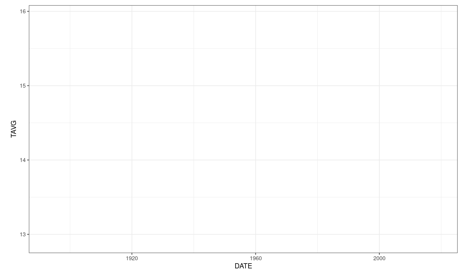
Now you may add a second layer with dots indicating temperatures throughout time. Note that you can add the layer to the plot you made in the previous step.
dot_plot <- axes + geom_point()dot_plot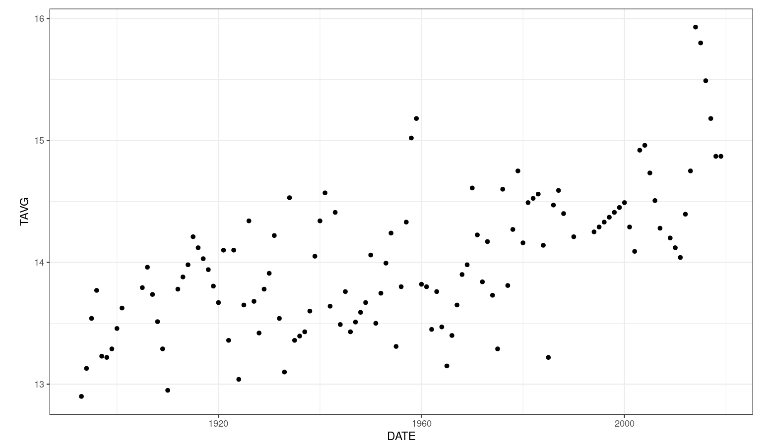
Finally, you may add a third layer containing the lines. It is important to highlight that some authors claim that the lines do not represent observed data and should be used carefully. For a complete discussion, please check chapter 13 of Fundamentals of Data Visualization by Claus O. Wilke.
dot_plot +geom_line()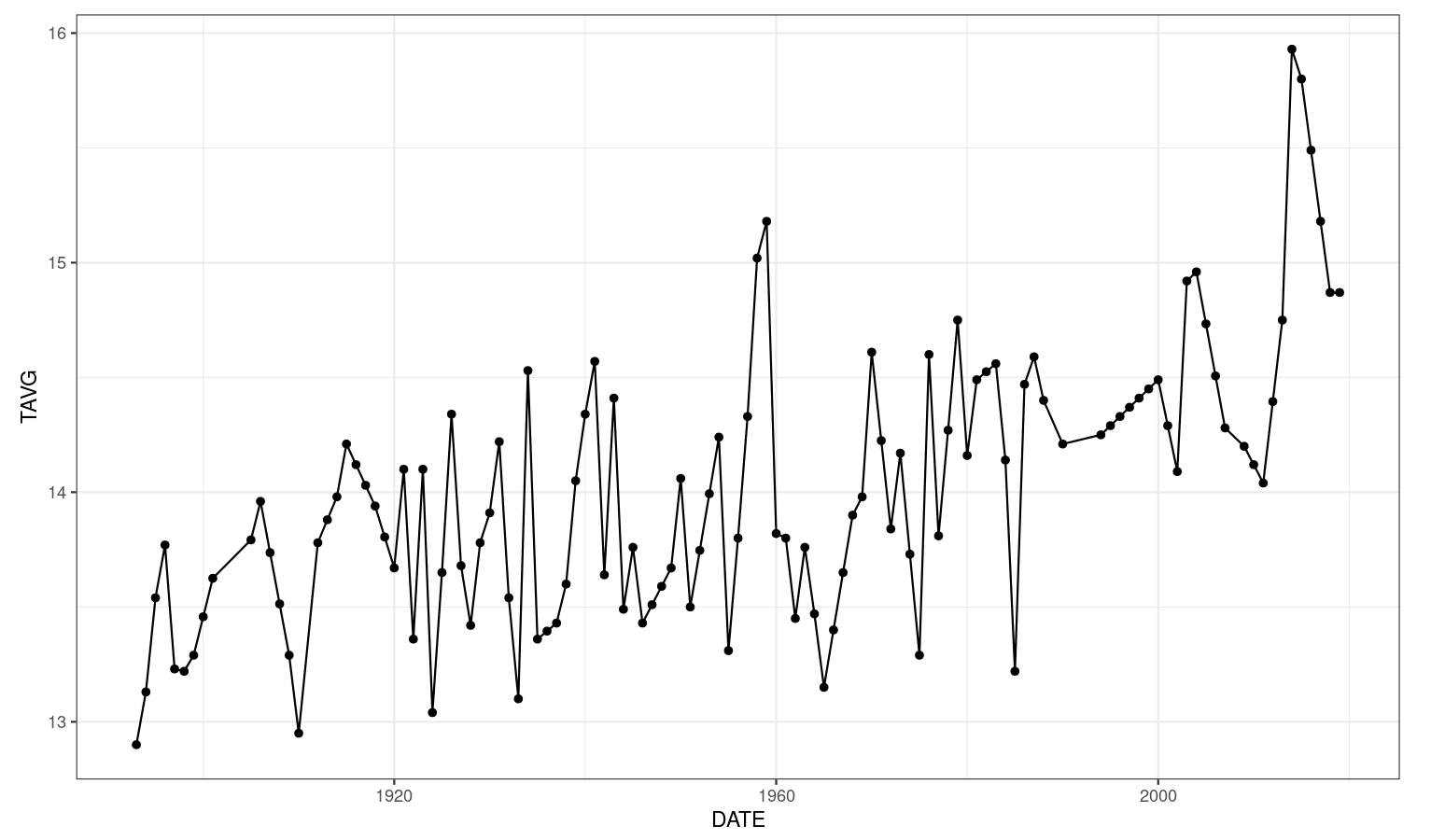
Step 4: Customizing Your Plot
In this section, you will learn how to customize your plot to make it clear, informative, and beautiful.
First, to make the increase in temperature more visible, we will map the color aesthetic of the dots to "TAVG" as well. Since it is a numeric variable, ggplot2 will use a gradient to represent continuous values as colors. You can choose which color will represent low temperatures as well as high temperatures with the scale_color_gradient() function.
Moreover, you may set the x and y axes' labels with xlab() and ylab(), respectively. A title can be added with ggtitle(). Finally, we will increase the size of the dots and add transparency to make overlapped data visible.
ggplot(data = df, aes(x = DATE, y = TAVG, color = TAVG))+geom_point(size = 7, alpha = 0.8)+scale_color_gradient(name = "ºC", low = "#47BEFB", high = "#ED6AA8")+ggtitle("Historical air temperature trend in Berkeley, CA")+xlab("Year")+ylab("Annual Mean Temperature in Berkeley [ºC]")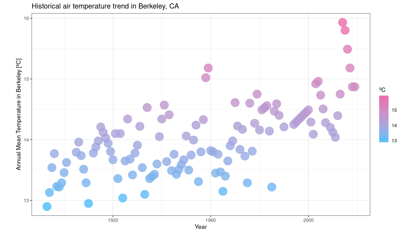
Edward Tufte, an expert in the field of data visualization, recommends maximizing the proportion of ink used to display non-redundant data. The author claims that it makes your plot clearer and avoids distracting your reader.
The ggplot2 theme we are using (theme_bw()) is already in line with Tufte's recommendations, but we could still eliminate the panel grids in the plot above. In order to achieve that, use the theme() function and pass two arguments to it, panel.grid.minor = element_blank() and panel.grid.major = element_blank().
ggplot(data = df, aes(x = DATE, y = TAVG, color = TAVG))+geom_point(size = 7, alpha = 0.8)+scale_color_gradient(name = "ºC", low = "#47BEFB", high = "#ED6AA8")+ggtitle("Historical air temperature trend in Berkeley, CA")+xlab("Year")+ylab("Annual Mean Temperature in Berkeley [ºC]")+theme(# Eliminates grids: panel.grid.minor = element_blank(), panel.grid.major = element_blank())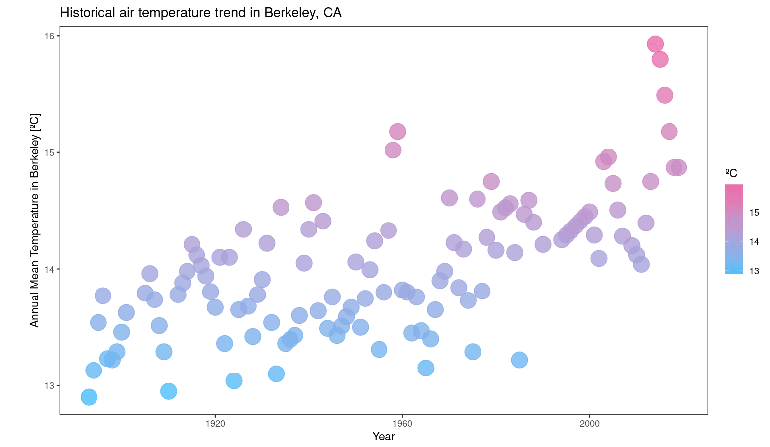
Step 5: Creating a ggplot2 Theme for Your Visualization
You will now learn how to create your own ggplot2 theme. As an example, we will create a theme_datacamp() to make our plot more consistent and harmonious with the DataCamp website.
First, a list with some DataCamp colors was created for future use.
datacamp_colors <- list(green = "#74F065", darkblue = "#05192D", blue = "#47BEFB", pink = "#ED6AA8")Second, we will load a Google Font called "Manjari" to use in our theme. You can easily load it with the "showtext" package. If you do not have it, please install it.
install.packages("showtext", quiet = TRUE)Below, we load the package and use the font_add_google() function to load "Manjari". We also tell R to render text using "showtext" with showtext_auto():
library(showtext)font_add_google("Manjari")showtext_auto()Loading required package: sysfontsLoading required package: showtextdbNow, we will use theme() to customize the graph. The figure below shows some of the arguments you can use. For a complete list, please check the ggplot2 reference.
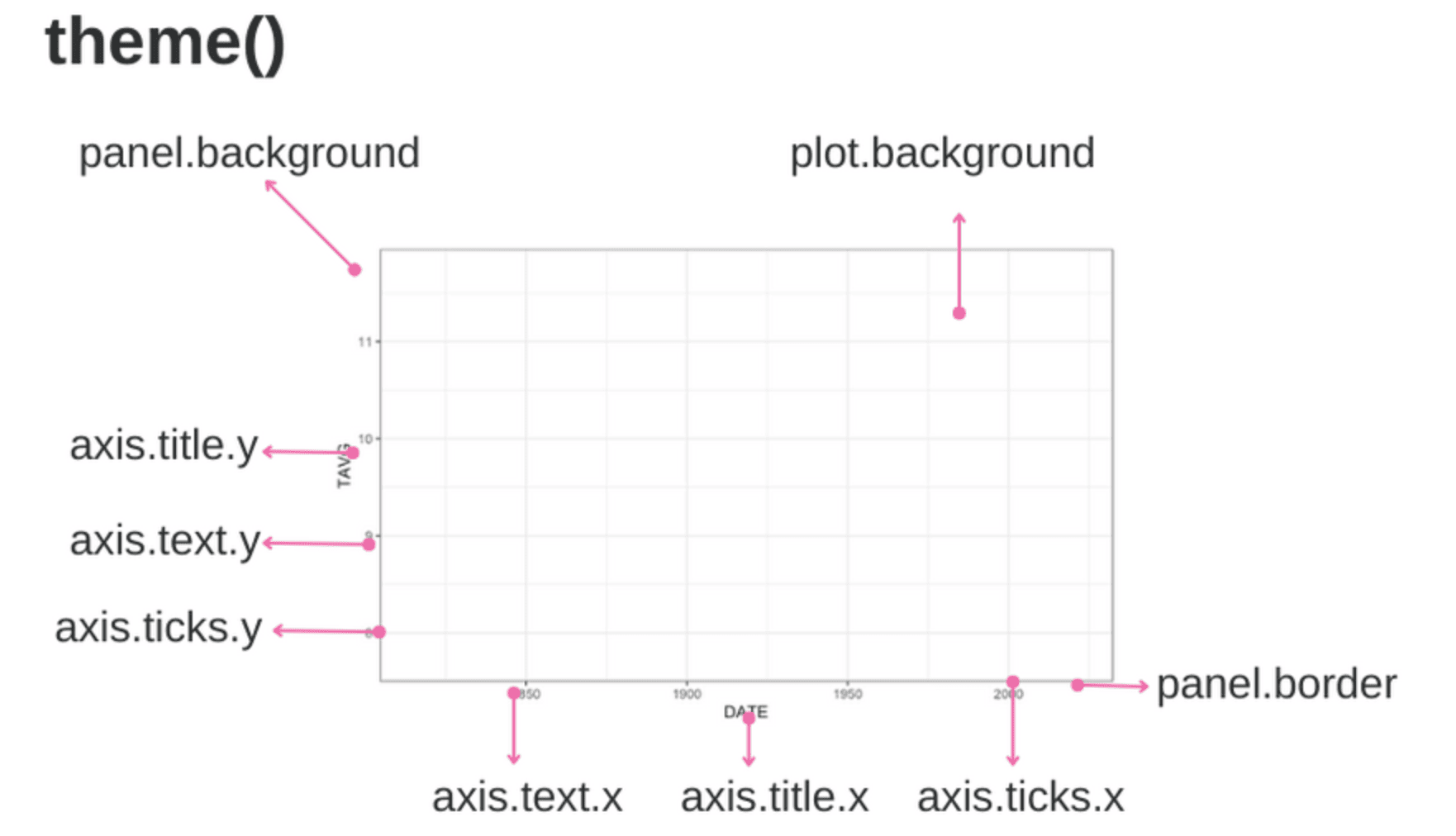
Theme arguments. Image created by the Author.
You may create a new theme with a function that calls the ggplot2 theme() function containing your customized specifications. Note that we start from the black-and-white theme (theme_bw()) and then eliminate grids and change the background, panel, and text colors. Moreover, a 0.5 cm margin is added to the plot. To facilitate future changes, two arguments were created for the user to specify the desired text, panel, and background colors.
theme_datacamp <- function(text_panel_color, background_color) { theme_bw()+ theme(text=element_text(size=28, family="Manjari", face = "bold", color = text_panel_color), # Eliminates grids panel.grid.minor = element_blank(), panel.grid.major = element_blank(), # Changes panel, plot and legend background to dark blue panel.background = element_rect(fill = background_color), plot.background = element_rect(fill = background_color), legend.background = element_rect(fill= background_color), # Changes legend texts color to white legend.text = element_text(color = text_panel_color, margin = margin(0, 0, 0, -0.5, "cm")), legend.title = element_text(color = text_panel_color), legend.text.align = 0, # Changes color of plot border to white panel.border = element_rect(size = 1, color = text_panel_color), # Changes color of axis texts to white axis.text.x = element_text(color = text_panel_color), axis.text.y = element_text(color = text_panel_color), axis.title.x = element_text(color= text_panel_color), axis.title.y = element_text(color= text_panel_color), # Changes axis ticks color to white axis.ticks.y = element_line(color = text_panel_color), axis.ticks.x = element_line(color = text_panel_color), # Adds margin plot.margin = margin(1, 1, 1, 1, "cm") )}Now, you can simply add theme_datacamp() to your plot, specifying your preferred colors. Here, I used Datacamp colors:
ggplot(data = df, aes(x = DATE, y = TAVG, color = TAVG))+geom_point(size = 7, alpha = 0.8)+scale_color_gradient(name = "ºC", low = datacamp_colors$blue, high = datacamp_colors$pink)+ggtitle("Historical air temperature trend in Berkeley, CA")+xlab("Year")+ylab("Annual Mean Temperature in Berkeley [ºC]")+theme_datacamp(text_panel_color = datacamp_colors$green, background_color = datacamp_colors$darkblue)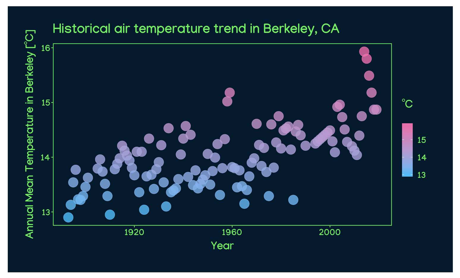
Finally, you could show the temperature trend with a LOESS (locally estimated scatterplot smoothing) smoother, as recommended by Claus O. Wilke in Chapter 14 of Fundamentals of Data Visualization. You can do that adding a ggplot layer containing the element geom_smooth().
ggplot(data = df, aes(x = DATE, y = TAVG, color = TAVG))+geom_point(size = 7, alpha = 0.8)+geom_smooth(color = datacamp_colors$green, se = FALSE)+scale_color_gradient(name = "ºC", low = datacamp_colors$blue, high = datacamp_colors$pink)+ggtitle("Historical air temperature trend in Berkeley, CA", subtitle = "Visualization using theme_datacamp()")+xlab("Year")+ylab("Annual Mean Temperature in Berkeley [ºC]")+theme_datacamp(text_panel_color = datacamp_colors$green, background_color = datacamp_colors$darkblue)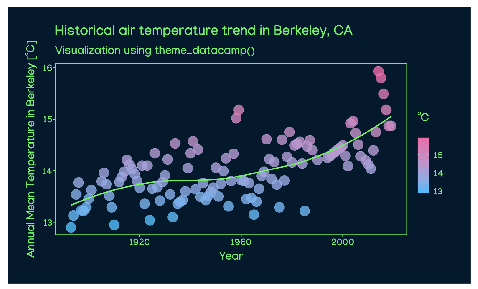
Feel free to test other color and font combinations to produce the most compelling visualizations. Below, for instance, I change the LOESS curve, panel, and text color to white.
ggplot(data = df, aes(x = DATE, y = TAVG, color = TAVG))+geom_point(size = 7, alpha = 0.8)+geom_smooth(color = "white", se = FALSE)+scale_color_gradient(name = "ºC", low = datacamp_colors$blue, high = datacamp_colors$pink)+ggtitle("Historical air temperature trend in Berkeley, CA", subtitle = "Visualization using theme_datacamp()")+xlab("Year")+ylab("Annual Mean Temperature in Berkeley [ºC]")+theme_datacamp(text_panel_color = "white", background_color = datacamp_colors$darkblue)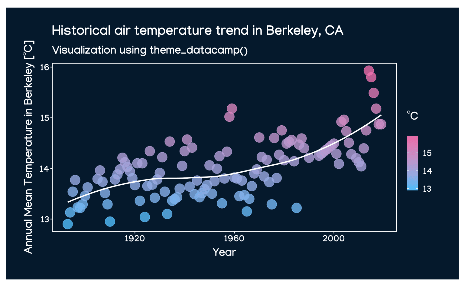
Conclusion
In this tutorial, you've learned how to use ggplot2 in R to visualize historical climate data effectively. We've covered everything from sourcing reliable data to creating a custom ggplot2 theme, equipping you with the skills to raise awareness about climate change through data visualization.
As a next step, consider diving deeper into data visualization and R programming with DataCamp's Introduction to Data Visualization with ggplot2 and Intermediate R courses. These courses will help you build on the skills you've acquired here and enable you to tackle more complex projects.