Course
Visualizing Geospatial Data in R
4 hr
29.7K

From retail and e-commerce to environmental sustainability, military, and natural disasters, geospatial data is crucial to enrich our data analyses.
In this post, we discuss what geospatial data analysis is, the benefits, the types of geospatial data, and how it's used. Lastly, we close off with a walkthrough of geospatial data analysis in Power BI.
Geospatial data describes things in terms of their location on Earth. These could be people, animals, objects, natural phenomena, or business outcomes.
Geospatial data analysis goes beyond just describing things and also explains where and why they occur. This process involves collecting, transforming, and visualizing geospatial data.
Many industries can use geospatial data analysis, from retail and e-commerce to environmental stability, and even governments for tracking resources, weather, disease, and defense.
Using geospatial data in analytics offers many benefits to organizations. Most importantly, this type of location-based data provides a multi-dimensional context to your data. We discuss the three most significant benefits of geospatial data analysis.
Geospatial data makes it easier to identify patterns and visualize trends in location-based data compared to other methods, like bar charts or tables. Furthermore, we can easily infer these patterns and trends based on their relative geographical proximity.
We can then segment and filter the data based on these patterns to obtain even deeper insights into why they may occur.
By visualizing geographical data, we can better represent the real world. In addition, having real-time data (or even close to real-time) can significantly enhance our understanding of business data to drive decision-making.
For example, suppose a retail business owner wants to set up a new shop in their area. They can use geospatial data to answer questions that help them determine the best location for their shop.
Some examples of these questions are:
Geospatial data analysis helps organizations visualize which locations are more successful than others.
Suppose a business understands the relationship between its products or services and the location they offer them. In that case, they can target those products to those locations or develop new products with a proven track record of success in a particular location.
There are two main types of geospatial data: vector and raster data. Additionally, the third type of data typically accompanies geographical data: attributes.
The type of data we are dealing with informs what tools we should use to analyze and then visualize the data. We will discuss each of these data types below.
An additional point to note is that all types of geospatial data must be accompanied by coordinate reference system (CRS) information. This CRS information tells the software we use to conduct geospatial data analysis where the geospatial data is located on Earth.
When sharing geospatial data, if you use a different CRS system than someone else, the data will show up in a different geographic location when analyzed. Unfortunately, CRS systems are beyond the scope of this article (and you will see later how ArcGIS for Power BI simplifies it for us). However, we have a course on working with geospatial data that explores CRS systems in depth, among other things.
Vector data describes the features of geographic locations on Earth through the use of points, lines, and polygons.
Raster data is pixel- or grid-based data describing geographic location characteristics. Each pixel can be either a continuous value (such as an elevation value) or a categorical classification (such as land cover classifications). You might already be familiar with pixel-based data types, as this is how images are typically represented in machine learning models, such as in computer vision applications.
The resolution of the digital images used for raster data is essential because it determines the area of the ground that each pixel covers.
Attributes are descriptive (non-spatial) data combined with other geospatial data to enhance visualizations and analytics. For example, when dealing with sales and customer data, these attributes can be information on the purchases that customers made or on the customers themselves.
One of the most recent public applications of geospatial data analysis is for tracking COVID-19 around the world and determining the subsequent environmental and social impacts of COVID-19. This involves a combination of population data, real-time updates, maps, environmental factors (like CO2 ommissions), and so on.
For example, the US Department of Transportation conducted a geospatial data analysis of CO2 emissions from transportation from April 2019 to April 2020. Their visualizations show a significant drop in CO2 emissions over time, which they calculated to be as much as 40%. While it is possible to state a value like this, it does not have the same impact as the visualization on a map.
Here are a few more geospatial data examples:
Geospatial data can be analyzed in popular programming languages like R and Python. In addition, there are several packages designed specifically for handling geospatial data. Check out these DataCamp courses to learn more about these:
ArcGIS for Power BI is a tool for geospatial data analysis and visualization. ArcGIS is a tool for creating maps from geospatial data, but when combined with Power BI, you can quickly build powerful reports to generate insights and drive decision-making.
This section will introduce you to ArcGIS for Power BI and show you how to create ArcGIS maps in Power BI. If you want to follow along with this section, we will be exploring the Airbnb listing data found on DataLab. You will also need Power BI Desktop installed on your PC. For more information on how to download and install Power BI, see this install guide.
Geospatial data can only be visualized effectively if the locations in the data are properly geocoded. This refers to the process of transforming the description of a location into a recognized location on Earth.
ArcGIS for Power BI offers two services for mapping location data onto a location on the map. The first is the ArcGIS World Geocoding Service which detects point locations (such as addresses and cities). The second is the ArcGIS GeoEnrichment Service which detects boundary locations (such as ZIP Codes and countries).
However, it is also possible to improve the accuracy of your location data with a few extra data preparation steps.
You can add detailed address information to the ArcGIS map, such as an address, city, state, province, ZIP code, country, etc. However, to achieve this, the ArcGIS visualization on Power BI can only add a single column from your dataset to the Location field. If you have separate columns for each element of this address information in your data, you will need to combine these into a single column.
You can create a calculated column to combine each of these elements using a formula like this:
Column = [Address] & ", " & [City] & ", " & [Country] & ", " & [Postal Code]
If you do not have detailed address information but rather more general data like country or US state, then ArcGIS can recognize this information and map a wider boundary (this is like the polygon data type from vector data mentioned above).
One of the easiest, and most accurate ways, of adding location information to an ArcGIS map is to use separate longitude and latitude columns added to their respective fields in the visualization options. Using this type of information is recommended if it is available in your data.
ArcGIS is a built-in visual in Power BI. You can find it among all other visualization choices. We have a course on data visualization in Power BI if you'd like extra guidance on visualizing data in Power BI and the best practices.
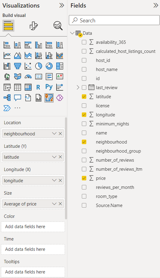
Click the ArcGIS icon to add it to the Power BI canvas. In the options on the right-hand side, you will see the types of fields that this visual supports. We add the neighborhood column to the Location field and the latitude and longitude columns to their respective fields. We want to visualize the prices of Airbnb listings in Los Angeles, so we add the price column to the Size field.
This produces the following result:
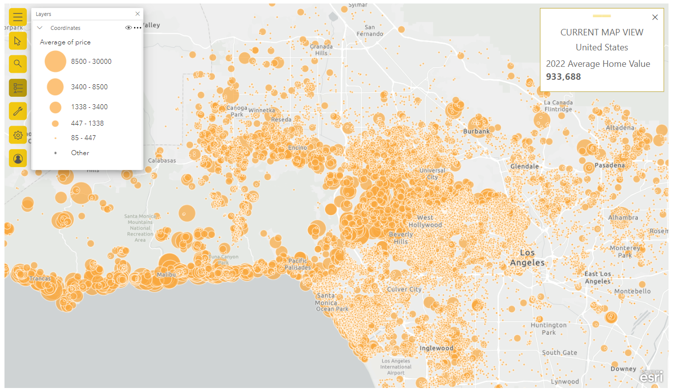
In addition to the information in our dataset, we add an additional infographic card to the chart. This is a feature offered by ArcGIS, and it dynamically changes based on the items we can see - in this case, we have zoomed into Los Angeles. Since we are dealing with property data, we added the average home value. This adds some context to the relative prices of Airbnb listings we see in this visual.
Based on the size of the circles, we can see that Malibu has some of the most expensive Airbnb listings!
Geospatial data analysis is a powerful tool for generating deeper insights and offers an additional layer of context to our data. This improves decision-making in organizations across many industries.
As you have seen in this post, using ArcGIS with Power BI dramatically simplifies the preparation of geospatial data and allows you to create dynamic visualizations quickly and easily.
Data Visualization Courses
Course
Course
Course
Tutorial
Parul Pandey
Tutorial
Joleen Bothma
Tutorial
Joleen Bothma
Tutorial
Parul Pandey
Tutorial
DataCamp Team
code-along
Nick Switzer