Course
Introduction to Tableau
6 hr
319.5K
Imagine scrolling through endless rows of data, unable to spot the insights hidden within. That’s the reality for many businesses today, with an estimated 402.74 million terabytes of data generated daily. So how do we make sense of it all? The answer lies in data visualization.
Organizations and individuals leverage data to determine the causes of problems and identify actionable steps. However, with an ever-growing amount of data, it becomes increasingly challenging to make sense of it all. Our innate nature is to search for patterns and find structure. This is how we store information and learn new insights. When incoming data is not presented in a visually pleasing way, seeing these patterns and finding structure can be difficult or, in some cases, impossible.
In this article, we will examine how data visualization can solve the above problem. We will also discuss what data visualization is, why it is important, tips for developing your skills, common graphs, and tools for visualizing your data.
Data visualization is the process of graphically representing data. It is the act of translating data into a visual context, which can be done using charts, plots, animations, infographics, etc. The idea behind it is to make it easier for us to identify trends, outliers, and patterns in data. We explore this concept more in our Understanding Data Visualization course.
Data professionals regularly leverage data visualizations to summarize key insights from data and relay that information back to the appropriate stakeholders.
For example, a data professional may create data visualizations for management personnel, who then leverage those visualizations to project the organizational structure. Another example is when data scientists use visualizations to uncover the underlying structure of the data to provide them with a better understanding of their data.
Given the defined purpose of data visualization stated above, there are two vital insights we can take away from what data visualization is:
1) A way to make data accessible: The best way to make something accessible is to keep things simple. The word ‘simple’ here needs to be put into context: what is straightforward for a ten-year-old to understand may not be the same for a Ph.D holder. Thus, data visualization is a technique used to make data accessible to whomever it may concern.
2) A way to communicate: This takeaway is an extension of the first. To communicate effectively, everyone in the room must be speaking the same language. It does not matter if you are working on a task independently or with a team, visualizations should derive interesting insights relative to those who may view them. A CEO may prefer to view insights that provide actionable steps, and a machine learning team may prefer to view insights into how their models perform.
In short, data visualization is a technique used to make it easier to recognize patterns or trends in data.
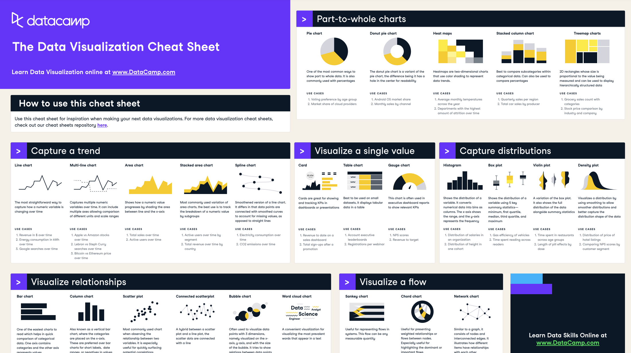
Our data visualization cheat sheet gives a visual representation of the concepts of data visualization
Data science is an interdisciplinary field that uses scientific methods, processes, algorithms, and systems to extract knowledge and insights from noisy, structured, and unstructured data (see our 'what is data science' guide for a deeper explanation). However, the challenge data scientists face is that it is not always possible to connect the dots when faced with raw data; this is where data visualization is extremely valuable. Let’s look at why data visualization is such a powerful tool for data scientists.
Data scientists are required to have a good understanding of the data they use. Data visualization makes it possible for data scientists to bring out the most informative aspects of their data, making it quick and easy for them (and others) to grasp what is happening in the data. For example, identifying trends in a dataset represented in a table format is much more complicated than seeing it visually. We will talk more about this in more detail later in the article.
Stories have been used to share information for centuries. The reason stories are so compelling is that they create an emotional connection with the audience. This connection allows the audience to gain a deeper understanding of other people’s experiences, making the information more memorable. Data storytelling is a form of visualization: it helps data scientists to make sense of their data and share it with others in an easily understandable format.
Insights can undoubtedly be derived from databases (in some cases), but this endeavor requires immense focus and is a significant business expense. Using data visualization in such instances is much more efficient. For example, if the goal is to identify all of the companies that suffered a loss in 2024, it would be easier to use red to highlight all the companies with profits less than zero, and green to highlight those greater than zero. The companies that broke even remain neutral. This technique is much more efficient than manually parsing the database to mark the individual companies.
While raw data may be informative, it is rarely visually pleasing or engaging. Data visualization is a technique used to take informative yet dull data and transform it into beautiful, insightful knowledge. Making data more visually appealing plays into our nature of being primarily optical beings. In other words, we process information much faster when it stimulates our visual senses.
Data visualization is a critical skill for anyone working with data, from business analysts to data scientists. Mastering it allows you to communicate insights effectively, making your data-driven decisions clearer and more impactful. If you’re wondering where to start, we offer a variety of resources designed to guide you at every stage of your data visualization journey—whether you’re a beginner or looking to sharpen your advanced skills.
Here’s how you can get started:
If you’re completely new to data visualization, it’s essential to understand the fundamentals before diving into advanced tools and techniques. DataCamp provides structured learning paths to guide you through these basics.
For those who aren’t yet familiar with programming, we have courses on tools that allow you to create visualizations without writing code. These tools are great for business users, managers, and anyone looking to quickly create insightful visualizations.
If you’re ready to get hands-on with coding, learning to create visualizations using Python or R can greatly expand your ability to customize and automate your data visualizations.
Once you’ve learned the basics, practice is key to mastering data visualization. DataCamp’s hands-on projects let you apply your skills to real-world datasets, helping you gain practical experience.
Data visualization is an evolving field, with new tools and techniques emerging regularly. DataCamp regularly updates its courses and introduces new ones to keep you informed of the latest trends.
Data professionals, such as data scientists and data analysts, would typically leverage data visualization tools as this helps them to work more efficiently and communicate their findings more effectively.
The tools can be broken down into two categories: 1) code free and 2) code based. Let’s take a look at some popular tools in each category.
Not everyone in your organization is going to be tech-savvy. However, lacking the ability to program should not deter you from deriving insights from data. You can lack programming ability but still be data literate – someone who can read, write, communicate, and reason with data to make better data-driven decisions.
Thus, code-free tools serve as an accessible solution for people who may not have programming knowledge (although people with programming skills may still opt to use them. More formally: code-free tools are graphical user interfaces that come with the capabilities of running native scripts to process and augment the data.
Some example code-free tools include:
Power BI is a highly-popular Microsoft solution for data visualization and business intelligence. It is among the world's most popular business intelligence tools used for reporting, self-service analytics, and predictive analytics. This platform service makes it easy for you to quickly clean, analyze, and begin finding insights into your organization's data.
If you are interested in learning Power BI, consider starting with Datacamp’s Power BI Fundamentals skill track.
Tableau is also one of the world’s most popular business intelligence tools. Its simple drag-and-drop functionality makes it easily accessible for anyone to begin finding insights into their organization's data using interactive data visualizations.
DataCamp’s Tableau Fundamentals skill track is a great way to get started with Tableau.
ChatGPT has quickly become a tool for helping people visualize their data. As we explore in our article on GPT-4o, with a few prompts, you can use the tool to visualize trends in your data. Generative AI is changing the way we think about our data, and there is much more to come! Check out our ChatGPT Fundamentals skill track to learn more about how to use this powerful tool.
If you are more tech-savvy, you may prefer to use a programming language to visualize your data. The increase in data production has boosted the popularity of Python and R due to their various packages that support data processing.
Let’s take a look at some of these packages.
Python is a high-level, interpreted, general-purpose programming language. It offers several great graphing packages for data visualization, such as:
The Data Visualization with Python skills track is a great sequence of courses to supercharge your data science skills using Python's most popular and robust data visualization libraries.
R is a programming language for statistical computing and graphics. It is a great tool for data analysis, as you can create almost any type of graph using its various packages. Popular R data visualization packages include:
Check out the Data Visualization with R and Interactive Data Visualization in R skill tracks to level up your visualization skills with the R programming language.
We have established that data visualization is an effective way to present and communicate with data. In this section, we will cover how we can create some common types of charts & graphs, which are an effective starting point for most data visualization tasks, by using Python and the Matplotlib python package for data visualization. We will also share some use cases for each graph.
You can check out this DataLab workbook to access the full code.
A frequency table is a great way to represent the number of times an event or value occurs. We typically use them to find descriptive statistics for our data. For example, we may wish to understand the effect of one feature on the final decision.
Let’s create an example frequency table. We will use the Car Evaluation Data Set from the UCI Machine Learning repository and Pandas to build our frequency table.
import pandas as pd"""source: https://heartbeat.comet.ml/exploratory-data-analysis-eda-for-categorical-data-870b37a79b65"""def frequency_table(data:pd.DataFrame, col:str, column:str): freq_table = pd.crosstab(index=data[col], columns=data[column], margins=True) rel_table = round(freq_table/freq_table.loc["All"], 2) return freq_table, rel_tablebuying_freq, buying_rel = frequency_table(car_data, "class", "buying")print("Two-way frequency table")print(buying_freq)print("---" * 15)print("Two-way relative frequency table")print(buying_rel)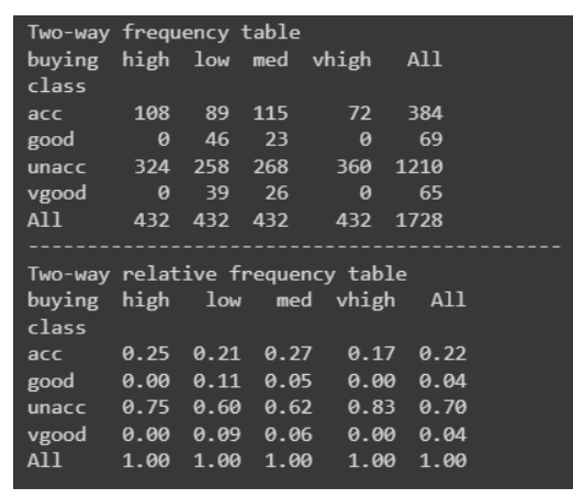
The bar graph is among the most simple yet effective data visualizations around. It is typically deployed to compare the differences between categories. For example, we can use a bar graph to visualize the number of fraudulent cases to non-fraudulent cases. Another use case for a bar graph may be to visualize the frequencies of each star rating for a movie.
Here is how we would create a bar graph in Python:
"""Starter code from tutorials pointsee: https://bit.ly/3x9Z6HU"""import matplotlib.pyplot as plt# Dataset creation.programming_languages = ['C', 'C++', 'Java', 'Python', 'PHP', "Other", "None"]employees_frequency = [23, 17, 35, 29, 12, 5, 38]# Bar graph creation.fig, ax = plt.subplots(figsize=(10, 5))plt.bar(programming_languages, employees_frequency)plt.title("The number of employees competent in a programming langauge")plt.xlabel("Programming languages")plt.ylabel("Frequency")plt.show()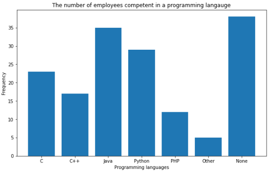
Pie charts are another simple and efficient visualization tool. They are typically used to visualize and compare parts of a whole. For example, a good use case for a pie chart would be to represent the market share for smartphones. Let’s implement this in Python.
"""Example to demonstrate how a pie chart can be used to represent the marketshare for smartphones.Note: These are not real figures. They were created for demonstration purposes."""import numpy as npfrom matplotlib import pyplot as plt# Dataset creation.smartphones = ["Apple", "Samsung", "Huawei", "Google", "Other"]market_share = [50, 30, 5, 12, 2]# Pie chart creationfig, ax = plt.subplots(figsize=(10, 6))plt.pie(market_share, labels = smartphones, autopct='%1.2f%%')plt.title("Smartphone Marketshare for April 2021 - April 2022", fontsize=14)plt.show()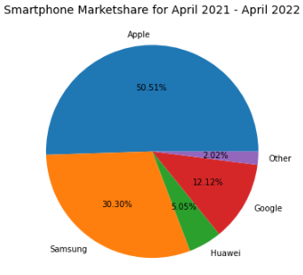
Line graphs are great for visualizing trends or progress in data over a period of time. For example, we can visualize the number of sneaker sales for the month of July with a line graph.
import matplotlib.pyplot as plt# Data creation.sneakers_sold = [10, 12, 8, 7, 7, 10]dates = ["Jul '1", "Jul '7", "Jul '14", "Jul '21", "Jul '28", "Jul '31"]# Line graph creationfig, ax = plt.subplots(figsize=(10, 6))plt.plot(dates, sneakers_sold)plt.title("Sneakers sold in Jul")plt.ylim(0, 15) # Change the range of y-axis.plt.xlabel("Dates")plt.ylabel("Number of sales")plt.show()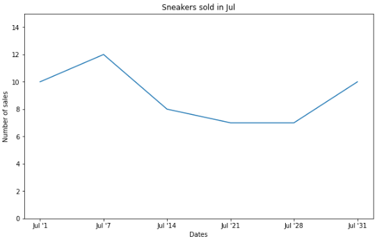
An area chart is an extension of the line graph, but they differ in that the area below the line is filled with a color or pattern.
Here is the exact same data above plotted in an area chart:
# Area chart creationfig, ax = plt.subplots(figsize=(10, 6))plt.fill_between(dates, sneakers_sold)plt.title("Sneakers sold in Jul")plt.ylim(0, 15) # Change the range of y-axis.plt.xlabel("Dates")plt.ylabel("Number of sales")plt.show()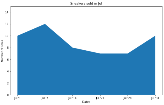
It is also quite common to see stacked area charts that illustrate the changes of multiple variables over time. For instance, we could visualize the brands of the sneakers sold in the month of July rather than the total sales with a stacked area chart.
# Data creation.sneakers_sold = [[3, 4, 2, 4, 3, 1], [3, 2, 6, 1, 3, 5], [4, 6, 0, 2, 1, 4]]dates = ["Jul '1", "Jul '7", "Jul '14", "Jul '21", "Jul '28", "Jul '31"]# Multiple area chart creationfig, ax = plt.subplots(figsize=(10, 6))plt.stackplot(dates, sneakers_sold, labels=["Nike", "Adidas", "Puma"])plt.title("Sneakers sold in Jul")plt.ylim(0, 15) # Change the range of y-axis.plt.xlabel("Dates")plt.ylabel("Number of sales")plt.legend()plt.show()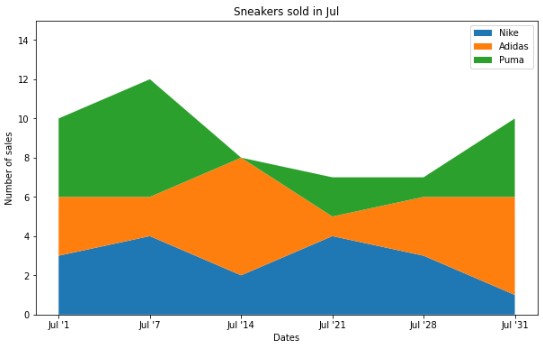
Each plot is showing the exact same data but in a different way.
Histograms are used to represent the distribution of a numerical variable.
import numpy as npimport matplotlib.pyplot as pltdata = np.random.sample(size=100) # Graph will change with each runfig, ax = plt.subplots(figsize=(10, 6))plt.hist(data, bins=6)plt.title("The distribution of data")plt.xlabel("Data")plt.ylabel("Frequency")plt.show()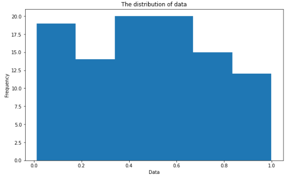
Scatter plots are used to visualize the relationship between two different variables. It is also quite common to add a line of best fit to reveal the overall direction of the data. An example use case for a scatter plot may be to represent how the temperature impacts the number of ice cream sales.
import numpy as npimport matplotlib.pyplot as plt# Data creation.temperature = np.array([30, 21, 19, 25, 28, 28]) # Degree's celsiusice_cream_sales = np.array([482, 393, 370, 402, 412, 450])# Calculate the line of best fitX_reshape = temperature.reshape(temperature.shape[0], 1)X_reshape = np.append(X_reshape, np.ones((temperature.shape[0], 1)), axis=1)y_reshaped = ice_cream_sales.reshape(ice_cream_sales.shape[0], 1)theta = np.linalg.inv(X_reshape.T.dot(X_reshape)).dot(X_reshape.T).dot(y_reshaped)best_fit = X_reshape.dot(theta)# Create and plot scatter chartfig, ax = plt.subplots(figsize=(10, 6))plt.scatter(temperature, ice_cream_sales)plt.plot(temperature, best_fit, color="red")plt.title("The impact of weather on ice cream sales")plt.xlabel("Temperature (Celsius)")plt.ylabel("Ice cream sales")plt.show()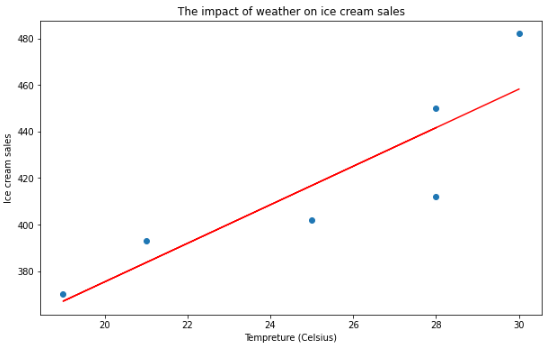
Heatmaps use a color-coding scheme to depict the intensity between two items. One use case of a heatmap could be to illustrate the weather forecast (i.e. the areas in red show where there will be heavy rain). You can also use a heatmap to represent web traffic and almost any data that is three-dimensional.
To demonstrate how to create a heatmap in Python, we are going to use another library called Seaborn – a high-level data visualization library based on Matplotlib.
import numpy as npimport seaborn as snsimport matplotlib.pyplot as pltdata = np.random.rand(8, 10) # Graph will change with each runfig, ax = plt.subplots(figsize=(10, 6))sns.heatmap(data)plt.title("Random Uniform Data")plt.show()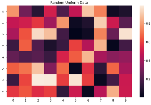
Treemaps are used to represent hierarchical data with nested rectangles. They are great for visualizing part-to-whole relationships among a large number of categories such as in sales data.
To help us build our treemap in Python, we are going to leverage another library called Plotly, which is used to make interactive graphs.
"""Source: https://plotly.com/python/treemaps/"""import plotly.express as pximport numpy as npdf = px.data.gapminder().query("year == 2007")fig = px.treemap(df, path=[px.Constant("world"), 'continent', 'country'], values='pop', color='lifeExp', hover_data=['iso_alpha'], color_continuous_scale='RdBu', color_continuous_midpoint=np.average(df['lifeExp'], weights=df['pop']))fig.update_layout(margin = dict(t=50, l=25, r=25, b=25))fig.show()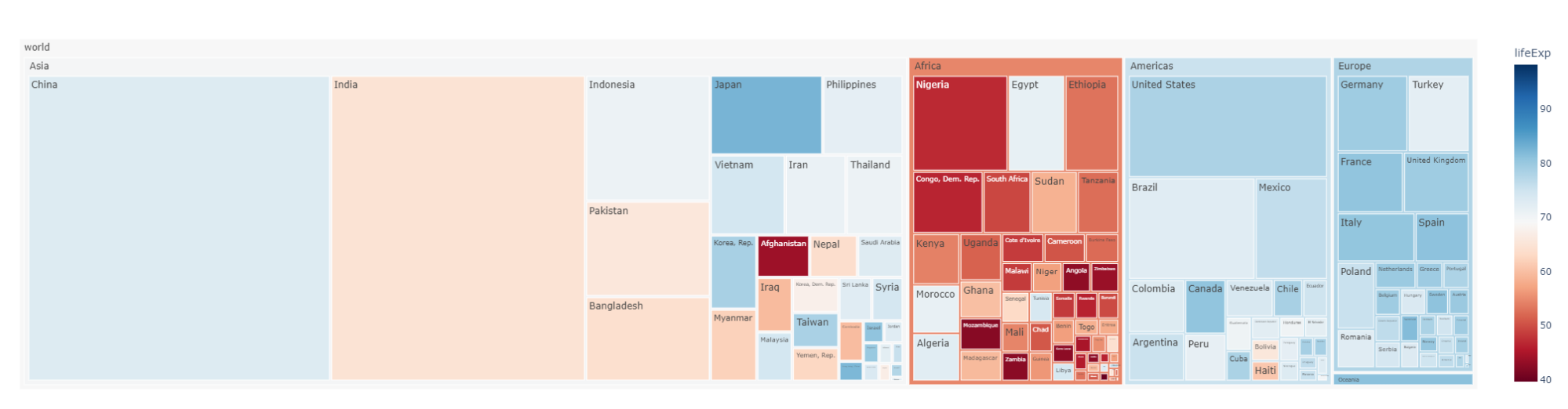
Data visualization is an art. Developing your skills will take time and practice. Here are three tips to get you moving in the right direction:
The first and most crucial step in creating an effective data visualization is having a clear and specific question in mind. Without this, you risk producing visualizations that are unfocused and difficult to interpret.
Having this precise question helps you focus the visualization on answering it directly, avoiding unnecessary information that could confuse or overwhelm the viewer.
Not all visualizations are created equal. Choosing the wrong type of chart can distort your message and confuse your audience. Each chart type has its strengths and is suited to specific kinds of data.
Choosing the Right Chart Type:
Takeaway: Match the chart type to the specific question or data you’re working with to enhance clarity.
While creating a visualization, it’s essential to direct your audience’s attention to the key insights. Effective use of color, size, and design elements can help you emphasize what matters most.
Here’s how you can highlight important information:
Takeaway: Subtle design choices like color, size, and labels can greatly improve your audience’s ability to quickly grasp the key insights.
With all things said, an effective visualization leans on our natural tendencies to recognize patterns. The use of colors, shapes, size, etc is an extremely effective technique for emphasizing the most important information you want to display.
Data visualization is an art; doing it well involves asking a specific question, selecting the appropriate visualization to use, and highlighting the most important information. Do not be too discouraged if your first attempt is not the greatest; it takes time and practice to improve your skills and DataCamp's wide range of data visualization courses are an excellent resource to help you become a master data visualizer.
Data Visualization Courses at DataCamp
Course
Course
Course
blog
Javier Canales Luna
12 min
blog
Javier Canales Luna
13 min
blog
Javier Canales Luna
11 min
blog
Wendy Gittleson
15 min
cheat-sheet
Richie Cotton
Tutorial
DataCamp Team