Course
You will be implementing KNN on the famous Iris dataset.
Note: You might want to consider taking up the course on Machine Learning with Python or for a background on how ML evolved and a lot more consider reading this post.
Introduction
Machine Learning evolved from computer science that primarily studies the design of algorithms that can learn from experience. To learn, they need data that has certain attributes based on which the algorithms try to find some meaningful predictive patterns. Majorly, ML tasks can be categorized as concept learning, clustering, predictive modeling, etc. The ultimate goal of ML algorithms is to be able to take decisions without any human intervention correctly. Predicting the stocks or weather are a couple of applications of machine learning algorithms.
There are various machine learning algorithms like Decision trees, Naive Bayes, Random forest, Support vector machine, K-nearest neighbor, K-means clustering, etc.
From the class of machine learning algorithms, the one that you will be using today is k-nearest neighbor.
Now, the question is what exactly is K-Nearest Neighbor algorithm, so let us find out!
What is a k-Nearest Neighbor?
The KNN or k-nearest neighbor algorithm is a supervised learning algorithm, by supervise it means that it makes use of the class labels of training data during the learning phase. It is an instance-based machine learning algorithm, where new data points are classified based on stored, labeled instances (data points). KNN can be used both for classification and regression; however, it is more widely used for classification purposes.
The k in KNN is a crucial variable also known as a hyperparameter that helps in classifying a data point accurately. More, precisely, the k is the number of nearest neighbors you wish to take a vote from when classifying a new data point.

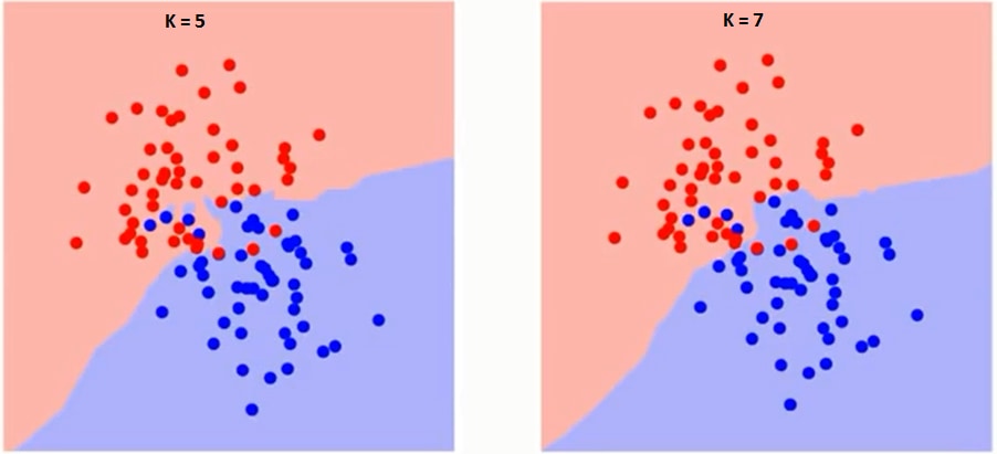
You can see as the value of k increases from 1 to 7, the decision boundary between two classes having some data points becomes more Smoother.
Now the question is how does all of this magic happen, wherein every time a new data point comes in, it is classified based on the stored data points?
So, let's quickly understand it in the following ways:
- Firstly, you load all the data and initialize the value of k,
- Then, the distance between the stored data points and a new data point that you want to classify is calculated using various similarity or distance metrics like Manhattan distance (L1), Euclidean distance (L2), Cosine similarity, Bhattacharyya distance, Chebyshev distance, etc.
- Next, the distance values are sorted either in descending or ascending order and top or lower k-nearest neighbors are determined.
- The labels of the k-nearest neighbors are gathered, and a majority vote or a weighted vote is used for classifying the new data point. The new data point is assigned a class label based on a certain data point that has the highest score out of all the stored data points.
- Finally, the predicted class for the new instance is returned.
The prediction can be of two types: either classification in which a class label is assigned to a new data point or regression wherein a value is assigned to the new data point. Unlike classification, in regression, the mean of all the k-nearest neighbors is assigned to the new data point.
Drawback of KNN: Firstly, complexity in searching the nearest neighbor for each new data point. Secondly, determining the value of k sometimes becomes a tedious task. Finally, it is also not clear which type of distance metric one should use while computing the nearest neighbors.
Enough of theory right? So, let's load, analyze and understand the data that you will be using in today's small tutorial.
Loading the Iris Data
Iris data set consists of 150 samples having three classes namely Iris-Setosa, Iris-Versicolor, and Iris-Virginica. Four features/attributes contribute to uniquely identifying as one of the three classes are sepal-length, sepal-width, petal-length and petal-width.
Feel free to use some other public dataset or your private dataset.
Sklearn is a machine learning python library that is widely used for data-science related tasks. It features various classification, regression and clustering algorithms including support vector machines, random forests, gradient boosting, k-means, KNN, etc.. Under sklearn you have a library called datasets in which you have multiple datasets that can be used for different tasks including the Iris dataset, all these datasets can be loaded out of the box. It is pretty intuitive and straightforward. So, let's quickly load the iris dataset.
from sklearn.datasets import load_iris
load_iris has both the data and the class labels for each sample. Let's quickly extract all of it.
data = load_iris().data
data variable will be a numpy array of shape (150,4) having 150 samples each having four different attributes. Each class has 50 samples each.
data.shape
(150, 4)
Let's extract the class labels.
labels = load_iris().target
labels.shape
(150,)
Next, you have to combine the data and the class labels, and for that, you will use an excellent python library called NumPy. NumPy adds support for large, multi-dimensional arrays and matrices, along with an extensive collection of high-level mathematical functions to operate on these arrays. So, let's quickly import it!
import numpy as np
Since data is a 2-d array, you will have to reshape the labels also to a 2-d array.
labels = np.reshape(labels,(150,1))
Now, you will use the concatenate function available in the numpy library, and you will use axis=-1 which will concatenate based on the second dimension.
data = np.concatenate([data,labels],axis=-1)
data.shape
(150, 5)
Next, you will import python's data analysis library called pandas which is useful when you want to arrange your data in a tabular fashion and perform some operations and manipulations on the data. In particular, it offers data structures and operations for manipulating numerical tables and time series.
In today's tutorial, you will use pandas quite extensively.
import pandas as pd
names = ['sepal-length', 'sepal-width', 'petal-length', 'petal-width', 'species']
dataset = pd.DataFrame(data,columns=names)
Now, you have the dataset data frame that has both data & the class labels that you need!
Before you dive any further, remember that the labels variable has class labels as numeric values, but you will convert the numeric values as the flower names or species.
For doing this, you will select only the class column and replace each of the three numeric values with the corresponding species. You will use inplace=True which will modify the data frame dataset.
dataset['species'].replace(0, 'Iris-setosa',inplace=True)
dataset['species'].replace(1, 'Iris-versicolor',inplace=True)
dataset['species'].replace(2, 'Iris-virginica',inplace=True)
Let's print the first five rows of the dataset and see what it looks like!
dataset.head(5)
| sepal-length | sepal-width | petal-length | petal-width | species | |
|---|---|---|---|---|---|
| 0 | 5.1 | 3.5 | 1.4 | 0.2 | Iris-setosa |
| 1 | 4.9 | 3.0 | 1.4 | 0.2 | Iris-setosa |
| 2 | 4.7 | 3.2 | 1.3 | 0.2 | Iris-setosa |
| 3 | 4.6 | 3.1 | 1.5 | 0.2 | Iris-setosa |
| 4 | 5.0 | 3.6 | 1.4 | 0.2 | Iris-setosa |
Analyze your Data
Let's quickly find out how all the three flowers look like when visualized and how different they are from each other not just in numbers but also in real!
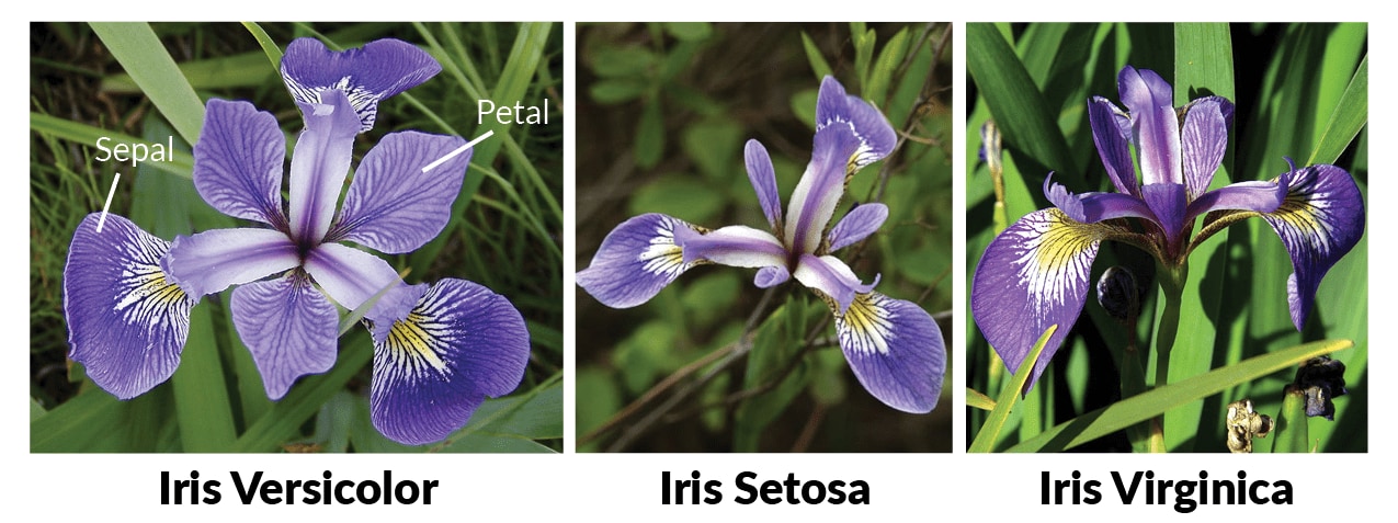 (Source)
Let's visualize the data that you loaded above using a scatterplot to find out how much one variable is affected by the other variable or let's say how much correlation is between the two variables.
You will use matplotlib library to visualize the data using a scatterplot.
import matplotlib.pyplot as plt
Tip: Are you keen on learning different ways of visualizing the data in python? Then check out Introduction to data visualization with matplotlib course.
plt.figure(4, figsize=(10, 8))

plt.scatter(data[:50, 0], data[:50, 1], c='r', label='Iris-setosa')

plt.scatter(data[50:100, 0], data[50:100, 1], c='g',label='Iris-versicolor')

plt.scatter(data[100:, 0], data[100:, 1], c='b',label='Iris-virginica')

plt.xlabel('Sepal length',fontsize=20)
plt.ylabel('Sepal width',fontsize=20)
plt.xticks(fontsize=20)
plt.yticks(fontsize=20)
plt.title('Sepal length vs. Sepal width',fontsize=20)
plt.legend(prop={'size': 18})
plt.show()
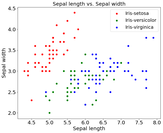
From the above plot, it is very much apparent that there is a high correlation between the Iris setosa flowers w.r.t the sepal length and sepal width. On the other hand, there is less correlation between Iris versicolor and Iris virginica. The data points in versicolor & virginica are more spread out compared to setosa that are dense.
Let's just quickly also plot the graph for petal-length and petal-width.
plt.figure(4, figsize=(8, 8))

plt.scatter(data[:50, 2], data[:50, 3], c='r', label='Iris-setosa')

plt.scatter(data[50:100, 2], data[50:100, 3], c='g',label='Iris-versicolor')

plt.scatter(data[100:, 2], data[100:, 3], c='b',label='Iris-virginica')
plt.xlabel('Petal length',fontsize=15)
plt.ylabel('Petal width',fontsize=15)
plt.xticks(fontsize=15)
plt.yticks(fontsize=15)
plt.title('Petal length vs. Petal width',fontsize=15)
plt.legend(prop={'size': 20})
plt.show()
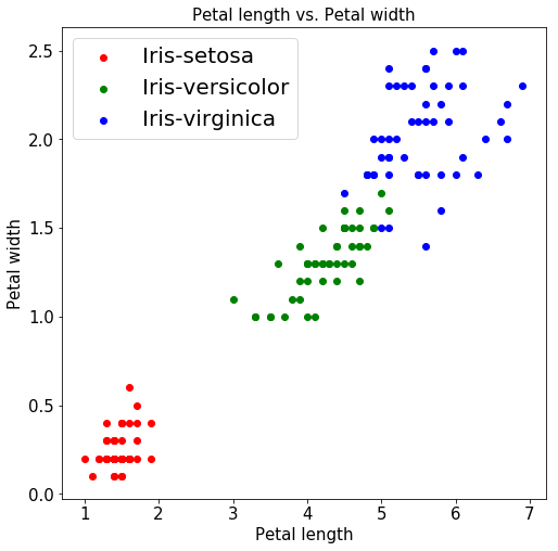
Even when it comes to petal-length and petal-width, the above graph indicates a strong correlation for setosa flowers which are densely clustered together.
Next, to further validate the claim of how petal-length and petal-width are correlated, let's plot a correlation matrix for all the three species.
dataset.iloc[:,2:].corr()
| petal-length | petal-width | |
|---|---|---|
| petal-length | 1.000000 | 0.962865 |
| petal-width | 0.962865 | 1.000000 |
The above table signifies a strong correlation of 0.96 for petal-length and petal-width when all three species are combined.
Let's also analyze the correlation between all three species separately.
dataset.iloc[:50,:].corr() #setosa
| sepal-length | sepal-width | petal-length | petal-width | |
|---|---|---|---|---|
| sepal-length | 1.000000 | 0.742547 | 0.267176 | 0.278098 |
| sepal-width | 0.742547 | 1.000000 | 0.177700 | 0.232752 |
| petal-length | 0.267176 | 0.177700 | 1.000000 | 0.331630 |
| petal-width | 0.278098 | 0.232752 | 0.331630 | 1.000000 |
dataset.iloc[50:100,:].corr() #versicolor
| sepal-length | sepal-width | petal-length | petal-width | |
|---|---|---|---|---|
| sepal-length | 1.000000 | 0.525911 | 0.754049 | 0.546461 |
| sepal-width | 0.525911 | 1.000000 | 0.560522 | 0.663999 |
| petal-length | 0.754049 | 0.560522 | 1.000000 | 0.786668 |
| petal-width | 0.546461 | 0.663999 | 0.786668 | 1.000000 |
dataset.iloc[100:,:].corr() #virginica
| sepal-length | sepal-width | petal-length | petal-width | |
|---|---|---|---|---|
| sepal-length | 1.000000 | 0.457228 | 0.864225 | 0.281108 |
| sepal-width | 0.457228 | 1.000000 | 0.401045 | 0.537728 |
| petal-length | 0.864225 | 0.401045 | 1.000000 | 0.322108 |
| petal-width | 0.281108 | 0.537728 | 0.322108 | 1.000000 |
From the above three tables, it is pretty much clear that the correlation between petal-length and petal-width of setosa and virginica is 0.33 and 0.32 respectively. Whereas, for versicolor it is 0.78.
Next, let's visualize the feature distribution by plotting the histograms:
fig = plt.figure(figsize = (8,8))
ax = fig.gca()
dataset.hist(ax=ax)
plt.show()
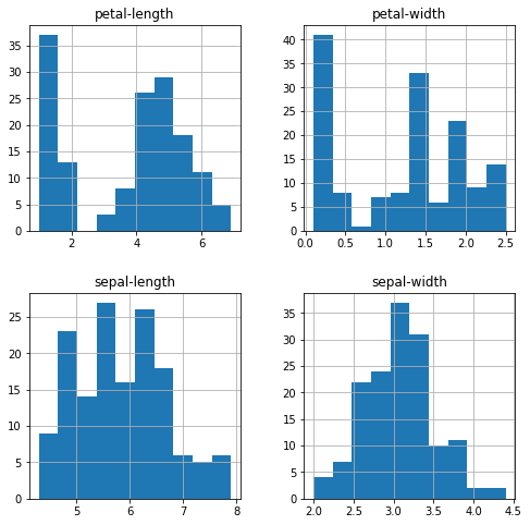
The petal-length, petal-width, and sepal-length shows a unimodal distribution, whereas sepal-width shows a kind of Gaussian distribution. All these are useful analysis because then you can think of using an algorithm that works well with this kind of distribution.
Next, you will analyze whether all the four attributes are on the same scale or not; this is an essential aspect of ML. pandas data frame has an inbuilt function called describe that gives you the count, mean, max, min of the data in a tabular format.
dataset.describe()
| sepal-length | sepal-width | petal-length | petal-width | |
|---|---|---|---|---|
| count | 150.000000 | 150.000000 | 150.000000 | 150.000000 |
| mean | 5.843333 | 3.057333 | 3.758000 | 1.199333 |
| std | 0.828066 | 0.435866 | 1.765298 | 0.762238 |
| min | 4.300000 | 2.000000 | 1.000000 | 0.100000 |
| 25% | 5.100000 | 2.800000 | 1.600000 | 0.300000 |
| 50% | 5.800000 | 3.000000 | 4.350000 | 1.300000 |
| 75% | 6.400000 | 3.300000 | 5.100000 | 1.800000 |
| max | 7.900000 | 4.400000 | 6.900000 | 2.500000 |
You can see that all the four attributes have a similar scale between 0 & 8 and are in centimeters if you want you can further scale it down to between 0 and 1.
Even though you all know that there are 50 samples per class, i.e., ~33.3% of the total distribution, but still let's recheck it!
print(dataset.groupby('species').size())
species
Iris-setosa        50
Iris-versicolor    50
Iris-virginica     50
dtype: int64
Preprocessing your Data
After having loaded the data and analyzed it extensively, it is time to prepare your data which you can then feed to your ML model. In this section, you will preprocess your data in two ways: normalizing your data and splitting your data into training and testing sets.
Normalizing your data
There can be two ways by which you can normalize your data:
- Example normalization wherein you normalize each sample individually,
- Feature normalization in which you normalize each feature in the same way across all samples.
Now the question is why or when do you need to normalize your data? And do you need to standardize the Iris data?
Well, the answer is pretty much all the time. It is a good practice to normalize your data as it brings all the samples in the same scale and range. Normalizing the data is crucial when the data you have is not consistent. You can check for inconsistency by using the describe() function that you studied above which will give you max and min values. If the max and min values of one feature are significantly larger than the other feature then normalizing both the features to the same scale is very important.
Let's say X is one feature having a larger range and Y being the second feature with a smaller range. Then, the influence of feature Y can be overpowered by feature X's influence. In such a case, it becomes important to normalize both the features X and Y.
In Iris data, normalization is not required.
Let's print the describe() function again and see why you do not need any normalization.
dataset.describe()
| sepal-length | sepal-width | petal-length | petal-width | |
|---|---|---|---|---|
| count | 150.000000 | 150.000000 | 150.000000 | 150.000000 |
| mean | 5.843333 | 3.057333 | 3.758000 | 1.199333 |
| std | 0.828066 | 0.435866 | 1.765298 | 0.762238 |
| min | 4.300000 | 2.000000 | 1.000000 | 0.100000 |
| 25% | 5.100000 | 2.800000 | 1.600000 | 0.300000 |
| 50% | 5.800000 | 3.000000 | 4.350000 | 1.300000 |
| 75% | 6.400000 | 3.300000 | 5.100000 | 1.800000 |
| max | 7.900000 | 4.400000 | 6.900000 | 2.500000 |
The sepal-length attribute has values that go from 4.3 to 7.9 and sepal-width contains values from 2 to 4.4, while petal-length values range from 1 to 6.9 and petal-width ranges from 0.1 to 2.5. The values of all the features are within the range of 0.1 and 7.9, which you can consider acceptable. Hence, you do not need to apply any normalization to the Iris dataset.
Splitting the data
This is another significant aspect of machine learning since your goal is to make a model capable enough to be able to take decisions or classify data in a test environment without any human intervention. Hence, before deploying your ML model in the industry, you need to make sure that the model can generalize well on the testing data.
For this purpose, you need a training and testing set. Coming back to the Iris data, you have 150 samples, you will be training your ML model on 80% of the data and the remaining 20% of the data will be used for testing.
In data-science, you will often come across a term called Overfitting which means that your model has learned the training data very well but fails to perform on the testing data. So, splitting the data into training and testing or validation set will often help you to know whether your model is overfitting or not.
For training and testing set split, you will use the sklearn library which has an in-built splitting function called train_test_split. So, let's split the data.
from sklearn.model_selection import train_test_split

train_data, test_data, train_label, test_label = train_test_split(dataset.iloc[:,:3], dataset.iloc[:,3], test_size=0.2, random_state=42)
Note that the random_state is a seed that takes a random_state as input if you change the number the split of the data will also change. However, if you keep the random_state same and run the cell multiple times the data splitting will remain unchanged.
Let's quickly print the shape of training and testing data along with its labels.
train_data.shape,train_label.shape,test_data.shape,test_label.shape
((120, 3), (120,), (30, 3), (30,))
Finally, it's time to feed the data to the k-nearest neighbor algorithm!
The KNN Model
After all the loading, analyzing and preprocessing of the data, it is now time when you will feed the data into the KNN model. To do this, you will use sklearn's inbuilt function neighbors which has a class called KNeigborsClassifier in it.
Let's start by importing the classifier.
from sklearn.neighbors import KNeighborsClassifier
Note: the k (n_neighbors) parameter is often an odd number to avoid ties in the voting scores.
In order to decide the best value for hyperparameter k, you will do something called grid-search. You will train and test your model on 10 different k values and finally use the one that gives you the best results.
Let's initialize a variable neighbors(k) which will have values ranging from 1-9 and two numpy zero matrices namely train_accuracy and test_accuracy each for training and testing accuracy. You will need them later to plot a graph to choose the best neighbor value.
neighbors = np.arange(1,9)
train_accuracy =np.zeros(len(neighbors))
test_accuracy = np.zeros(len(neighbors))
Next piece of code is where all the magic will happen. You will enumerate over all the nine neighbor values and for each neighbor you will then predict both on training and testing data. Finally, store the accuracy in the train_accuracy and test_accuracy numpy arrays.
for i,k in enumerate(neighbors):
    knn = KNeighborsClassifier(n_neighbors=k)

    #Fit the model
    knn.fit(train_data, train_label)

    #Compute accuracy on the training set
    train_accuracy[i] = knn.score(train_data, train_label)

    #Compute accuracy on the test set
    test_accuracy[i] = knn.score(test_data, test_label)
Next, you will plot the training and testing accuracy using matplotlib, with accuracy vs. varying number of neighbors graph you will be able to choose the best k value at which your model performs the best.
plt.figure(figsize=(10,6))
plt.title('KNN accuracy with varying number of neighbors',fontsize=20)
plt.plot(neighbors, test_accuracy, label='Testing Accuracy')
plt.plot(neighbors, train_accuracy, label='Training accuracy')
plt.legend(prop={'size': 20})
plt.xlabel('Number of neighbors',fontsize=20)
plt.ylabel('Accuracy',fontsize=20)
plt.xticks(fontsize=20)
plt.yticks(fontsize=20)
plt.show()
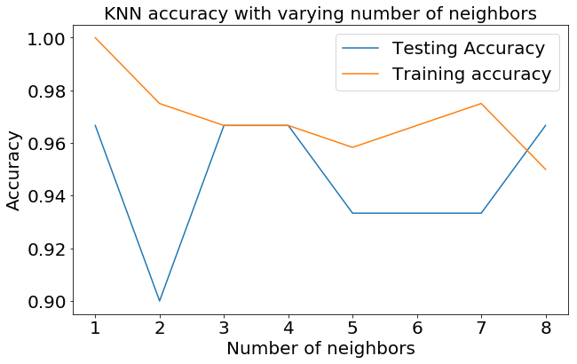
Well, by looking at the above graph, it looks like when n_neighbors=3, both the model performs the best. So, let's stick with n_neighbors=3 and re-run the training once again.
knn = KNeighborsClassifier(n_neighbors=3)

#Fit the model
knn.fit(train_data, train_label)

#Compute accuracy on the training set
train_accuracy = knn.score(train_data, train_label)

#Compute accuracy on the test set
test_accuracy = knn.score(test_data, test_label)
Evaluating your Model
In the last segment of this tutorial, you will be evaluating your model on the testing data using a couple of techniques like confusion_matrix and classification_report.
Let's first check the accuracy of the model on the testing data.
test_accuracy
0.9666666666666667
Viola! It looks like the model was able to classify 96.66% of the testing data correctly. Isn't that amazing? With just a few lines of code, you were able to train an ML model that is now able to tell you the flower name by using only four features with 96.66% accuracy. Who knows maybe it performed way better than a human can.
Confusion Matrix
A confusion matrix is mainly used to describe the performance of your model on the test data for which the true values or labels are known.
Scikit-learn provides a function that calculates the confusion matrix for you.
prediction = knn.predict(test_data)
The following plot_confusion_matrix() function has been modified and acquired from this source.
import itertools
def plot_confusion_matrix(cm, classes,
                          normalize=False,
                          title='Confusion matrix',
                          cmap=plt.cm.Blues):


    plt.imshow(cm, interpolation='nearest', cmap=cmap)
    plt.title(title)
    plt.colorbar()
    tick_marks = np.arange(len(classes))
    plt.xticks(tick_marks, classes, rotation=45)
    plt.yticks(tick_marks, classes)

    fmt = '.2f' if normalize else 'd'
    thresh = cm.max() / 2.
    for i, j in itertools.product(range(cm.shape[0]), range(cm.shape[1])):
        plt.text(j, i, format(cm[i, j], fmt),
                 horizontalalignment="center",
                 color="white" if cm[i, j] > thresh else "black")

    plt.ylabel('True label',fontsize=30)
    plt.xlabel('Predicted label',fontsize=30)
    plt.tight_layout()
    plt.xticks(fontsize=18)
    plt.yticks(fontsize=18)
class_names = load_iris().target_names


# Compute confusion matrix
cnf_matrix = confusion_matrix(test_label, prediction)
np.set_printoptions(precision=2)

# Plot non-normalized confusion matrix
plt.figure(figsize=(10,8))
plot_confusion_matrix(cnf_matrix, classes=class_names)
plt.title('Confusion Matrix',fontsize=30)
plt.show()
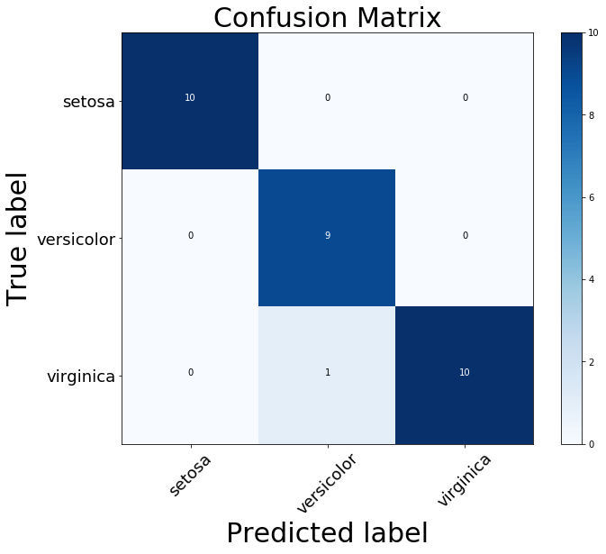
From the above confusion_matrix plot, you can observe that the model classified all the flowers correctly except one virginica flower which is classified as a versicolor flower.
Classification Report
Classification report helps you in identifying the misclassified classes in much more detail by giving precision, recall and F1 score for each class. You will use the sklearn library to visualize the classification report.
from sklearn.metrics import classification_report
print(classification_report(test_label, prediction))
                 precision    recall  f1-score   support

    Iris-setosa       1.00      1.00      1.00        10
Iris-versicolor       0.90      1.00      0.95         9
 Iris-virginica       1.00      0.91      0.95        11

      micro avg       0.97      0.97      0.97        30
      macro avg       0.97      0.97      0.97        30
   weighted avg       0.97      0.97      0.97        30
Go Further!
First of all congratulations to all those who successfully made it till the end! But this was just the start. There is still a long way to go!
This tutorial majorly dealt with the basics of machine learning and the implementation of one kind of ML algorithm known as KNN with Python. The Iris data set that you used was pretty small and a little simple.
If this tutorial ignited an interest in you to learn more, you can try using some other datasets or try learning about some more ML algorithms and maybe apply on the Iris dataset to observe the effect on the accuracy. This way you will learn a lot more than just understanding the theory!
If you have experimented enough with the basics presented in this tutorial and other machine learning algorithms, you might want to go further into python and data analysis.

