Course
Unsupervised Learning in Python
4 hr
179.6K

Machine learning is a subfield of artificial intelligence devoted to understanding and building methods to imitate the way humans learn. These methods include the use of algorithms and data to improve the performance on some set of tasks and often fall into one of the three most common types of learning:
Scikit-learn, also known as sklearn, is an open-source, robust Python machine learning library. It was created to help simplify the process of implementing machine learning and statistical models in Python.
The library enables practitioners to rapidly implement a vast range of supervised and unsupervised machine learning algorithms through a consistent interface. Sklearn was built on top of SciPy and works on all types of numeric data stored as either NumPy arrays, SciPy sparse matrices, and all other data types that can be converted to numeric arrays such as Pandas DataFrames.
In this hands-on sklearn tutorial, we will cover various aspects of the machine learning lifecycle, such as data processing, model training, and model evaluation.
Check out this DataCamp workspace to follow along with the code.
The first aspect of the sklearn we will explore is the data; Scikit-learn comes with some standard machine learning datasets, which means you’re not required to download them from an external website or database.
Examples of the toy datasets available in sklearn include the iris dataset for classification and the diabetes dataset for regression. For our example, we will be using the wine dataset.
Let’s load it into memory:
from sklearn.datasets import load_wine

wine_data = load_wine()
Executing the code above returns a dictionary-like object containing the data along with metadata about the data it contains.
The data we need is in the .data attribute returned by load_wine(). We can access it as an attribute of the wine_data instance as follows:
wine_data.dataThis returns an N x M array where N is the number of samples and M is the number of features.
Let’s use this knowledge to load our data into a pandas DataFrame, which is much easier to manipulate and analyze.
import pandas as pd
from sklearn.datasets import load_wine

wine_data = load_wine()

# Convert data to pandas dataframe
wine_df = pd.DataFrame(wine_data.data, columns=wine_data.feature_names)

# Add the target label
wine_df["target"] = wine_data.target

# Take a preview
wine_df.head()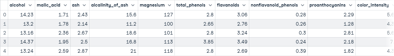
Now you’re ready to do some data exploration.
Pandas DataFrames are defined as two-dimensional labeled data structures consisting of columns, which may contain different data steps. The easiest way to conceptualize a DataFrame is to think of it as three components merged together; those components are 1) data, 2) an index, and 3) columns.
Data exploration is not the main focus of this article but it’s an extremely important step in any data project – you can learn more about it in our Python Exploratory Data Analysis tutorial. We will do a brief exploration to get a better idea of what our dataset contains; this will give us a better idea of how to process the data.
The first thing we are going to do is call the info() method on our pandas DataFrame; this will print a concise summary of the wine data contained within the DataFrame.
wine_df.info()

"""
<class 'pandas.core.frame.DataFrame'>
RangeIndex: 178 entries, 0 to 177
Data columns (total 14 columns):
 #   Column                        Non-Null Count  Dtype
---  ------                        --------------  -----
 0   alcohol                       178 non-null    float64
 1   malic_acid                    178 non-null    float64
 2   ash                           178 non-null    float64
 3   alcalinity_of_ash             178 non-null    float64
 4   magnesium                     178 non-null    float64
 5   total_phenols                 178 non-null    float64
 6   flavanoids                    178 non-null    float64
 7   nonflavanoid_phenols          178 non-null    float64
 8   proanthocyanins               178 non-null    float64
 9   color_intensity               178 non-null    float64
 10  hue                           178 non-null    float64
 11  od280/od315_of_diluted_wines  178 non-null    float64
 12  proline                       178 non-null    float64
 13  target                        178 non-null    int64
dtypes: float64(13), int64(1)
memory usage: 19.6 KB
"""
After executing this cell, you will learn:
We can also call the describe() method on our DataFrame to get descriptive statistics about each feature in the dataset.
For example:
wine_df.describe() 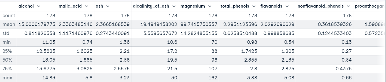
You also want to have an idea of the type of values being held in each feature. The fastest way to learn this is to use the head() method to display the first five rows of data or the tail() method to view the last five rows of data.
wine_df.tail()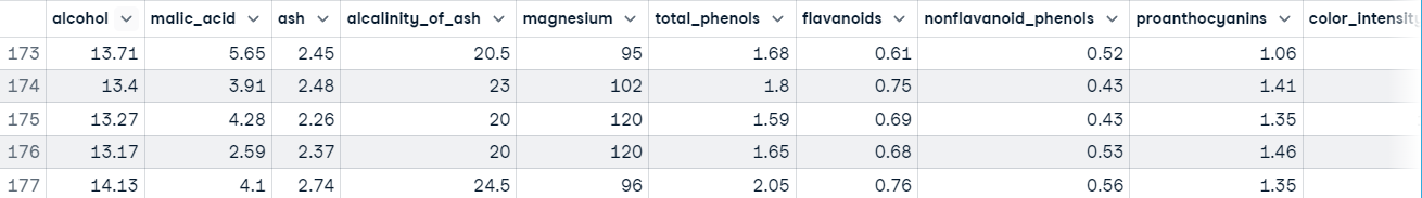
Executing this code shows us that our features are on different scales, which may cause problems when dealing with Gradient Descent based algorithms like logistic regression, and when dealing with distance-based algorithms like support vector machines. This is because they are sensitive to the range of data points.
In a normal machine learning workflow, this process will be much more drawn out, but we are going to skip ahead to the data processing to get back on track with the main focus of this tutorial, Scikit-learn.
You can learn more about Pandas in Python Pandas Tutorial: The Ultimate Guide for Beginners.
We have a decent understanding of what our data looks like. When you’ve reached this point, it usually means you’re ready to begin moving toward preparing the data to be fed into a machine learning model.
Data processing is a vital step in the machine learning workflow because data from the real world is messy. It may contain:
You must deal with all of this before feeding the data to a machine learning model; otherwise, the model will incorporate these mistakes into its approximation function – it will learn to make mistakes on new instances. This is what formed the famous machine learning saying, “Garbage in, garbage out.”
Another reason is that machine learning models typically require numeric data.
Other than our data being on different scales, there’s not much else wrong with our data at first glance. To combat this problem, let’s standardize the features using sklearn’s StandardScaler class; this will standardize features to have a mean of 0 and a standard deviation of 1.
Here’s the code:
from sklearn.preprocessing import StandardScaler

# Split data into features and label
X = wine_df[wine_data.feature_names].copy()
y = wine_df["target"].copy()

# Instantiate scaler and fit on features
scaler = StandardScaler()
scaler.fit(X)

# Transform features
X_scaled = scaler.transform(X.values)

# View first instance
print(X_scaled[0])

"""
[ 1.51861254 -0.5622498   0.23205254 -1.16959318  1.91390522  0.80899739
  1.03481896 -0.65956311  1.22488398  0.25171685  0.36217728  1.84791957
  1.01300893]
"""
Let’s move on to training the model.
Before a machine learning model can make predictions, it must be trained on a set of data to learn an approximation function.
But how will we know if the model performs well on data it has not seen before? We won’t unless we test it out.
One way to test a machine learning model before placing it in an environment where it impacts others is to split the training data into a training and test set and use the test set to evaluate what the model has learned; this is known as offline evaluation.
There are several ways to split data into train and test sets, but scikit-learn has a built-in function to do this on our behalf called train_test_split().
We’ll use this function to split our data such that 70% is used to train the model and 30% is used to evaluate the model's ability to generalize to unseen instances.
from sklearn.model_selection import train_test_split

# Split data into train and test
X_train_scaled, X_test_scaled, y_train, y_test = train_test_split(X_scaled,
                                                                  y,
                                                             train_size=.7,
                                                           random_state=25)

# Check the splits are correct
print(f"Train size: {round(len(X_train_scaled) / len(X) * 100)}% \n\
Test size: {round(len(X_test_scaled) / len(X) * 100)}%")

"""
Train size: 70%
Test size: 30%
Now let’s build some models.
Thanks to sklearn, building a machine learning model is extremely simple.
We are going to build three models to predict the class of wine:
from sklearn.linear_model import LogisticRegression
from sklearn.svm import SVC
from sklearn.tree import DecisionTreeClassifier

# Instnatiating the models
logistic_regression = LogisticRegression()
svm = SVC()
tree = DecisionTreeClassifier()

# Training the models
logistic_regression.fit(X_train_scaled, y_train)
svm.fit(X_train_scaled, y_train)
tree.fit(X_train_scaled, y_train)

# Making predictions with each model
log_reg_preds = logistic_regression.predict(X_test_scaled)
svm_preds = svm.predict(X_test_scaled)
tree_preds = tree.predict(X_test_scaled)
The next step is to evaluate how the models generalize into unseen instances.
Model evaluation is done to test how well the model generalizes to unseen instances. Scikit-learn provides an array of classification and regression metrics to evaluate a trained model's performance.
For our use case, we are going to use classification_report() from the metrics module to build a text report showing the main classification metrics such as precision, recall, f1_score, accuracy, etc.
Here’s how it looks in code:
from sklearn.metrics import classification_report

# Store model predictions in a dictionary
# this makes it easier to iterate through each model
# and print the results.
model_preds = {
    "Logistic Regression": log_reg_preds,
    "Support Vector Machine": svm_preds,
    "Decision Tree": tree_preds
}

for model, preds in model_preds.items():
    print(f"{model} Results:\n{classification_report(y_test, preds)}", sep="\n\n")

"""
Logistic Regression Results:
              precision    recall  f1-score   support

           0       1.00      1.00      1.00        17
           1       1.00      0.92      0.96        25
           2       0.86      1.00      0.92        12

    accuracy                           0.96        54
   macro avg       0.95      0.97      0.96        54
weighted avg       0.97      0.96      0.96        54

Support Vector Machine Results:
              precision    recall  f1-score   support

           0       1.00      1.00      1.00        17
           1       1.00      1.00      1.00        25
           2       1.00      1.00      1.00        12

    accuracy                           1.00        54
   macro avg       1.00      1.00      1.00        54
weighted avg       1.00      1.00      1.00        54

Decision Tree Results:
              precision    recall  f1-score   support

           0       0.94      0.94      0.94        17
           1       0.96      0.88      0.92        25
           2       0.86      1.00      0.92        12

    accuracy                           0.93        54
   macro avg       0.92      0.94      0.93        54
weighted avg       0.93      0.93      0.93        54
"""
At a first glance, it seems as though the support vector machine is the best model. In a typical workflow, this would spark curiosity into the model – is it really as good as it’s showing, or have we made a mistake somewhere? You should be intrigued to learn more about your models and what they are learning, as this will give you better insight into their strengths and weaknesses.
Knowing this information is extremely insightful to stakeholders since it allows them to find solutions to compensate for where the model falls short.
The scikit-learn library consists of several modules that make implementing machine learning models easy. These modules range from preprocessing tools to help you prepare your model to be fed into a machine learning model to models you can use to find patterns in your data, and evaluation metrics you can use to asses the performance of your model.
In this tutorial, we have merely scratched the surface of sklearn’s capabilities. To delve deeper into what you can do with the library, we have several resources to get you on your way. Here are a few to start with:
Learn more about Python and Machine Learning
Course
Course
Course
cheat-sheet
Karlijn Willems
Tutorial
Aditya Sharma
Tutorial
Kevin Babitz
Tutorial
Matthew Przybyla
Tutorial
Hugo Bowne-Anderson
code-along
George Boorman