Course
Interactive Data Visualization with plotly in R
4 hr
14.5K
The R Graph Gallery is a website that displays hundreds of R charts, always with the associated code. The website exists for a year and a half now and is visited by several thousands of people every day, looking for inspiration for or help with their R plots. The R Graph Gallery allows you to find lots of plots and the code that was used to make them!
This post describes the 5 most visited pages of the gallery that collect 45% of the total traffic of the site. It shows which are the main trends in data visualization that are currently sparking the interest of R enthusiasts.
Are you interested in data visualization with R? Consider DataCamp’s R Data Visualization Track.
ggplot2Unsurprisingly, ggplot2 category is the most visited theme from far: it represents about 15% of the traffic that was considered for this post (this was 45% of the total traffic, as mentioned above).
This amount of traffic can not only explained by the sheer popularity of this package in the R community, but also by the fact that this category gathers all sorts of graphs that you can make with this package, such as boxplots, scatterplots, area graphs, etc. and also contains some subsections that show you how you can add annotations, manage the colors of your plot and make data art. In short, this category contains a lot of information with regard to this R package.
This library, which is “a plotting system for R, based on the grammar of graphics”, is a reference for R graphics and a bunch of resources are available to learn its syntax, such as DataCamp’s Data Visualization with ggplot2 course, and ggplot2 creator Hadley Wickham’s ggplot2 book.
ggplot2 is an implementation of the grammar of graphics, which means that there is a basic grammar to producing graphics: you need data and graphical elements to make your plots, just like you need a personal pronouns and a conjugated verb to make sentences.
For graphs, this means that you feed data to a plot as x and y elements and you need to manipulate some details, such as colors, markers, etc. as graphical elements. You’ll see that ggplot2 makes this distinction as well, and you’ll see that there are a couple of basic elements that you can often distinguish in ggplot2 graphs, such as data, geometries, aesthetics and scales.
Of course, there are also some more advanced parts of the ggplot2 grammar, such as statistical transformations and facets, but those won’t be covered in this blog post. Check out the resources mentioned above to get more in-depth information on ggplot2 and its possibilities.
Going back to the gallery, you’ll see that it currently displays about 40 graphics using the package, which allows realizing the main chart types, such as the bar plot which you’ll find below:
You see that the graph below makes use of three of the four elements that were mentioned above: data, aesthetics and geometries. Now, let’s take a look at the result in closer detail or expand the window in the “Plots” tab that has appeared next to your R console in the DataCamp Light chunk above:

Note that if you need more themes, scales and geoms for your ggplot2 plots, you can always get them from additional packages such as ggthemes or ggthemr package.
Secondly, the interactive charts category makes up about 11% of the traffic that is considered for this blog post. Just like ggplot2, you can argue or suppose that most of the traffic to this category comes from the fact that it’s a more general category that subsumes a lot of different information on different interactive charts.
But what are interactive charts?
Well, of course they are charts, but what makes them special is that you can zoom in or out on the plots, play around with the axes, hover elements to get additional informations, export at png format, filter specific data, etc,… They allow users to play with data and find out the information they need.
When used during your analysis, interactive plots will allow you to more efficiently explore your data. When used for reporting to clients, colleagues, or readers, they will help captivate the audience and make them understand the data; Interactive charts allow for a two-way communication between the user and the graphs, which makes this a win-win situation.
It is not a coincidence that interactive graphs are now used by newspapers like the New York Times and scientific papers like Science!
In R, it is impressively easy to make them using the htmlwidgets.
Besides showing examples of this package, the gallery also shows several examples, where Plotly is used. Plotly is an R package for creating web-based graphs via the open source JavaScript graphic library plotly.js. The code syntax is really close to the one of ggplot2, so you’ll probably make your first interactive chart in minutes! If you’re looking to get started with this package, consider this Plotly Tutorial.
Of course, you can also make interactive charts with Shiny, an R library that allows you to turn your analyses into interactive web applications, and besides the libraries that you have seen in this section, there are many other libraries that allow you to turn your static visualizations into interactive ones!
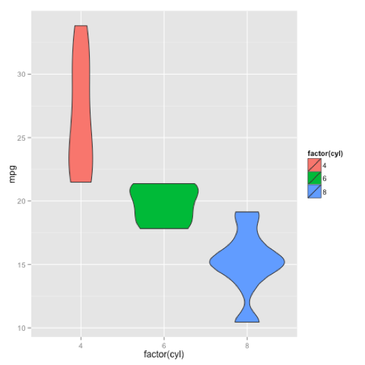
The boxplot category makes up about 8% of the traffic that was considered for this post. It is the third most popular category on the site, probably due to the fact that it’s more specific than the two previous categories: it deals with one specific type of plot.
Boxplots do not need to be presented anymore. It is a usual tool used to visualize the relationship between a numerical variable with a discrete variable. But be careful not to miss any information that could be hidden behind a boxplot (like a bimodal distribution)!
The R graph gallery will provide you with some interesting alternatives to boxplots, such as such as violin plots or boxplots with jitter. You’ll see that, notwithstanding the fact that ggplot2 has its own section, this package still is very popular, together with the base R functions such as jitter()!
Surprisingly, spider plots or web charts category show a huge success on the gallery, with 6% of the 45% of traffic that was analyzed for this blog post.
Radar charts are a way of comparing multiple quantitative variables. One of the examples is to build these charts with the fmsb library, which contains utility functions for the book “Practices of Medical and Health Data Analysis susing R”.
The code in the DataCamp Light chunk gives the following result (or just expand the window in the “Plots” tab that has appeared next to your R Console tab in the DataCamp Light chunk):
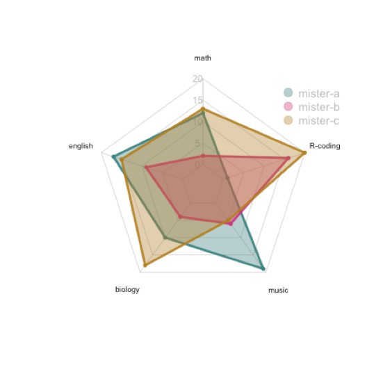
Tip: as you can imagine, you need to watch out to not represent too many groups on the same chart! It can become unreadable very quickly!
But the fmsb package is not all: you can also build up radar charts with ggplot, even though this is not included in the package. You can find a tutorial here or check out the ggplot2 extension ggradar.
But, what might also be interesting is the radarchart package. This one is an interesting one to keep in mind if you want to create interactive radar charts.
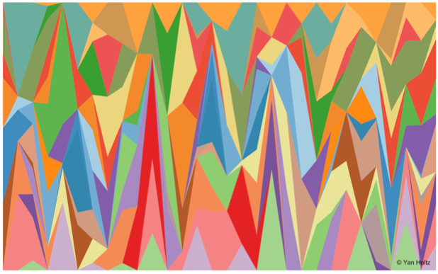
Curiosity? Fun? Interest? Surprise?
I don’t know what leads people there, but the Data Art section is the fifth most visited theme by the R Graph Gallery users, with about 5% of the traffic that was considered for this post.
It’s definitely something that you don’t see every day!
This page shows an abstract of the work of 10 data aRtists from all over the world. Data Art is a new tendency, where you, as the phrase might already imply, make art from data. It can take several forms, using real data or not, representing something or just making abstract shapes.
Are you interested and do you want to know more? Have a look to this section and of course, feel free to propose your pieces!
Do you want to contribute to the R Graph Gallery, propose a graph or request one that is missing? Go here.
Learn more about R
Course
Course
Course
blog
Luigi D'Introno
blog
Summer Worsley
15 min
blog
Elena Kosourova
14 min
cheat-sheet
Richie Cotton
Tutorial
Karlijn Willems
Tutorial
DataCamp Team