
How to Make a Bar Graph in Excel: A Beginner's Guide

Learn how to create a bar graph in Excel with this beginner-friendly guide. Explore chart types, formatting tips, dynamic features, and troubleshooting techniques.
Jul 29, 2025  · 10 min read

Bar graphs are one of the clearest ways to present comparisons across categories like monthly expenses or product sales. At a glance, they help you spot patterns, outliers, and shifts across groups.

Excel makes it easy to build these charts. In just a few steps, you can go from raw data to a clean, labeled graph. Once it’s created, Excel also gives you plenty of control to tweak the layout, apply styling, or automate updates.

This guide covers everything you need, from preparing your data and choosing the right chart type to formatting and fixing display issues. Along the way, you will see practical ways to improve readability and clarity without overcomplicating things.

The Steps to Create a Bar Graph in Excel

Creating a bar graph in Excel is simple, but making one that is well-structured and easy to understand takes a little more effort. The best charts start with organized data and end with thoughtful formatting.

Data preparation

Excel works best when your data is laid out like a table: one column for categories, one or more columns for values. 

Here are a few setup tips:

  • Put your category labels (like months, regions, or products) in the first column.
  • Place the corresponding numeric values in the next column(s).
  • Avoid merged cells or blank rows within your data range.
  • Use clear headers so anyone can quickly tell what they’re looking at.

If you want your chart to update as your data changes, press Ctrl + T to turn your dataset into an Excel Table. You can also set up a dynamic named range using Formulas > Name Manager.

Excel table with product categories and sales values arranged in columns.
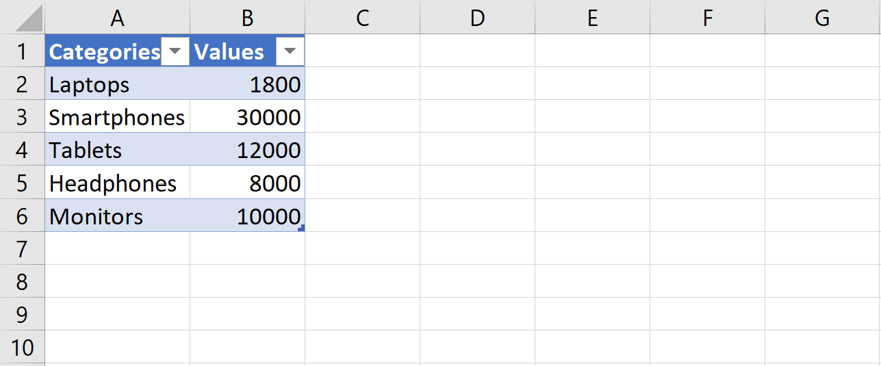
Sample dataset formatted for bar chart creation. Image by Author

Inserting a basic bar graph

Once your data is ready:

  1. Select the data range (including the headers).
  2. Click the Insert tab in the ribbon.
  3. In the Charts group, choose the Bar Chart icon.
  4. Choose Clustered Bar, Stacked Bar, or whatever layout fits your needs.

Excel interface showing the Insert tab with bar chart options highlighted.

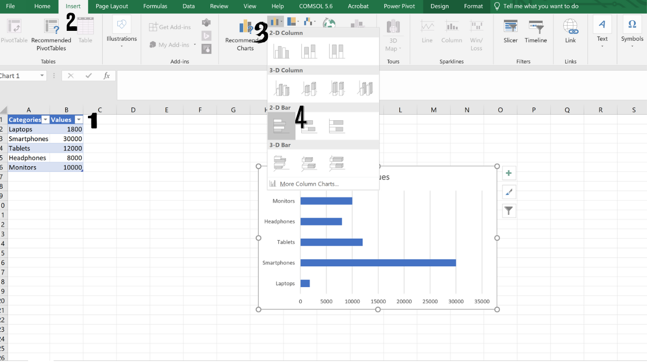
Inserting a bar chart using the Excel ribbon. Image by Author

Excel will place the chart on your sheet and activate the Chart Tools menu, where you can adjust the design, format, and layout.

If you’re in a hurry, Excel’s chart templates apply consistent fonts, colors, and spacing with a single click.

Configuring data series

If you’re working with grouped data, like quarterly sales for different products, each series will be a separate set of bars within the same chart.

Step 1: Create a clustered column chart

Highlight cells A1 to C6. This range includes categories and two quarters of sales.

Then:

  1. Go to the Insert tab.
  2. Click the Insert Column or Bar Chart icon.
  3. Choose Clustered Column from the drop-down menu.

You will get a chart with side-by-side bars for each quarter.

Excel chart displaying grouped bars for each product and quarter.

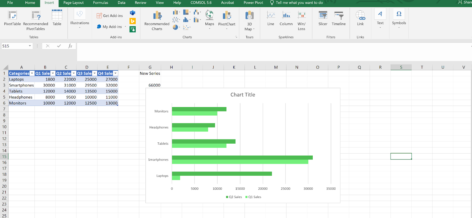
Comparing quarterly sales with a clustered column chart. Image by Author

Step 2: Open the Select Data Source dialog

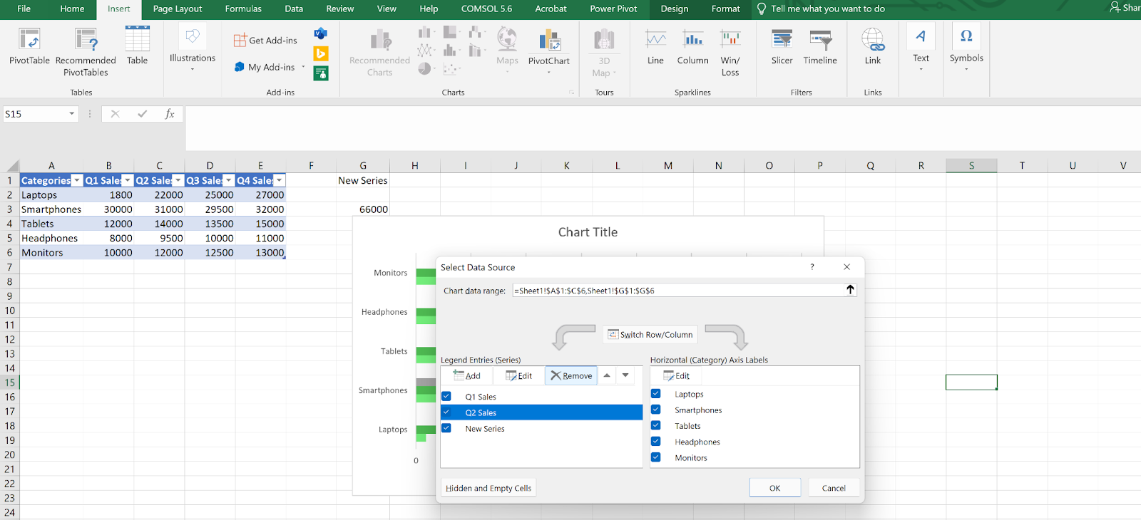
To manage your chart’s series:

  1. Click anywhere inside the chart to activate it.
  2. Right-click the chart area (not a bar).
  3. Click Select Data.

This opens the Select Data Source window, where you can manage the chart’s data sources and axis labels.

Excel chart with Select Data Source dialog open, showing series list and category axis labels.
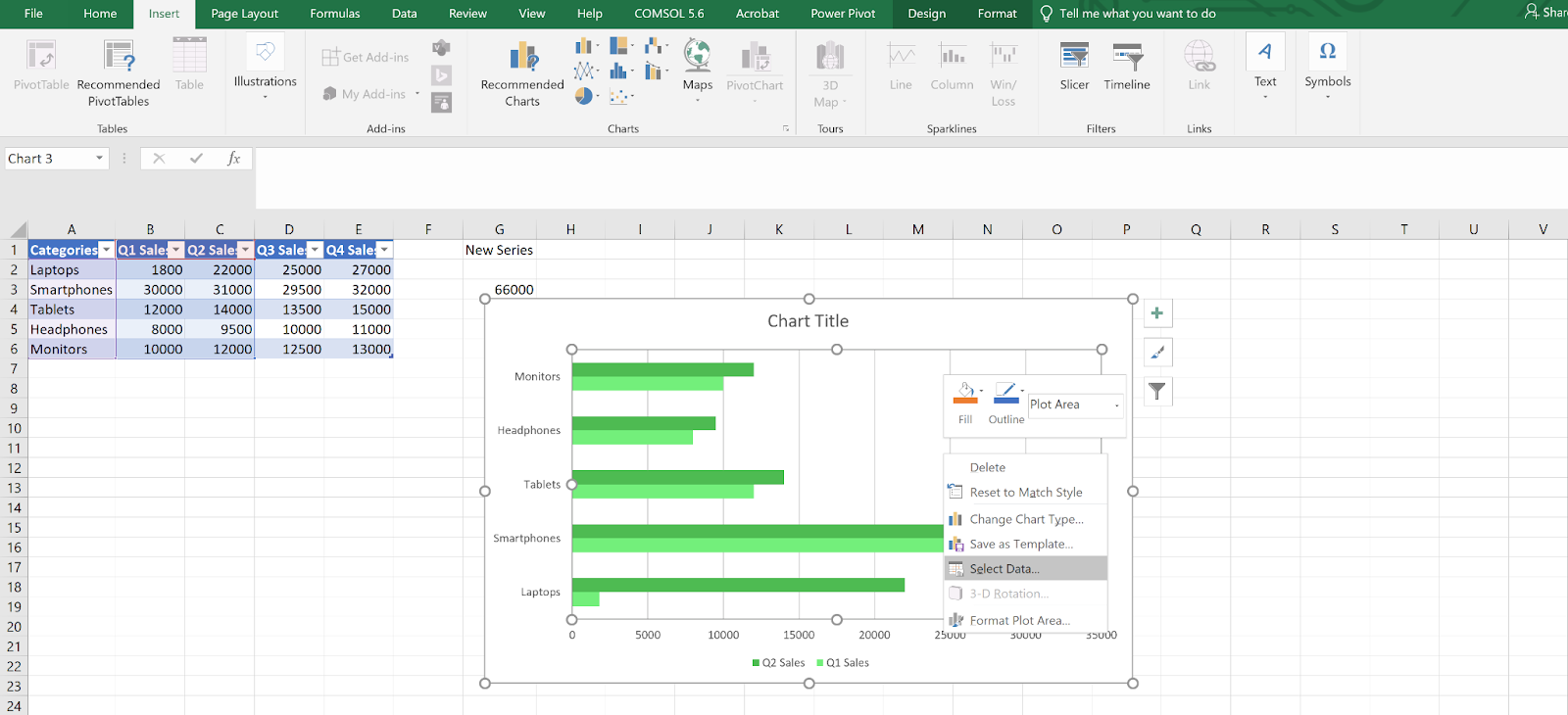
Opening the Select Data Source window to manage chart series. Image by Author

Step 3: Add a new data series

To highlight a specific category:

  1. Click Add in the Select Data Source window.
  2. In the Edit Series dialog:
    • For the Series name, click cell G1.
    • For the Series values, select G2 to G6.
  3. Click OK twice to return.

Now, only the entry with a value (e.g., “Smartphones”) will appear. Format this bar however you’d like to make it stand out.

Edit Series dialog in Excel used to define a new data series for highlighting.
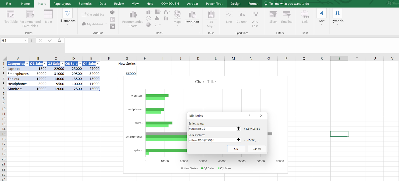
Adding a new data series to highlight a specific category. Image by Author

Step 4: Edit or remove a series

To edit:

  1. Reopen the Select Data Source dialog.
  2. Choose a series (e.g., Q2 Sales) and click Edit.
  3. Update the name or range.

To remove:

  1. Select the series.
  2. Click Remove.
  3. Press OK to apply.

Removing extra series can make your chart easier to interpret when you are focusing on a specific subset.

Excel dialog showing series selection with options to edit or delete.Modifying chart series in the Select Data Source dialog. Image by Author

Step 5: Adjust bar spacing and layout

  1. Click any bar in the chart.
  2. Right-click and choose Format Data Series.
  3. In the side pane, go to Series Options.

Use:

  • Series Overlap to control how much bars overlap.
  • Gap Width to adjust spacing between groups (lower = wider bars).

These options help fine-tune readability, especially for grouped data.

Excel pane with Series Overlap and Gap Width sliders visible.
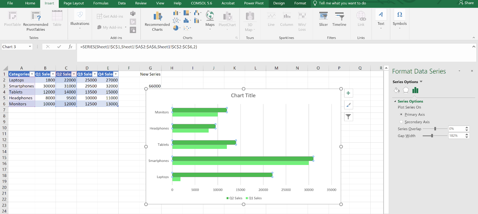
Adjusting bar spacing and overlap using the Format Data Series pane. Image by Author

Viewing and selecting bar chart types

Excel offers several bar chart variants that serve different purposes. Choosing the right one makes your chart easier to understand and communicate.

Step 1: Open the full chart menu

  1. Highlight your data (e.g., A1 to E6).
  2. Go to Insert > Insert Chart (use the small arrow at the bottom of the Charts group).

You’ll now see all available chart types.

Excel interface with Insert Chart dialog open, showing available chart categories.
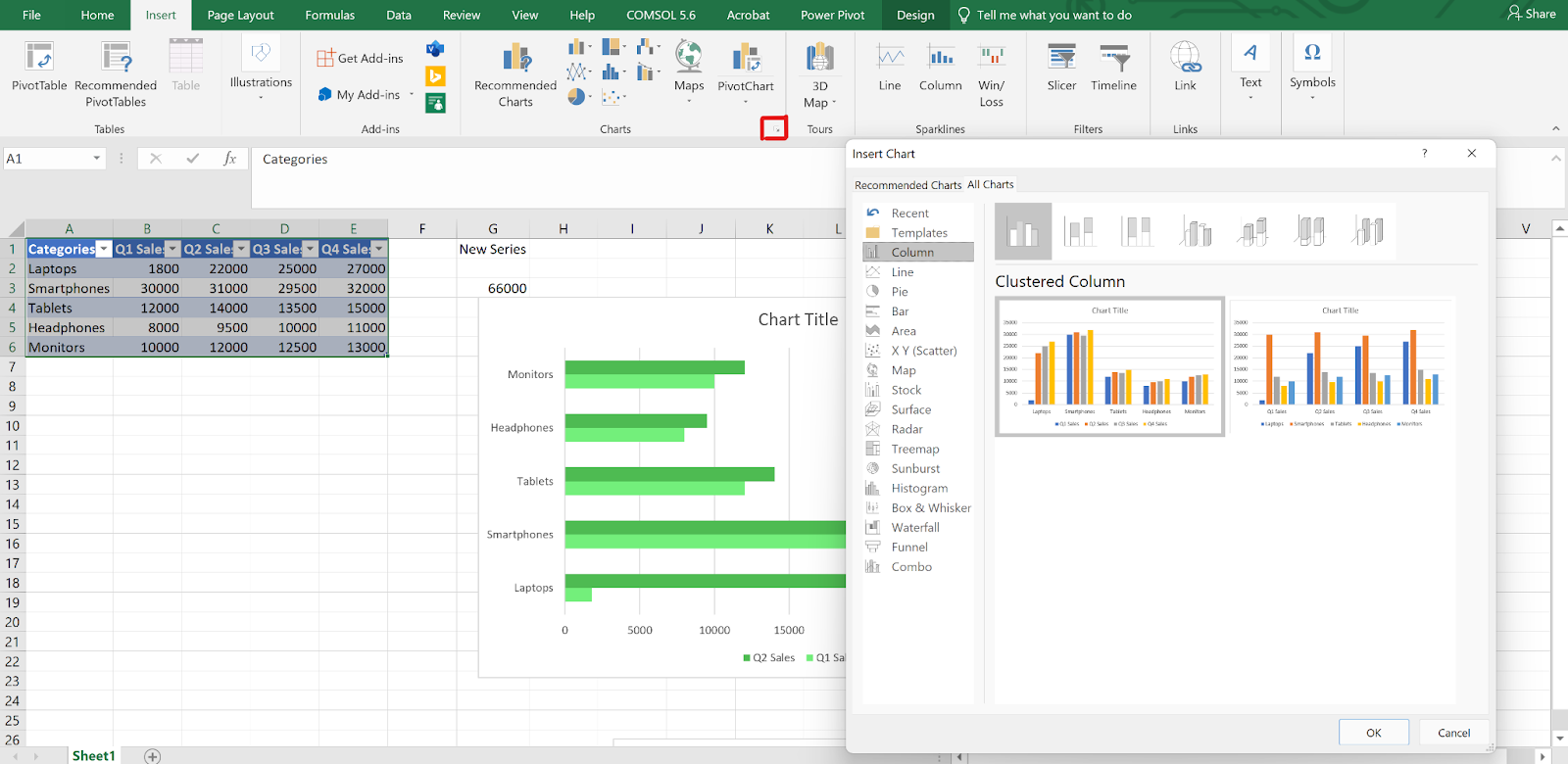
Accessing the full Insert Chart menu to browse Excel chart types. Image by Author

Step 2: Review bar chart options

From the list:

  • Clustered Bar: Horizontal bars, grouped by category. Best for side-by-side comparisons.
  • Stacked Bar: Combines bars within a category. Great for showing totals and part-to-whole relationships.
  • 100% Stacked Bar: Like Stacked Bar, but normalizes each total to 100%. Useful for comparing proportions.
  • 3-D Bar: Adds depth. Looks appealing, but may distort data.
  • Cylinder, Cone, and Pyramid: Decorative options. Rarely used for analysis.

Excel chart gallery displaying Clustered, Stacked, and 100% Stacked Bar options.
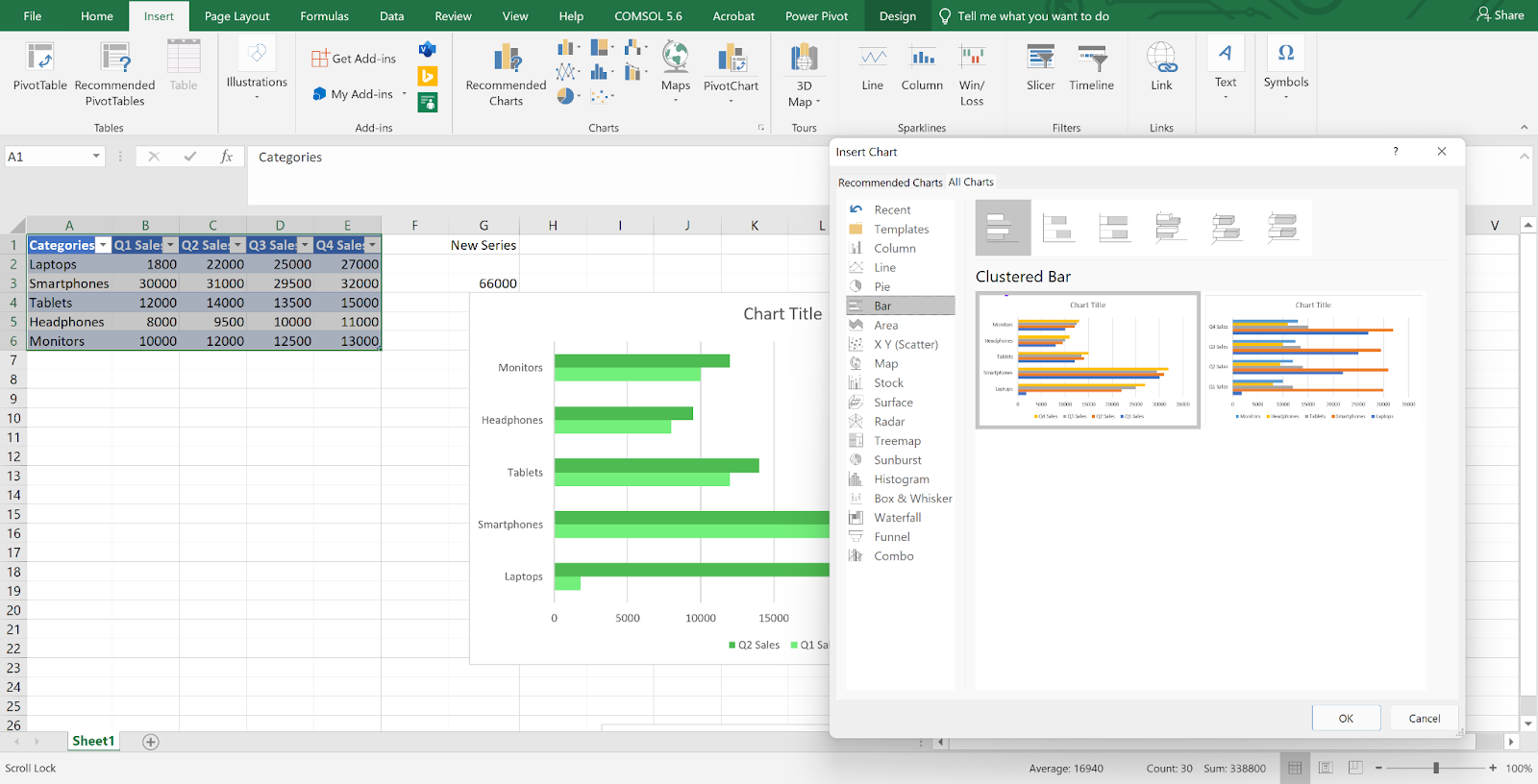
Choosing bar chart subtypes in Excel. Image by Author

Step 3: Choose a layout that fits your goal

Pick a layout based on what you are trying to show:

  • Use Clustered Bar for clear comparisons.
  • Go with Stacked Bar when showing contribution to a total.
  • Choose 100% Stacked for proportion comparisons.

The clearer the layout, the faster your audience will understand the chart.

Step 4: Switch between horizontal and vertical formats

  • Bar charts are horizontal.
  • Column charts are vertical.

Use bar charts for long category names or ranked lists. Use column charts for timelines or progressions.

To switch:

  1. Click your chart.
  2. Go to Chart Tools > Design.
  3. Choose Change Chart Type and pick either Bar or Column.

Excel Change Chart Type window showing selection between bar and column formats.
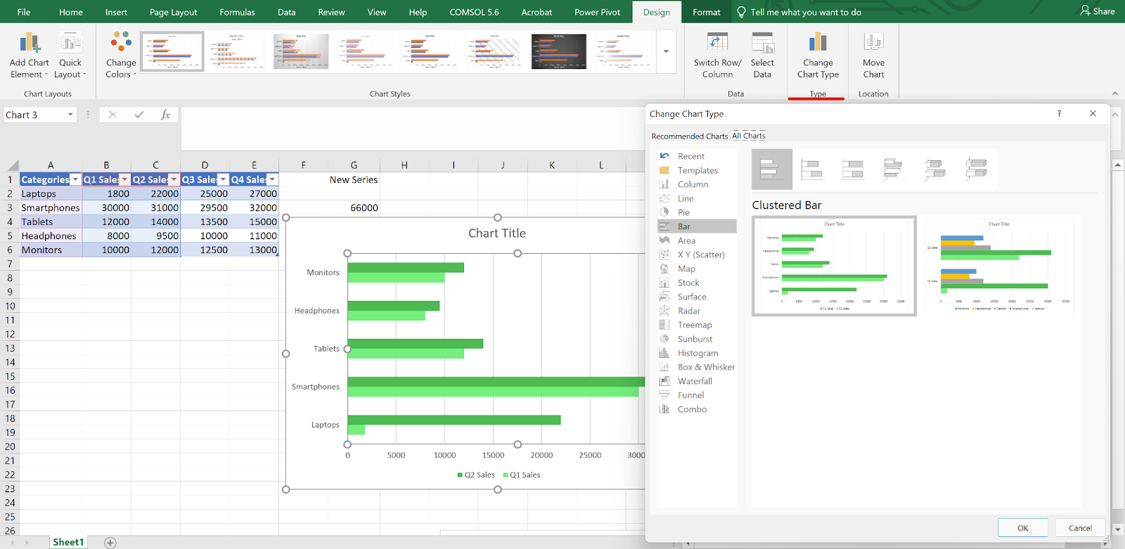
Switching between horizontal and vertical chart layouts in Excel. Image by Author

Advanced Customization Techniques

Once you’ve built your chart, you can tweak the layout, colors, and labels to match your purpose or make the chart easier to read.

Axis and label formatting

Start by clicking the axis you want to adjust. Then:

  1. Right-click it and choose Format Axis.
  2. Use the side pane to:
    • Set custom min/max values.
    • Adjust tick mark spacing.
    • Use a log scale if needed.

Excel chart with Format Axis pane open, showing options Alignment.
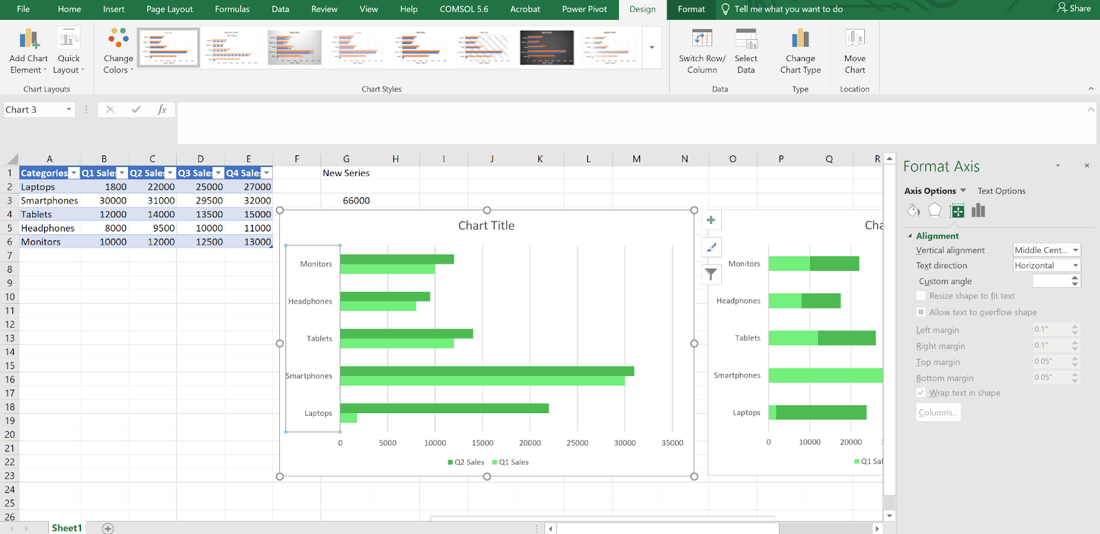
Opening the Format Axis pane to customize alignment. Image by Author

Excel Format Axis settings showing manual bounds and major unit controls.
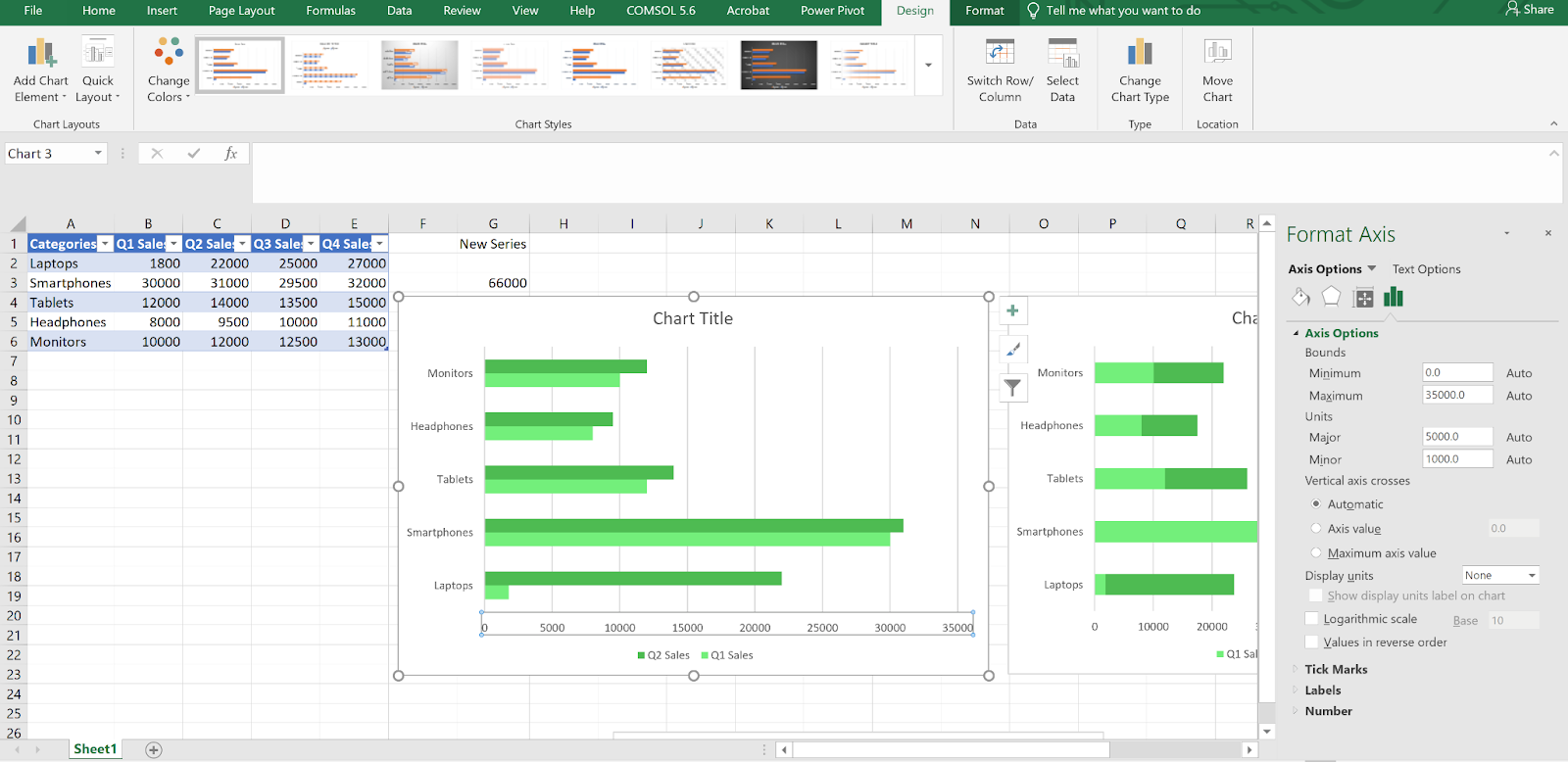
Setting minimum and maximum values to zoom in on a specific data range. Image by Author

For number formatting, scroll to the Number section. Choose the format (currency, percentage, etc.), set decimal places, and add unit symbols if helpful.

To rotate or stagger labels:

  1. Select the horizontal axis.
  2. In the Text Options tab, adjust the Text direction or Custom angle.

Text direction and custom angle options selected in Excel’s Format Axis pane.Adjusting label angle to improve readability in a crowded bar chart. Image by Author

To add and customize data labels:

  1. Click the chart, then the Chart Elements (+) button.
  2. Check Data Labels, then choose a position.
  3. Right-click a label to customize:
    • Change font and size.
    • Apply number formatting.
    • Remove labels from specific bars if needed.

Bar chart with data labels added, showing font and placement settings.
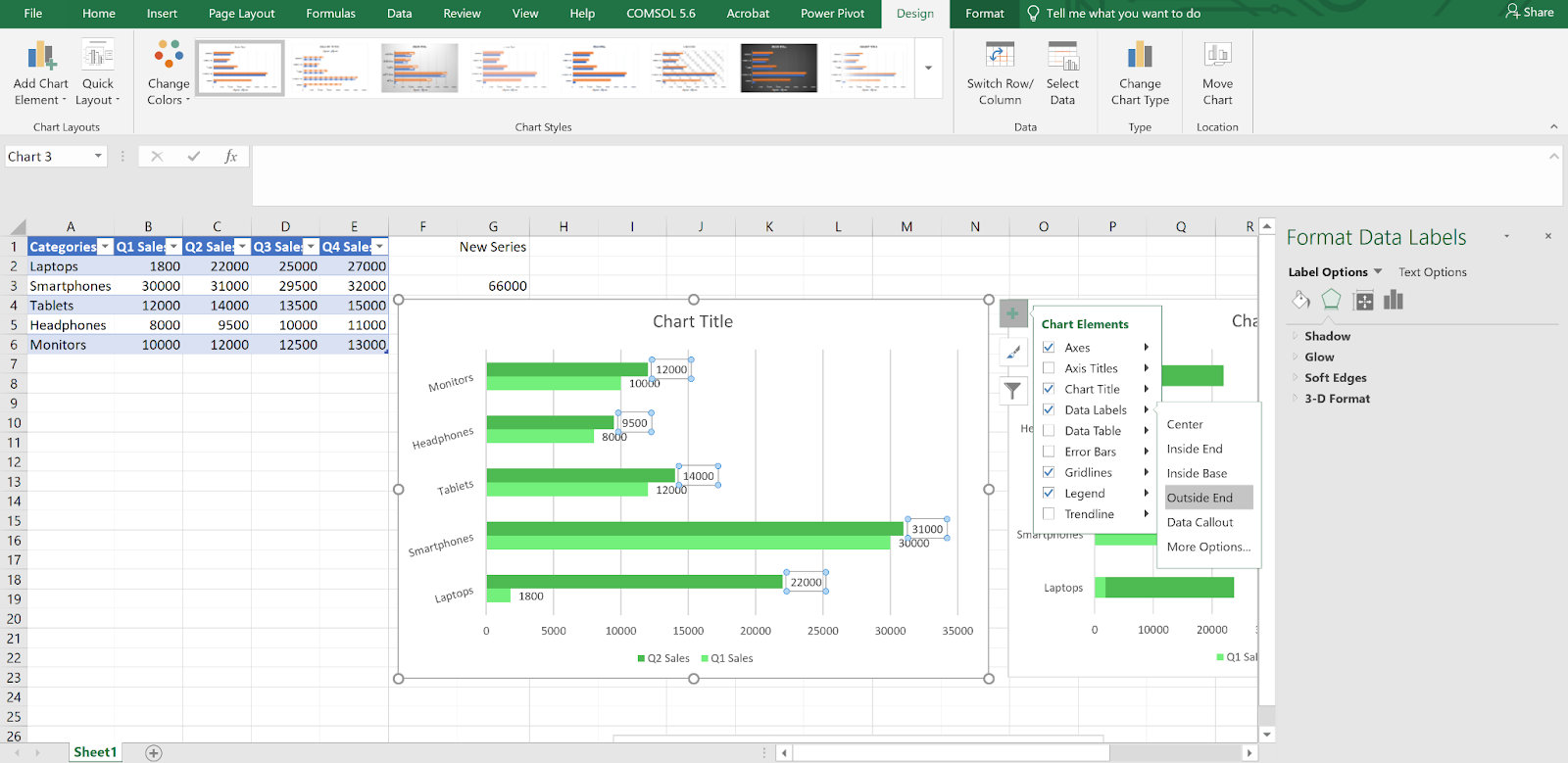
Enabling and formatting data labels to show exact values on each bar. Image by Author

Conditional formatting and special effects

Highlighting with “Invert if negative”

For charts with both positive and negative values:

  1. Select the series.
  2. Go to Format Data Series > Fill.
  3. Check Invert if negative.

This makes negative values automatically use a different color.

Format Data Series pane with “Invert if negative” checkbox selected.
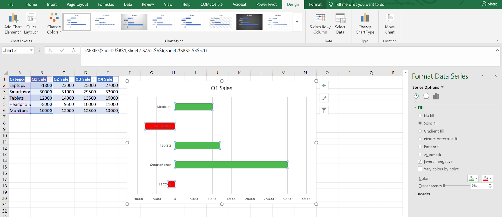
Using “Invert if negative” to highlight negative values in a different color. Image by Author

Gradient fills and conditional colors

To use gradients:

  1. Select the bars.
  2. In the Fill section, choose Gradient Fill.
  3. Adjust color stops as needed.

For threshold-based coloring:

  • Use formulas like IF() in a helper column to create rules.

  • Format each series or bar manually.

Highlight a specific bar

  1. Add a new column with a value only for the bar you want to highlight.
  2. Add that column as a new series.
  3. Format the new series with a distinct color or border.

Visual effects

You can add subtle effects if needed:

  1. Select a bar or series.
  2. In the Format Data Series pane, go to Effects.
  3. Apply options like: Shadow, Glow, Soft Edges, 3D Format.

Use these lightly to avoid distraction.

Making charts dynamic and accessible

  1. Click the chart title.

  2. In the formula bar, type = and click a cell (e.g., =A10).

  3. Press Enter.

The title will now update automatically based on that cell.

Formula bar showing chart title linked to cell A1 using =A10.
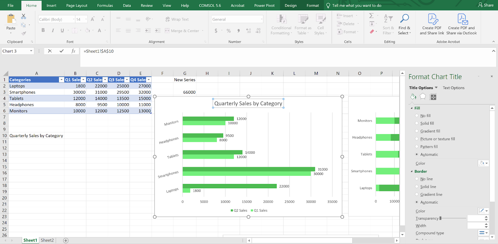
Linking a chart title to a cell so it updates dynamically with your data. Image by Author

Use dynamic ranges

Option 1: Excel Tables

  1. Select your data and press Ctrl + T.

  2. Charts linked to this table update as rows are added.

Option 2: Named range

  1. Go to Formulas > Name Manager.
  2. Use a formula like:
=OFFSET(Sheet1!$B$2,0,0,COUNTA(Sheet1!$B:$B)-1)

Excel Table format applied to data with chart updating automatically.
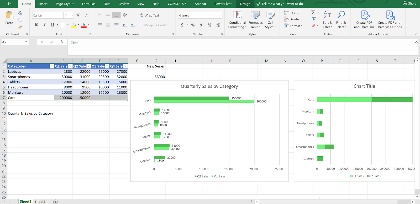
Creating a dynamic chart by turning your dataset into an Excel Table. Image by Author

Improve accessibility

  1. Use colorblind-friendly palettes.
  2. Avoid using color alone to indicate meaning. Combine with patterns or labels.
  3. Use high contrast text.
  4. Add alt text to the chart (right-click > Edit Alt Text).
  5. Stick to readable fonts and text sizes.

Examples of Excel Bar Graph Types

Horizontal bar graph

This is ideal for long category names or when visualizing rankings.

  • Insert a Clustered Bar.
  • Adjust spacing and labels.
  • To reverse order (e.g., highest value at top), go to Format Axis > Categories in reverse order.

Vertical bar graph (Column chart)

Best for showing changes over time or comparing values across groups.

  • Insert a Clustered Column.
  • Add gridlines or adjust bar spacing for clarity.

This is one of the most common chart types in Excel. 

Stacked bar graph

Use this when you want to show parts of a total:

  • Insert a Stacked Bar or 100% Stacked Bar.
  • Use distinct colors and a clear legend.
  • Add total labels if needed.

Troubleshooting Common Issues

Data not showing

  • Check that your range includes both categories and numbers.
  • Make sure all values are numeric because text will break the chart.
  • Revisit Select Data to confirm the correct ranges are being used.

Visual glitches

  • Axis labels overlapping? Rotate or stagger them.
  • Formatting not applying? Use Reset to Match Style or recreate the chart.
  • Bars too close or far apart? Adjust Gap Width under Format Data Series.

Performance issues

If your file slows down:

  • Avoid volatile functions like INDIRECT() or OFFSET().

  • Stick to Excel Tables instead of complex named ranges.

  • Skip heavy effects like 3D formatting.

  • Use a summary sheet as a chart source to keep things responsive.

Conclusion

Bar graphs in Excel are simple to create, but there’s more to them than just dragging data into a chart. Once your dataset is organized and you’ve spent some time with Excel’s charting tools, it becomes easier to build visuals that are easy to work with.

To build on what you’ve just learned and practiced here in this article, enroll in our Data Visualization in Excel course, which offers up more info on chart design and layout choices. Or, if you’re just starting out, our Introduction to Excel covers the basics. Last I'll say, if you think you will be working with larger datasets and trying to find patterns in them,  our Data Analysis in Excel introduces some more advanced workflows.


Samuel Shaibu's photo
Author
Samuel Shaibu
LinkedIn

Experienced data professional and writer who is passionate about empowering aspiring experts in the data space.

FAQs

How do I choose between a bar chart and a column chart in Excel?

Bar charts display data horizontally, while column charts show it vertically. If your category labels are long or you're comparing a small number of groups, bar charts are easier to read. For time-based data or when emphasizing progression, column charts are often a better fit.

Can I make my Excel bar chart update automatically when the data changes?

Yes. By converting your data into an Excel Table or using dynamic named ranges, you can link your chart to data that updates as you add or remove entries. This is useful for reports or dashboards that need to stay current.

What’s the best way to highlight one specific bar in a chart?

You can create a new data series that includes only the value you want to emphasize, then format it with a different color or effect. This allows you to keep the original chart structure while drawing attention to a key data point.

Why are my bars not showing up in the chart?

This usually happens when the data contains text instead of numbers or when the selected range is incomplete. Check that your values are numeric and that the entire data range is included in the chart settings.

Can I create a bar chart in Excel that is accessible to colorblind users?

Yes. Use high-contrast colors and avoid relying on color alone to convey meaning. Add data labels, use patterns or textures, and provide alt text to make your charts easier to interpret for everyone.

Topics

Learn Excel DataCamp

Course

Data Visualization in Excel

3 hr
40.8K
Learn how to create a range of visualizations in Excel for different data layouts, ensuring you incorporate best practices to help you build dashboards.
See DetailsRight Arrow
Start Course
See MoreRight Arrow
Related

Tutorial

How to Change Date Format in Excel: What You Need to Know

Learn how to create a bar graph in Excel with this beginner-friendly guide. Explore chart types, formatting tips, dynamic features, and troubleshooting techniques.
Laiba Siddiqui's photo

Laiba Siddiqui

Tutorial

How to Create a Line Graph in Excel: A Step-by-Step Guide

Learn to create clear and informative line graphs in Excel. This guide walks you through each step, from setting up your data to customizing the graph for better readability.
Derrick Mwiti's photo

Derrick Mwiti

Tutorial

How to Make a Pie Chart in Excel: The Steps Explained

Learn how to create, format, and customize Excel pie charts. Discover Excel pie chart options like doughnut charts, pie of pie charts, and exploded pie charts.
Oluseye Jeremiah's photo

Oluseye Jeremiah

Tutorial

How to Create a Histogram in Excel: A Step-by-Step Guide

Master the art of visualizing data in Excel using histograms! This step-by-step guide will walk you through various methods, such as built-in charts, formulas, and the Analysis ToolPak, to help you analyze frequency distributions like a pro.
Jachimma Christian's photo

Jachimma Christian

Excel Dashboard Strategy

Tutorial

How to Create a Dashboard in Excel in 3 Easy Steps

Learn everything you need to know about how to create a dashboard in Excel, with tips and examples.
Joleen Bothma's photo

Joleen Bothma

Tutorial

How to Create and Format a Combo Chart in Excel

To create a combo chart in Excel, select your data, go to the "Insert" tab, go to the "Charts" group, and choose "Combo Chart."
Elena Kosourova's photo

Elena Kosourova

See MoreSee More