
Track
Excel Fundamentals
16 hr
Pie charts are one of the simplest yet most effective ways to visualize proportions in a dataset. Whether you're presenting market share, survey results, or budget allocations, a well-designed pie chart can help your audience quickly grasp key insights at a glance.
In this guide, we'll walk you through how to create a pie chart in Excel, customize it for clarity, and explore advanced variations like doughnut charts and exploded pie charts to emphasize essential data points.
A pie chart is a circular graph that represents data as slices of a whole, with each slice corresponding to a category’s contribution to the total. Excel makes it easy to generate pie charts, requiring just one data series along with a corresponding set of labels. Everyday use cases for pie charts include:
While pie charts are great for showing relative proportions, they are best used when dealing with a small number of categories (ideally five or fewer) to avoid clutter and misinterpretation. That is, pie charts don’t work for data with high cardinality.
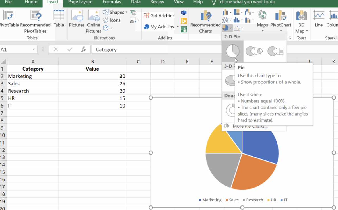
Let’s walk through the process step-by-step using a simple dataset. Imagine you have the following data representing different departments and their corresponding values:
| Category | Value |
|---|---|
| Marketing | 30 |
| Sales | 25 |
| Research | 20 |
| HR | 15 |
| IT | 10 |
First, we do some prep.
Next, we choose our values:
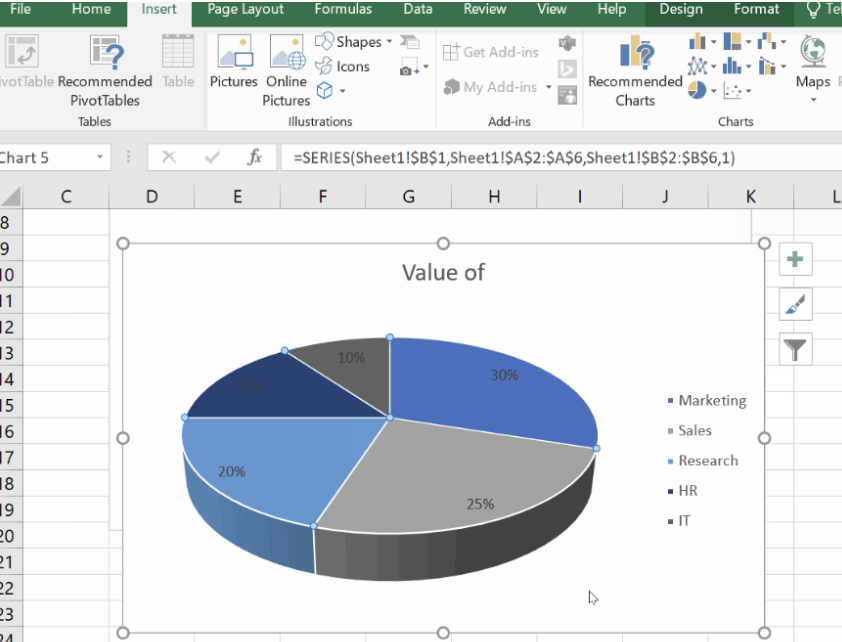
Now, for the pie chart:
This step-by-step process lets you visually represent the distribution of values among the departments, making it easier to see, for example, that Marketing holds the largest share.
Once you've created a pie chart, the next step is to make it visually appealing and easy to understand. Customizing your chart helps highlight key insights, improve readability, and align with your presentation or report's design. In this section, we’ll explore how to add and format labels, change colors and layouts, and adjust the legend and chart title.
Labels help your audience quickly understand what each slice of the pie represents. Excel allows you to add data labels that display category names, percentages, or values. You can also customize their appearance to make them stand out.
Let’s add labels to make it easy for the reader.
To show both percentage and category, right-click a label, choose Format Data Labels, and check both options under Label Options.
We can even customize the data labels:
Changing colors and layouts
A well-designed pie chart should be visually engaging without being overwhelming. Excel provides various customization options for adjusting colors and layouts to match your style or brand.
Here is how to change colors:
There’s also a way to do this using Quick Layout.
A legend helps viewers identify the meaning of each slice, while a clear title makes your chart more straightforward to interpret at a glance. You can reposition, remove, or edit these elements to improve clarity.
Let’s customize the chart legend.
Let’s now customize the chart title.
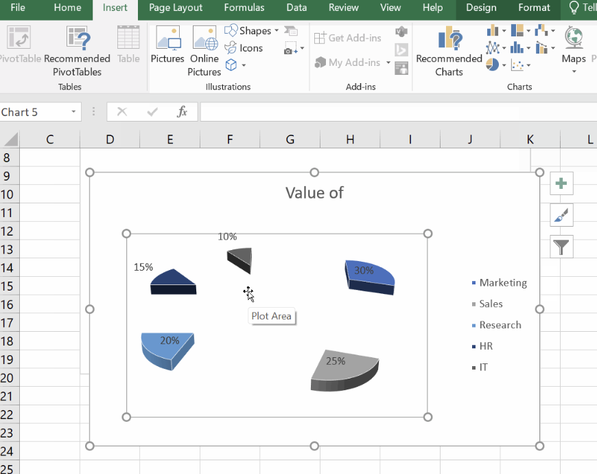
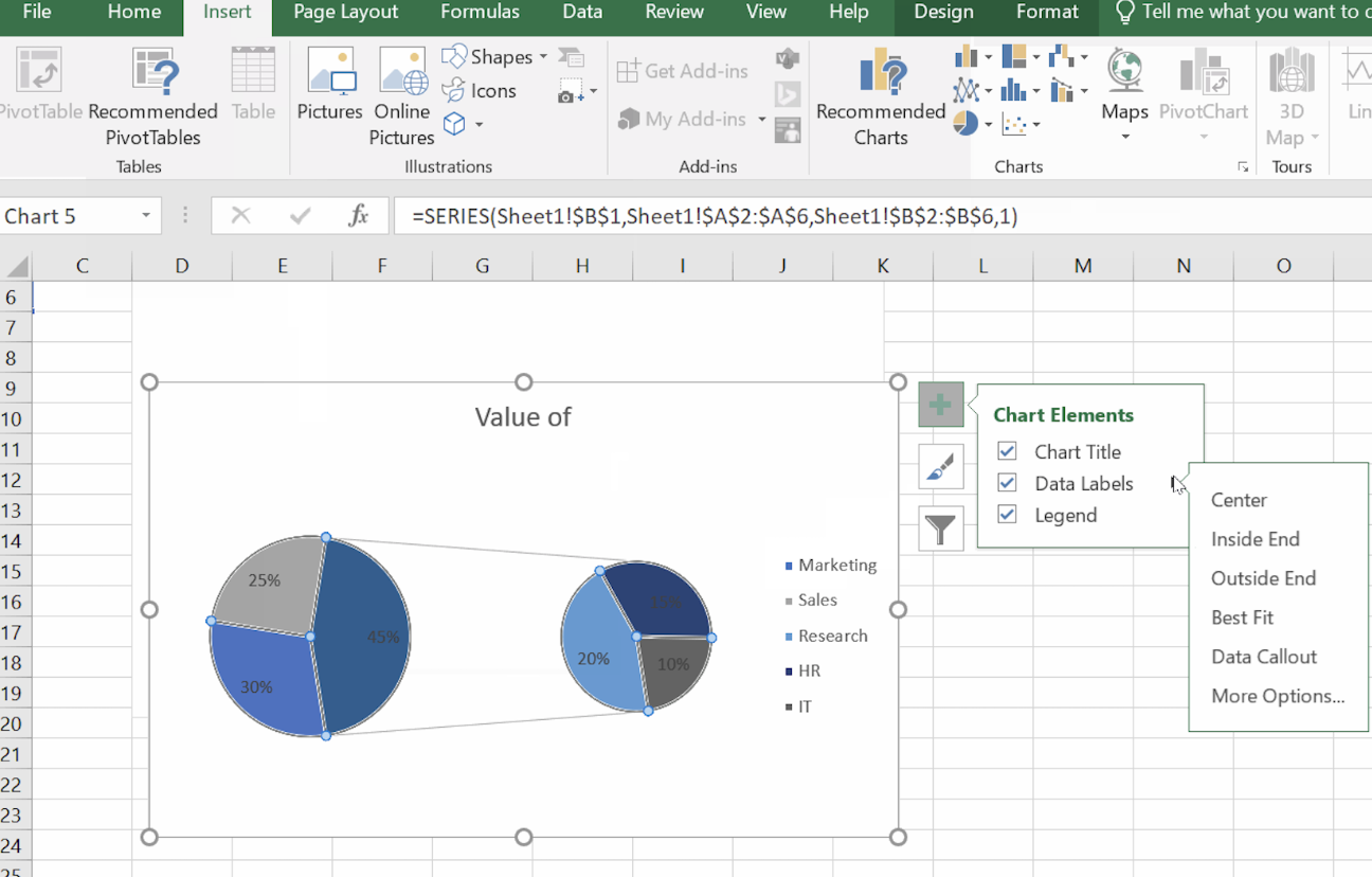
Excel offers additional chart types and effects that enhance the clarity and impact of your data visualization. If your pie chart includes many small categories or you need to highlight a particular section, these advanced options will help you create more insightful visuals.
In this section, we’ll explore some cool extensions including Exploded Pie Charts, Pie of Pie, Bar of Pie Charts, and Doughnut Charts.
An exploded pie chart separates one or more slices from the rest to emphasize specific data points. This is useful when you want to highlight a key category, such as the largest or smallest contributor.
When your data contains small slices that are difficult to see, pie-of-pie and bar-of-pie charts help by grouping smaller categories into a secondary chart.
A doughnut chart is similar to a pie chart but with a hole in the center, making it useful for displaying multiple data series, creating a cleaner, modern look, and comparing proportions while leaving space for additional labels.
Creating a pie chart is just the first step, but ensuring it effectively communicates your data is equally important. Poorly designed pie charts can be misleading or difficult to read, reducing their impact. In this section, we’ll cover essential best practices for making your charts clear and accurate.
Pie charts work best when they display a small number of categories. Too many slices make comparisons difficult and clutter the visual. For clarity, keep the number of slices between five and seven and avoid overloading the chart with excessive categories. If your dataset contains too many small values, consider grouping them into an "Other" category or using a pie-of-pie or bar-of-pie chart to separate smaller slices.
Color plays a role in making your pie chart easy to understand. Without enough contrast, slices may blend together.For best results, use contrasting colors to distinguish slices, avoid similar shades for adjacent slices, and maintain a color theme.
Without labels, viewers might struggle to understand what each slice represents. Include percentage labels to show proportions, add category names when needed for context. Also, position labels inside or outside slices depending on the space, and use data callouts for better readability. Basically, play around with the aesthetics until you’re sure it communicates what you need without confusion or distraction.
Finally, pie charts work best when categories have noticeable differences in proportions, but if values are too similar, distinguishing slices becomes difficult. In such cases, it's better to use a bar or column chart.
Even though Excel makes creating pie charts a pretty straightforward process, errors can occur as you are building them. Below are some common issues you might encounter:
Data not displaying correctly: Ensure your data is structured properly, with categories in one column and corresponding values in the next.
Numbers interpreted as headers: Check if Excel mistakenly recognizes the first row as a header. If needed, adjust the selection in the Select Data menu.
Non-adjacent selection problems: If your data isn't in a continuous range, you can use Ctrl (Windows) or Cmd (Mac) to select multiple areas before inserting the chart.
While pie charts are great for showing proportions, they have limitations, especially when dealing with too many categories or values that are too similar. In these cases, alternative chart types may provide clearer insights: Bar charts are ideal for comparing individual values more effectively. Column charts or stacked charts are better suited for time-based trends or grouped data.
If your pie chart looks cluttered or hard to interpret, consider switching to one of these options for better readability. If you are interesting in exploring the full range of data visualization options, take our Data Analyst in Excel course, which covers charting options but also other important hings like what-if analysis and forecasting.
Remember, choosing the right chart type is key: While pie charts work well for simple, clear proportions, more complex datasets may benefit from variations like doughnut or pie-of-pie charts. Experiment with these options to see which best communicates your data, and don't be afraid to tweak colors, labels, and layouts until your chart truly shines. And remember to take our Data Analyst in Excel course to keep learning about charting, of course, and what-if analysis and forecasting, as I mentioned, but as logical functions, PivotTables, and so much more.
Gain the skills to maximize Excel—no experience required.
Learn Excel with DataCamp
Track
Course
Course
Tutorial
Islam Salahuddin
Tutorial
Islam Salahuddin
Tutorial
Jachimma Christian
Tutorial
Derrick Mwiti
Tutorial
Joleen Bothma
Tutorial
Elena Kosourova